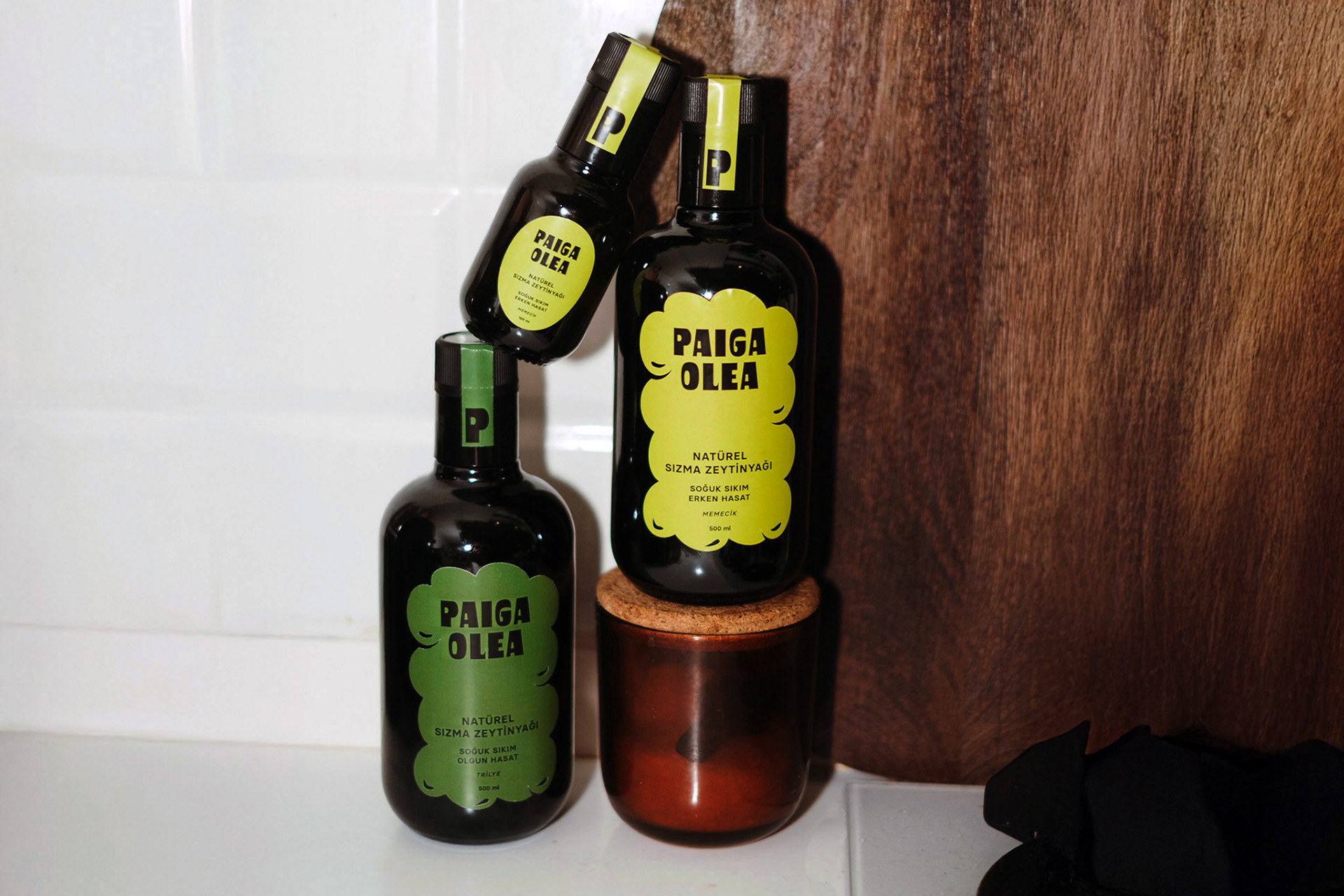
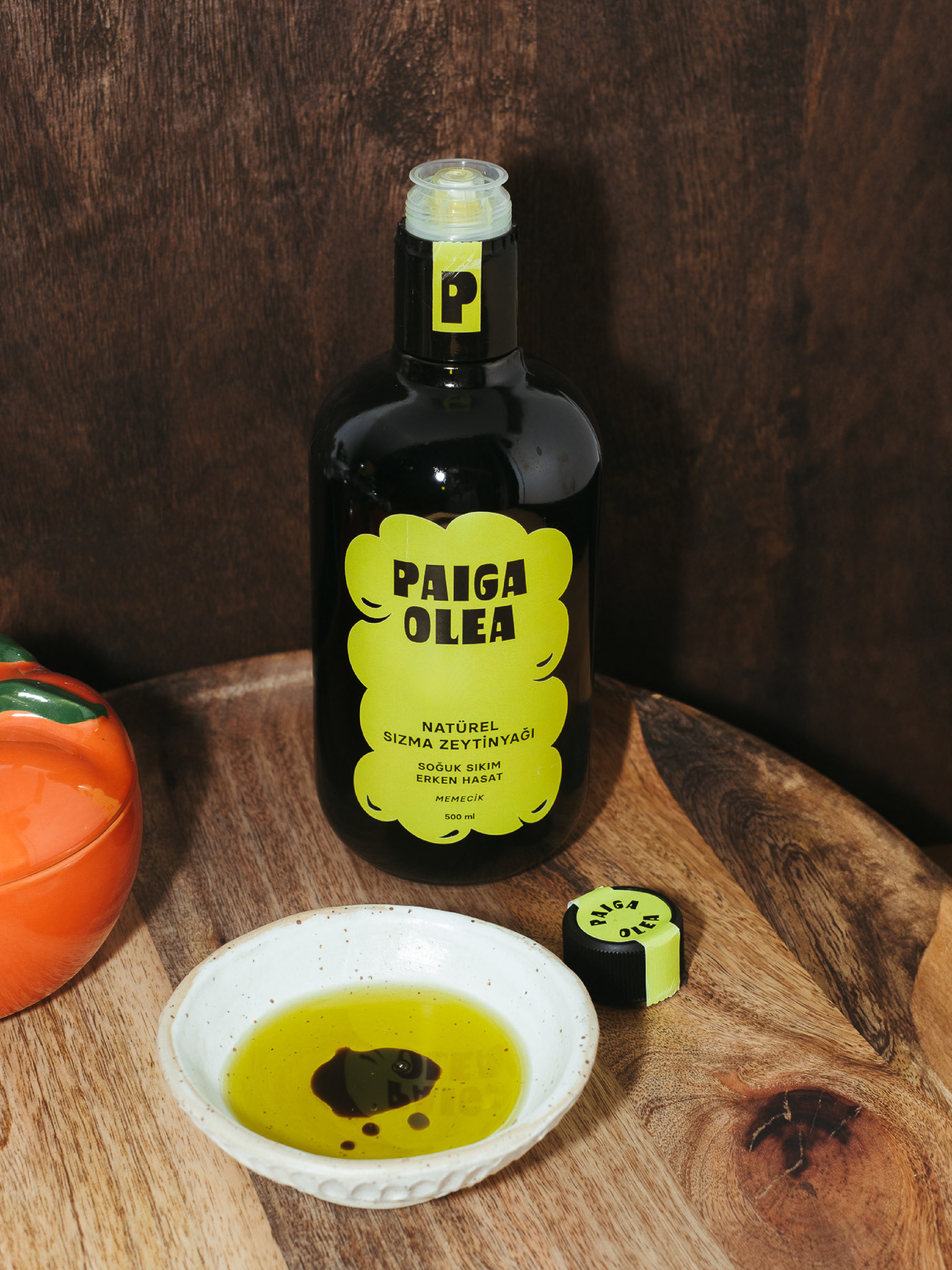
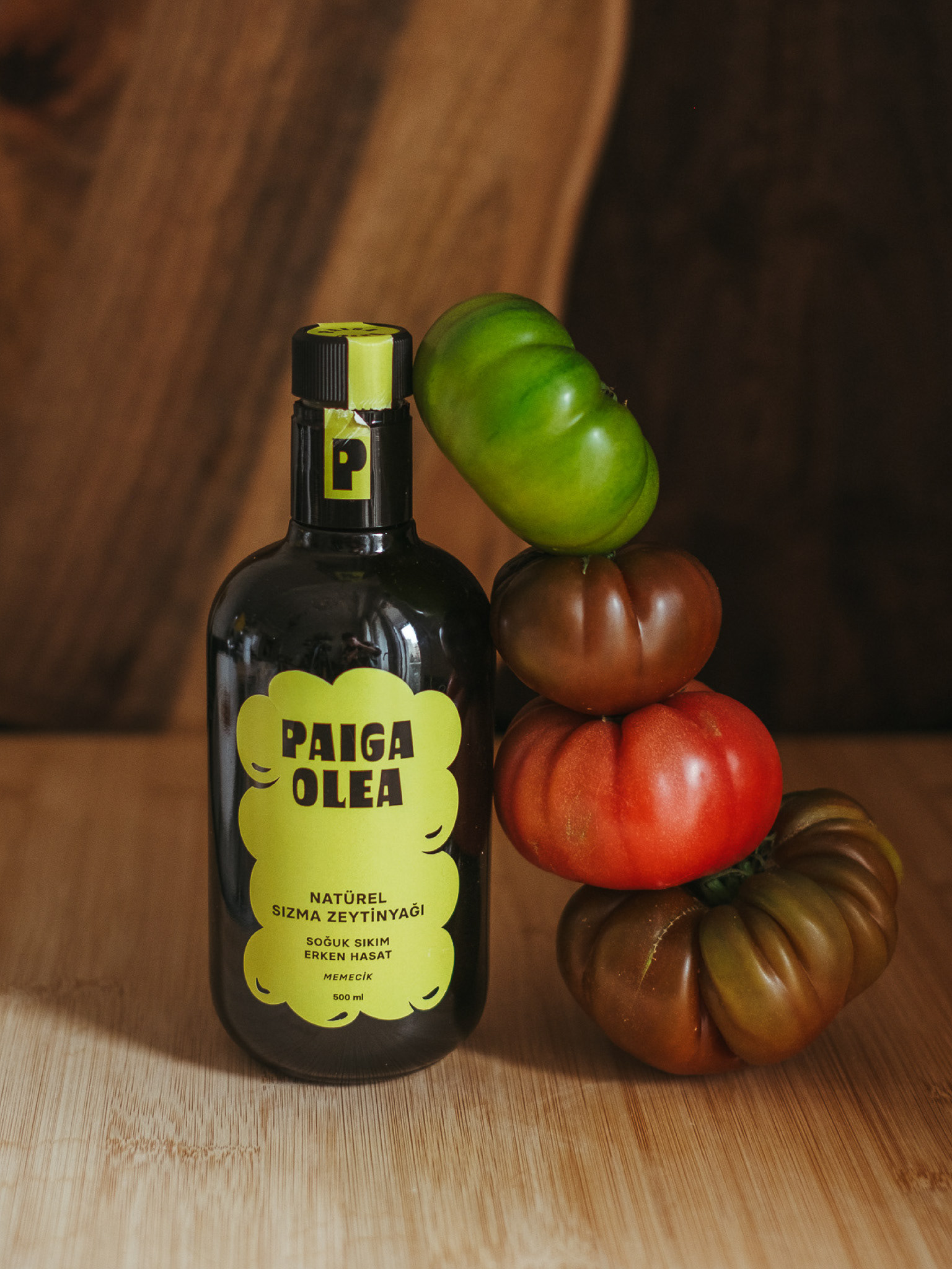
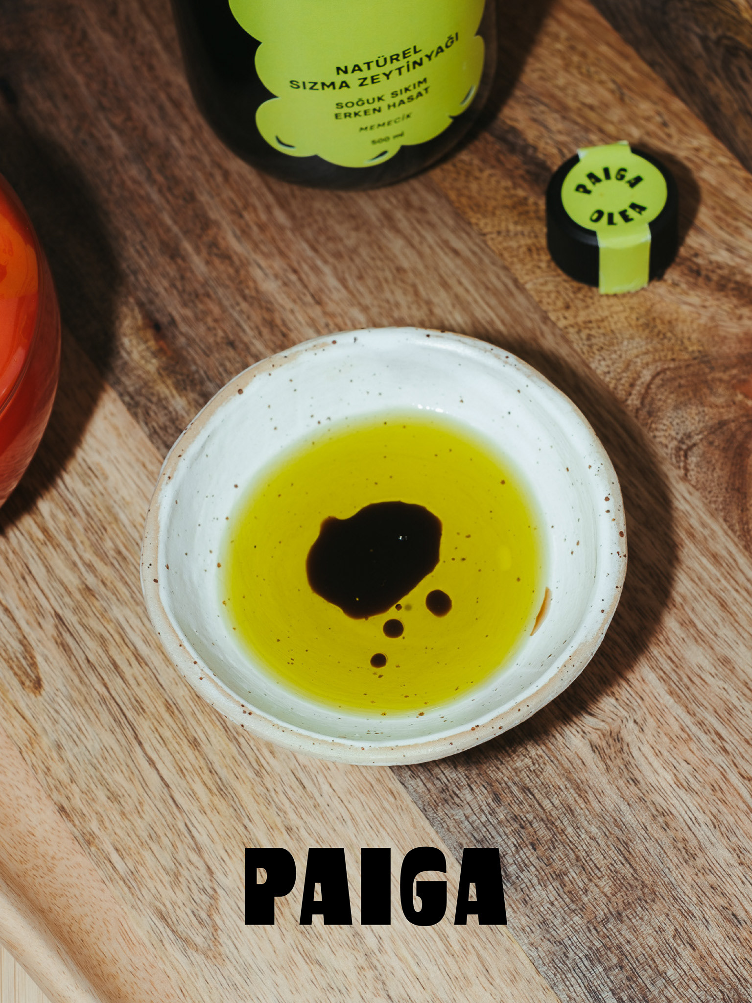
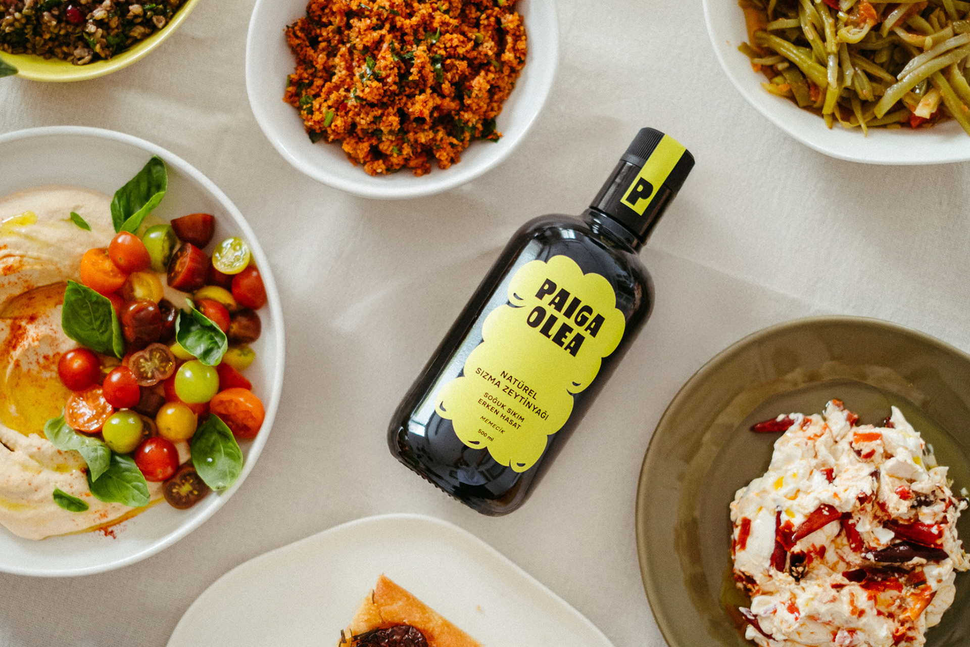
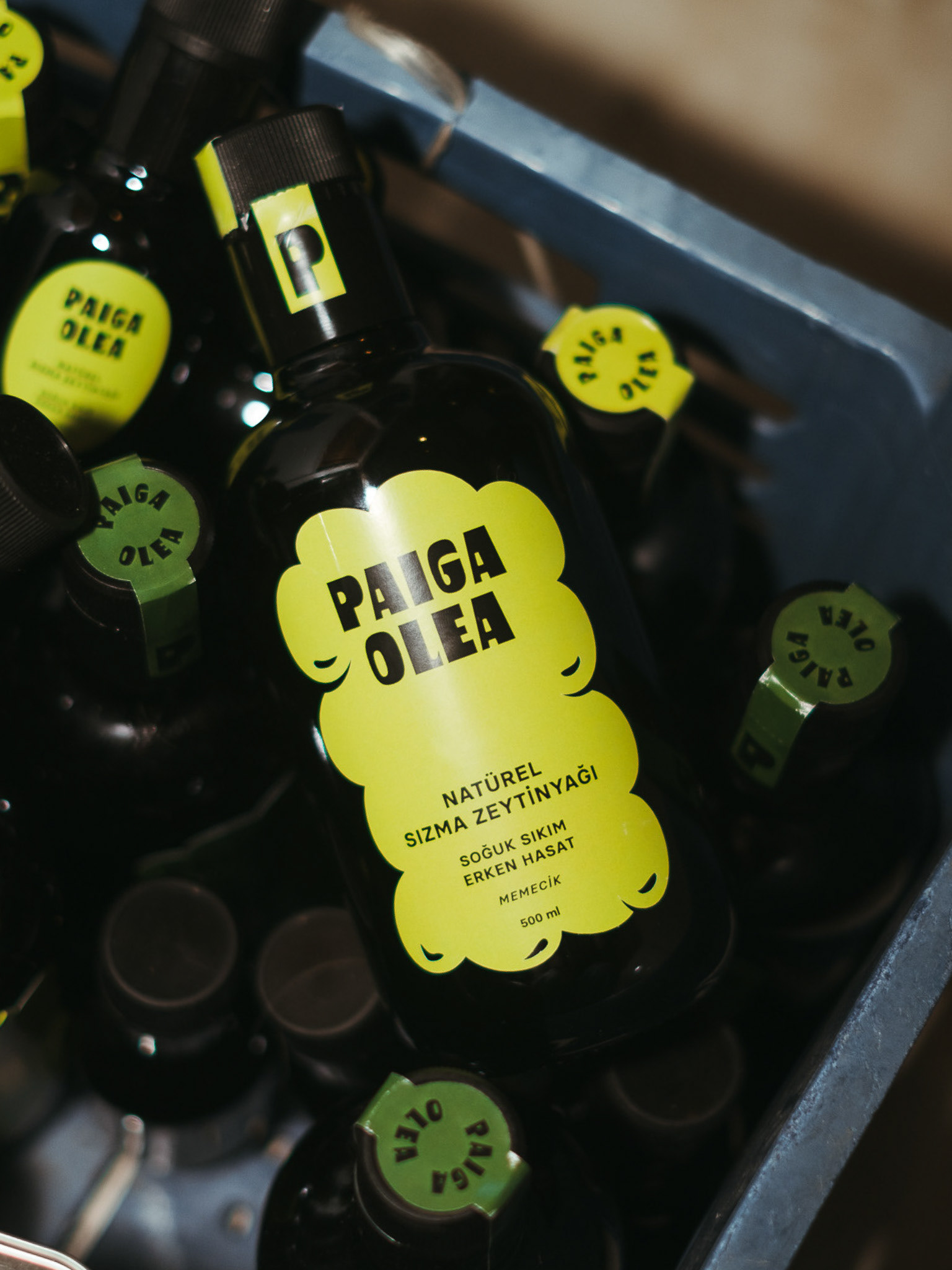
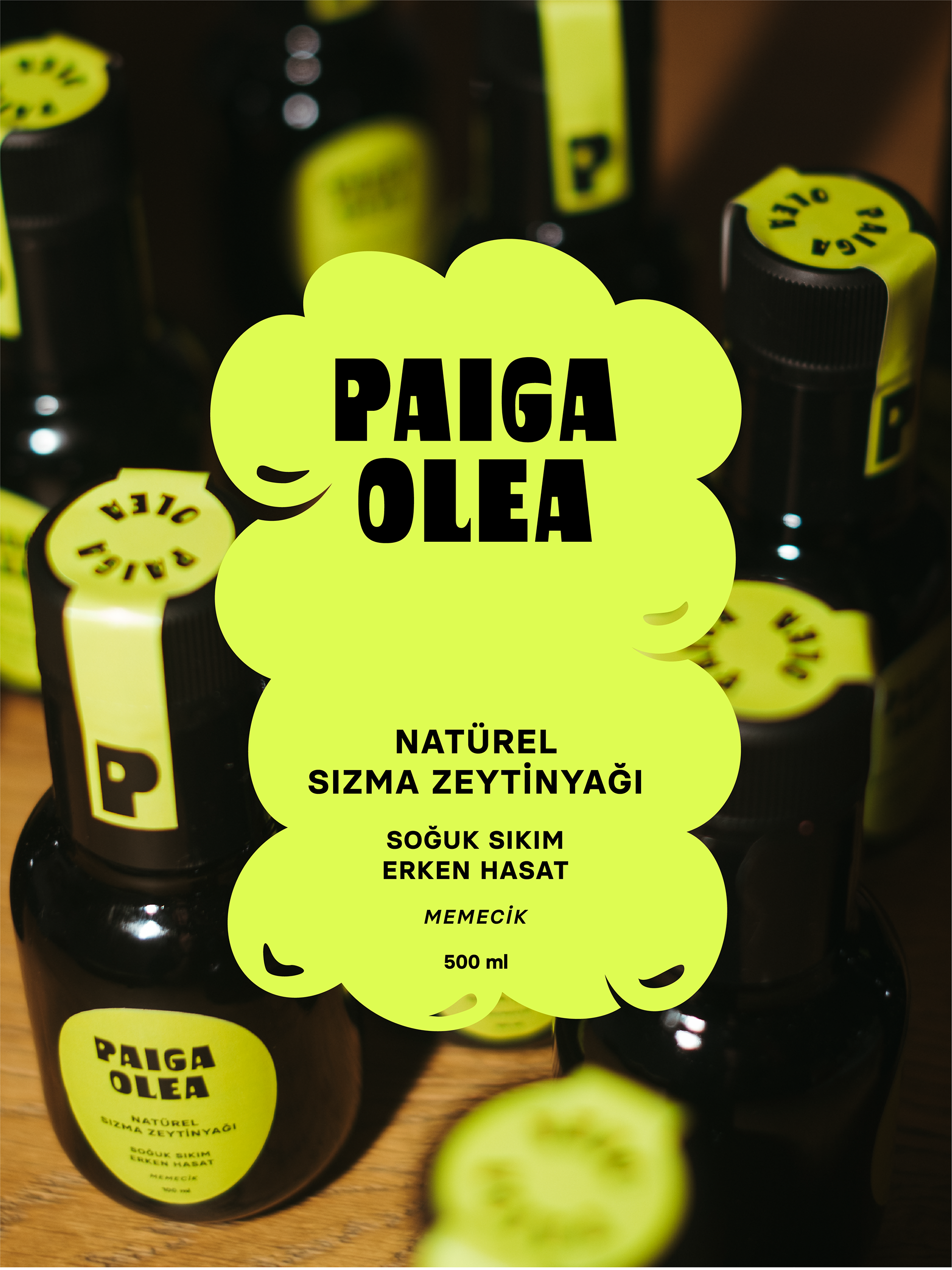
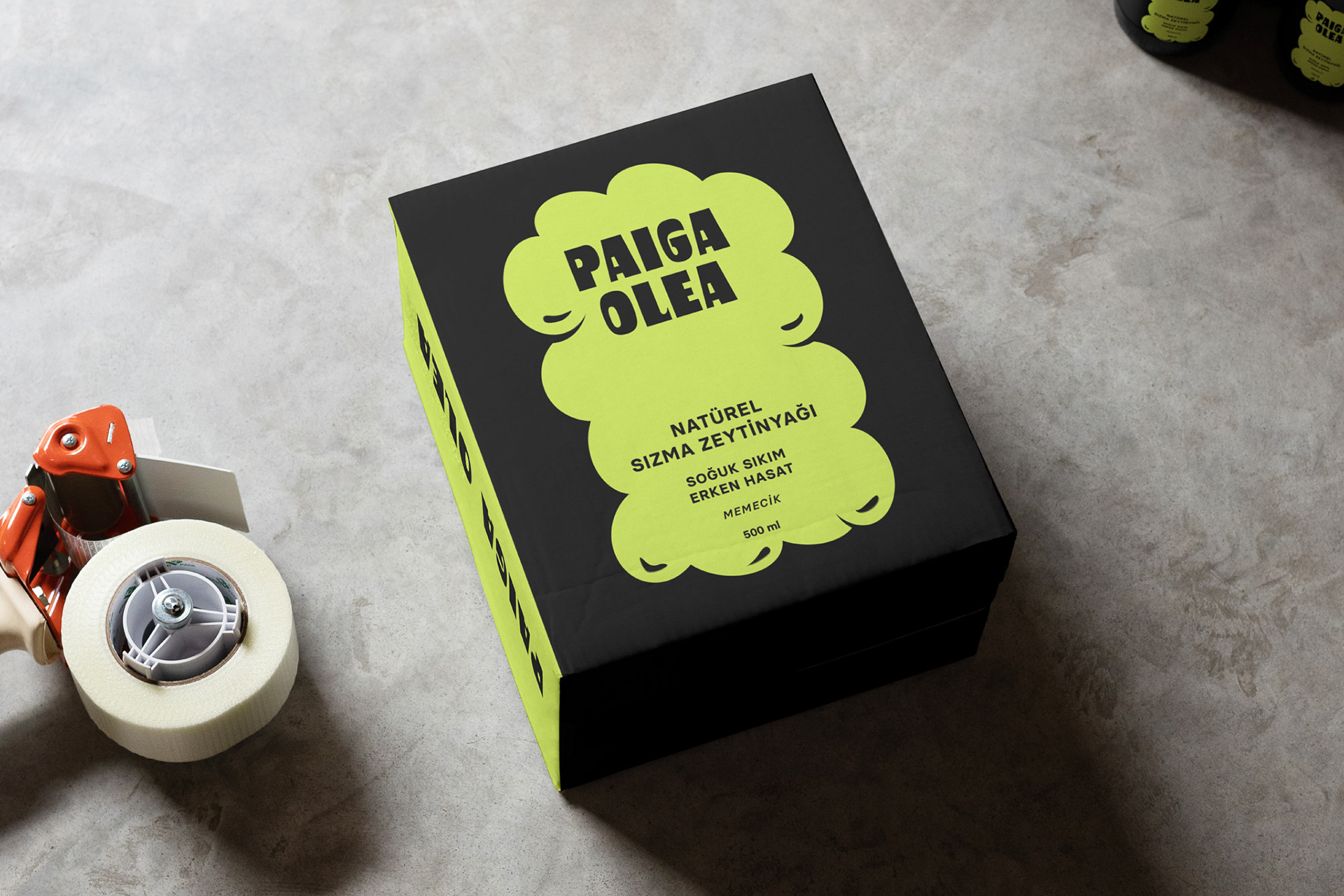
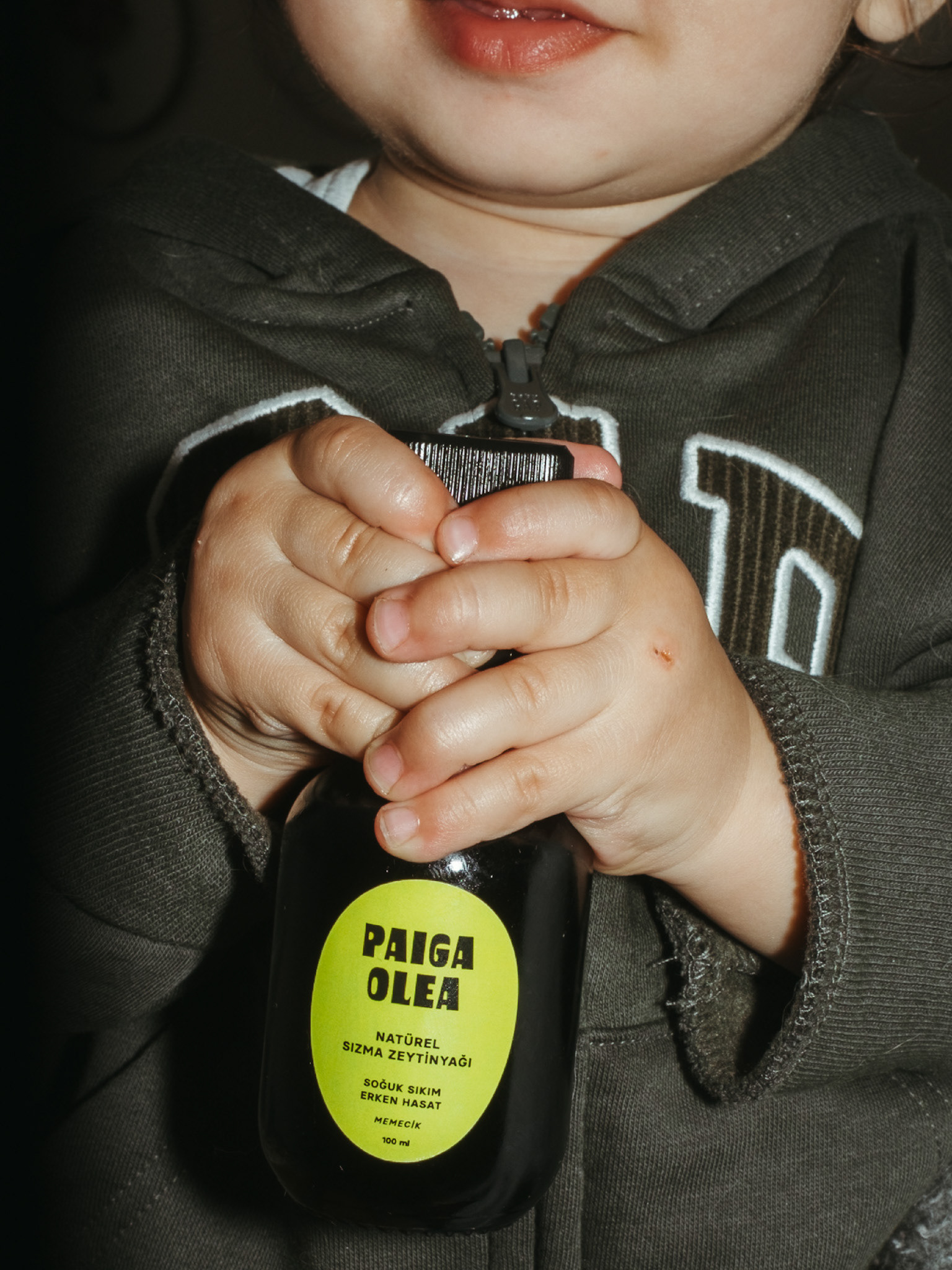
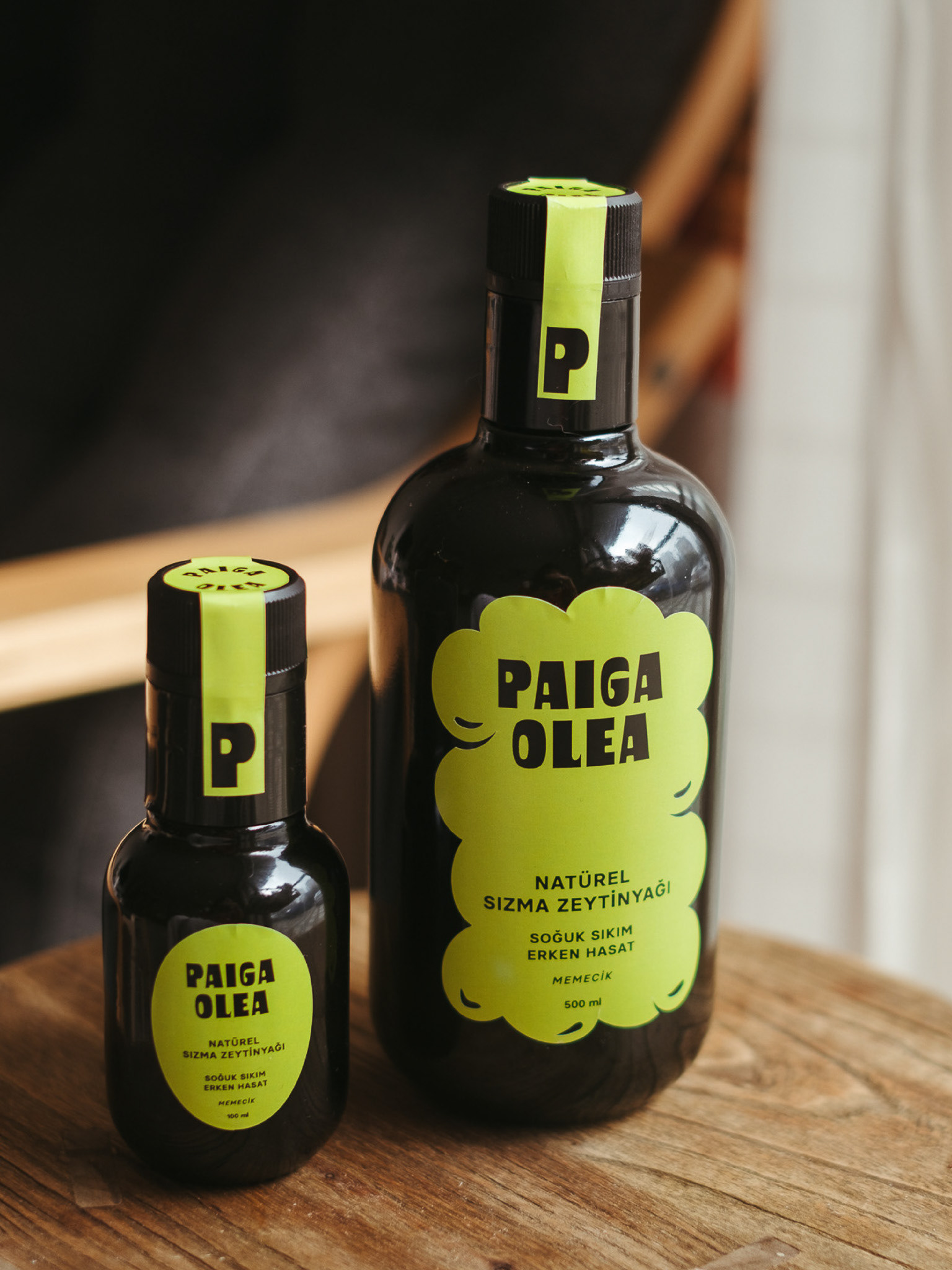
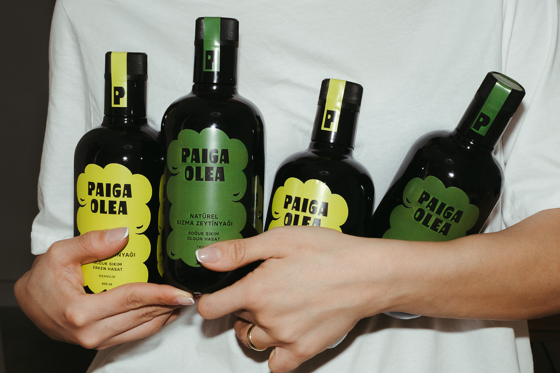
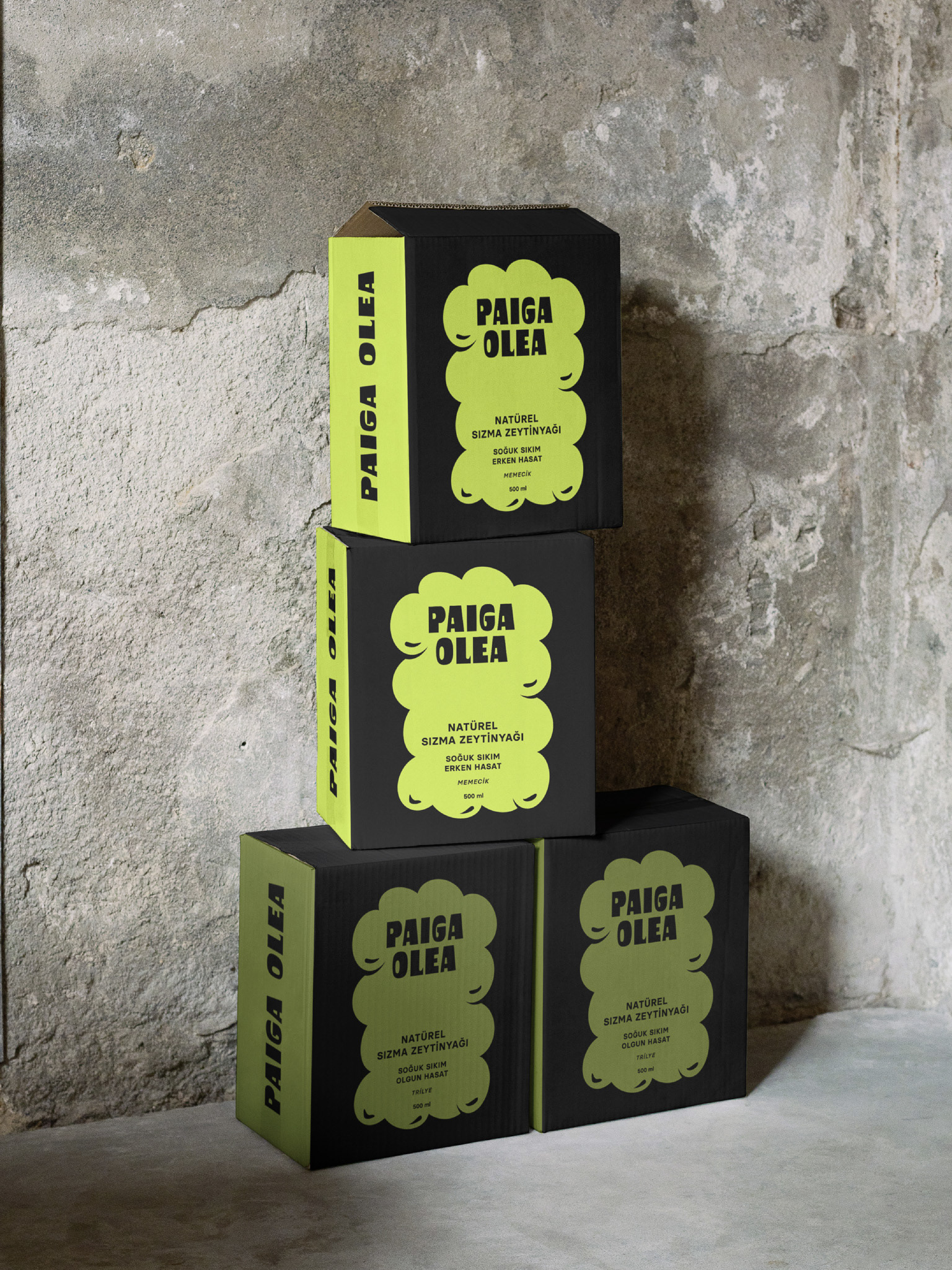
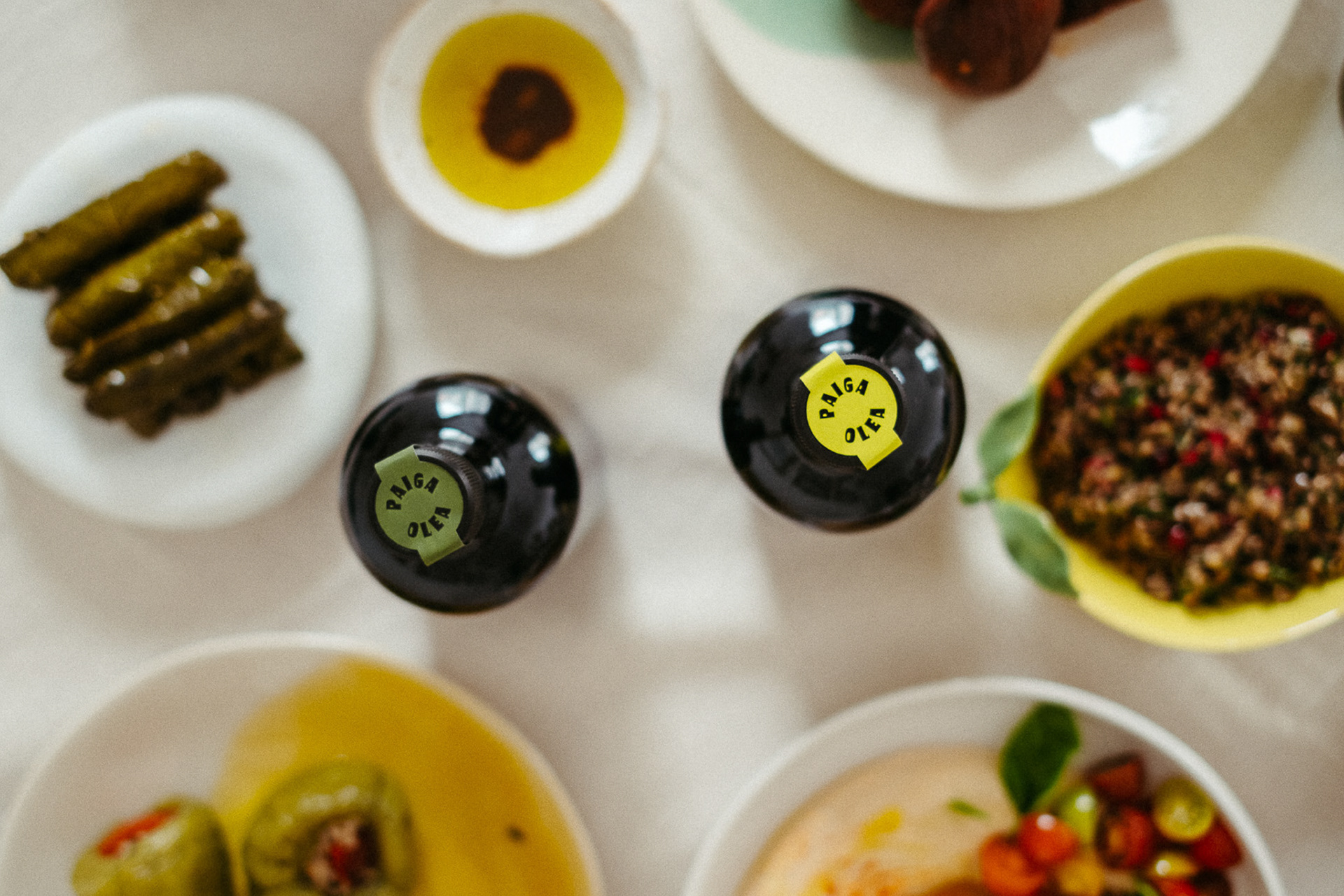
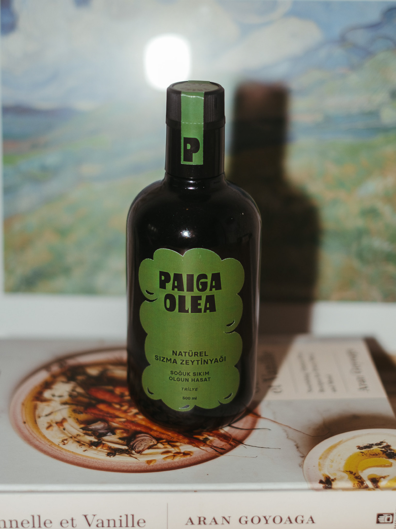
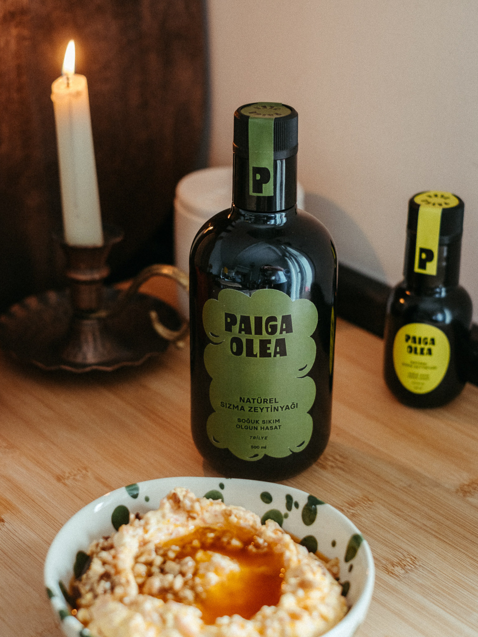
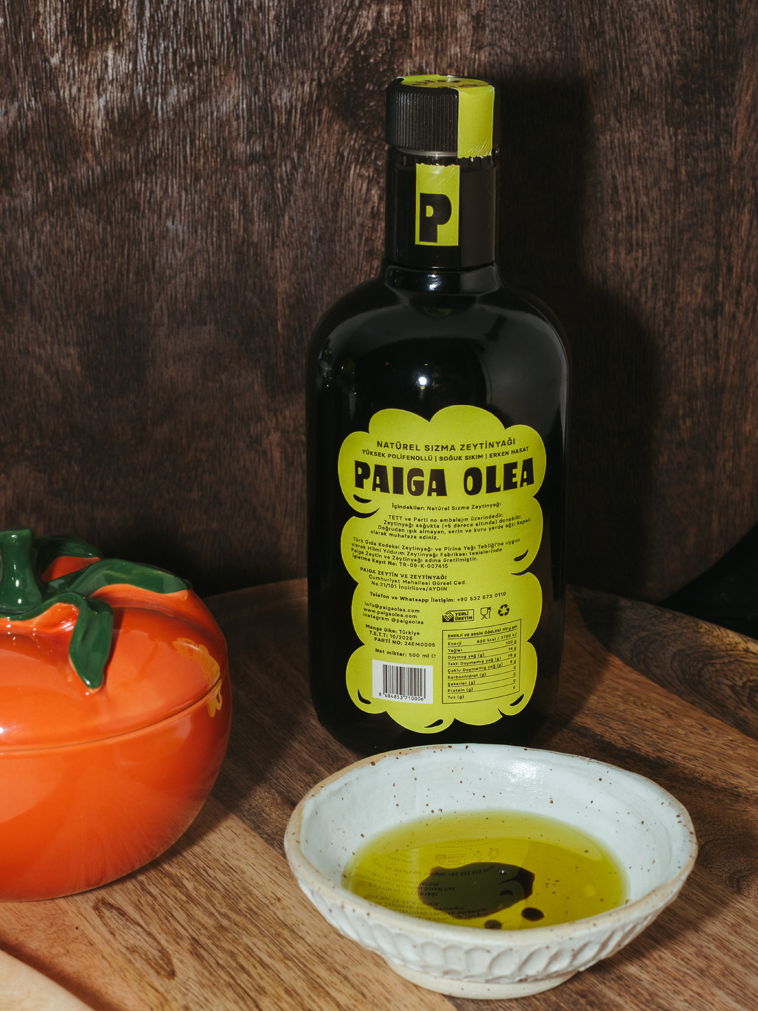
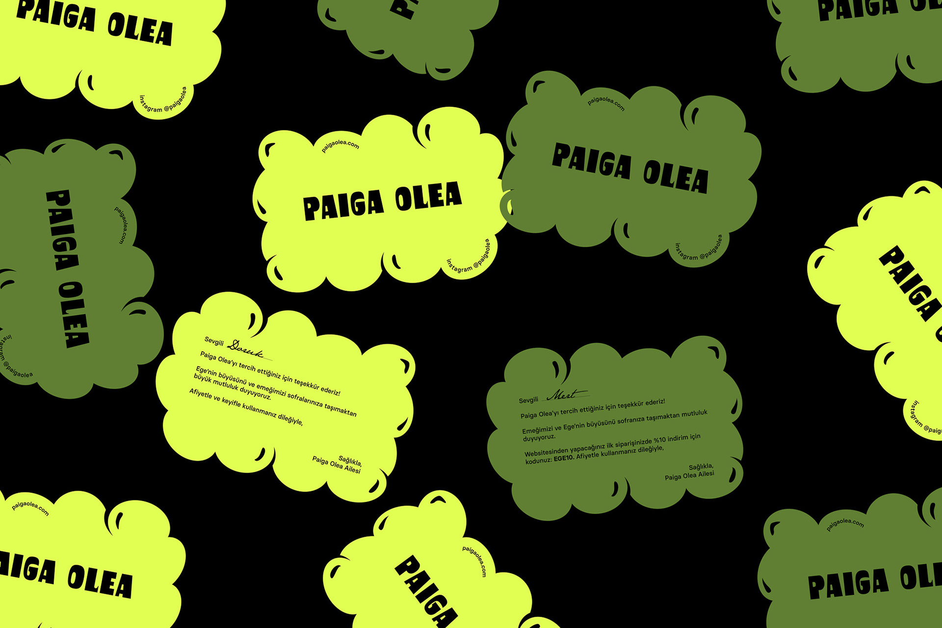
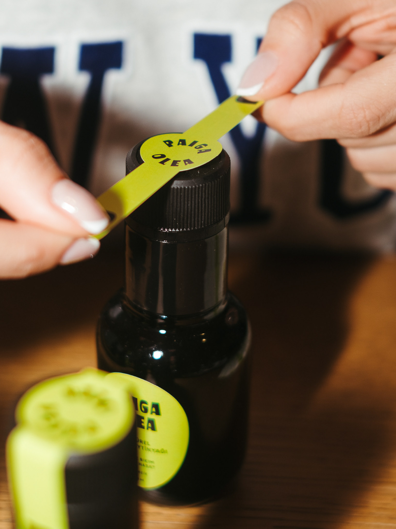
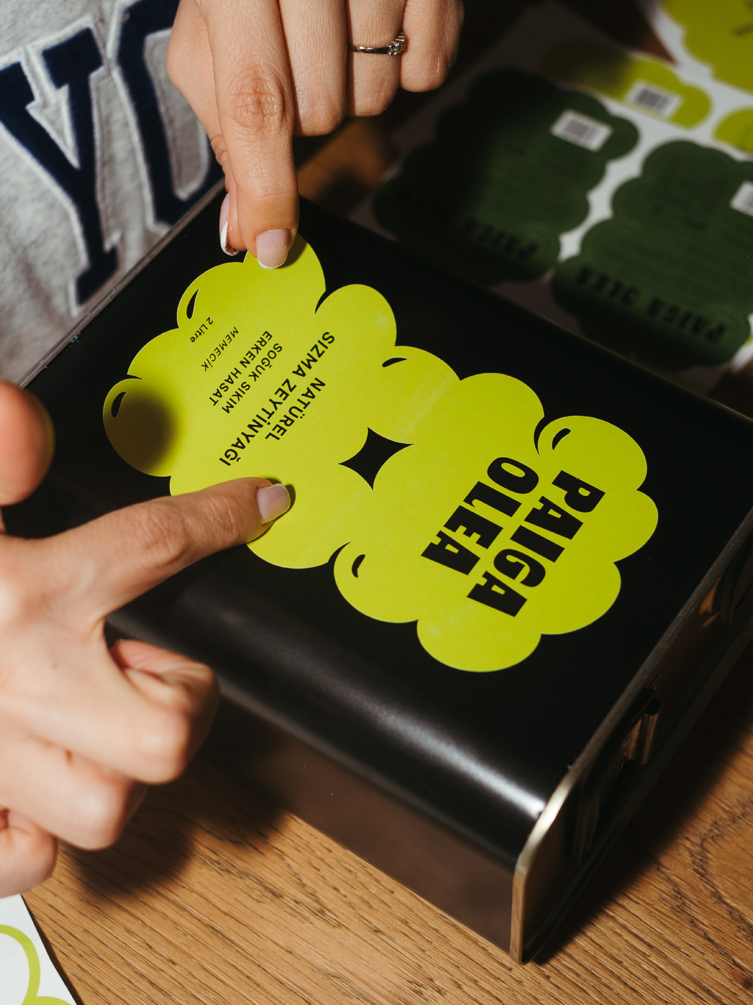
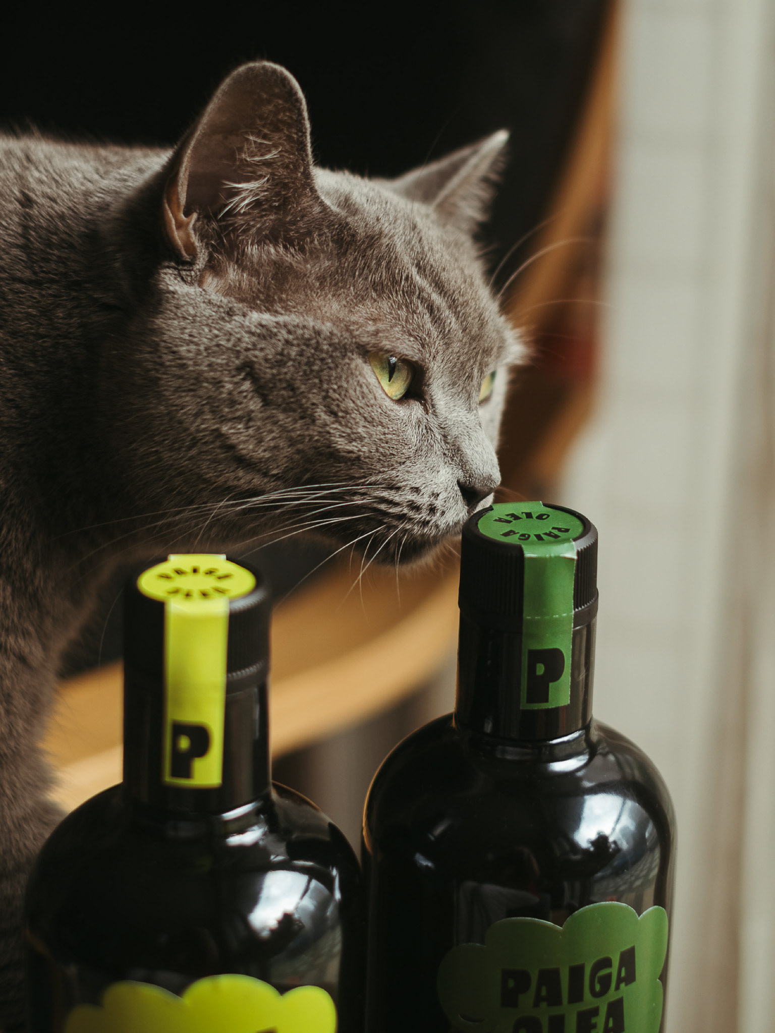
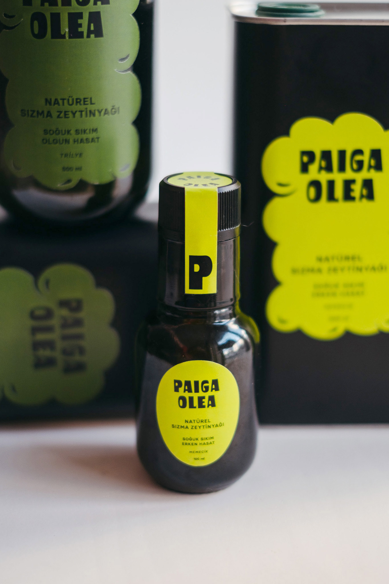
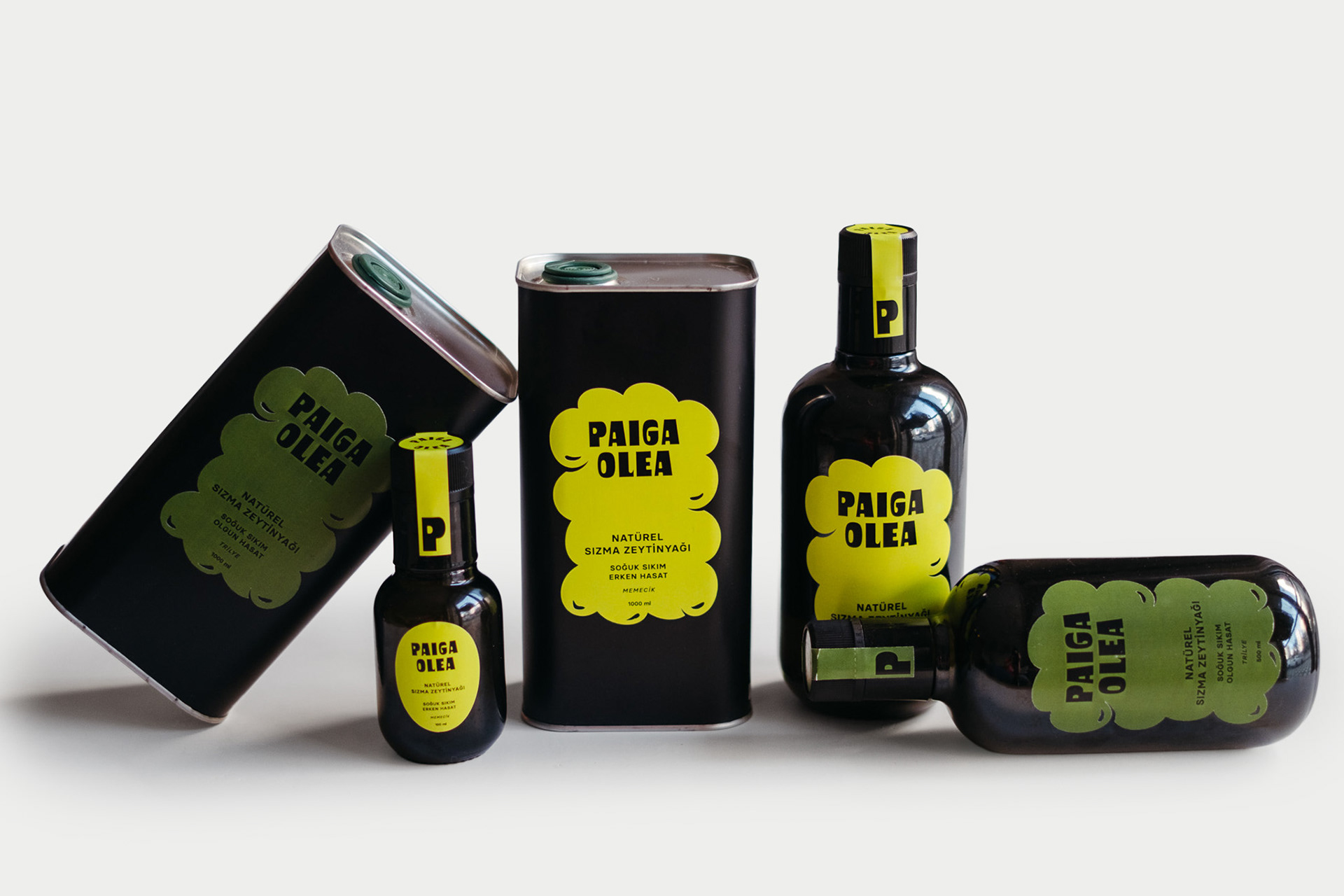
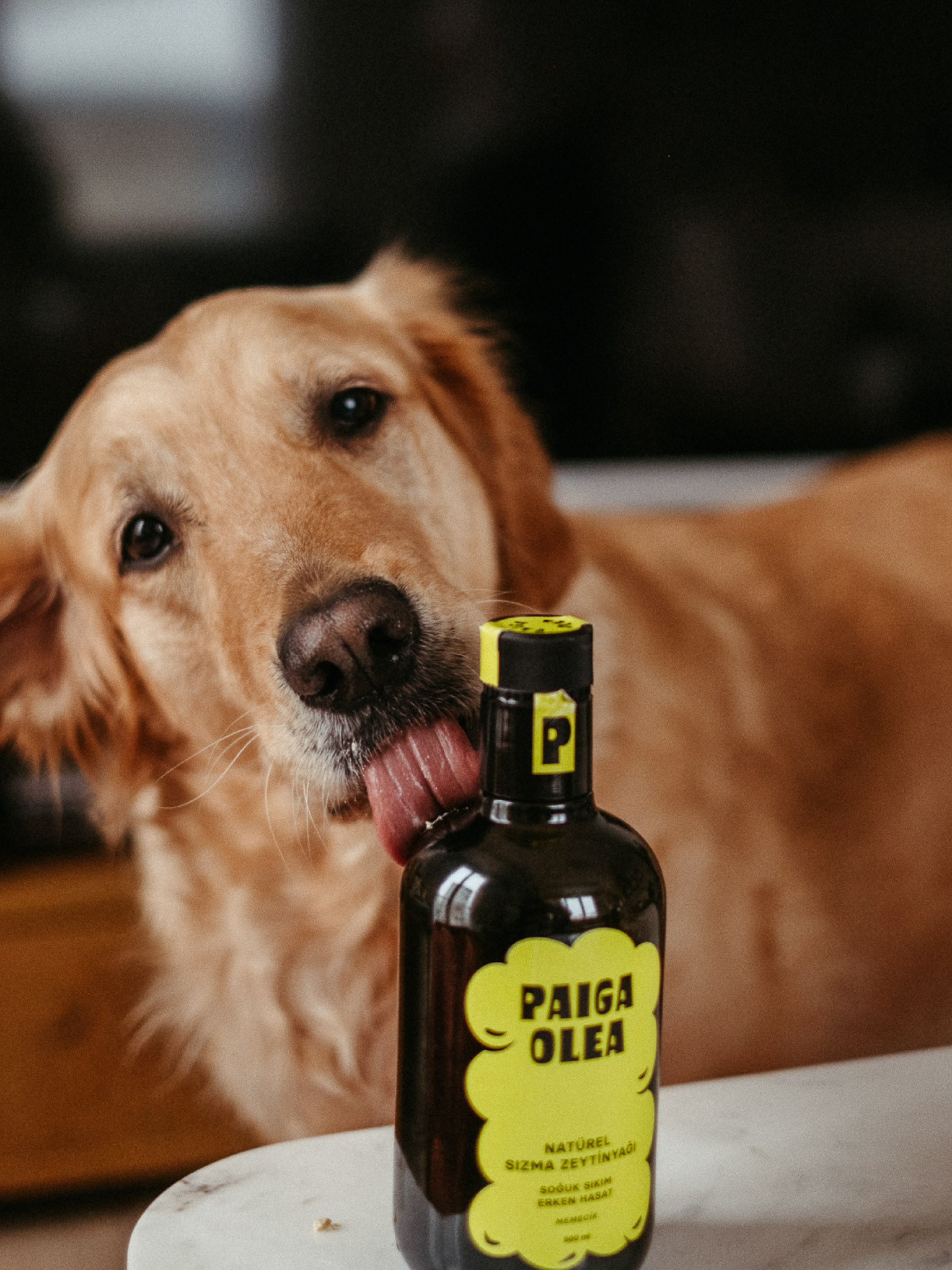
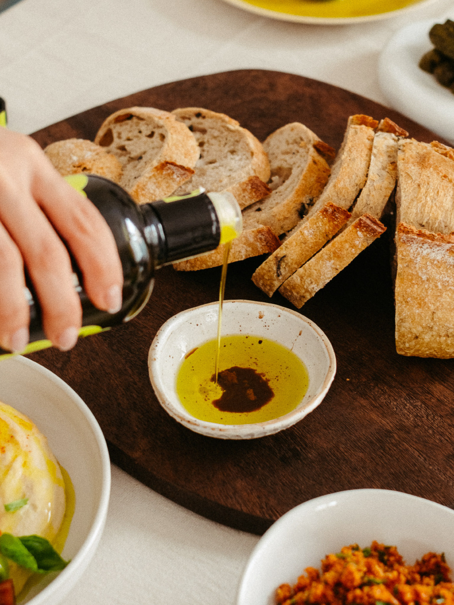
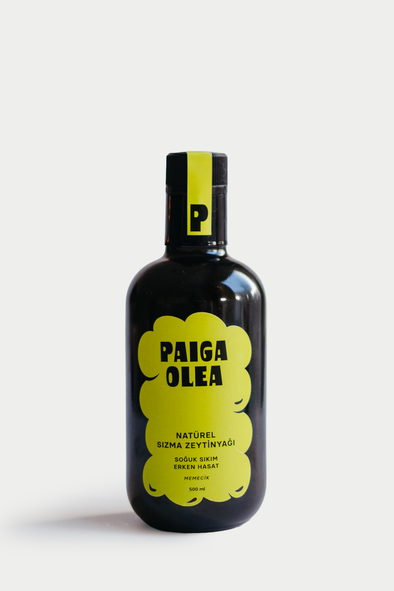
I designed this branding and packaging for Paiga to emphasize the qualities of olive oil through a modern approach. The central design element is label shaped as a silhouette of a cluster of olives, showed the idea that the product is "full of" olives in a very literal, creative way. For the early harvest olive oil, I chose a vibrant green color, representing the freshness and vitality of the olives at the start of the season. In contrast, the ripe harvest variant features a deeper olive tone, reflecting the maturity of fully ripened olives. These color choices are intentional, creating a visual language that intuitively communicates the differences between the two products when put side by side.
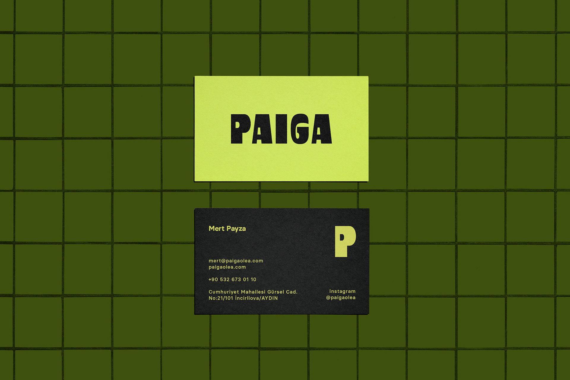
The look of the design is clean and bold, with a focus on functionality. The brand name, Paiga Olea, is displayed in a strong and playful typeface, ensuring that it is memorable and easily recognizable. The design is free from unnecessary clutter on the front of the label, prioritizing essential product details such as the type of harvest and pressing method. This minimalist approach creates a premium and contemporary feel, setting it apart from the busier, more traditional designs often seen in olive oil packaging on the shelves.
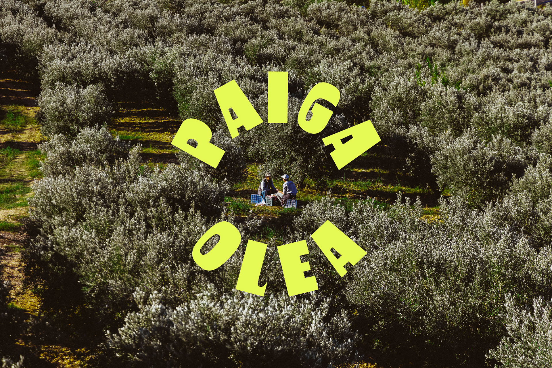
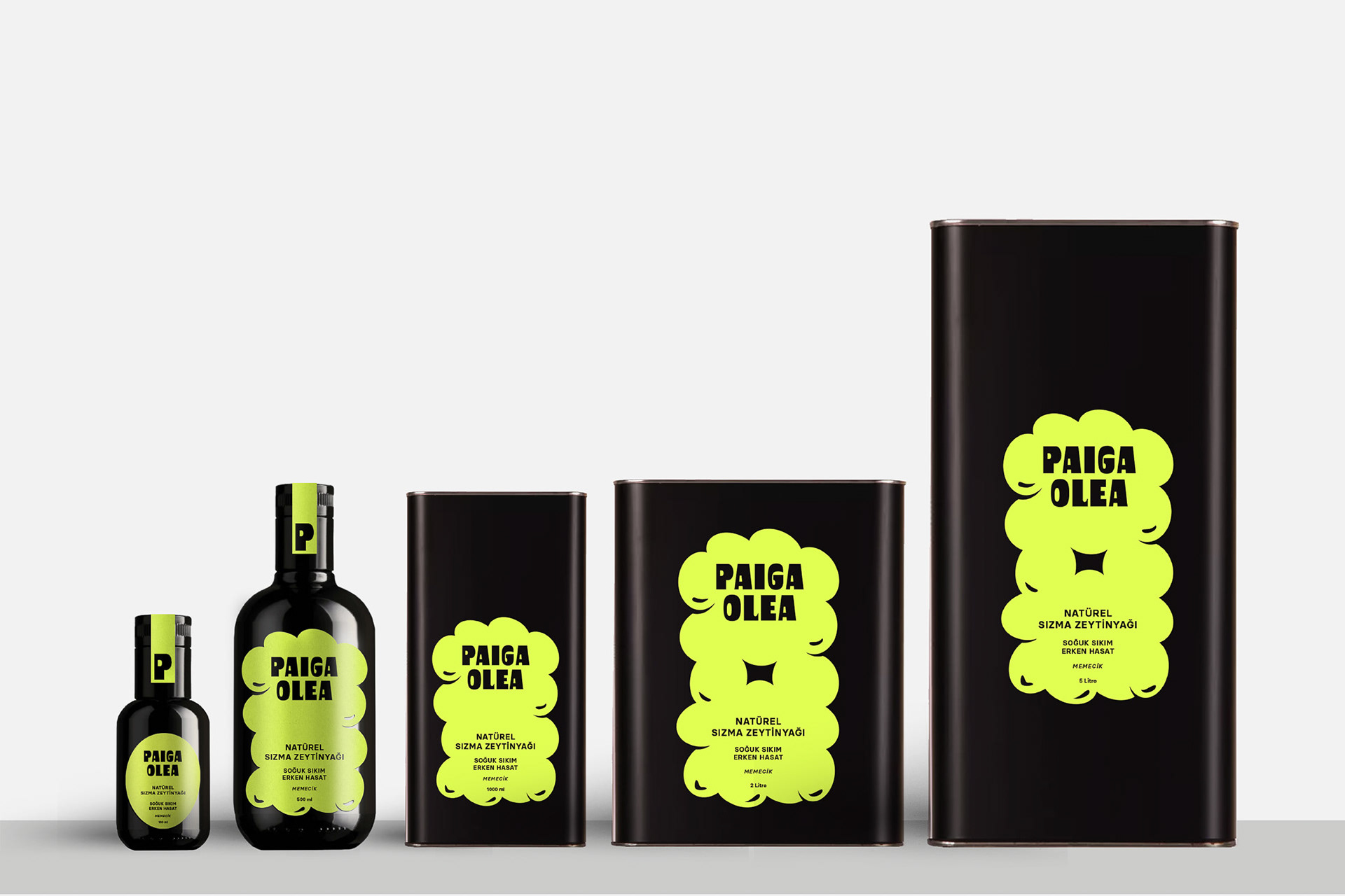
As the package volume increases from 100ml trial size to 5 liters, we see the amount of olives on background rise in numbers. On the 2 and 5 Litre tins we have a cutout created by olives to make it even more obvious that the background is created by olives, it transforms the design from something passive (just olives in the background) to something more dynamic and visually engaging.
Branding & packaging design, creative direction and photography by me.