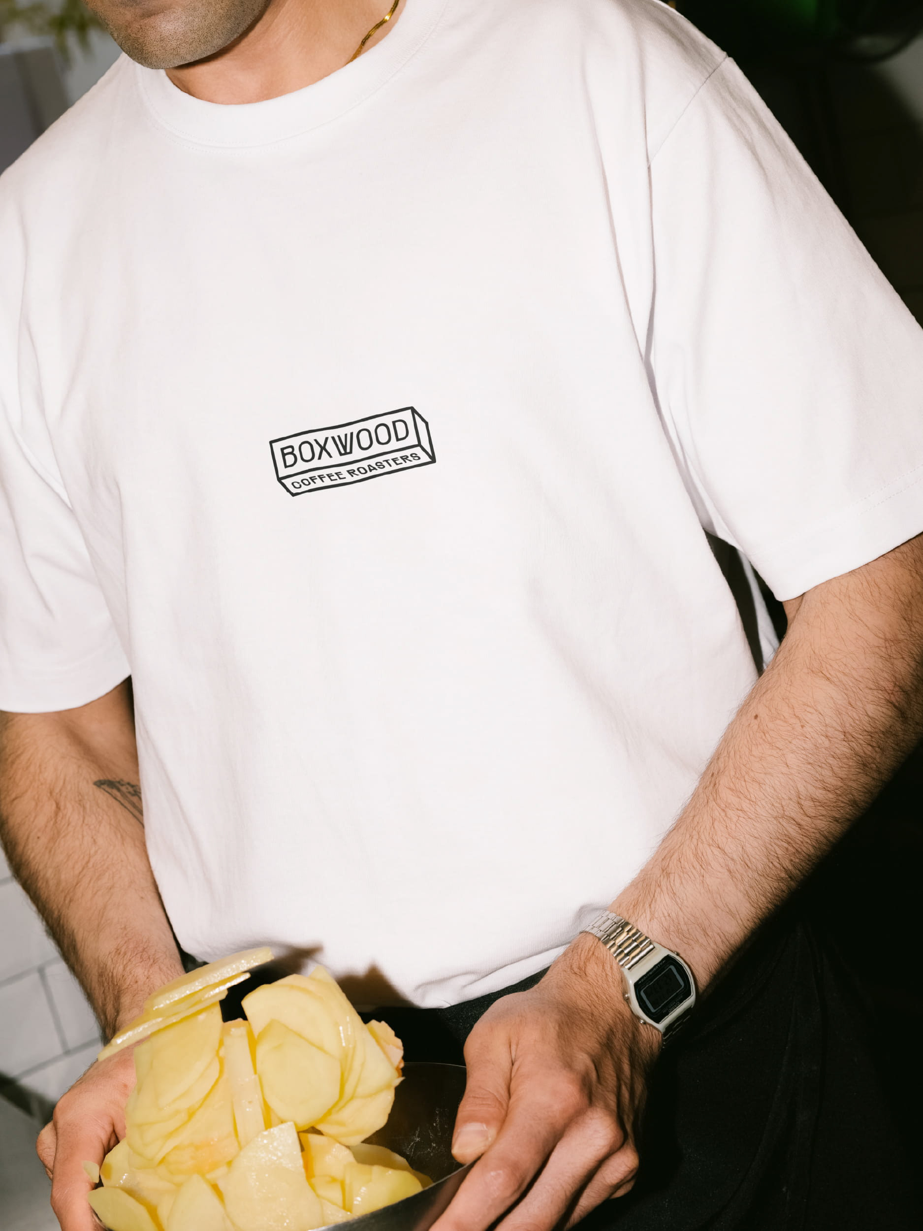
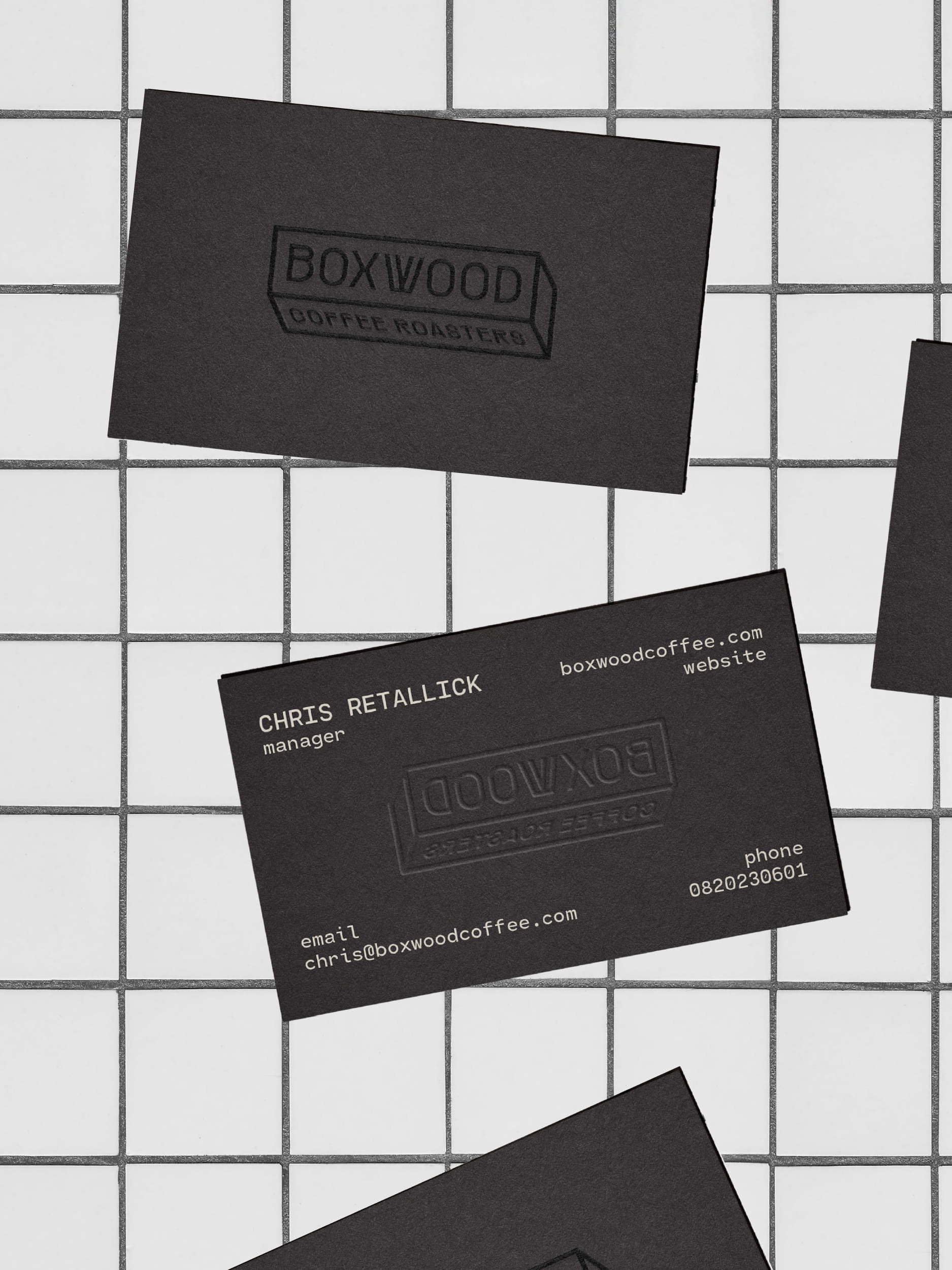
Boxwood identity started with a very simple idea: a box.
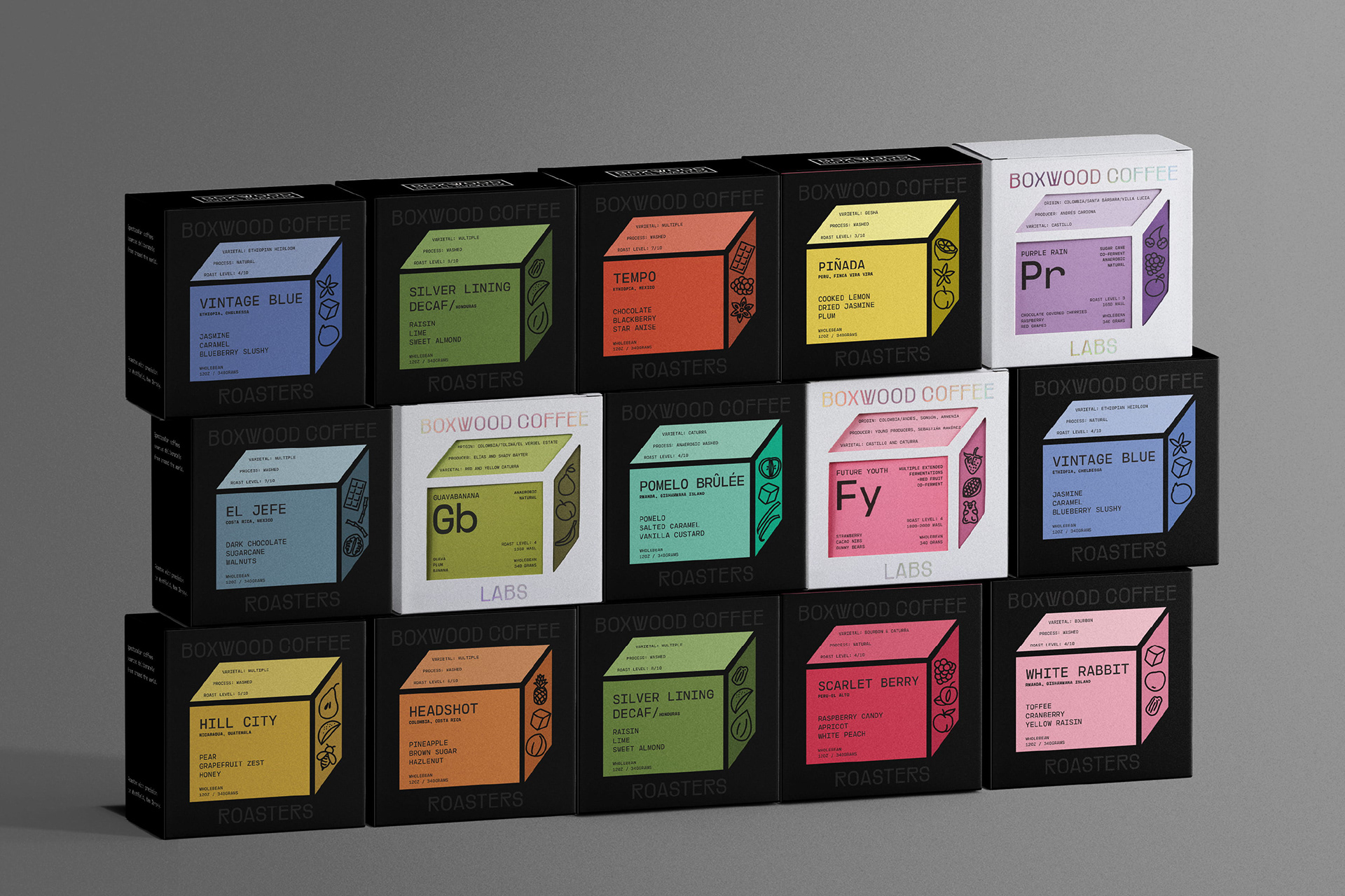
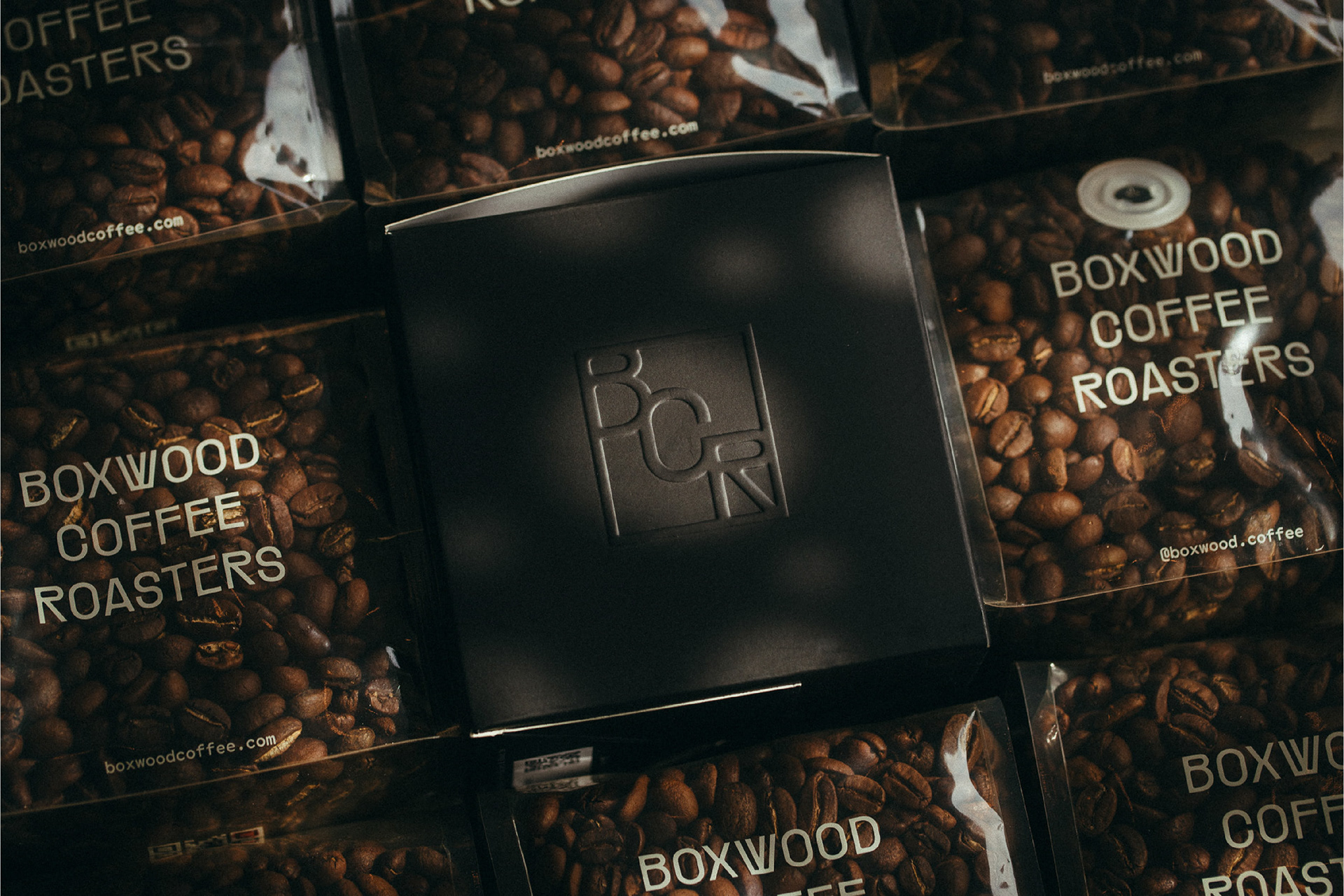
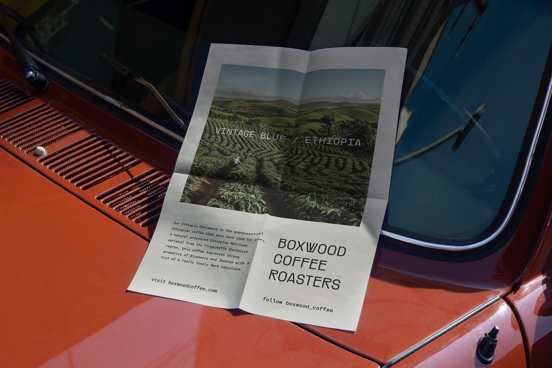
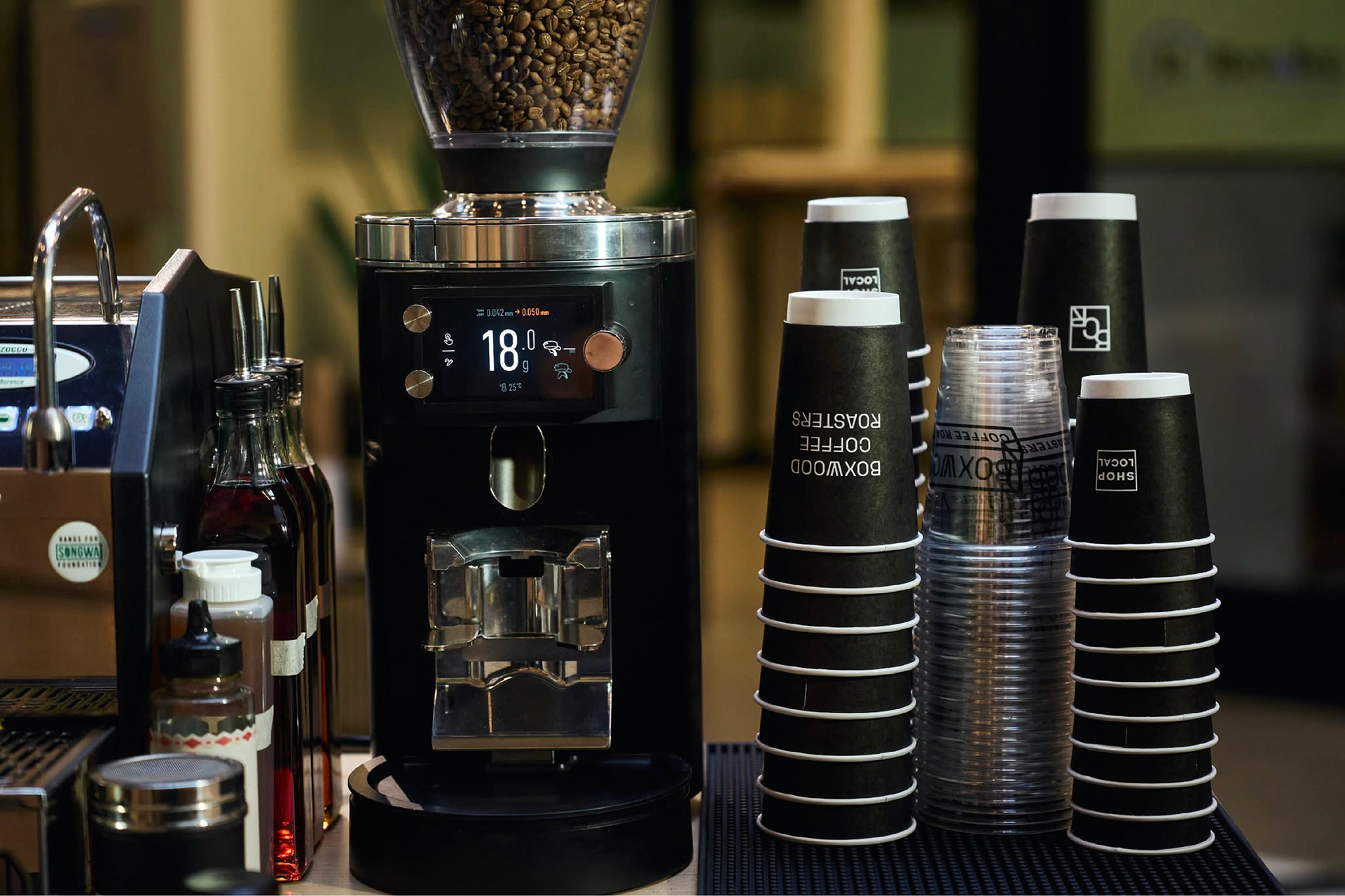
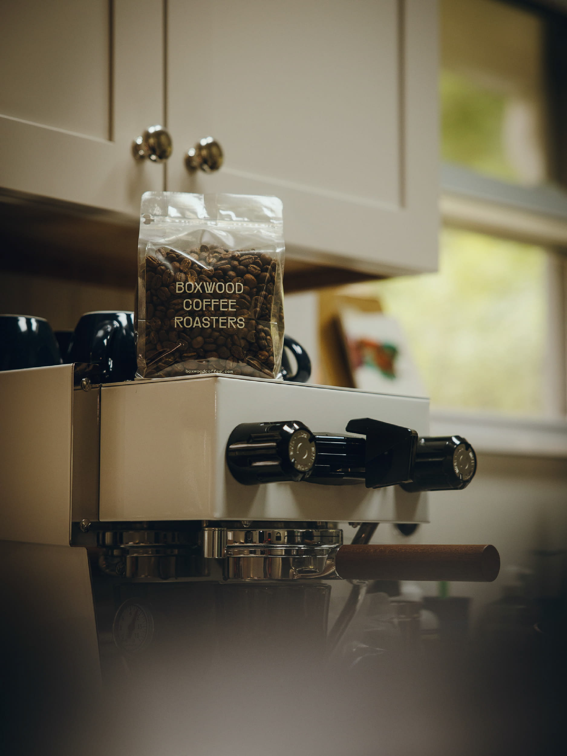
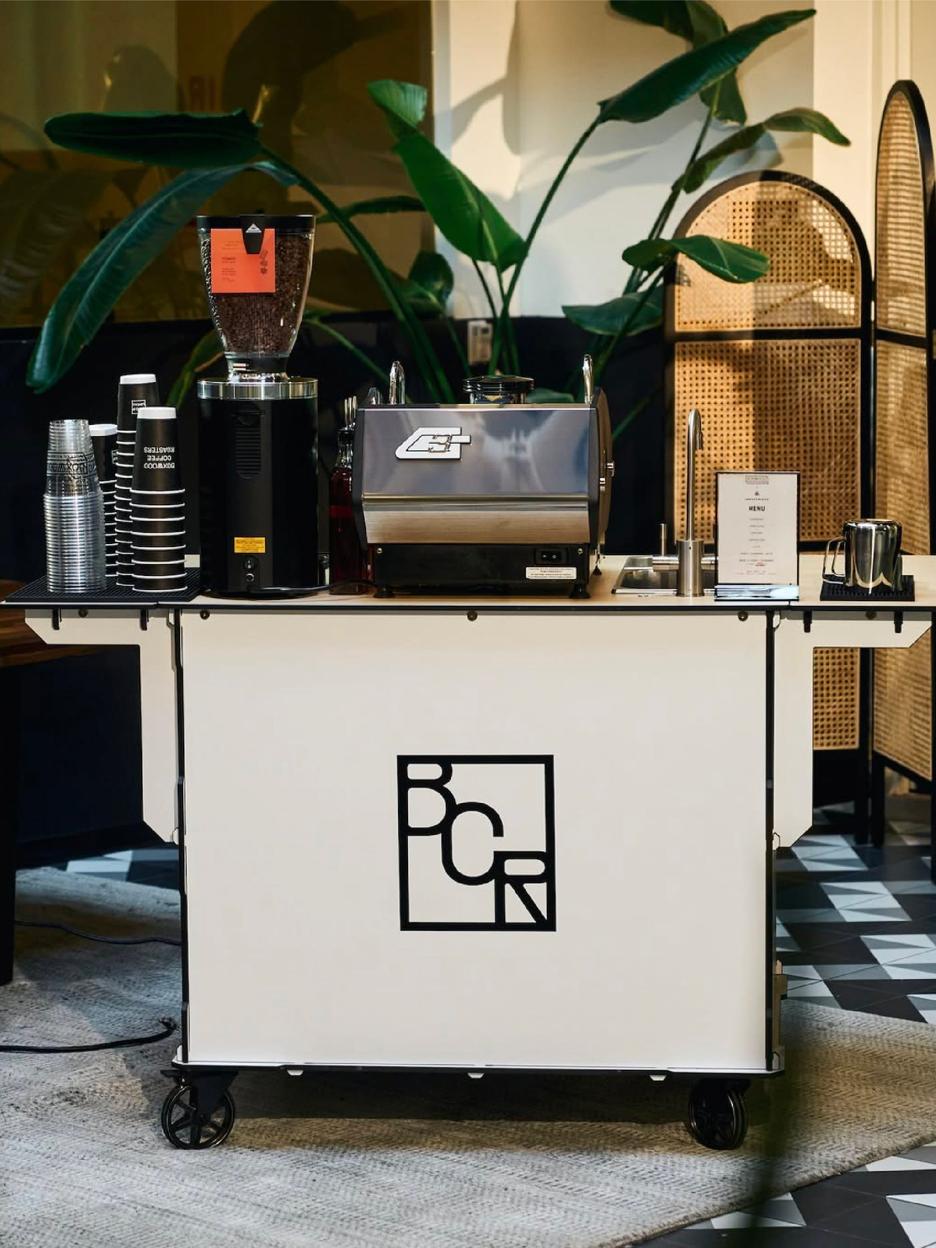
I wanted to take that basic geometric form and build the whole identity around it. From the logo to the packaging, the box became a visual language that we could keep evolving, playing with depth, perspective, and structure while keeping the overall identity clean and minimal. The BCR monogram was created in the simplest direction to enhance the brand identity.
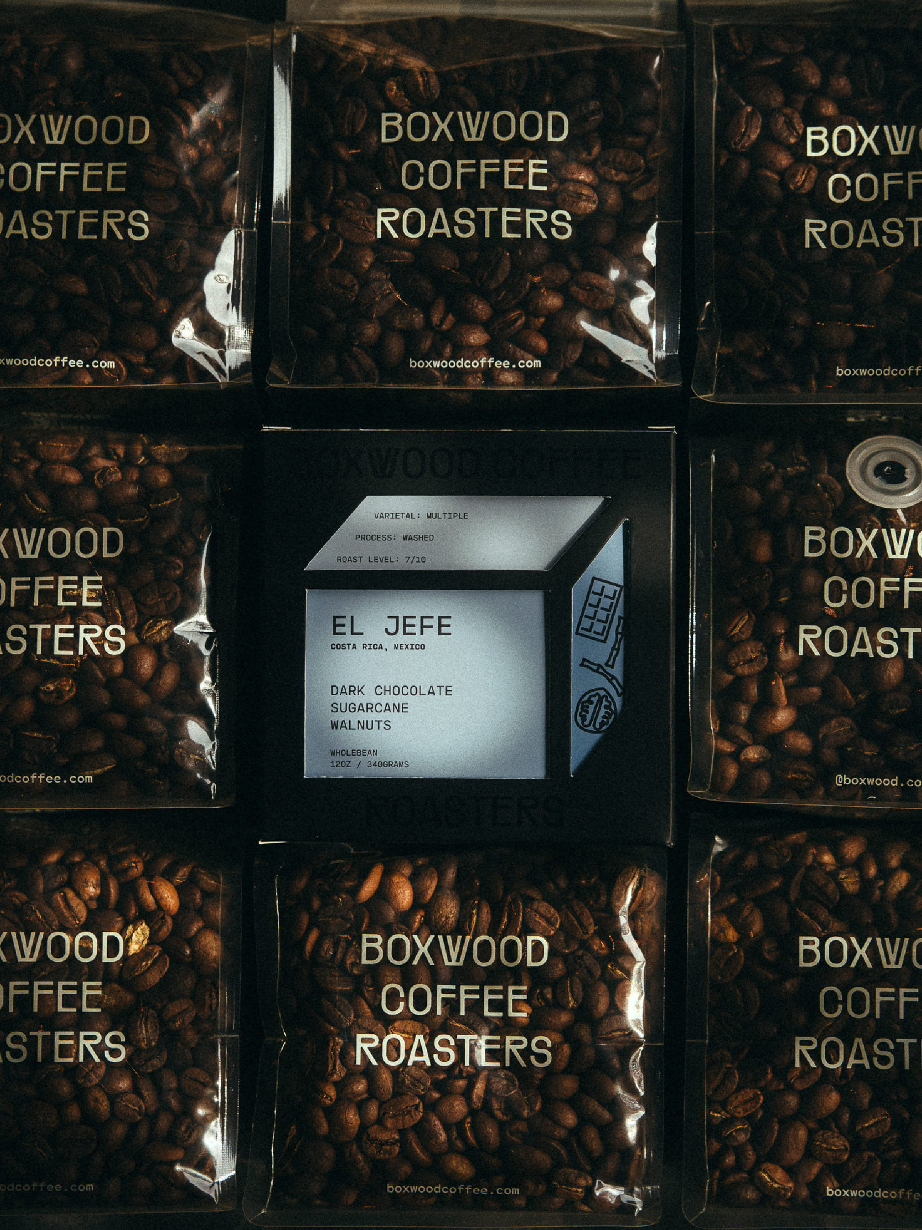
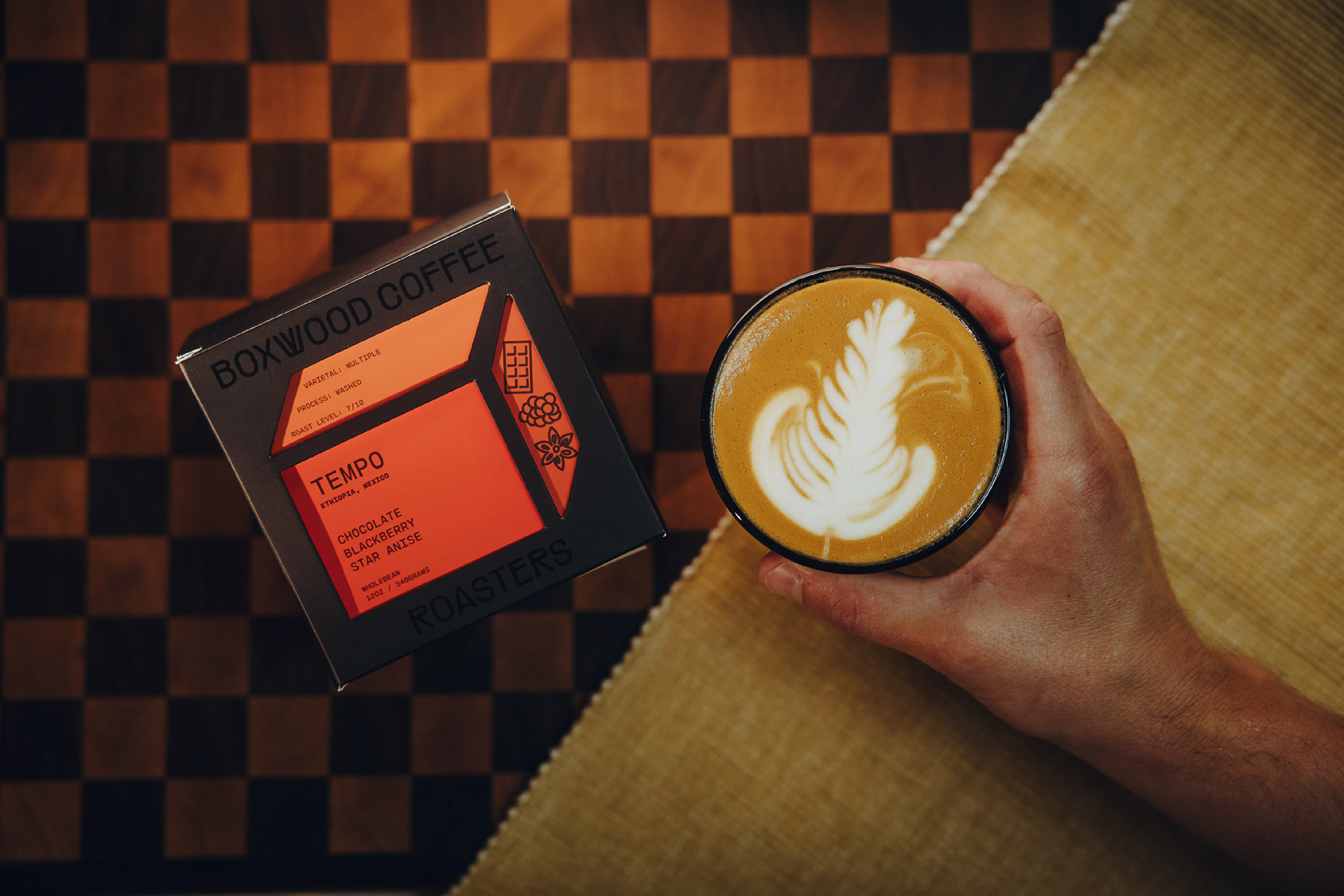
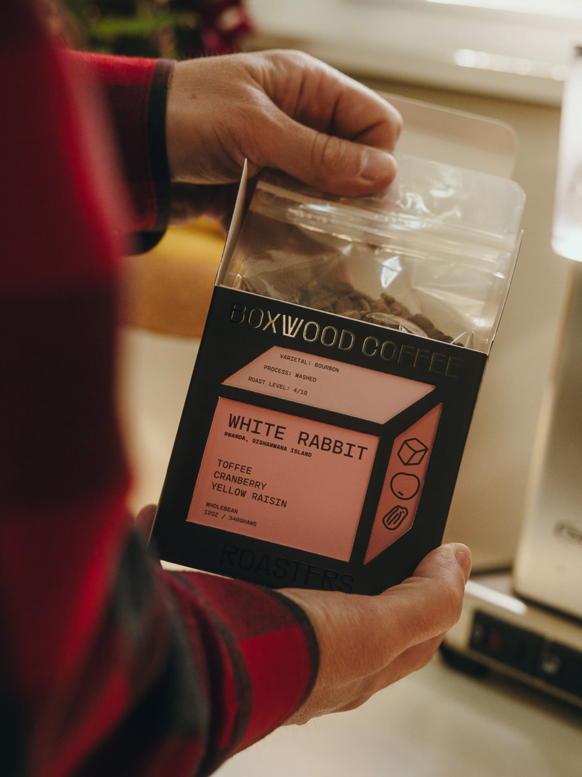
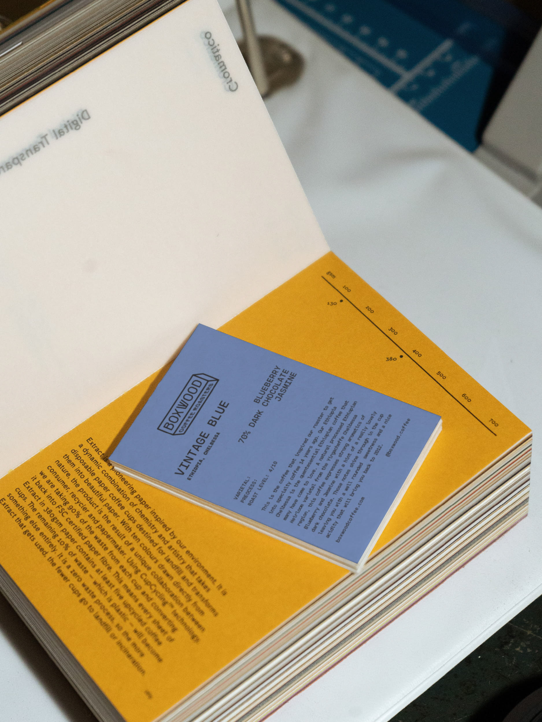
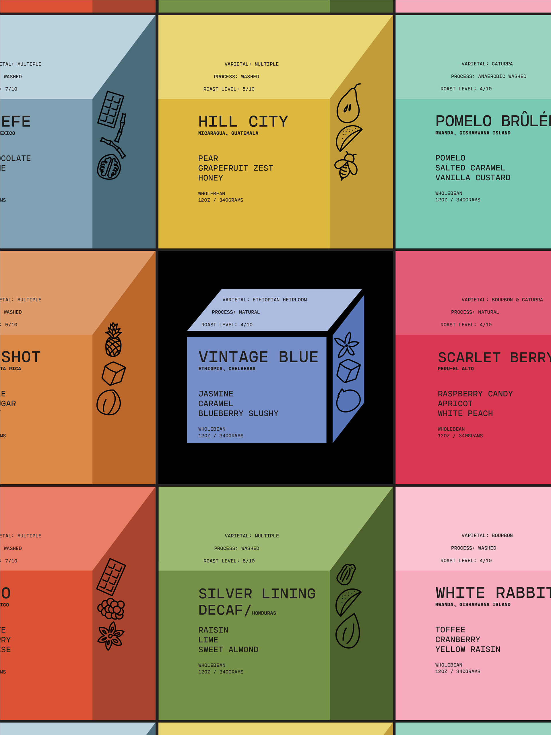
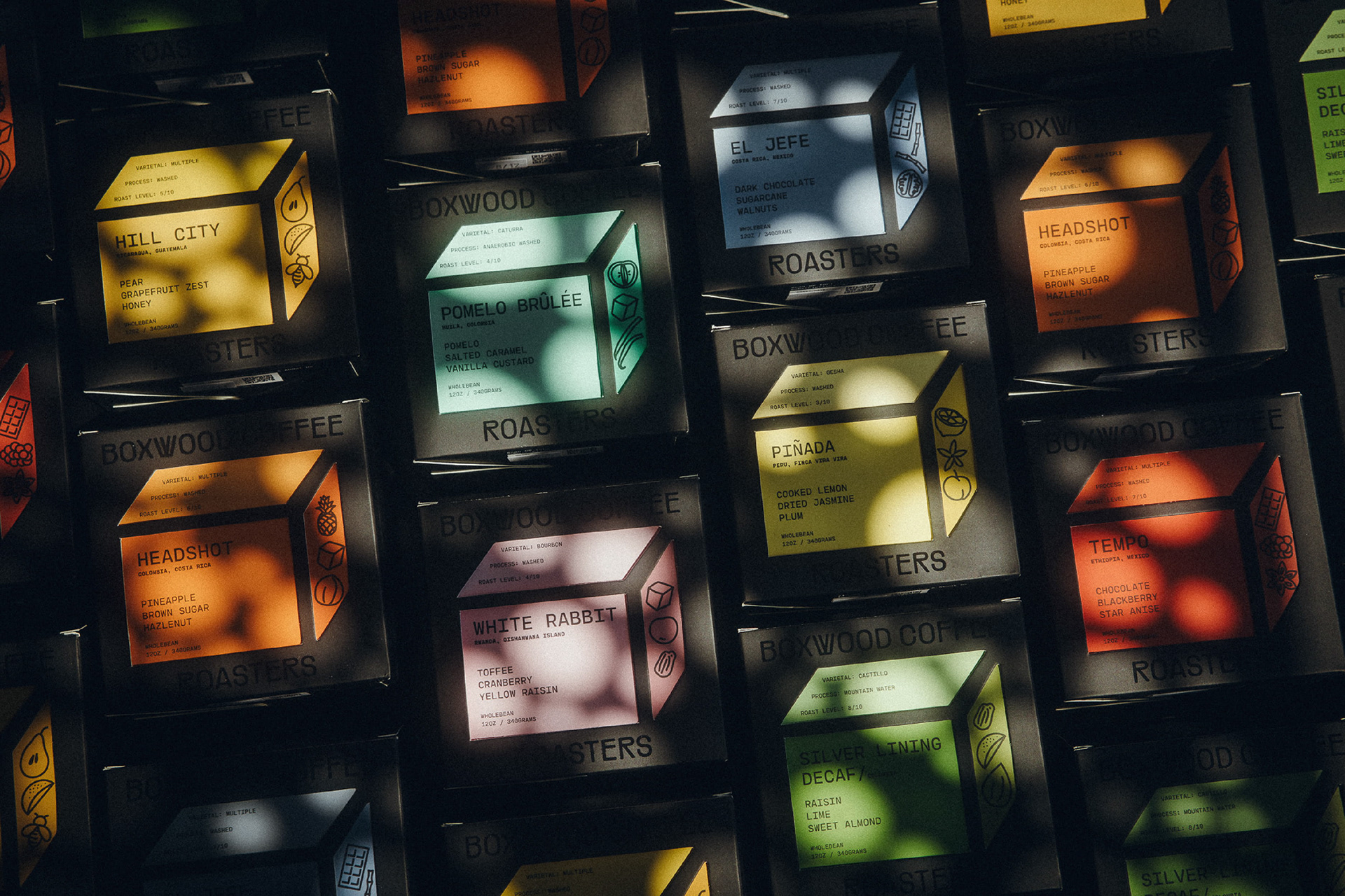
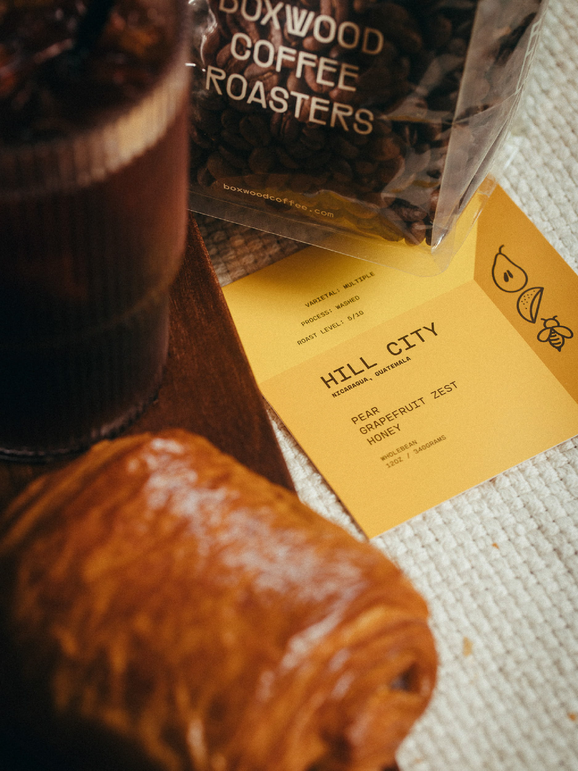
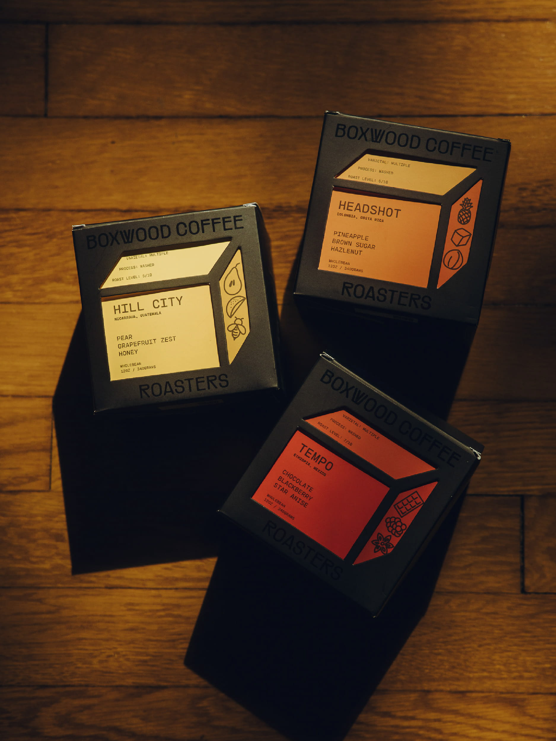
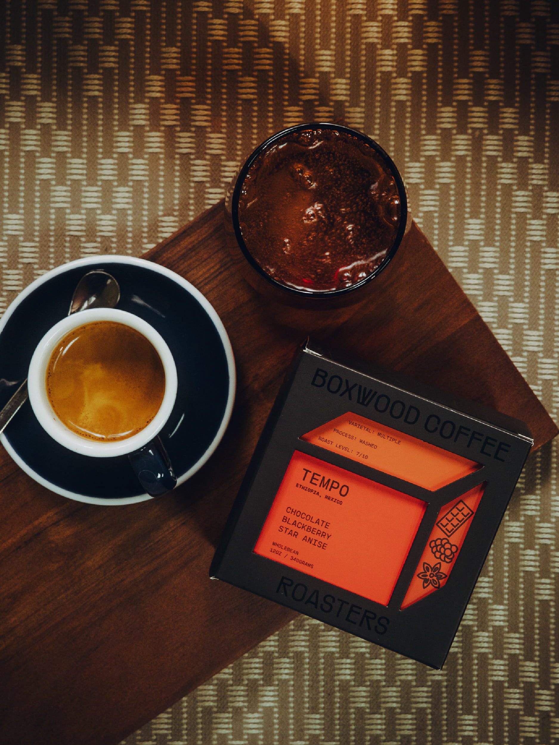
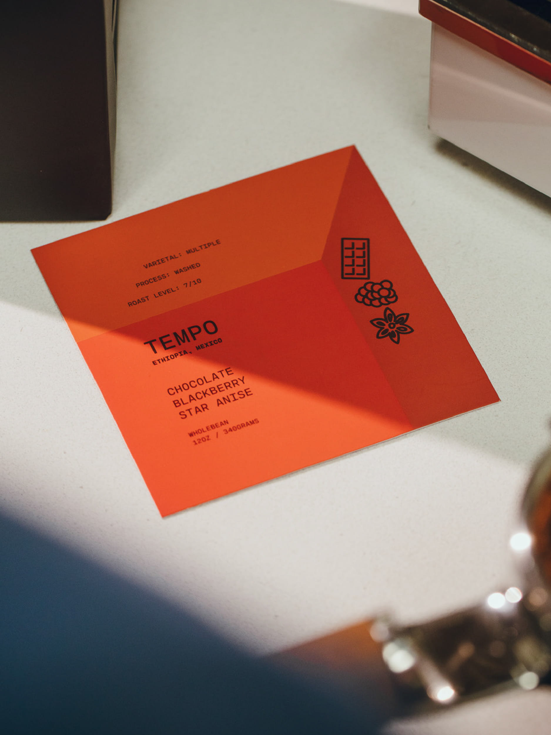
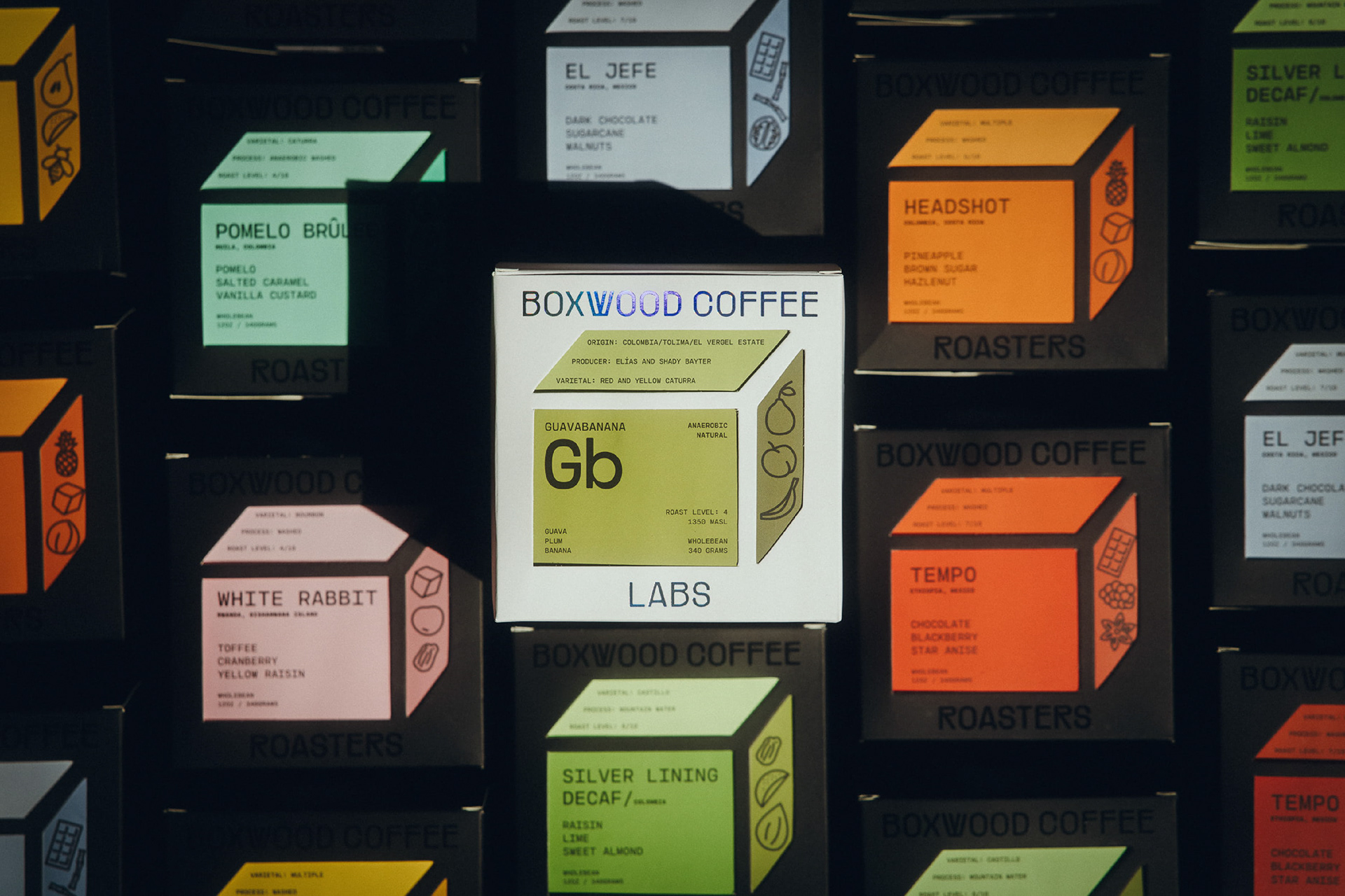
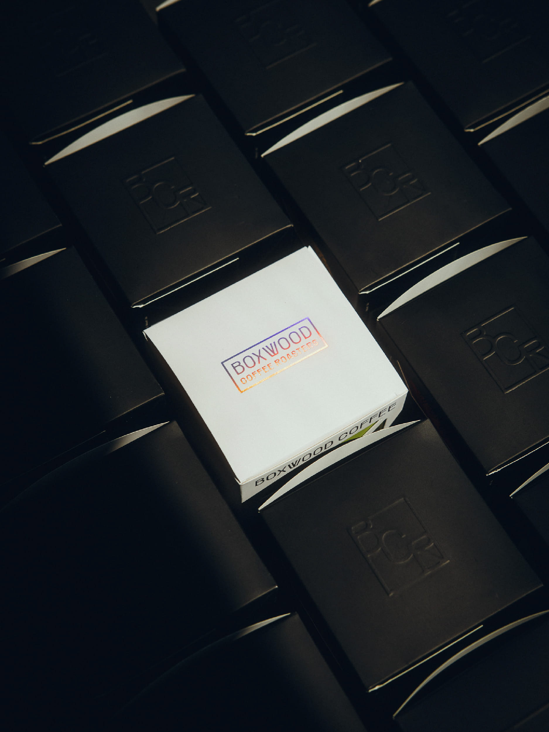
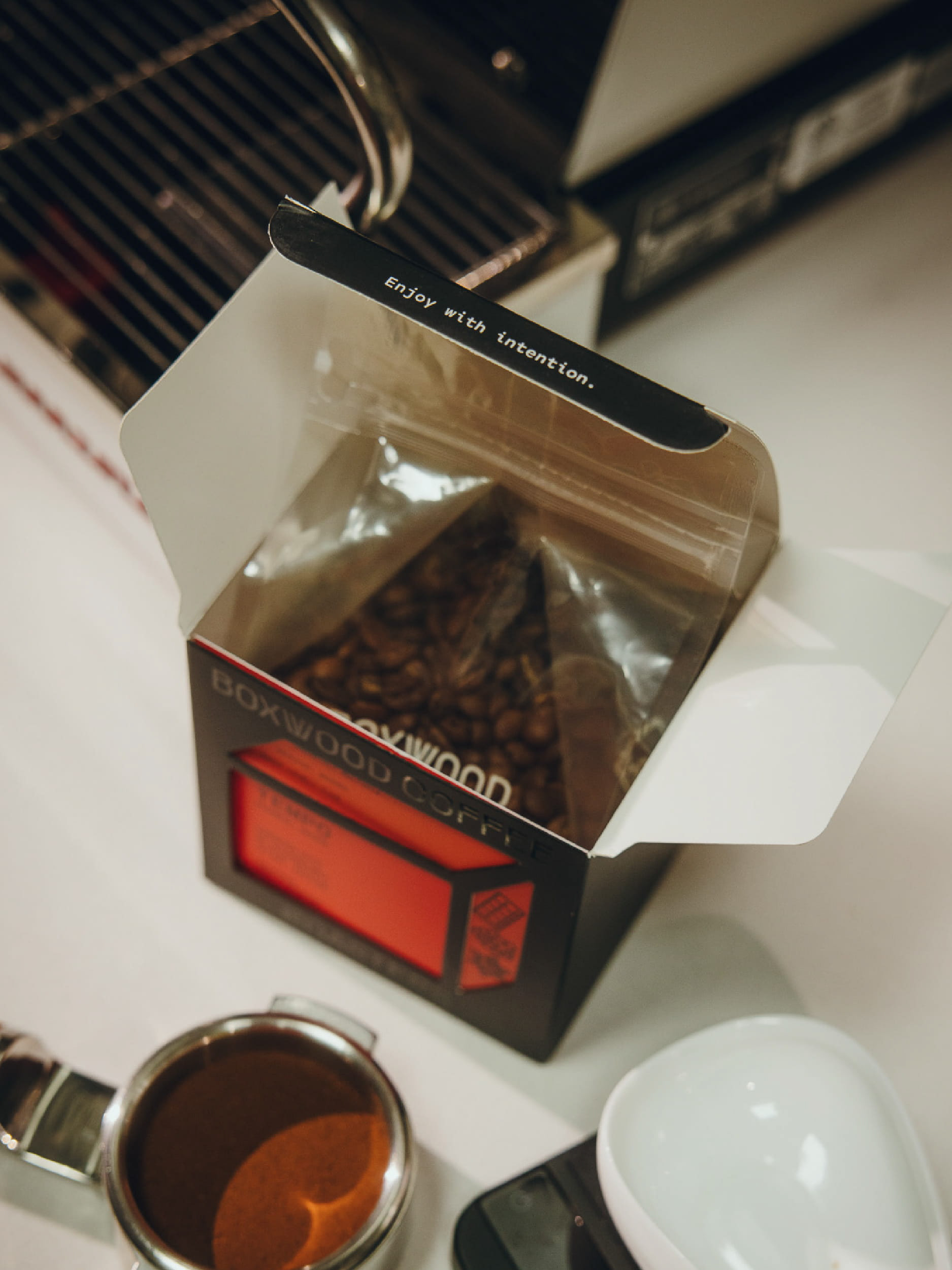
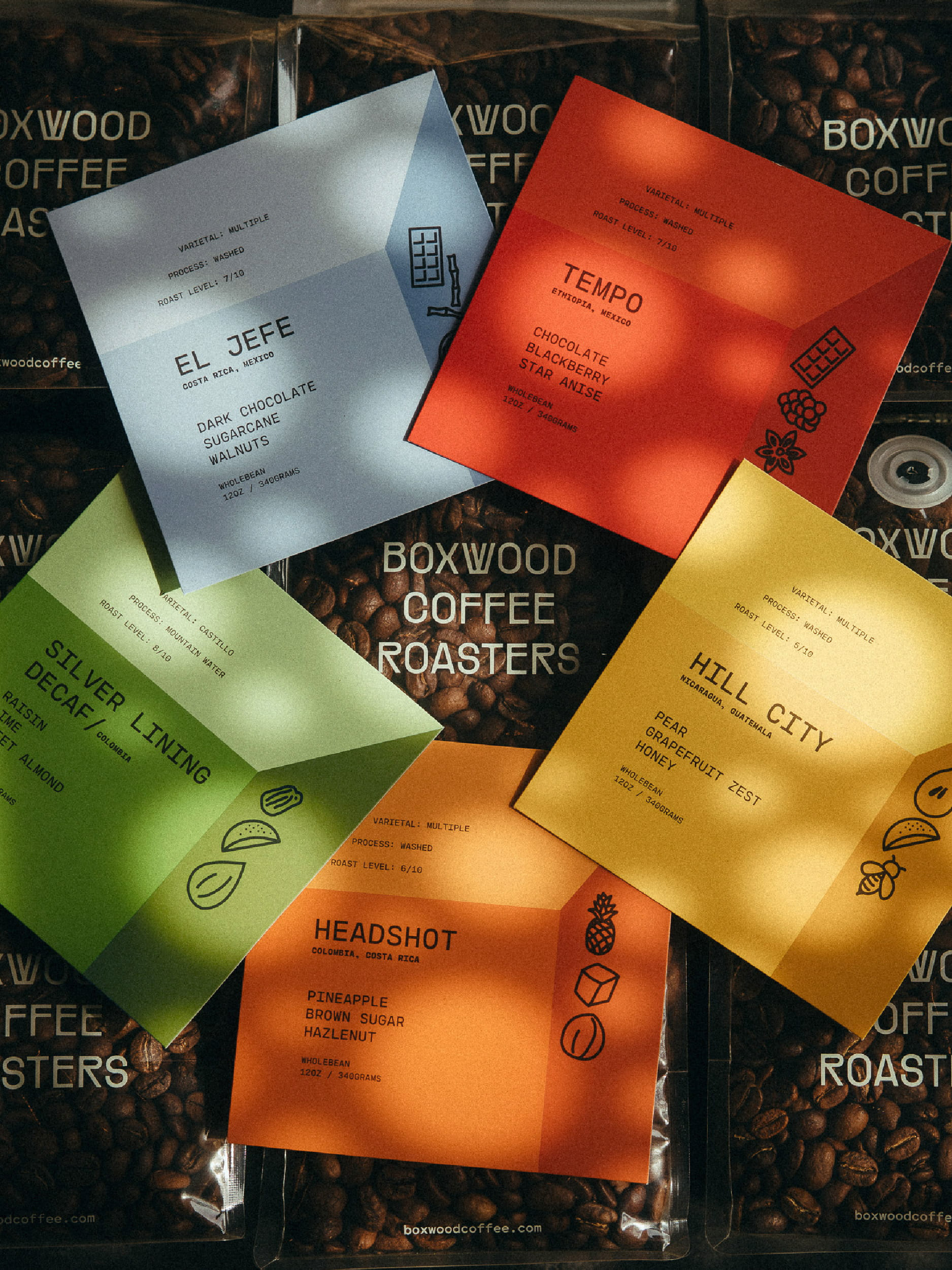
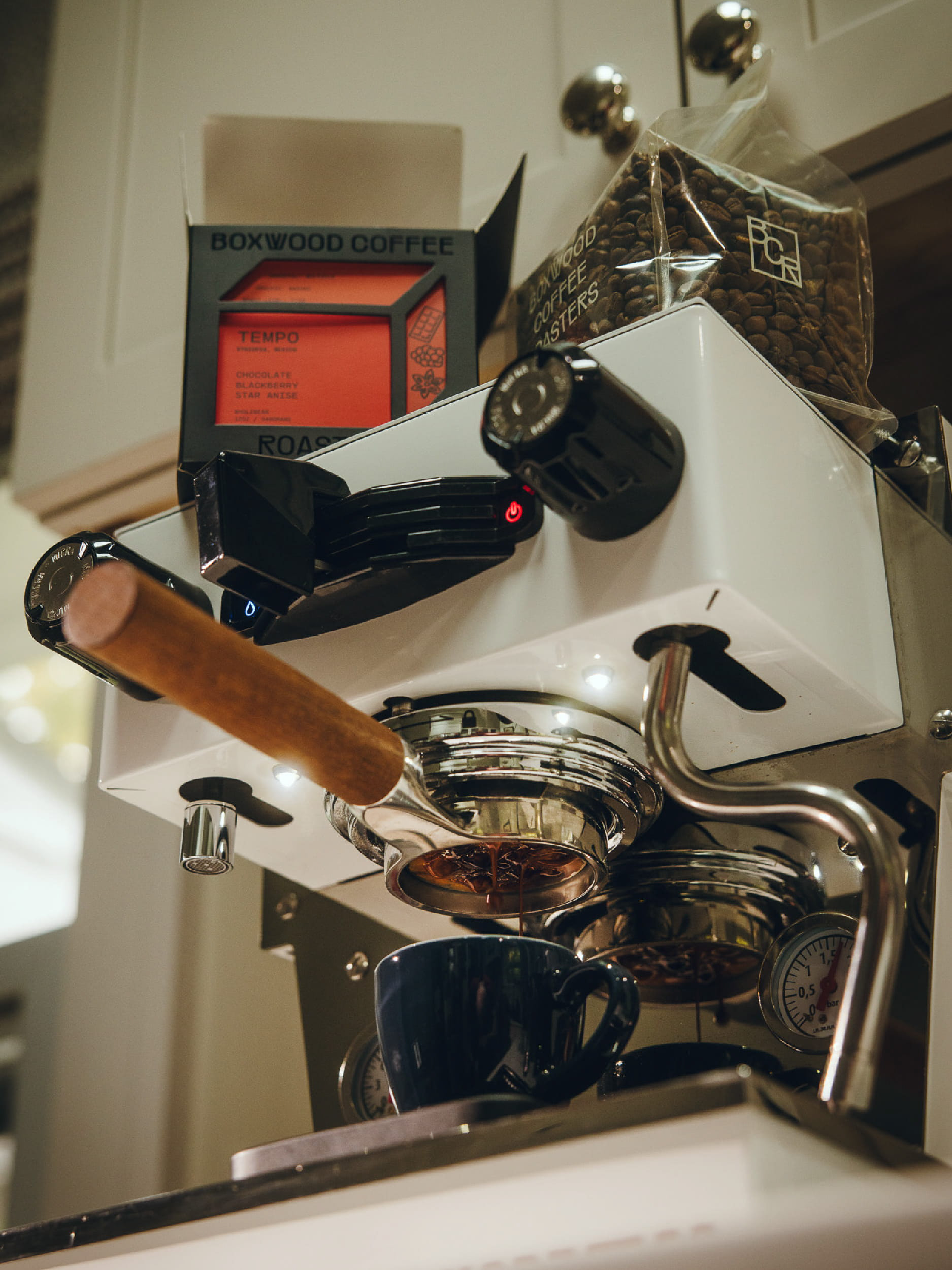
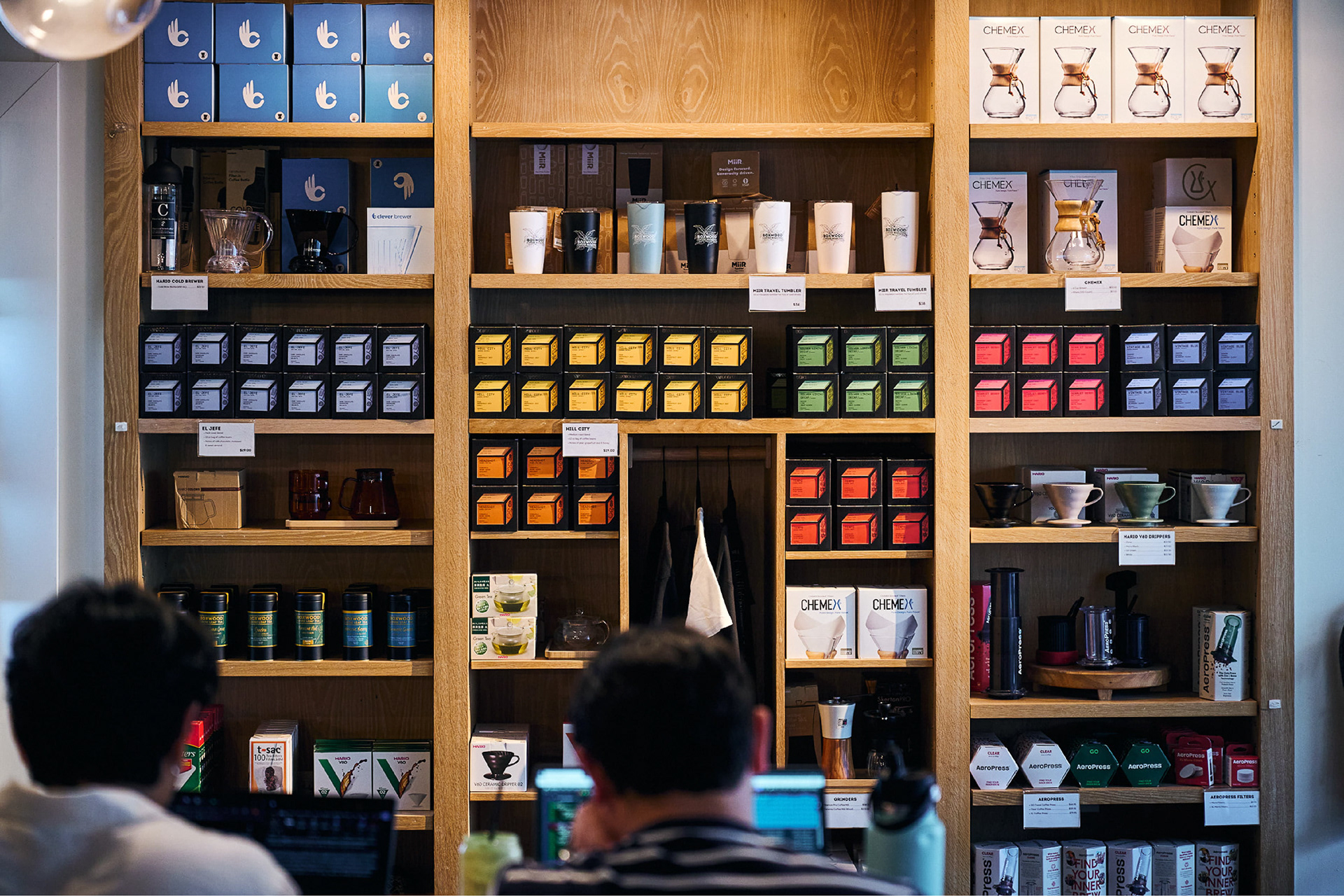
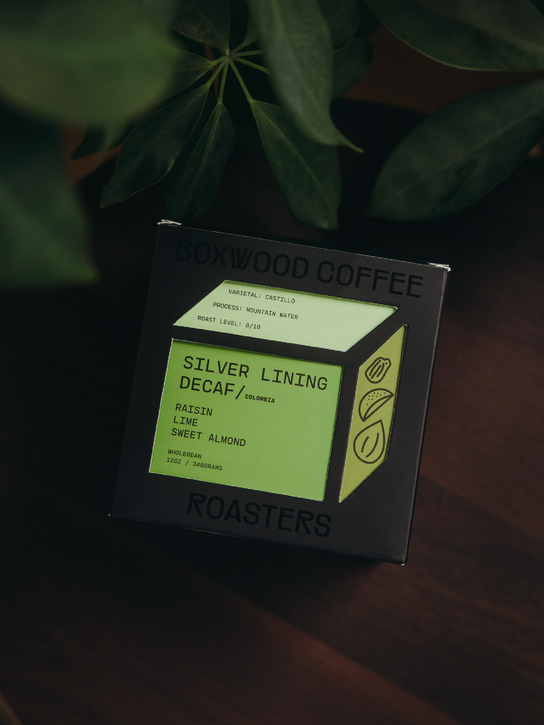
For the main coffee range, I created a 3D box cutout on a plain black box, with the logo embossed on top. The information card inside follows a simple logic, using three different colour depths to create a sense of dimension. All of the coffee information is organised within the box through a clear typographic hierarchy, keeping the packaging easy to navigate without losing its character. While keeping the black box very minimal, tiny hand-drawn icons were added to the card.
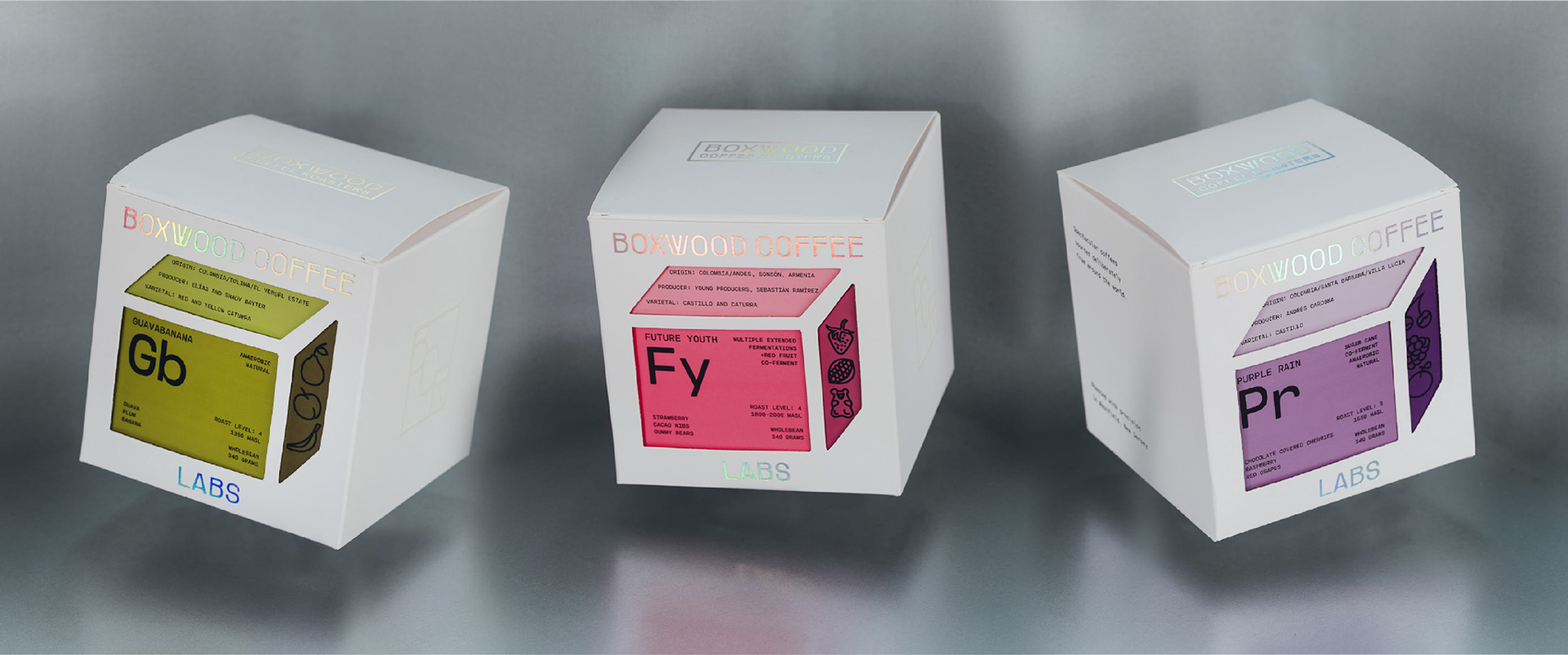
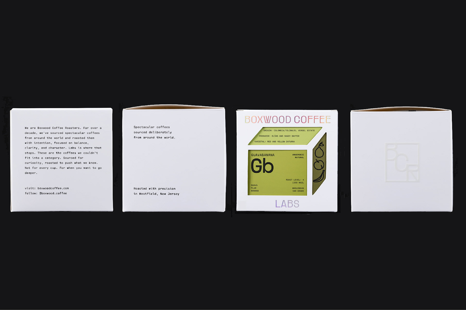
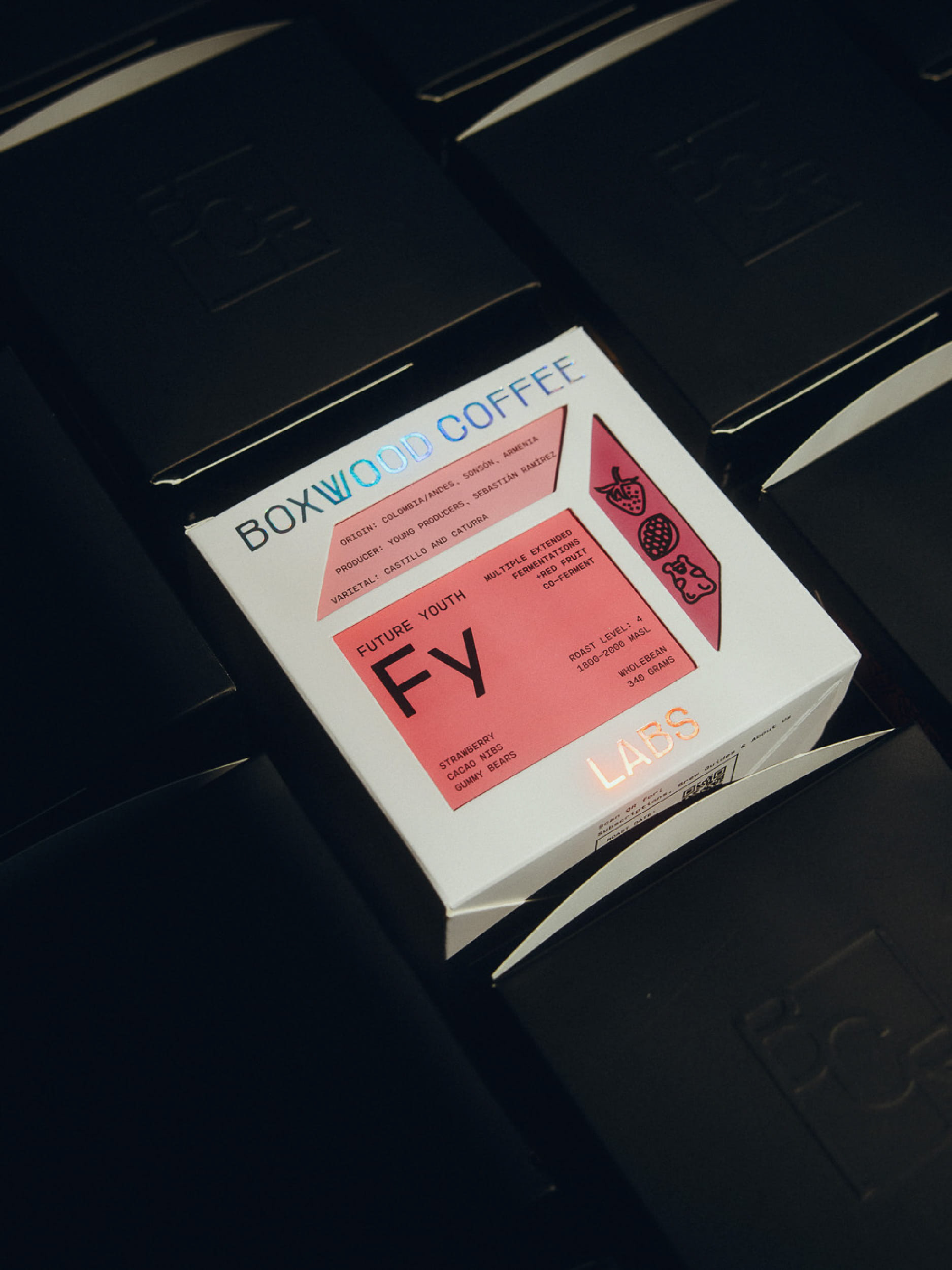
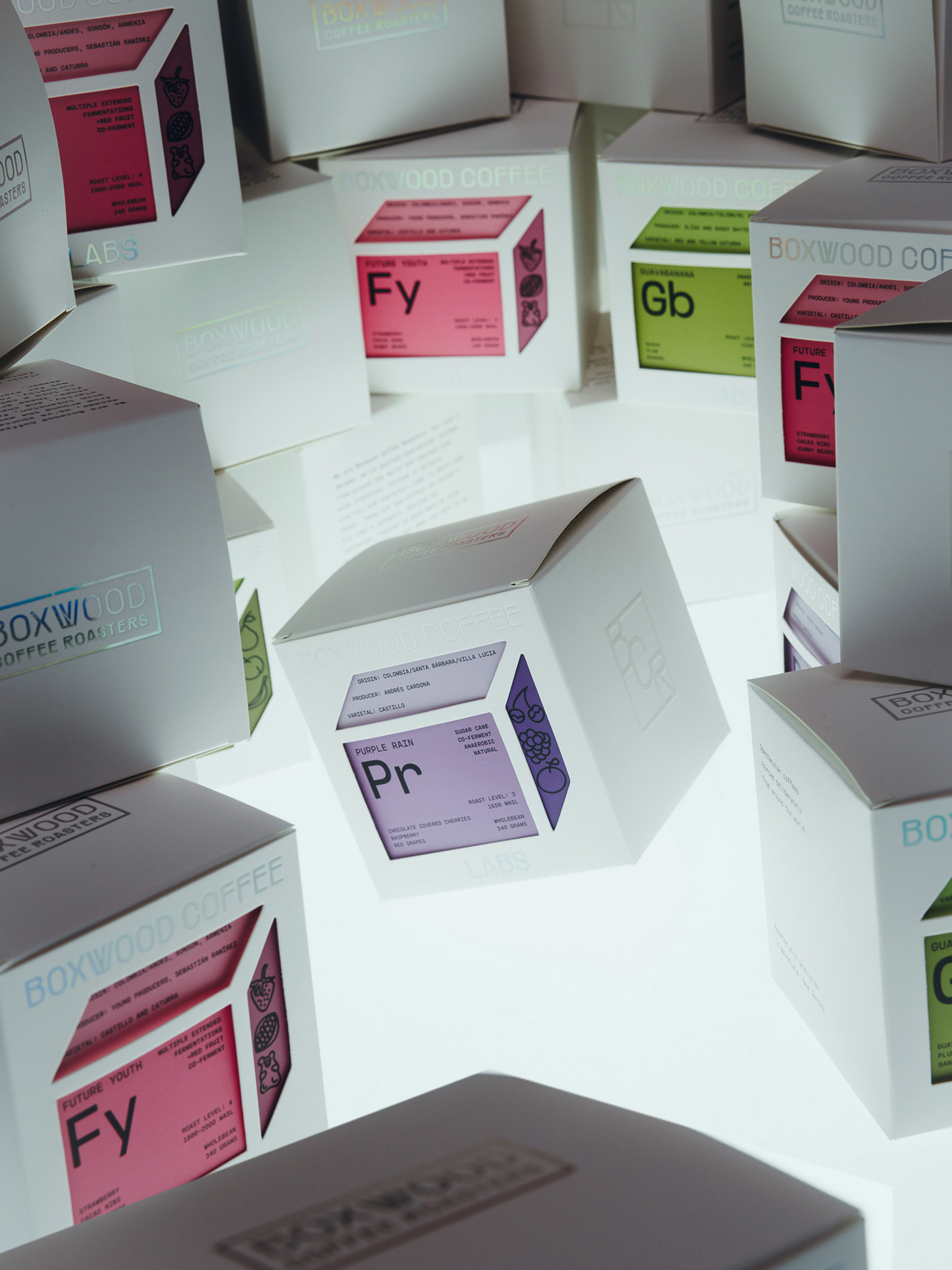
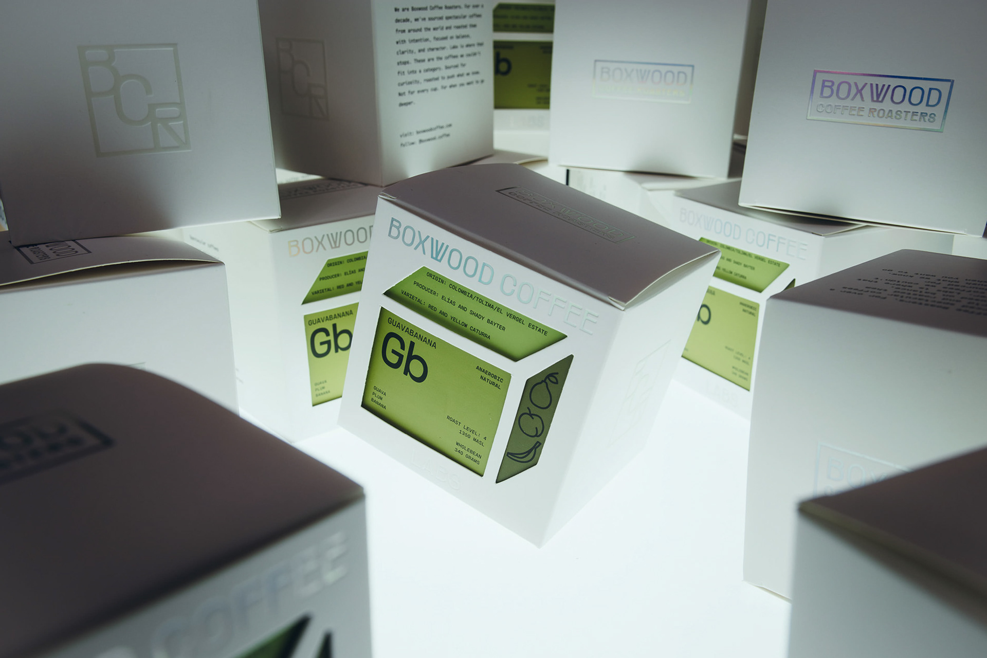
For Boxwood’s experimental line, Boxwood Coffee Labs, we pushed the idea further. The packaging takes inspiration from the periodic table, turning each coffee into its own little specimen with its own code, colour and personality. We also chose holographic printing on the main box, giving a small warning that this was going to be a more unpredictable journey for the consumer.
The idea was to make choosing coffee feel less like picking a standard bag off a shelf and more like discovering something experimental and playful.