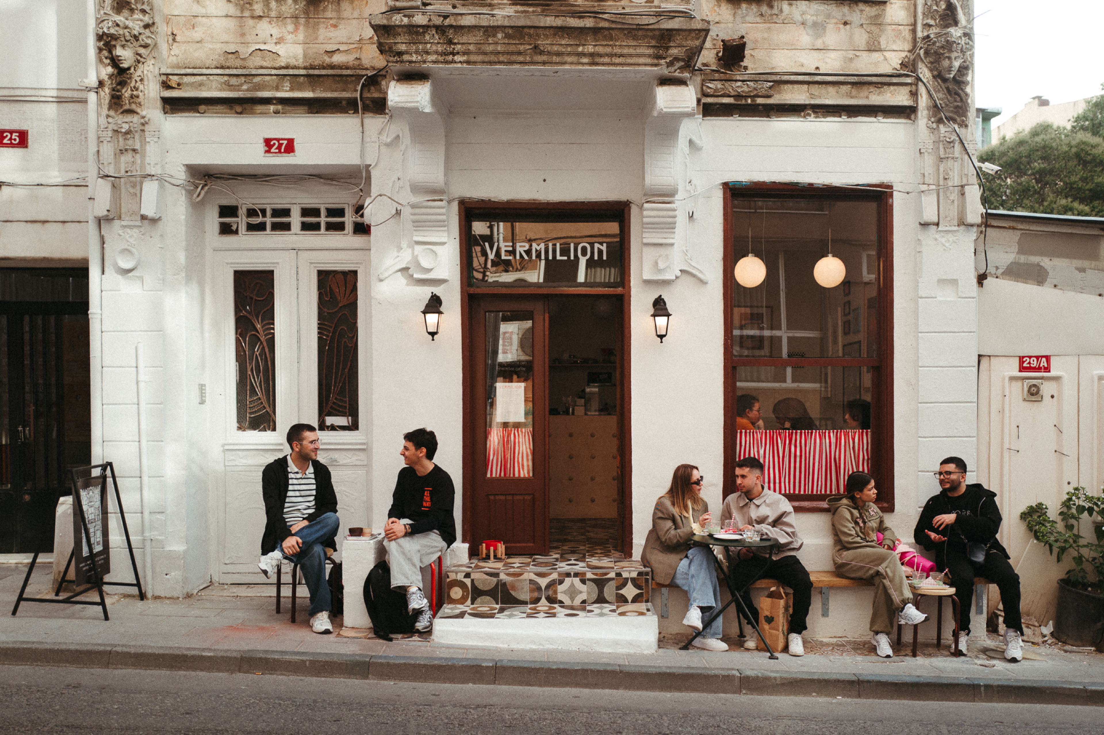
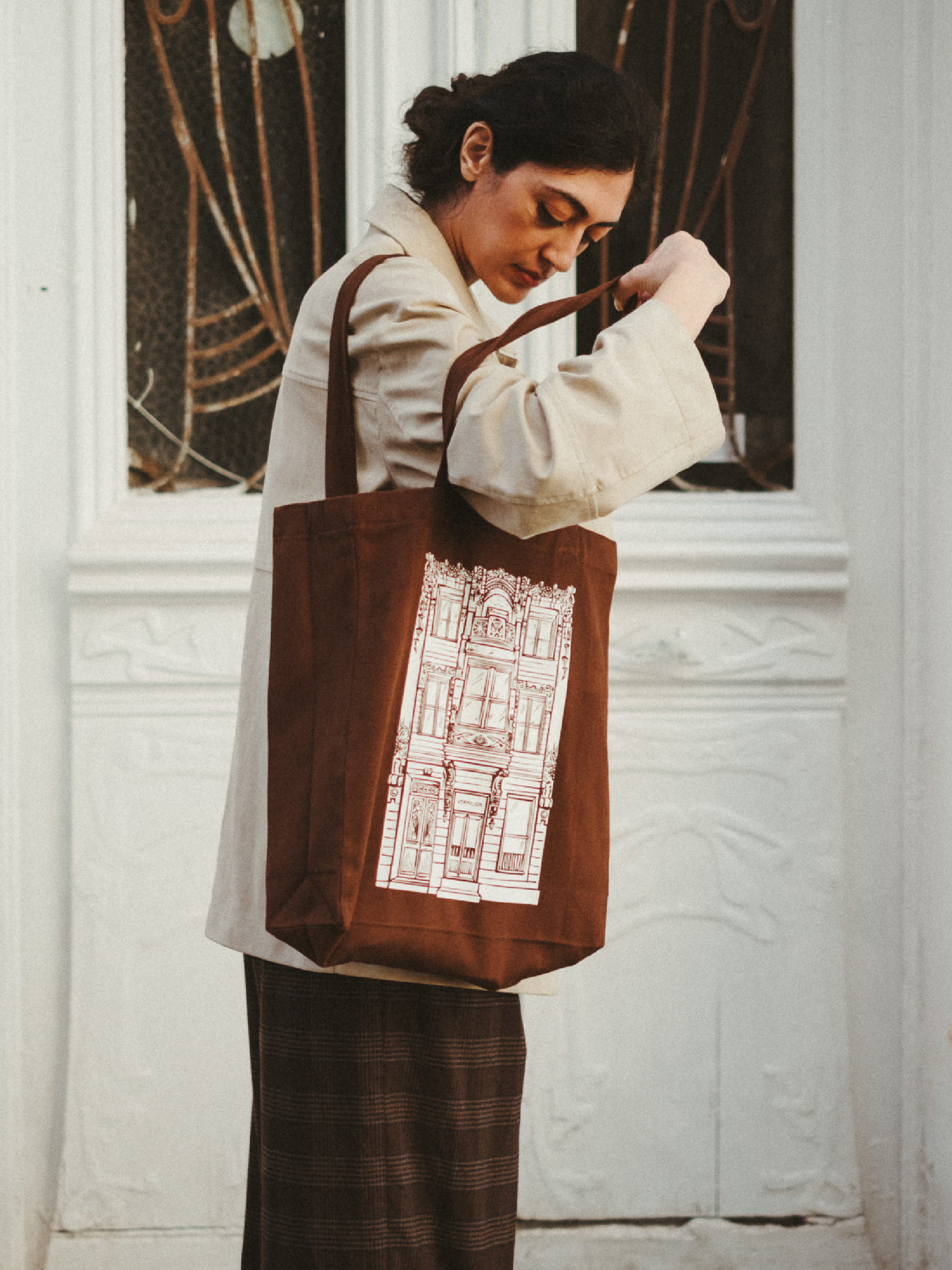
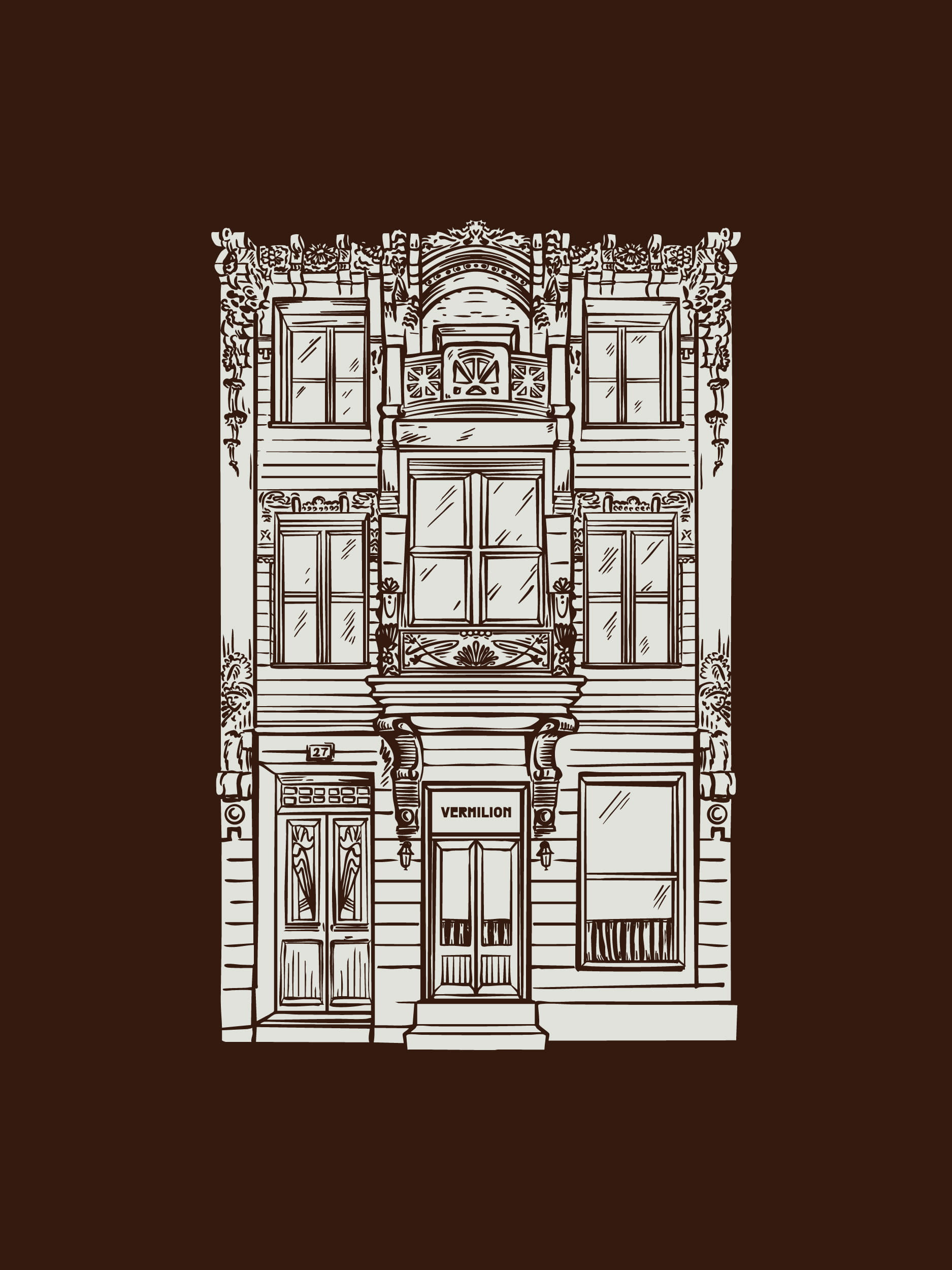
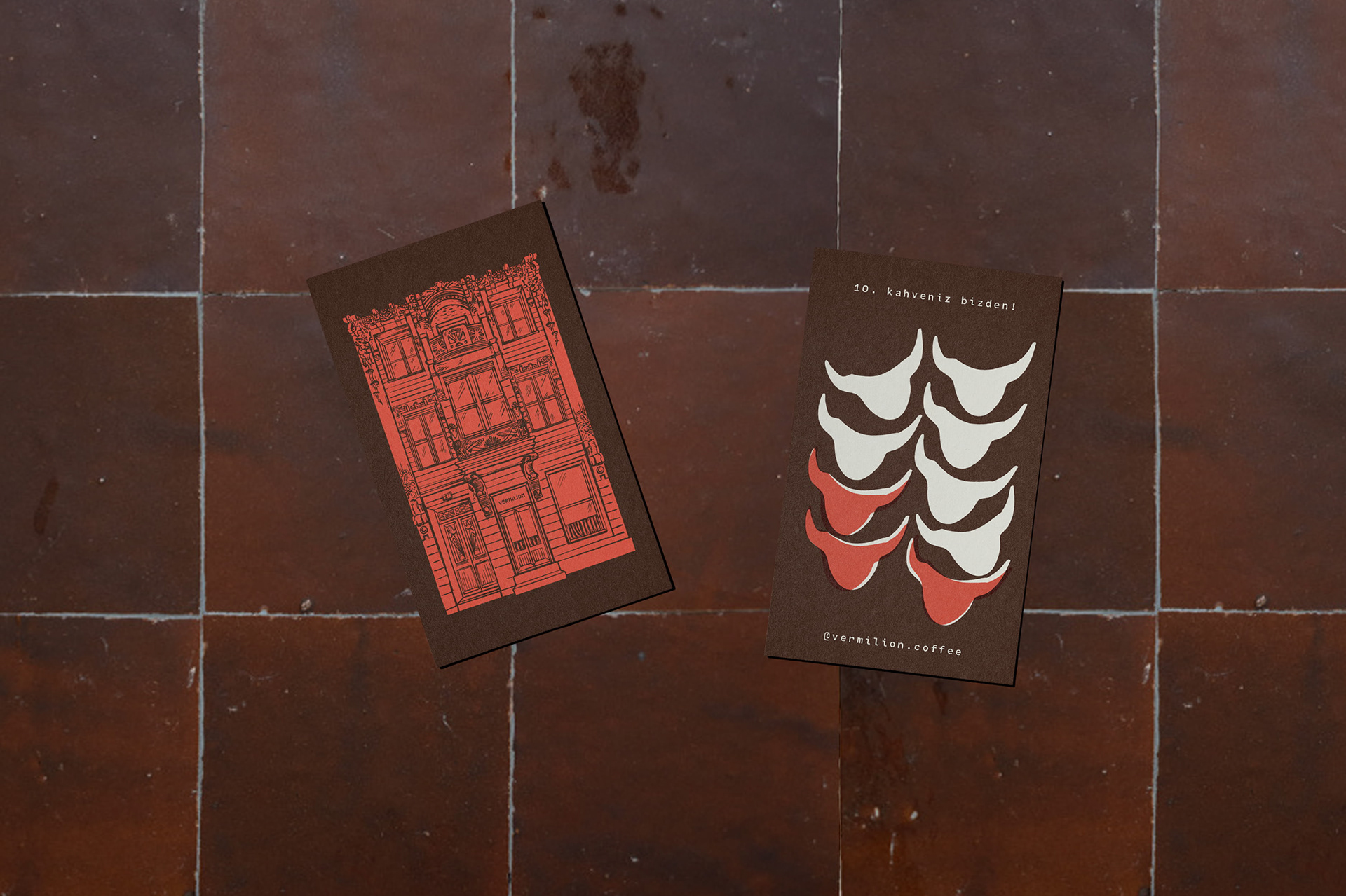
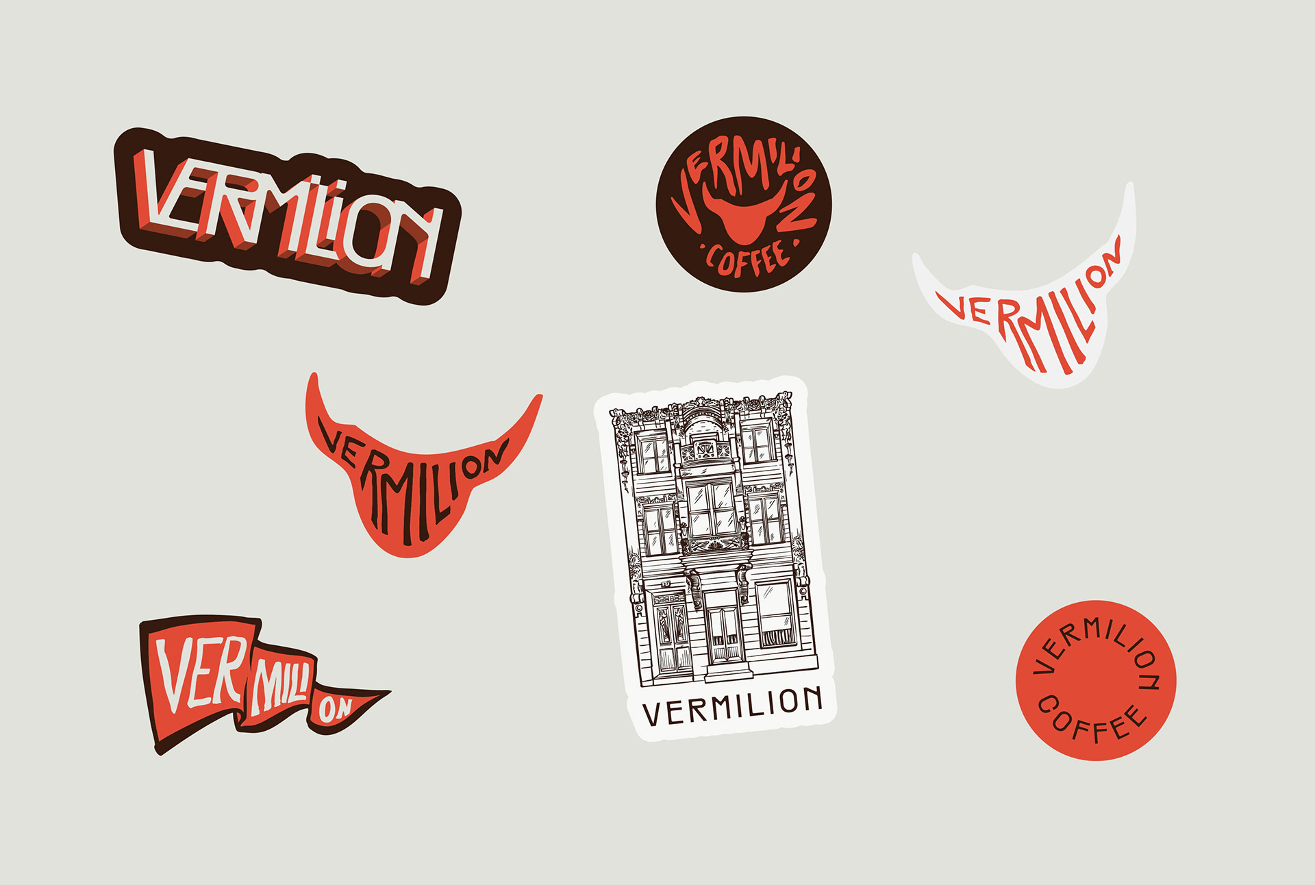
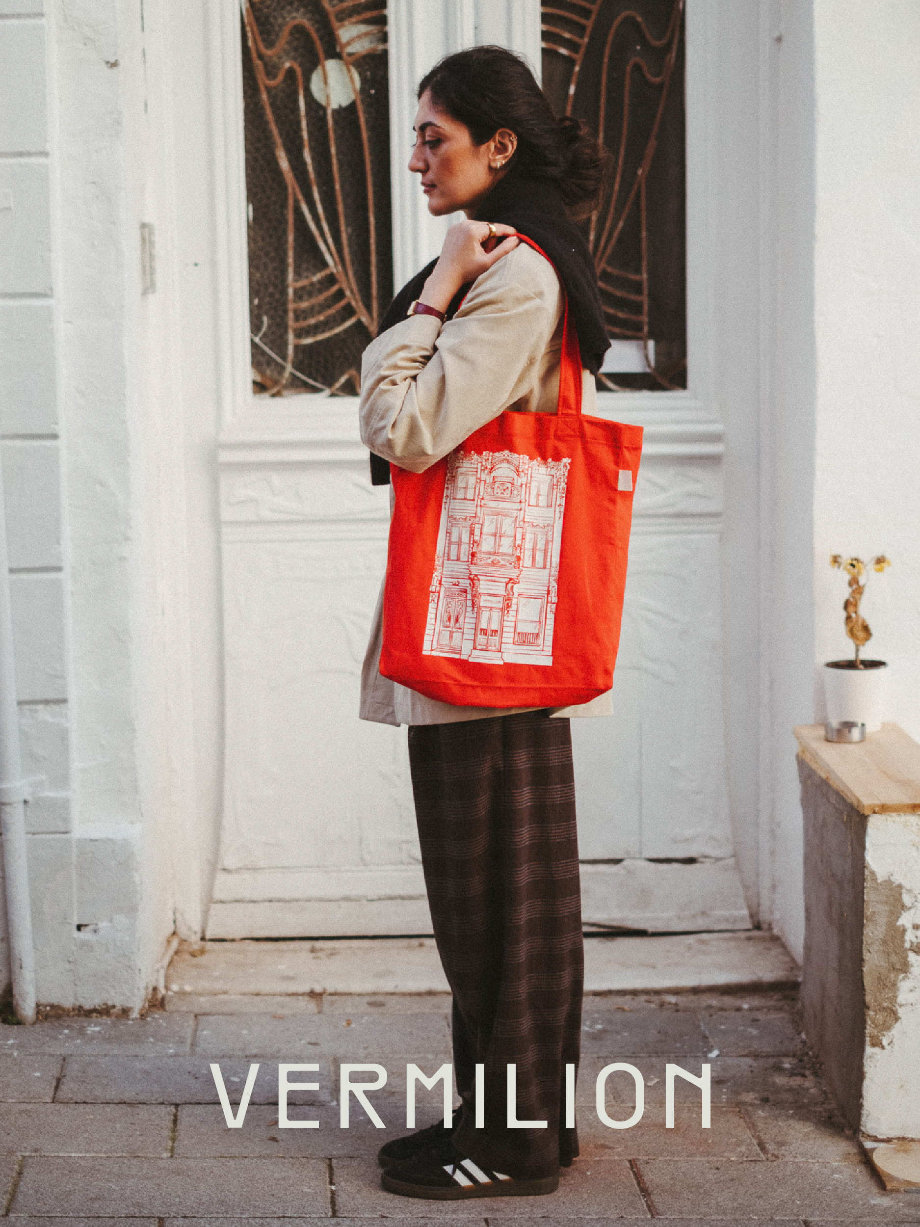
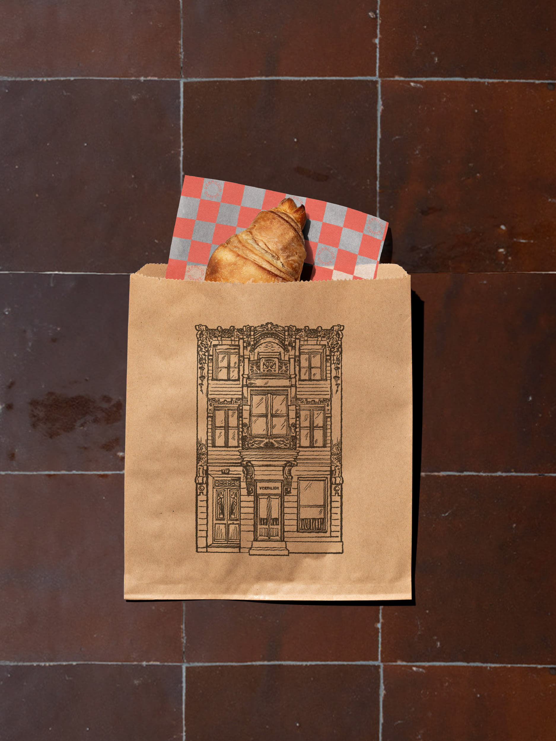
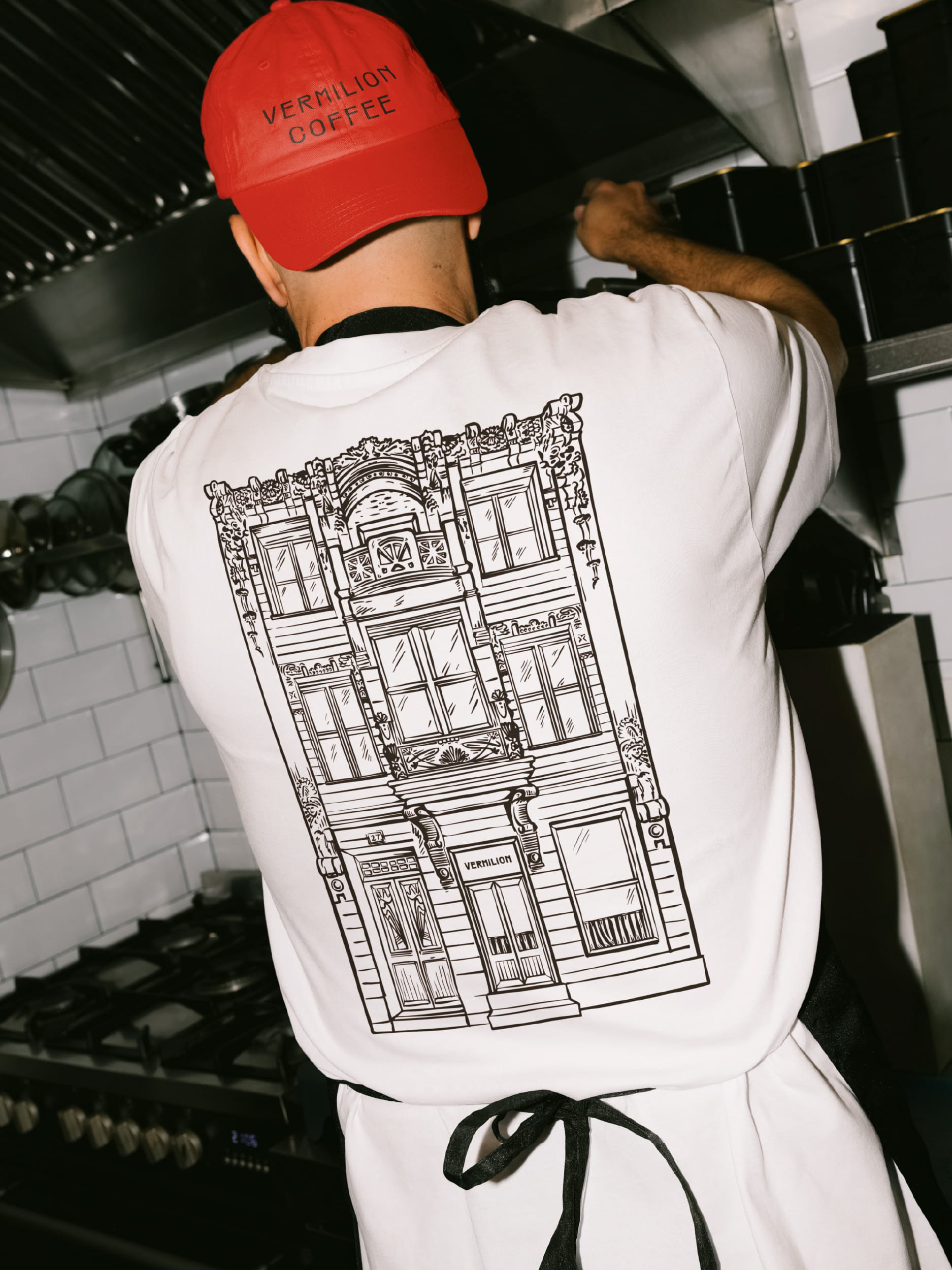
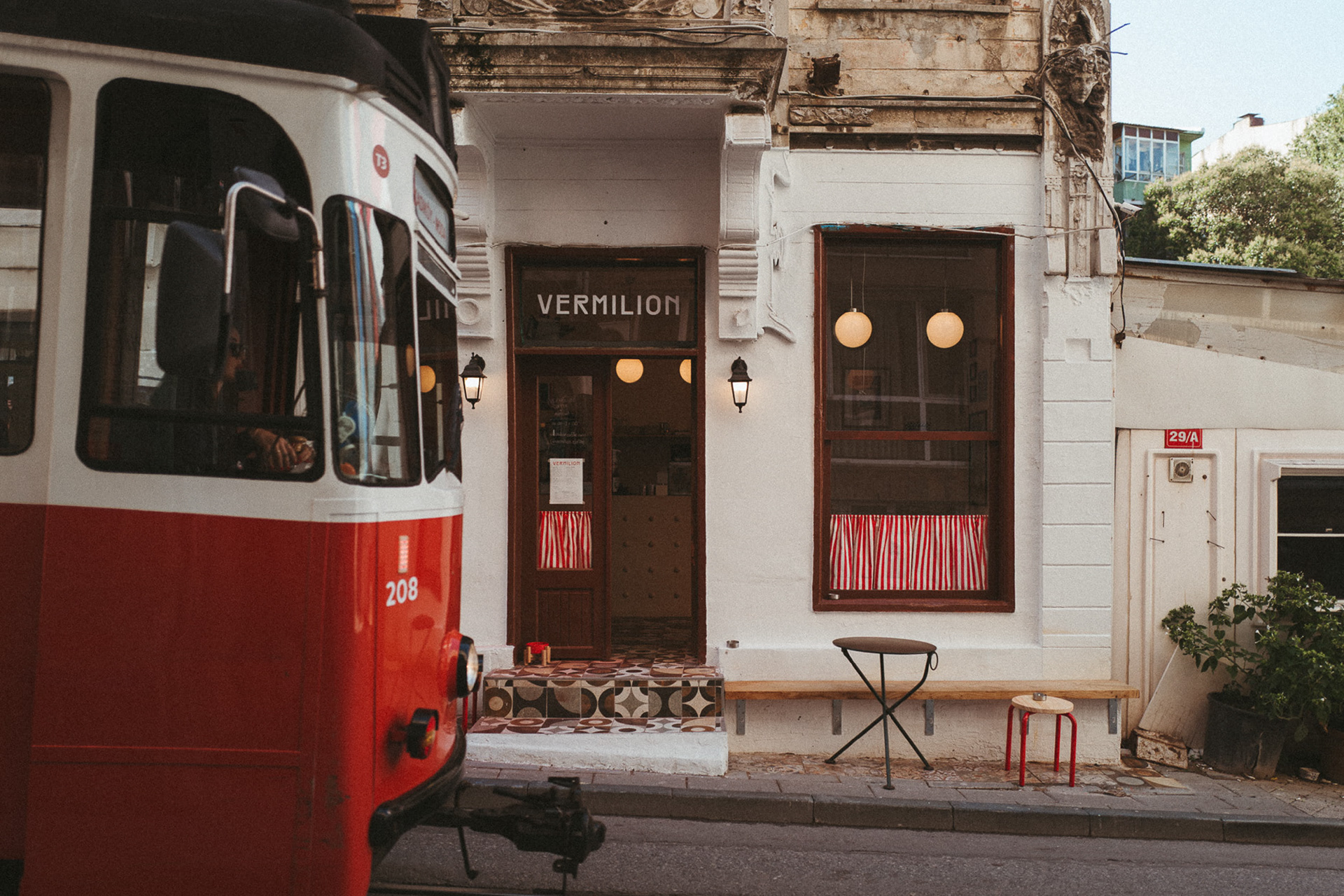
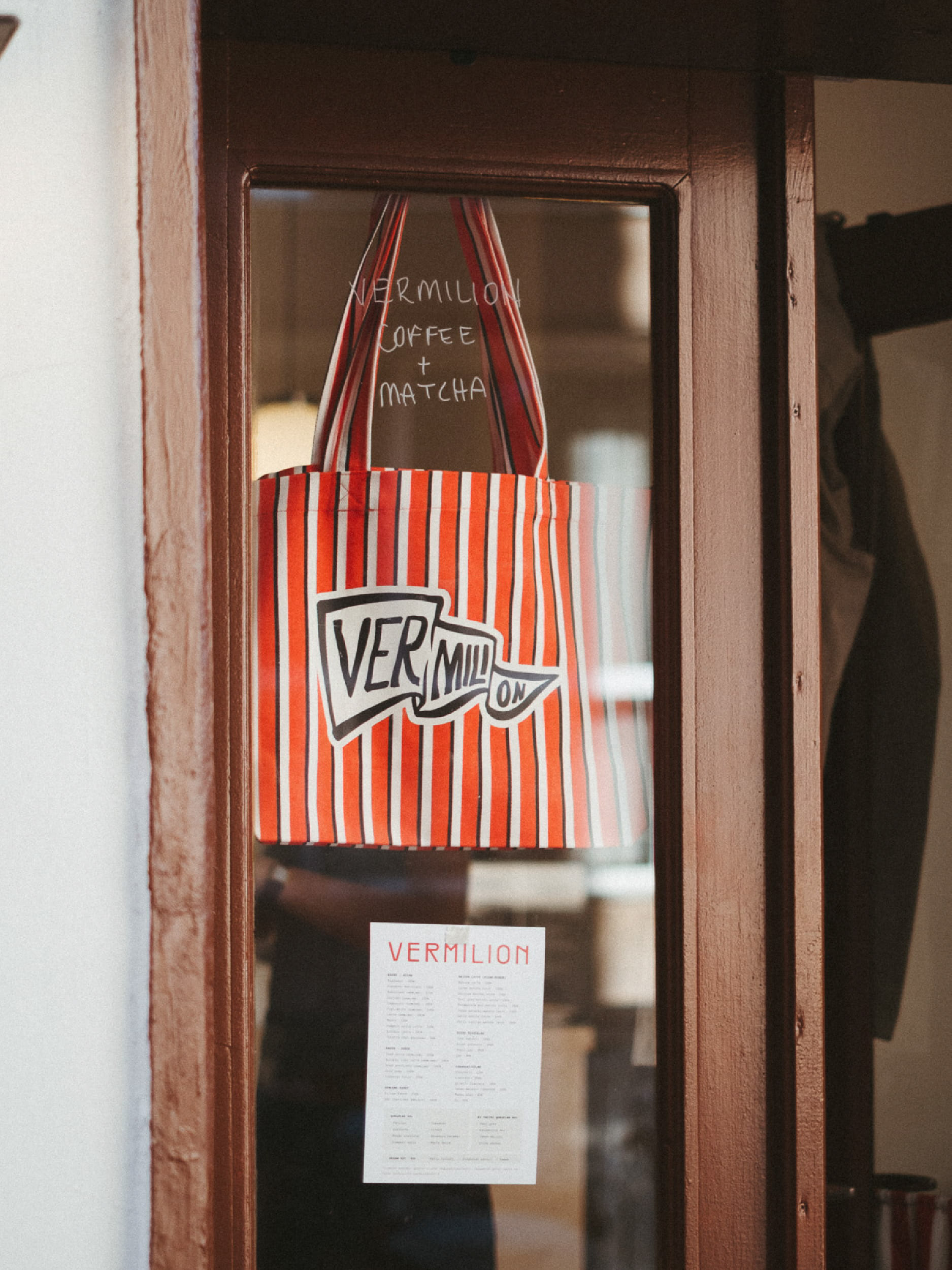
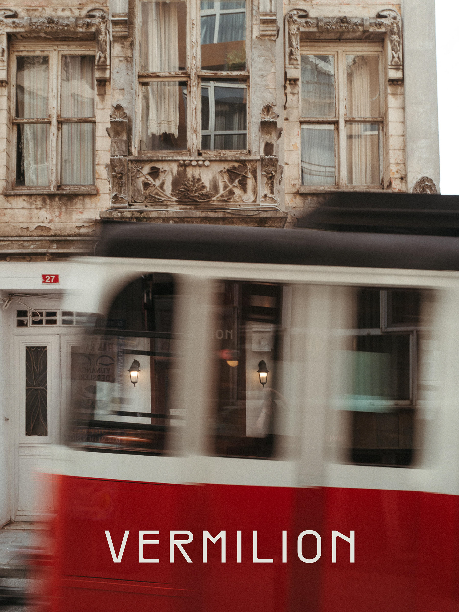
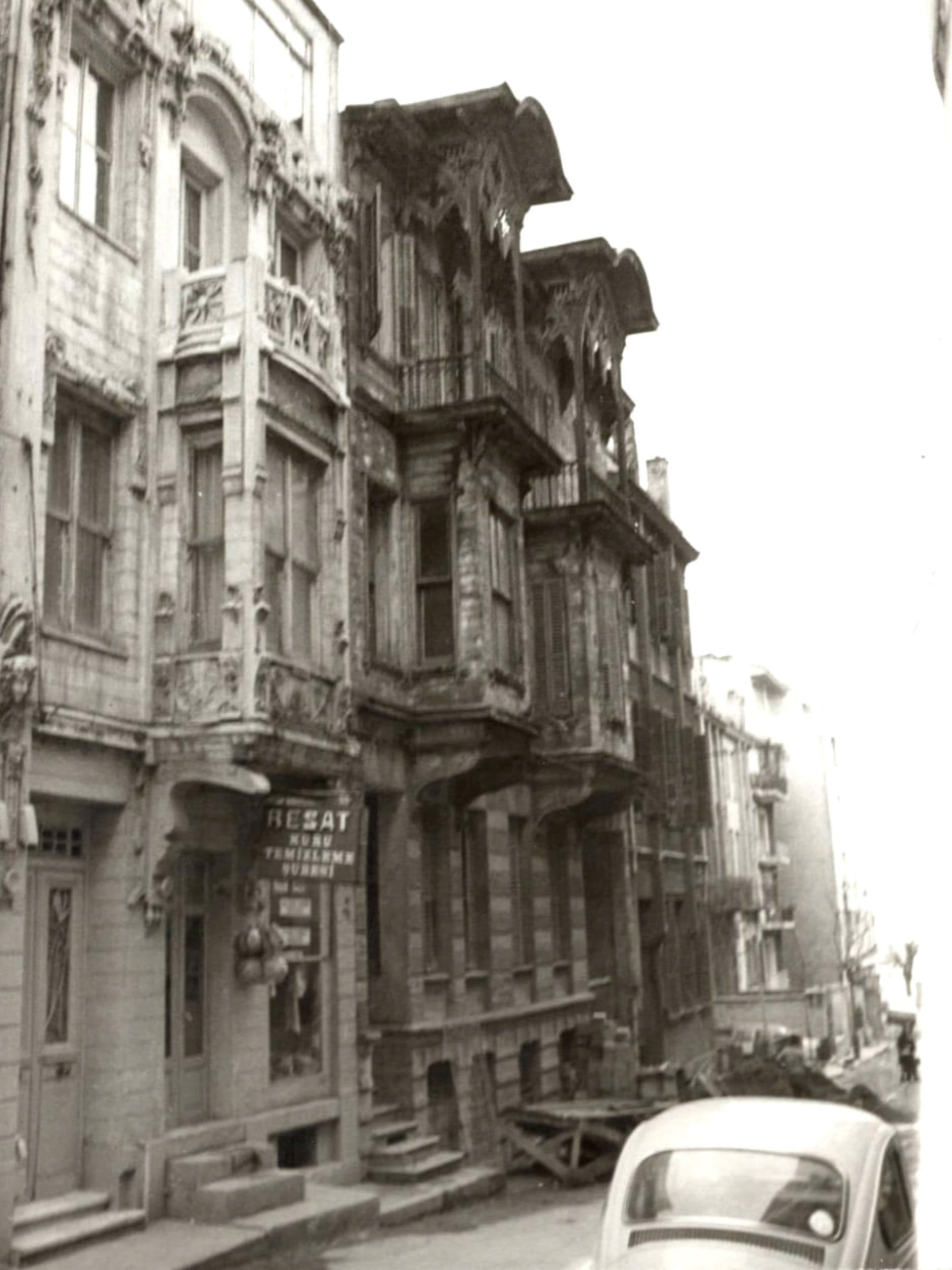
When I created the branding for Vermilion Coffee, I took a lot of inspiration from the Art Nouveau architecture of the building the café calls home. I illustrated the façade for the merchandise, but I didn't want the identity to rely on a single visual element.
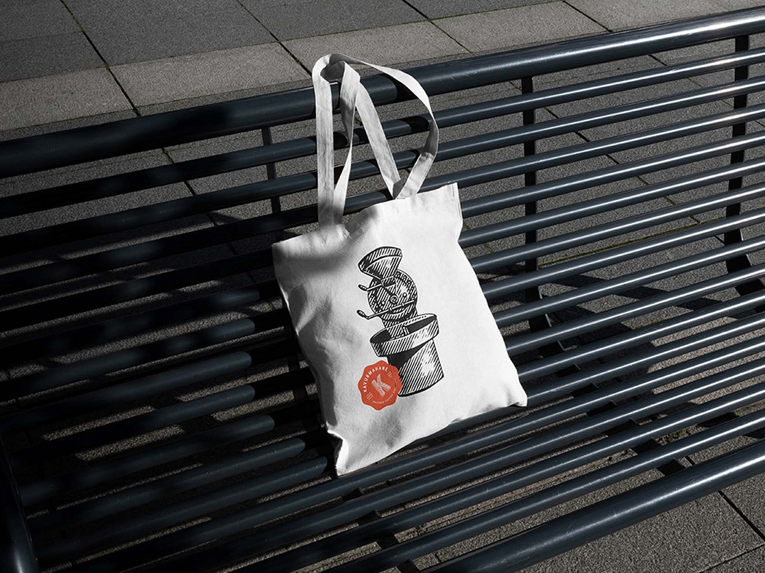
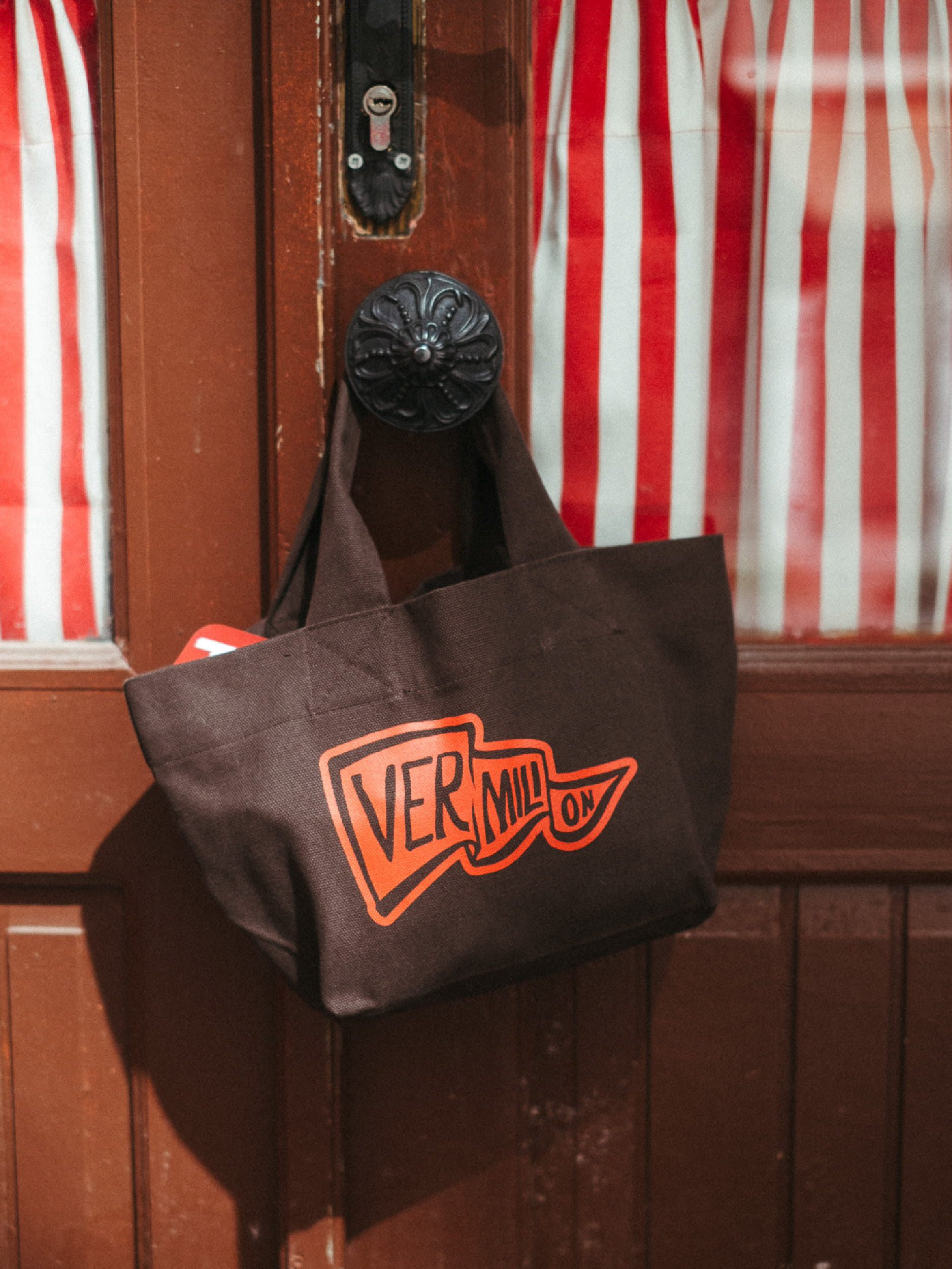
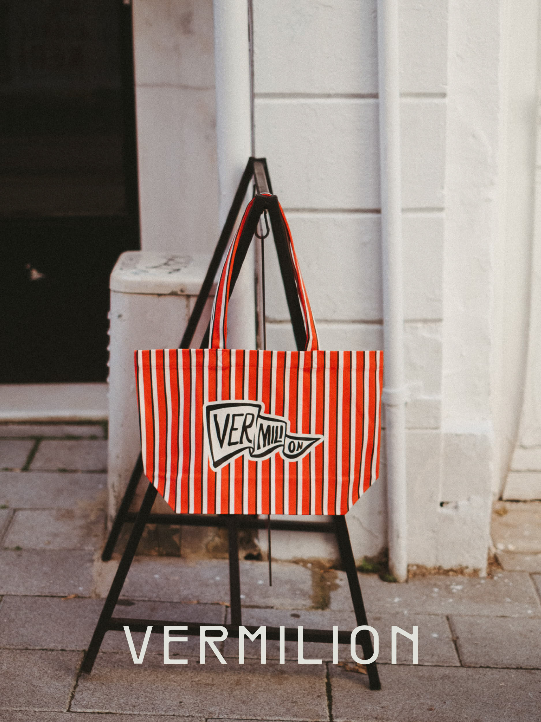
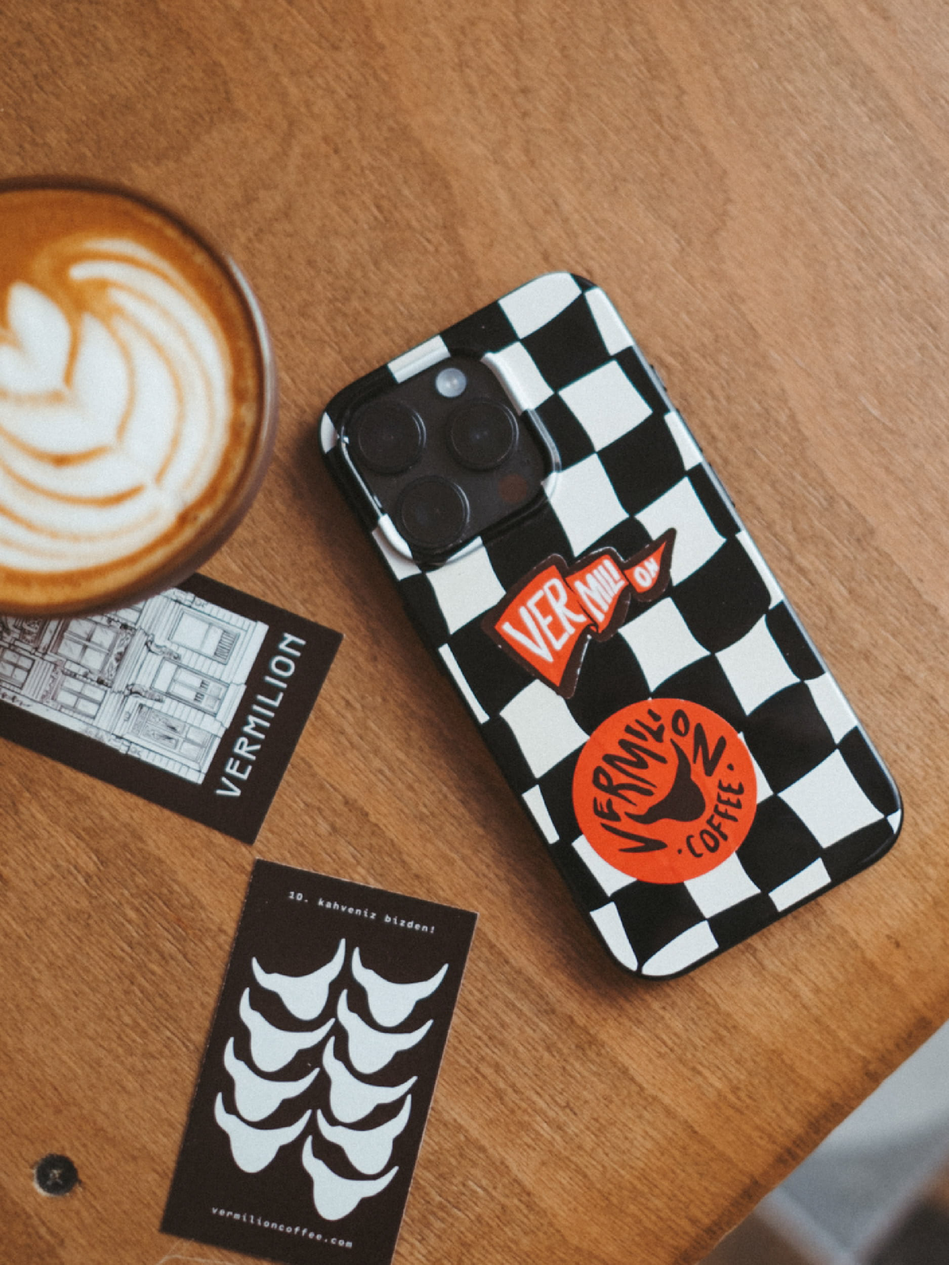
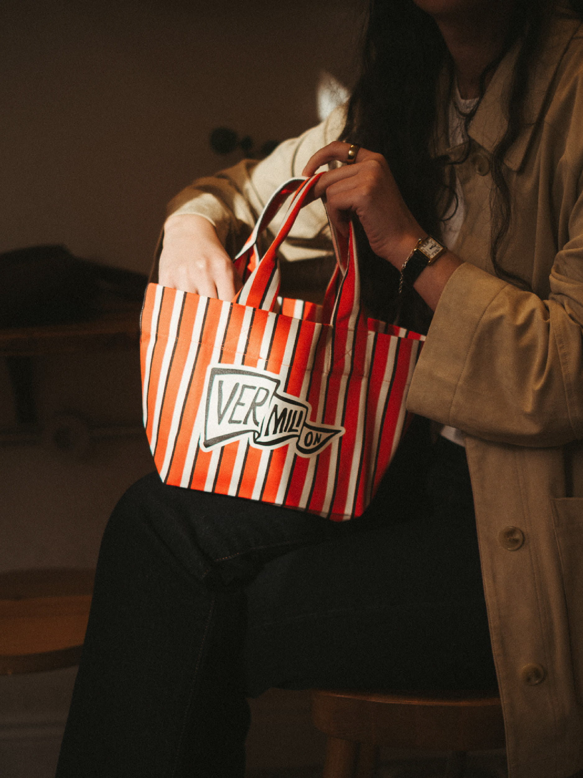
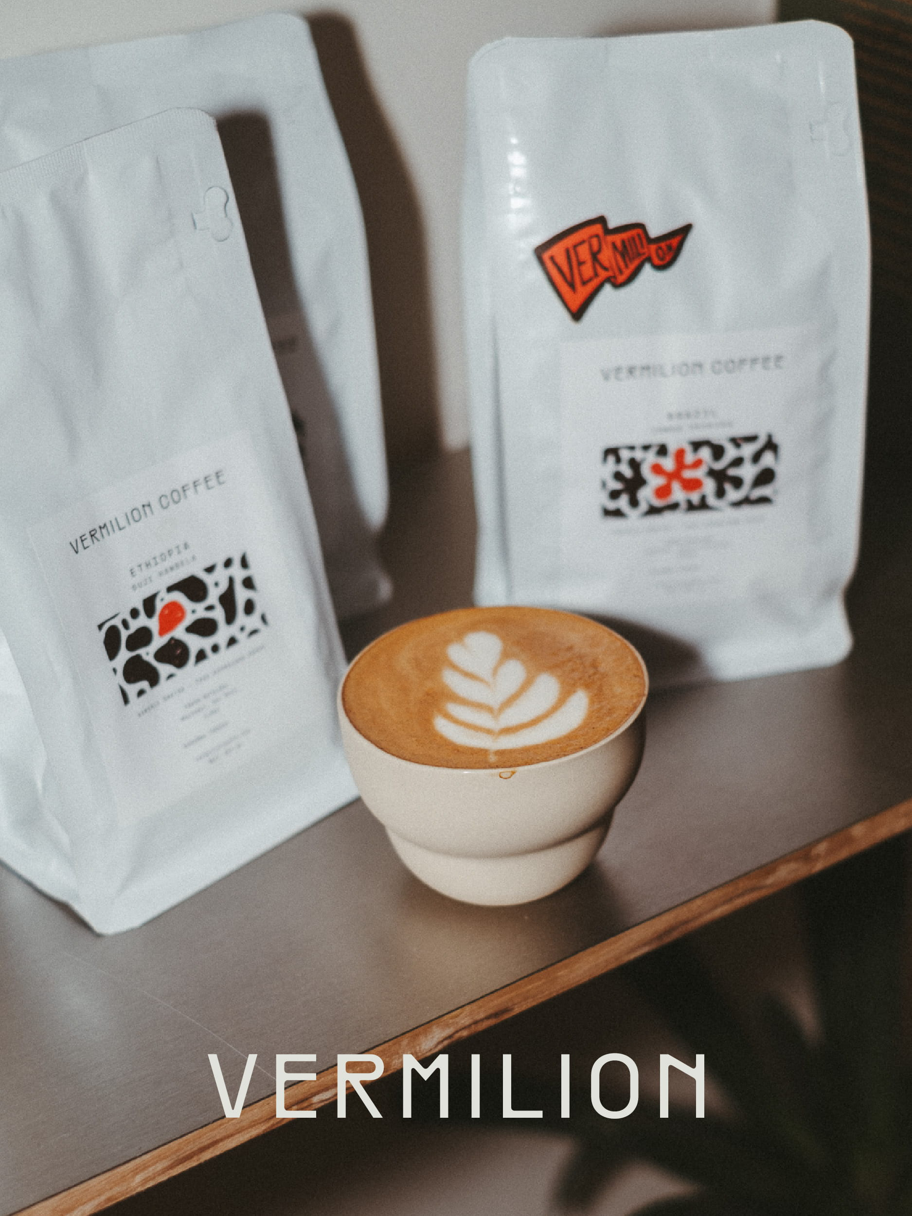
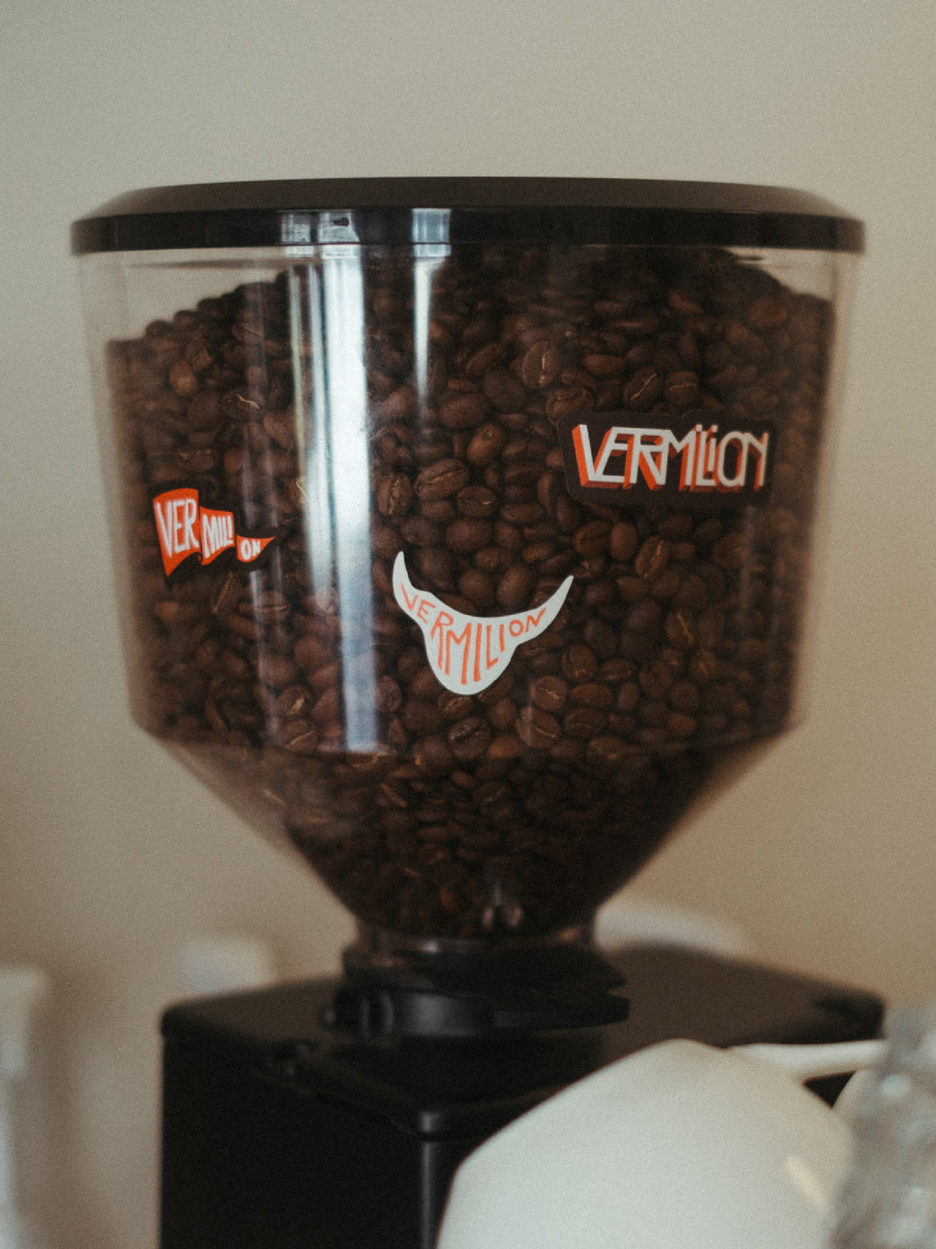
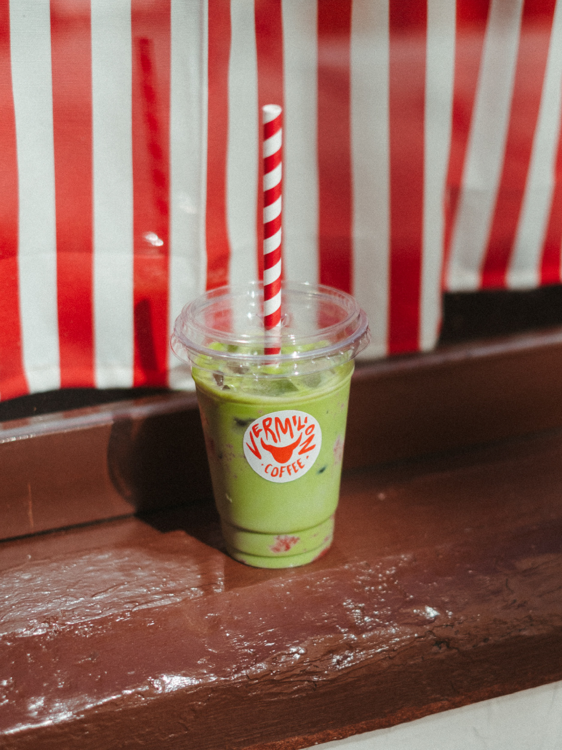
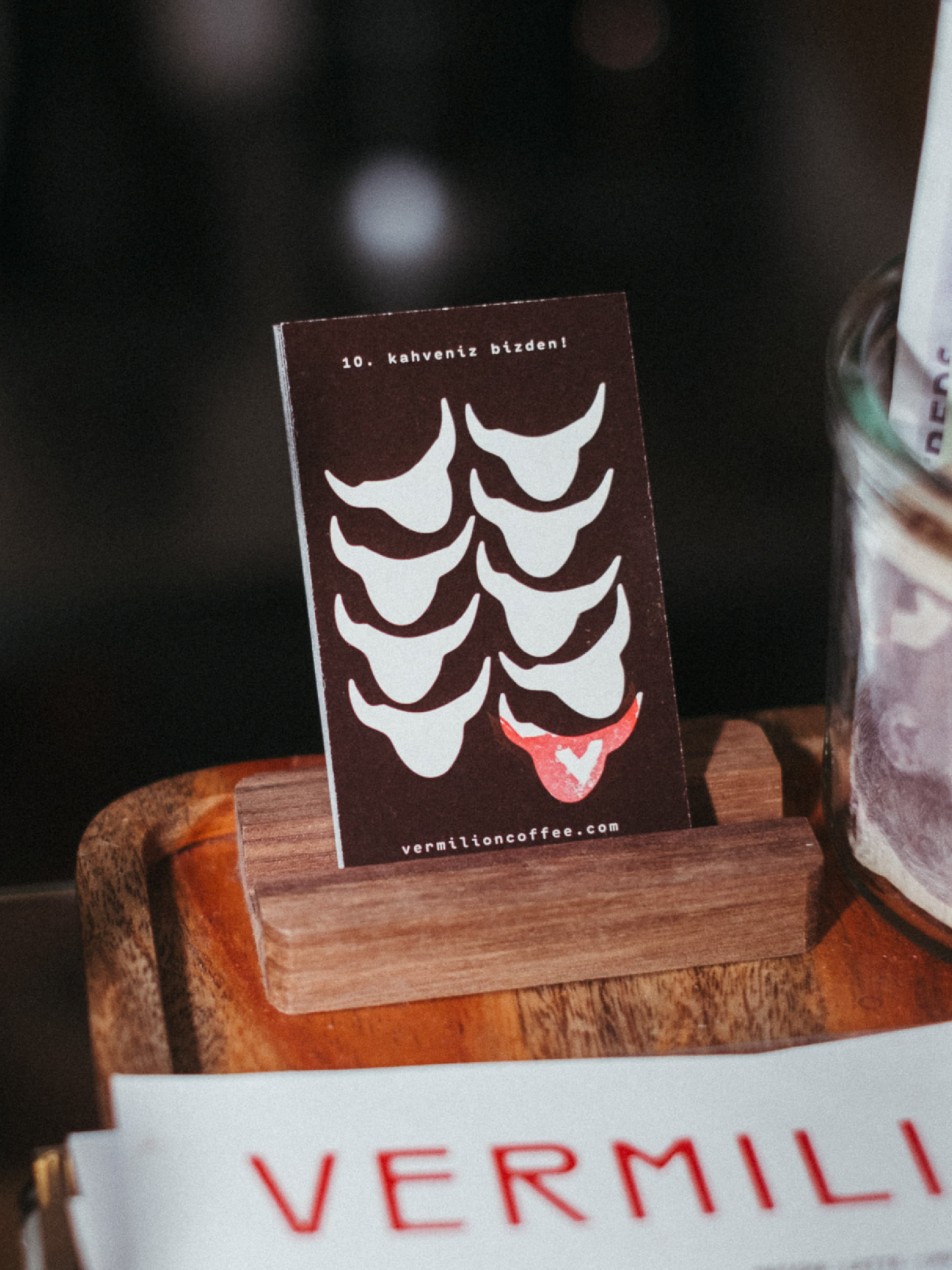
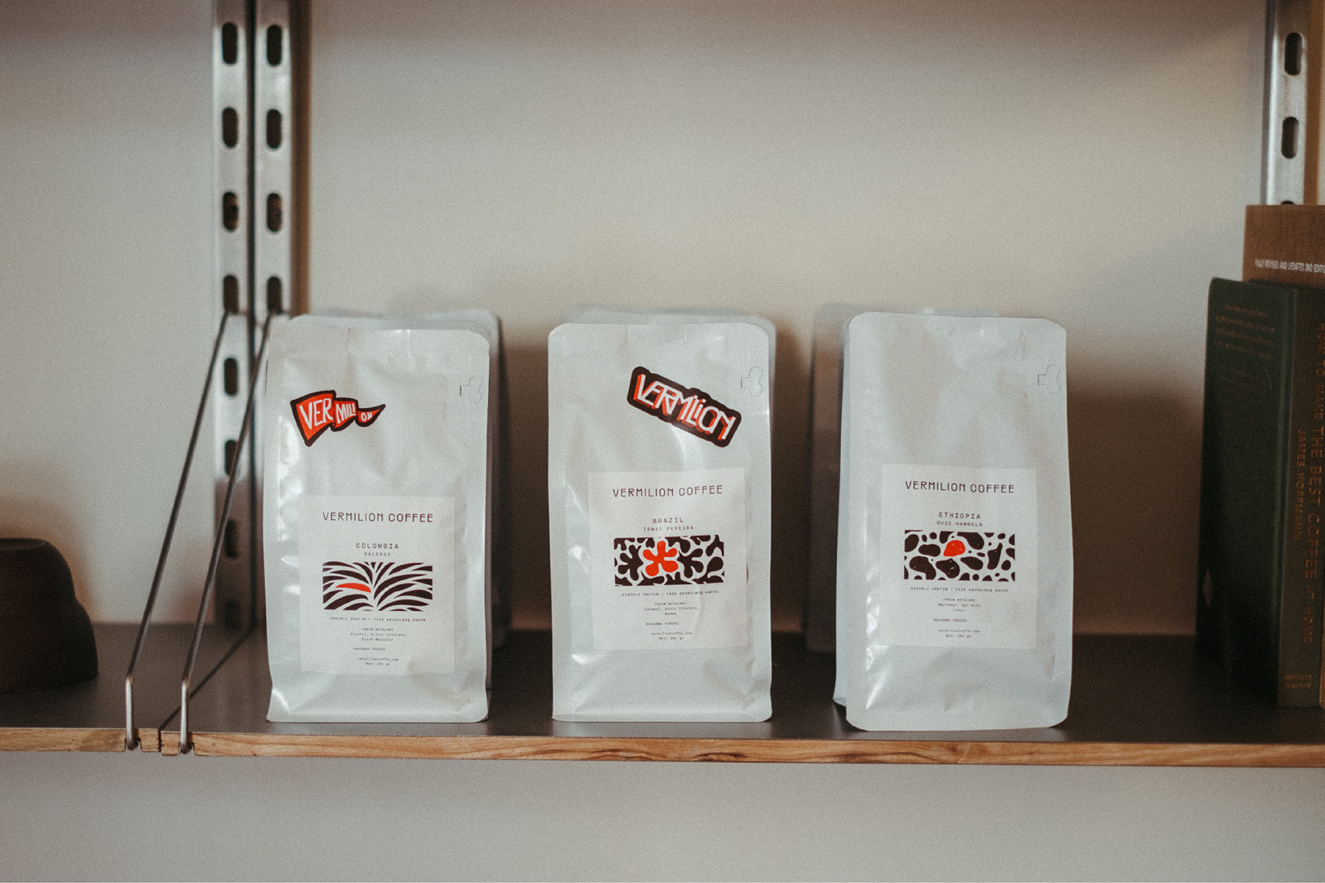
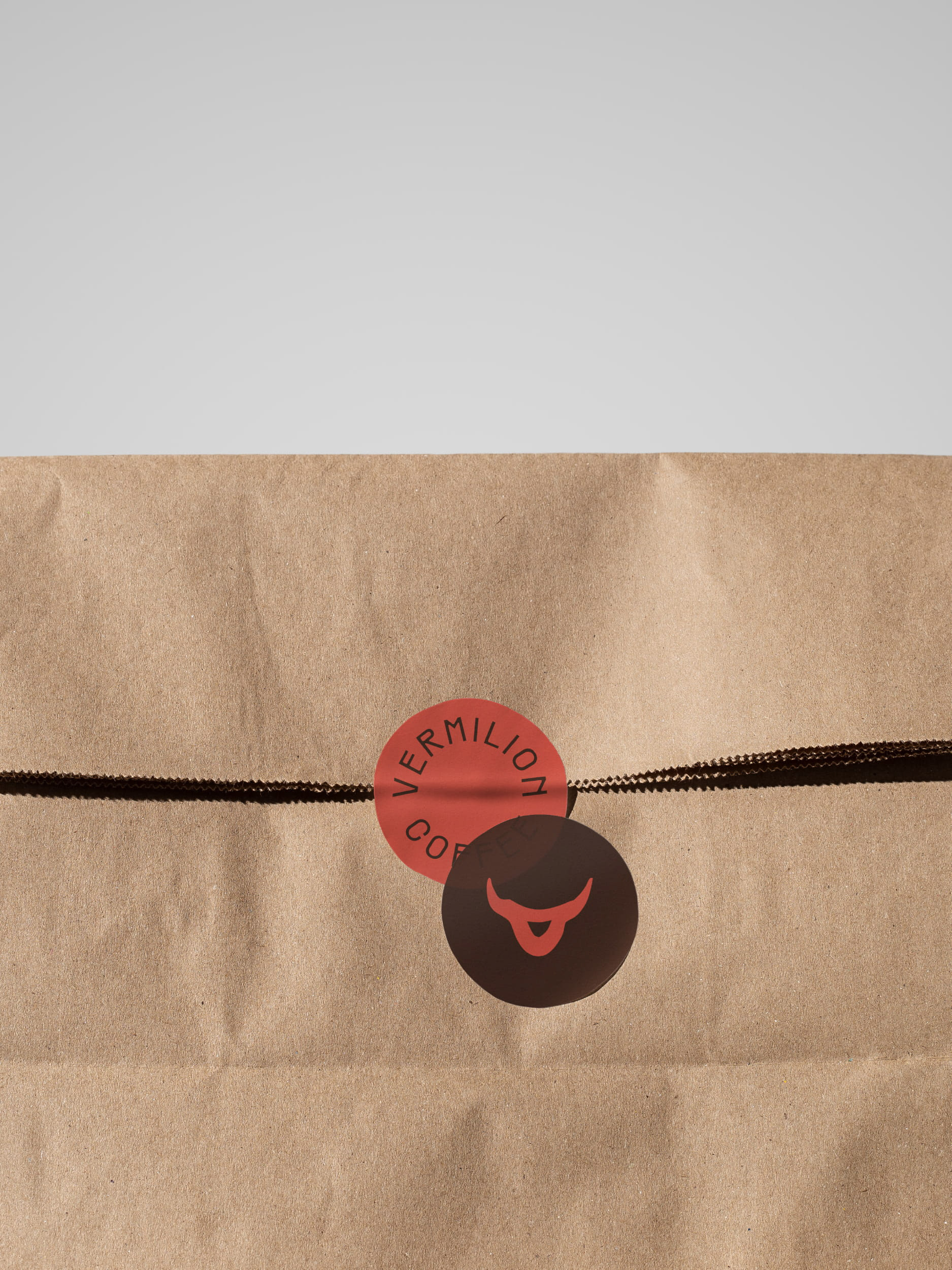
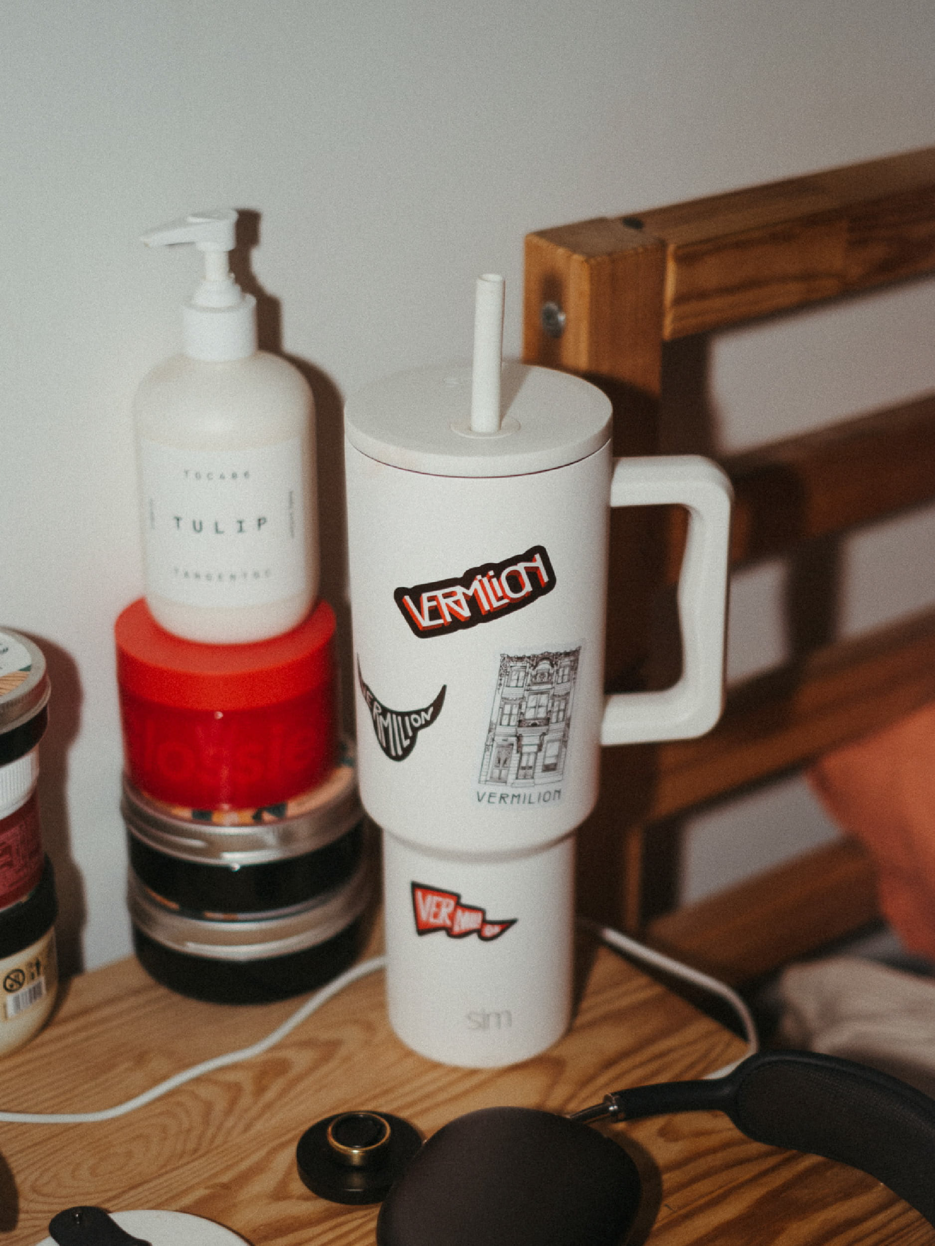
The name Vermilion, a vivid red pigment, became the starting point for a series of custom logos. One of my favourites is the hand-drawn vermilion flag, which eventually became the logo used on the tote bags. I also designed a minimal bull head, a subtle reference to Kadıköy's famous statue, combined with hand-lettered typography to create another distinctive mark for the brand.
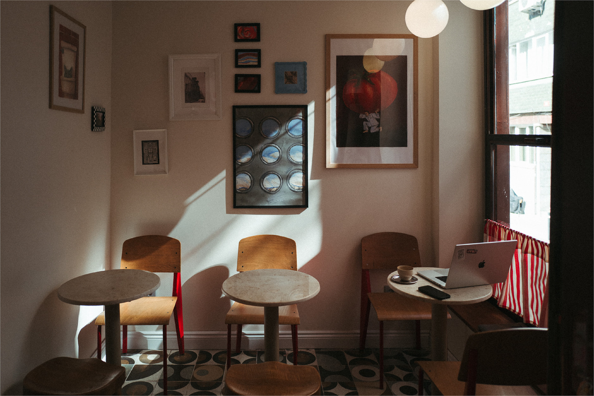
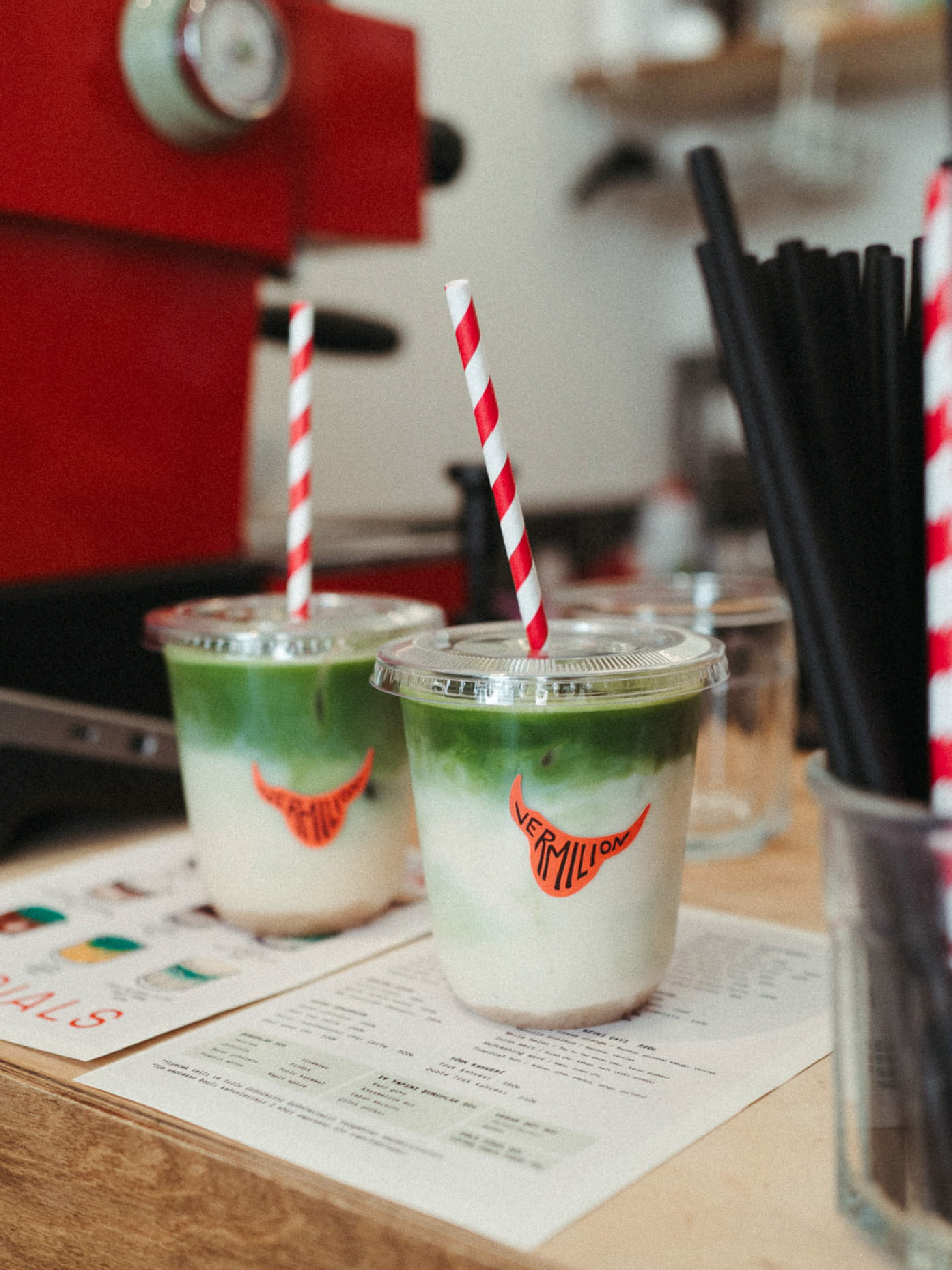
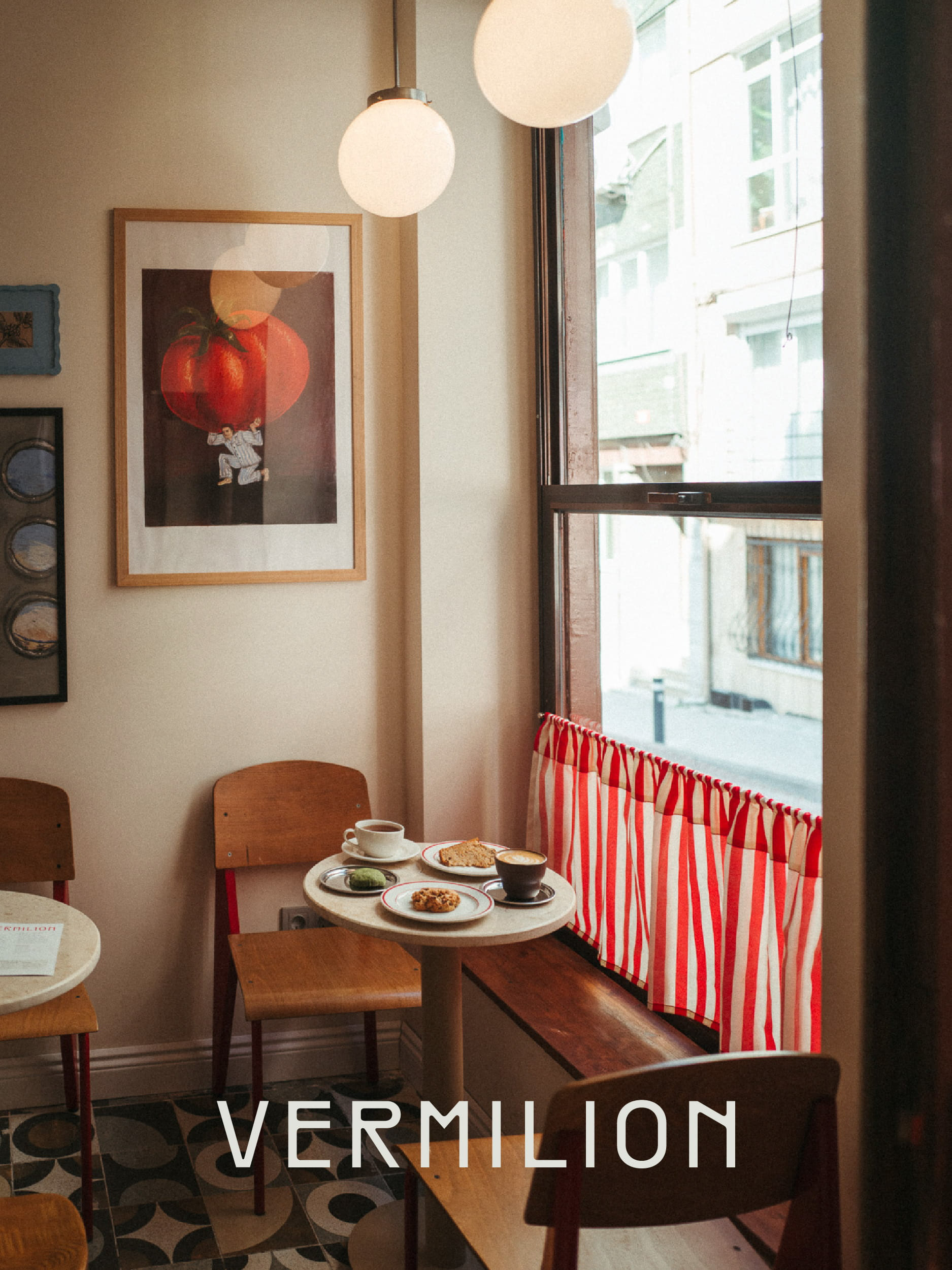
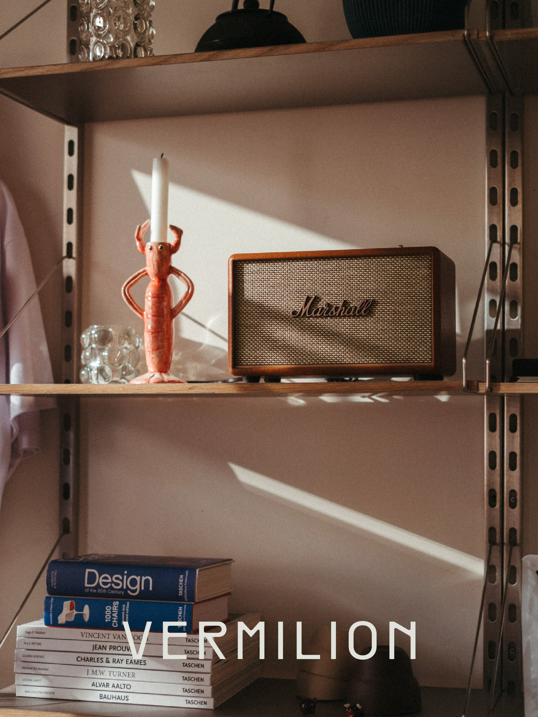
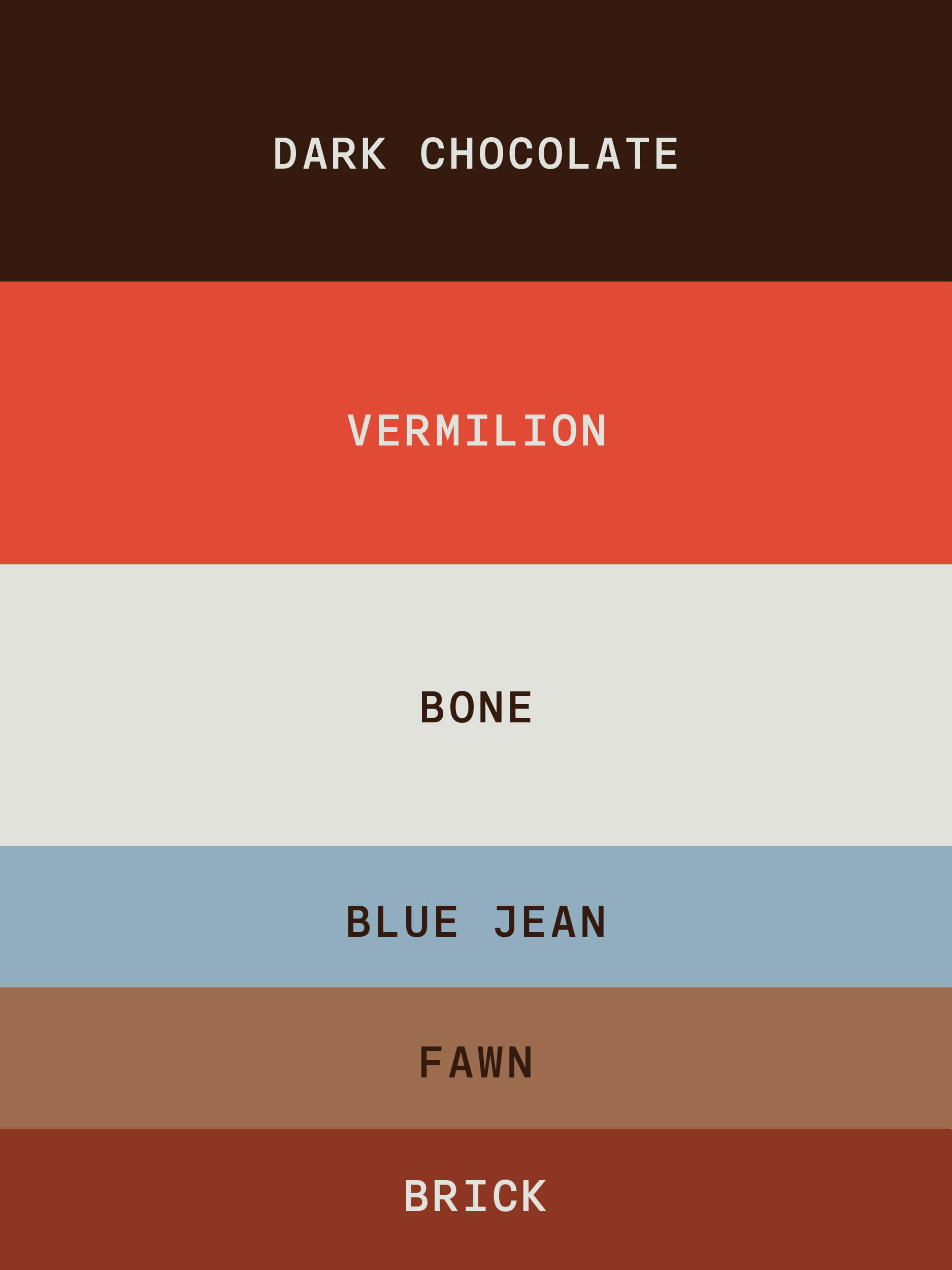
The colour palette naturally revolves around shades of Vermilion, balanced with contrasting and complementary colours to keep the identity bold, warm and playful. And the colors tie the cafe brand identity to the interior design.
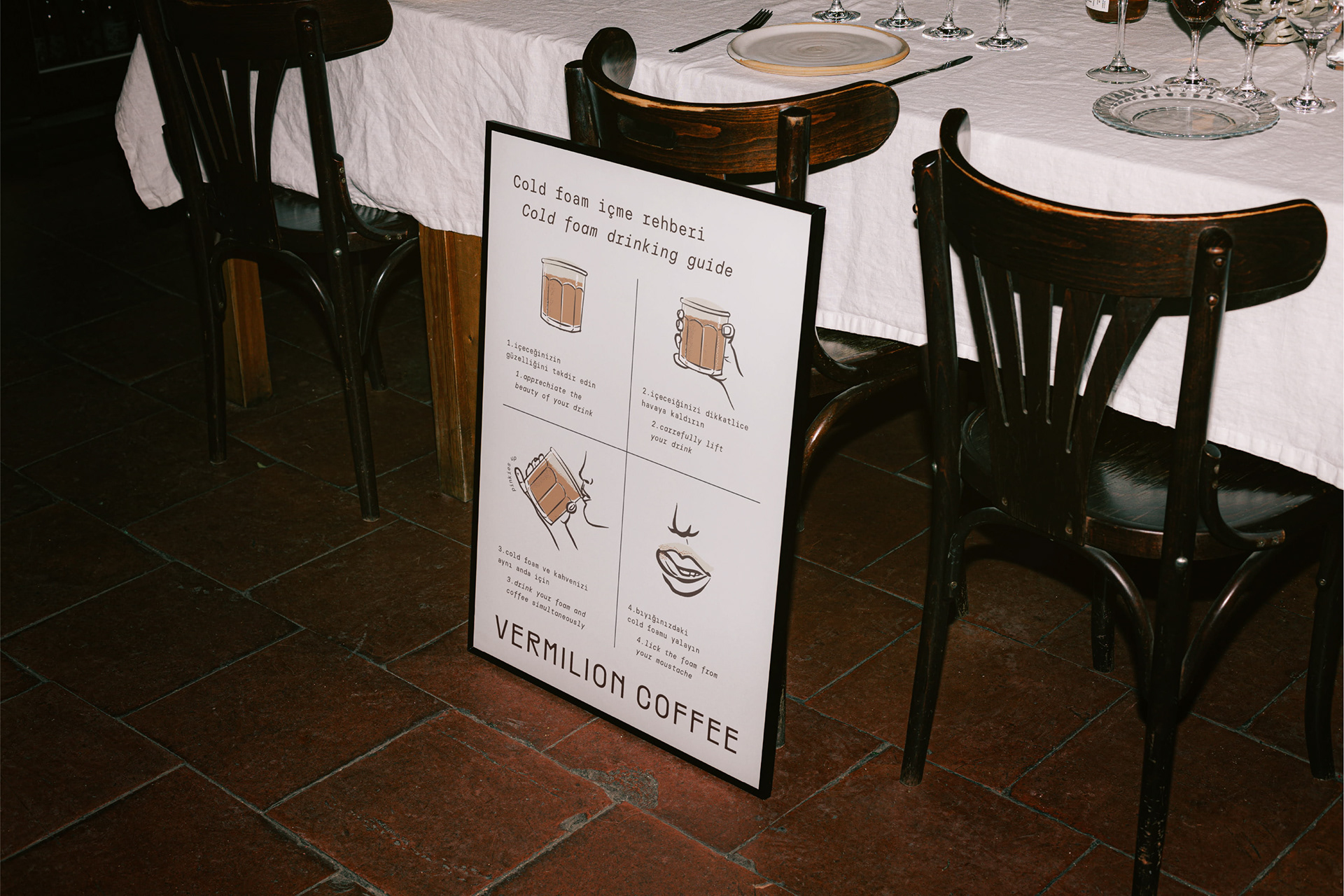
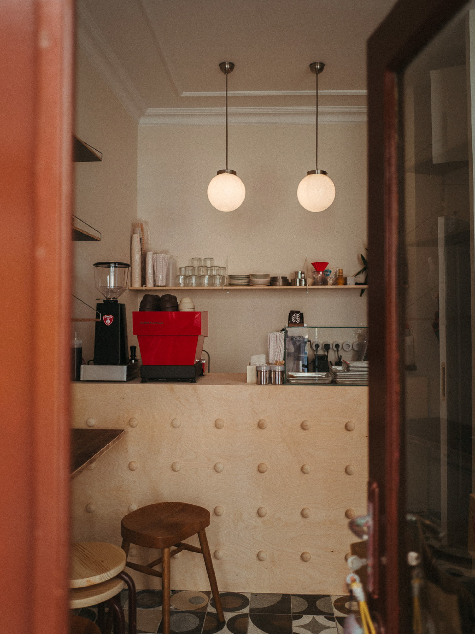
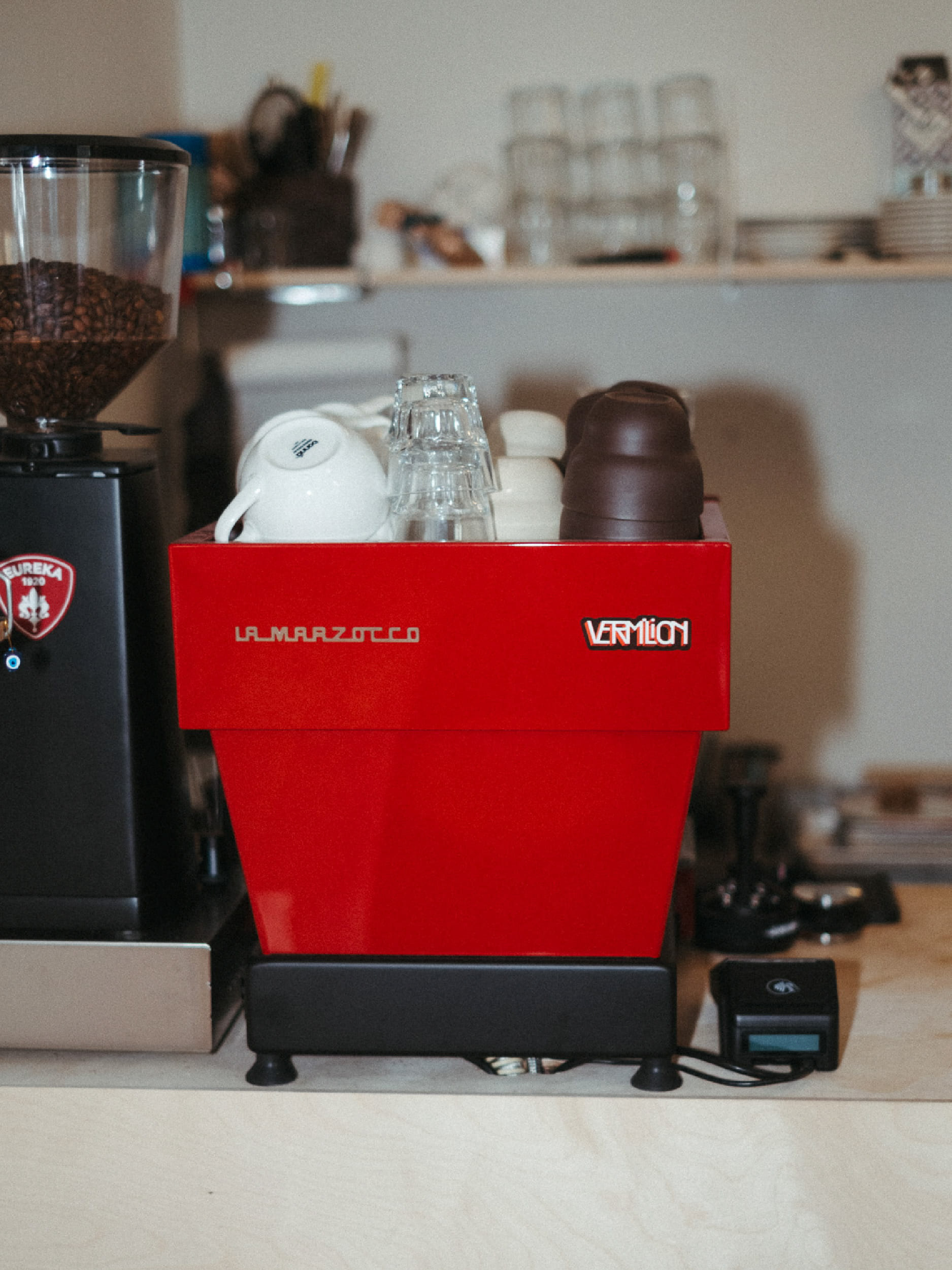
A fun fact about this project: I own Vermilion Coffee, so this became much more than a branding project. I also designed the interior, painted the wall paintings, and shaped the space as a whole, making it a true extension of the brand identity.
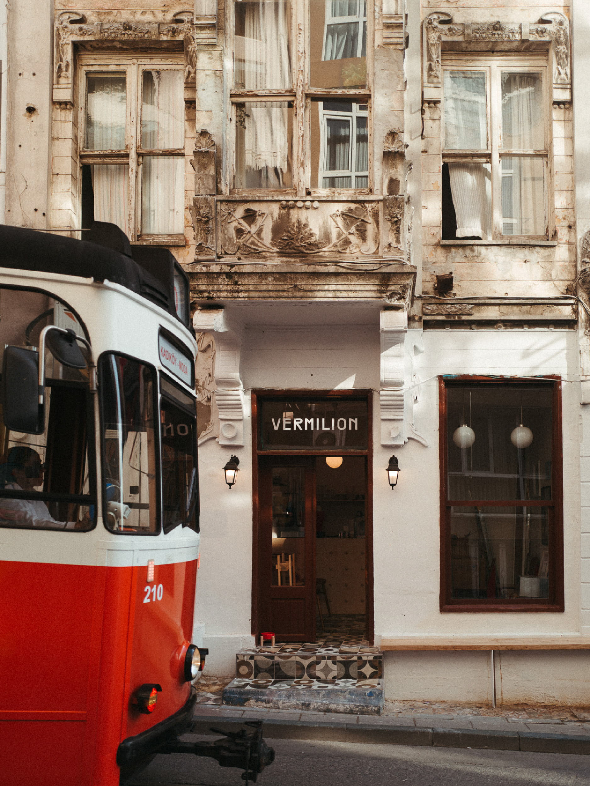
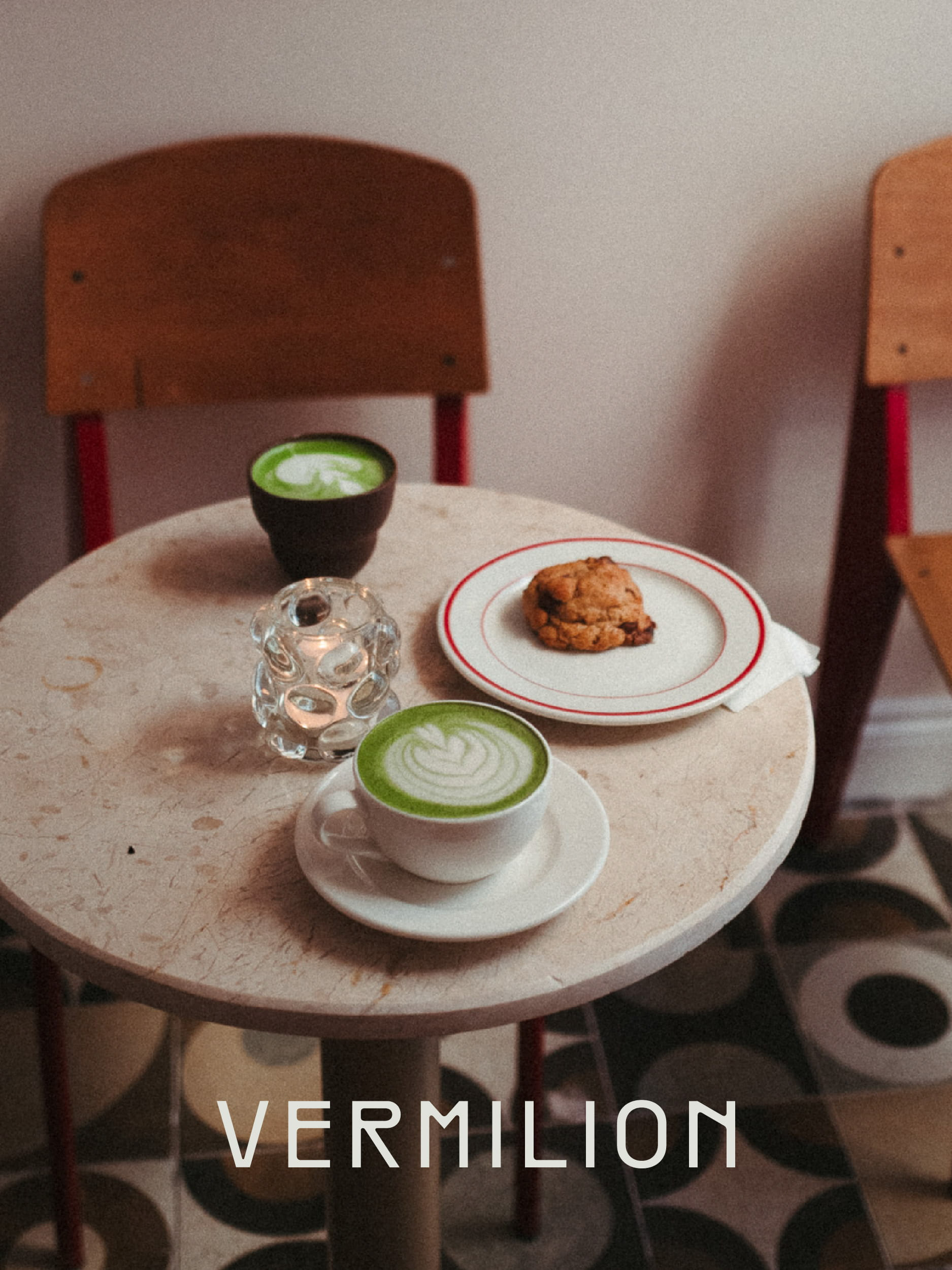

Brand identity, packaging, merchandise and interior design for an independent coffee and matcha café in Istanbul.