Le Beau Chaos is an artisan flower business that sells cut flowers in Quebec/Canada. Le Beau Chaos translates "beautiful chaos" in French.
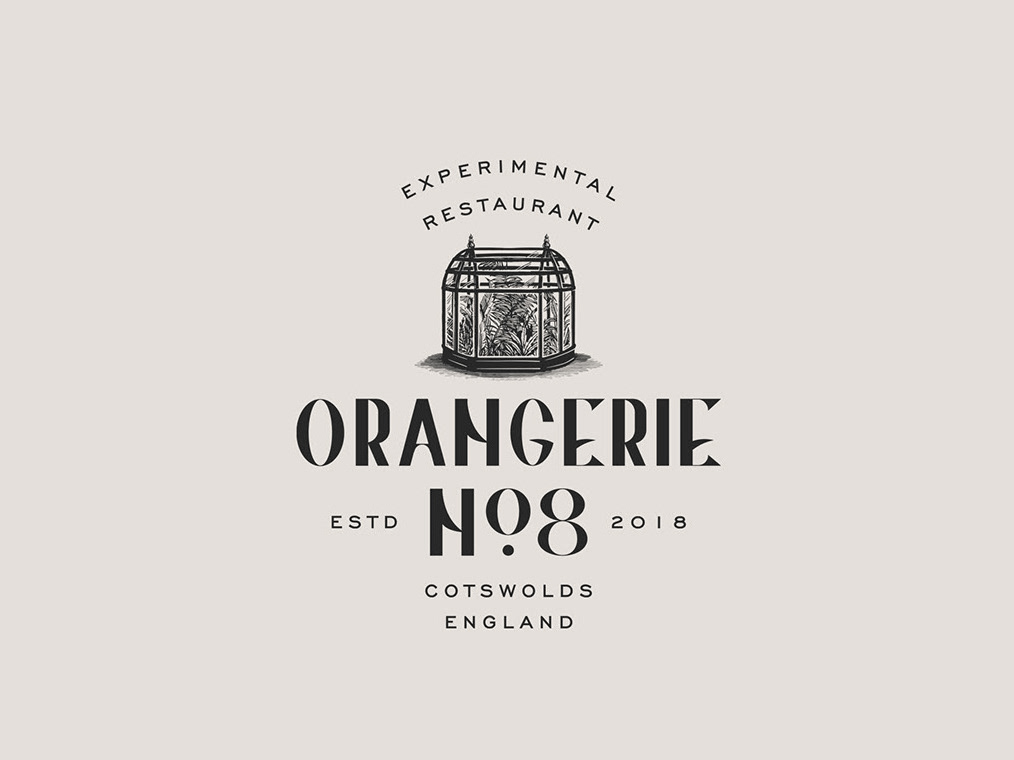
We were inspired by old English gardens, Victorian era and soft colors palettes with a romantic feel for Le Beau Chaos brand identity. I draw a wardian case illustration with flowers escaping from it and growing on the floor to create a chaotic feel for the logo design, used pale green tones with dark gray to have moody feel. Added badge design with fern illustration for small stickers and created a simple monogram design to complete the identity.
