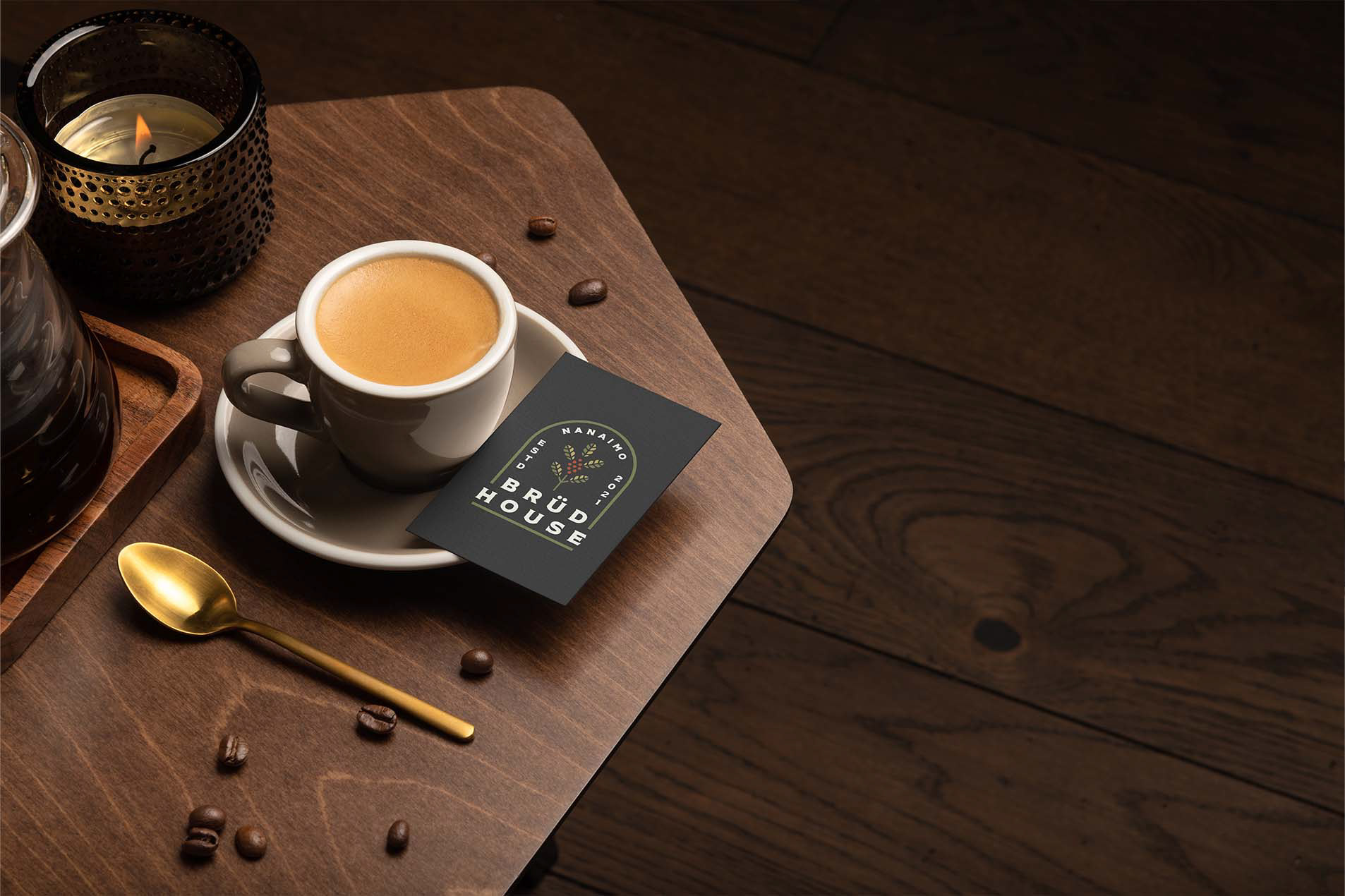
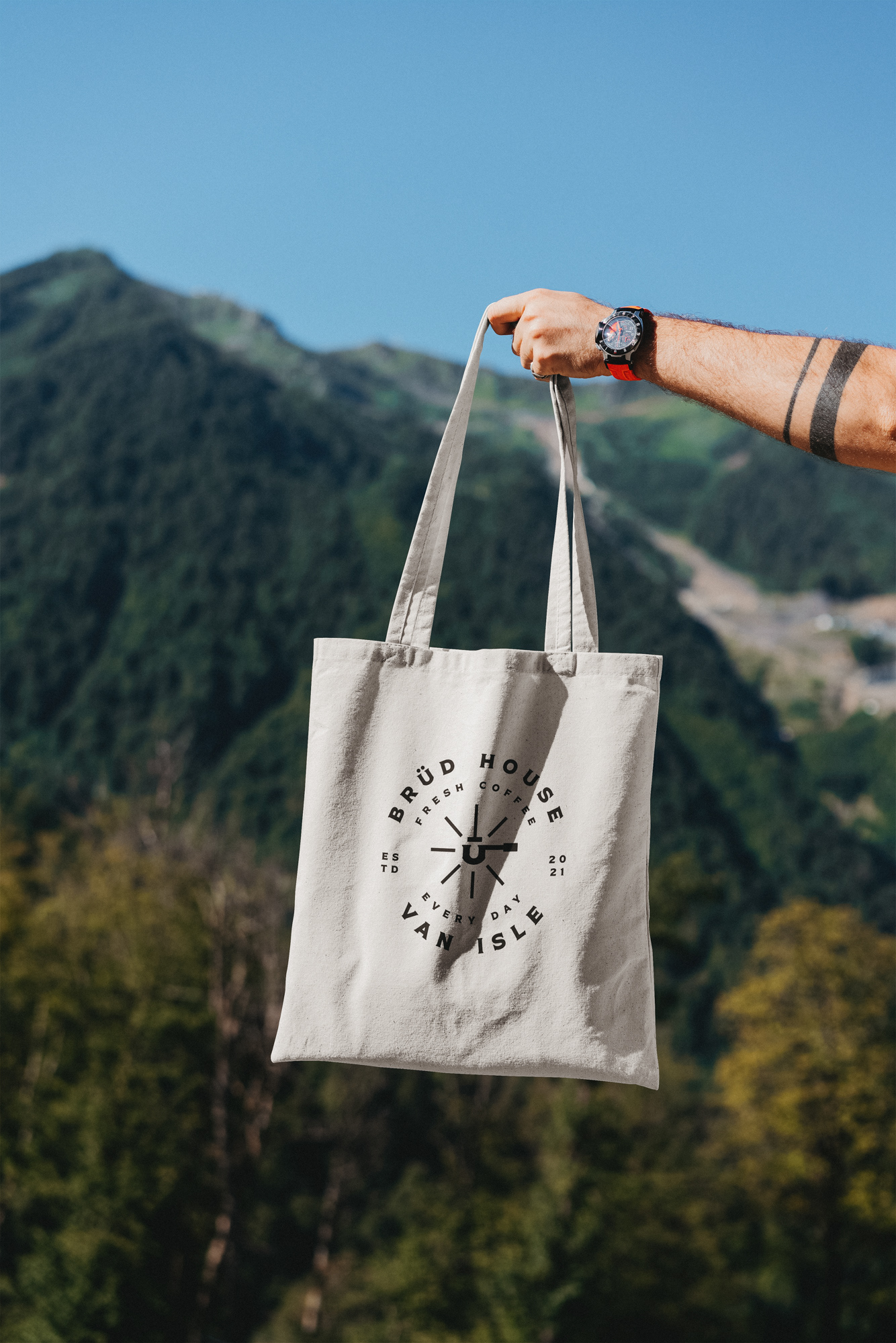
Brüd House is a community-based hub that's the place to come after your trail run or bike ride for a coffee or a beer in Vancouver Island, on the West Coast of Canada. A place where people with an active lifestyle hang out, feel warm but cool, clean and have high standards. Being a west coast, outdoorsy town, client was looking to have a community based meeting place for people post mountain bike or run/hike.
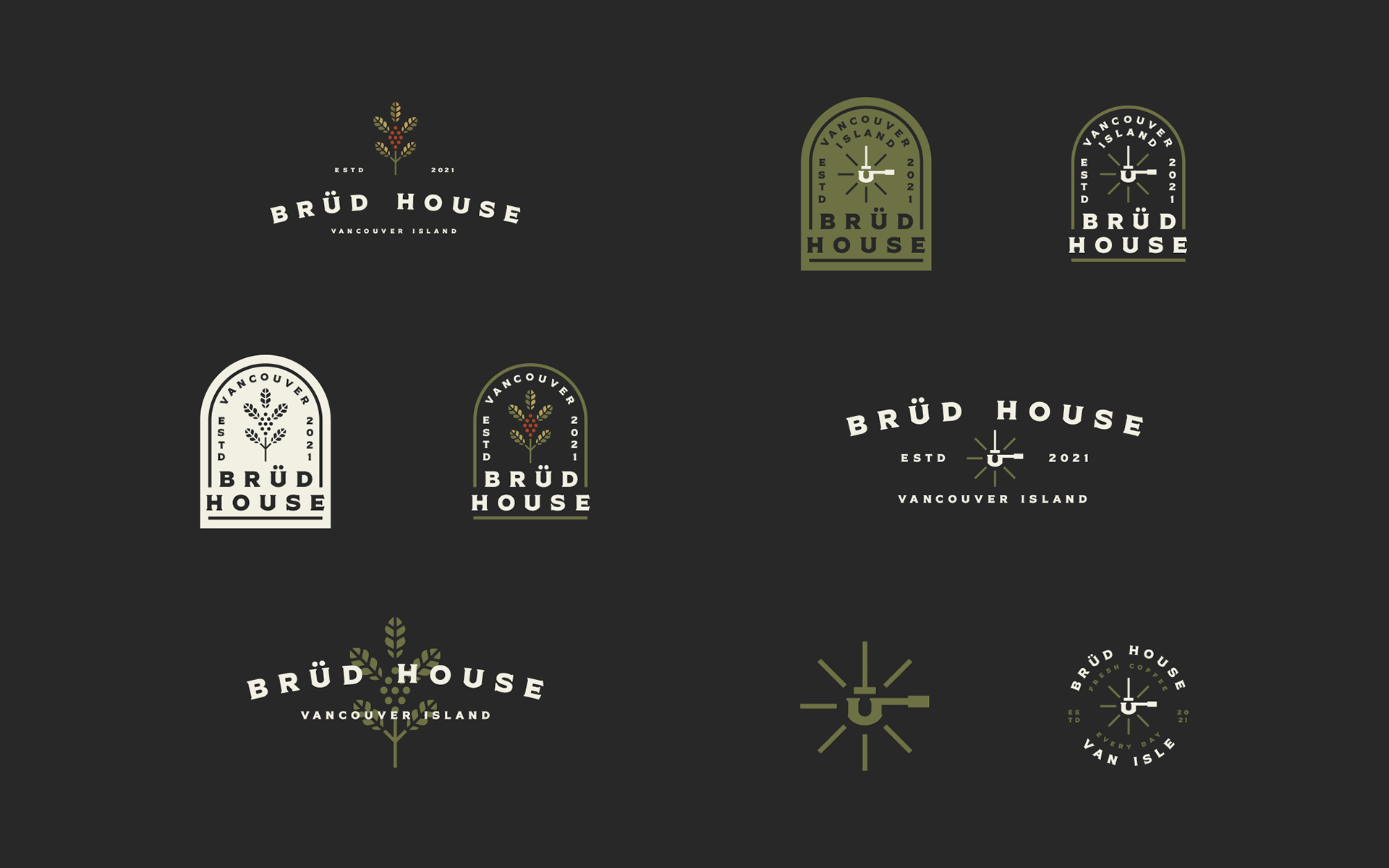
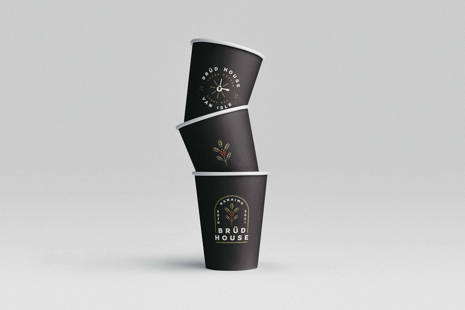
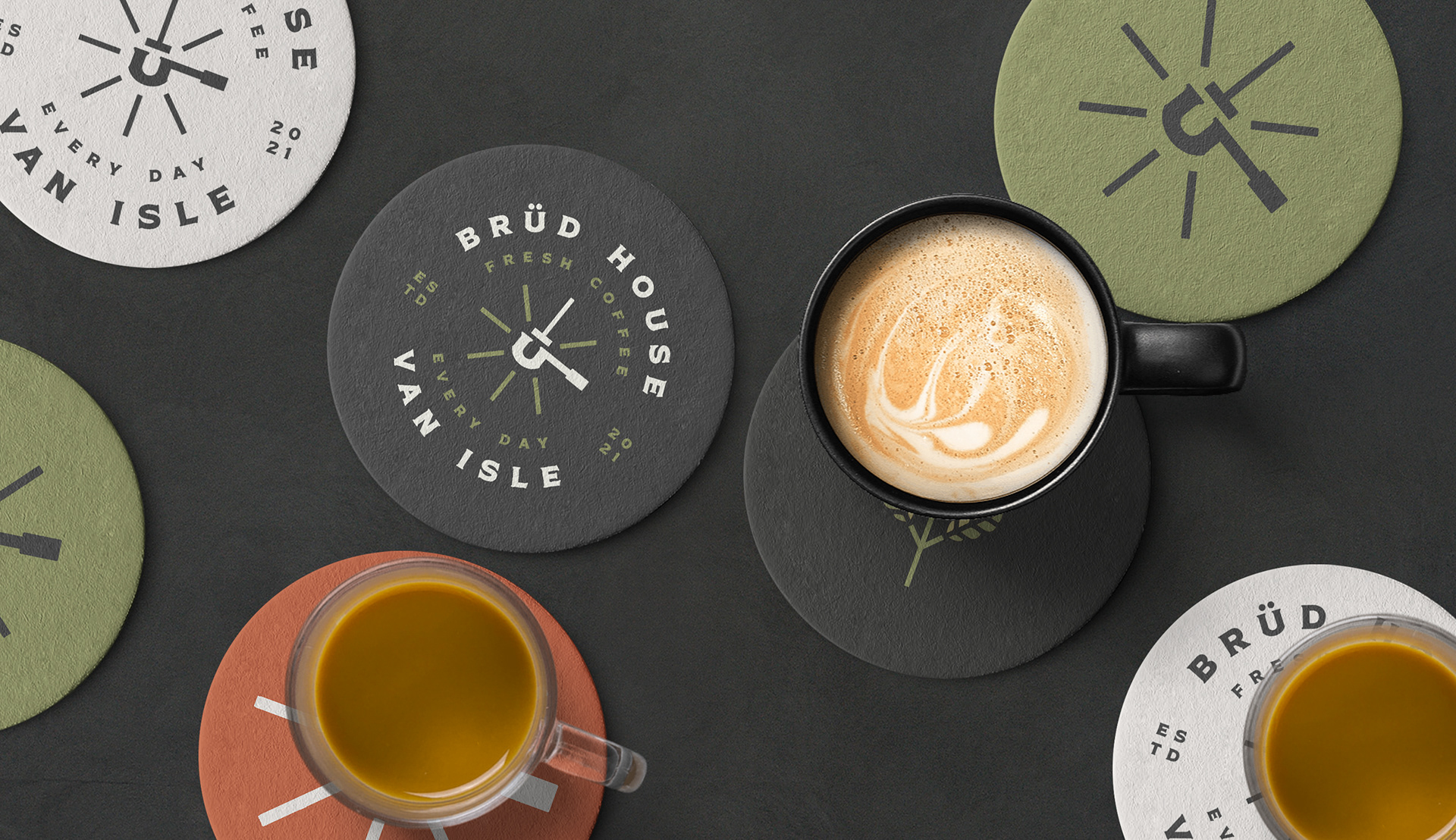
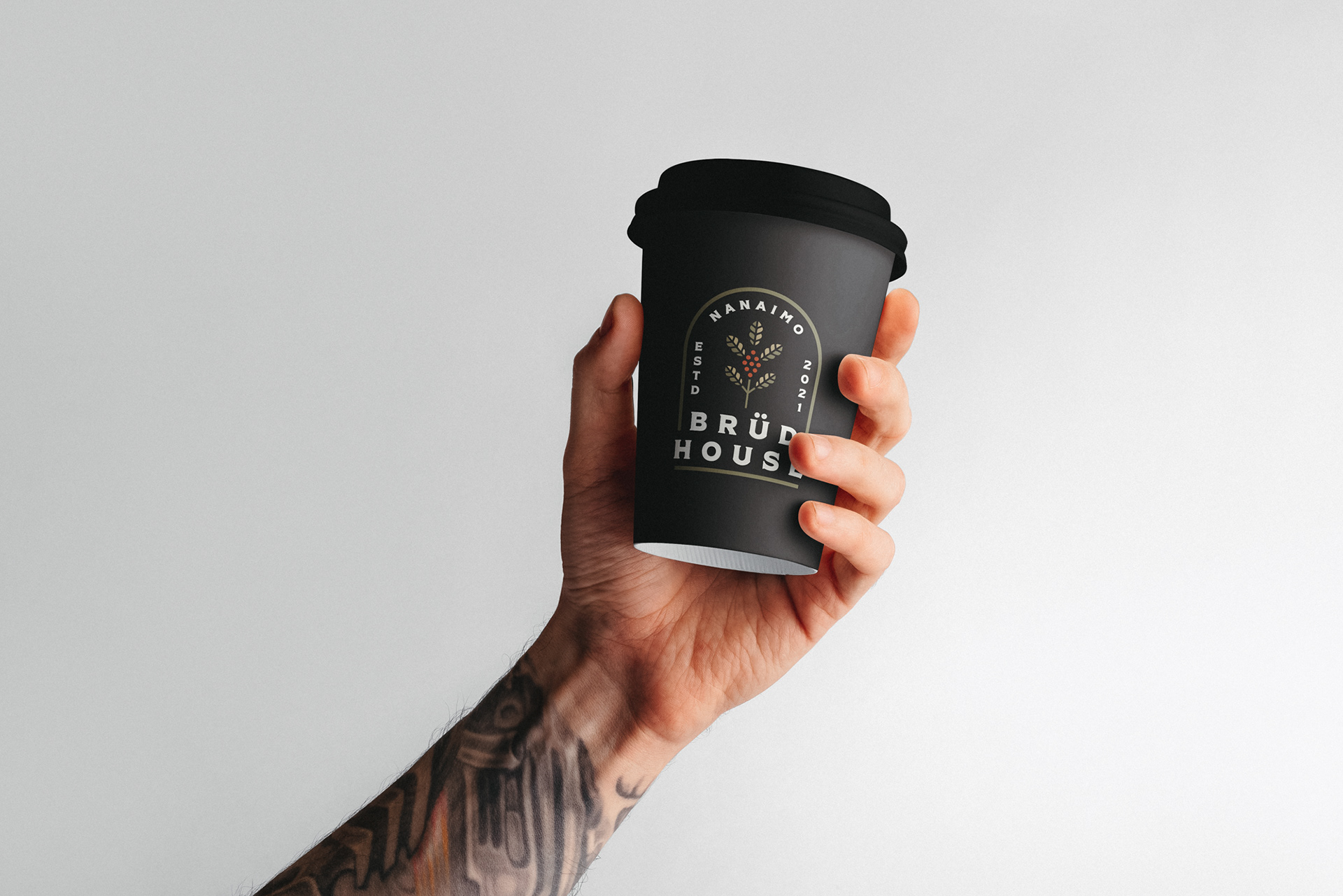
Brüd House name was chosen for the resemblance of word 'brewed'.
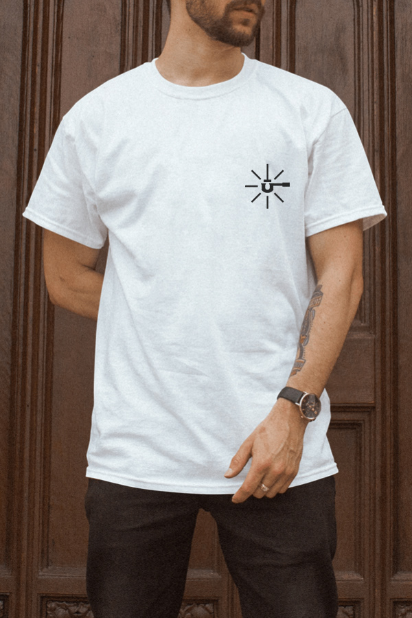
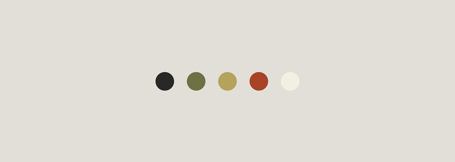
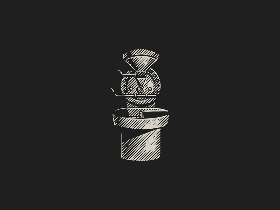
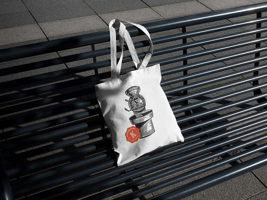
The logo was designed using a bold typeface for eye catching, classic and modern look. I wanted the logo to be recognizable and easy to use on products, so worked on a minimal coffee plant icon using a nature-inspired color palette suits for both the brand and interior design. Since the name was already short and memorable, adding a portafilter merged with letter ü icon created a fun look for the branding completed the package more youthful look.
This design was featured Logo Lounge 13 Book.
Logo Design, Branding / 2021