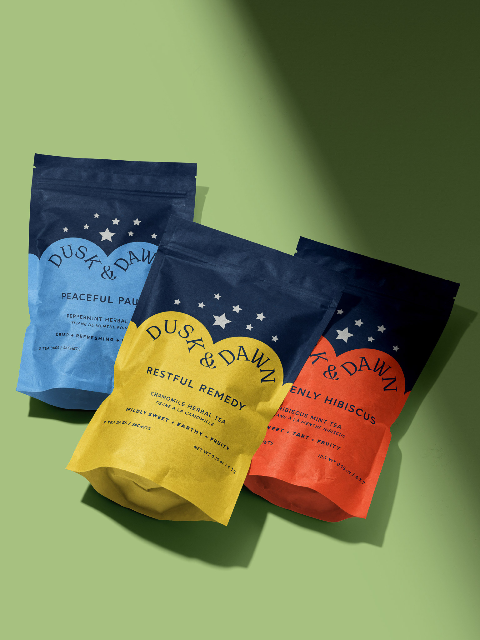
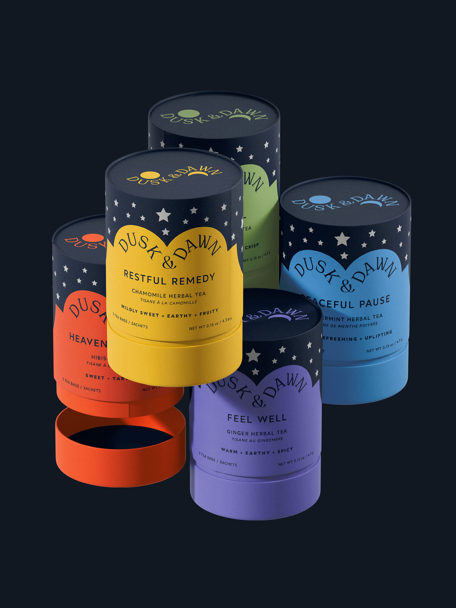
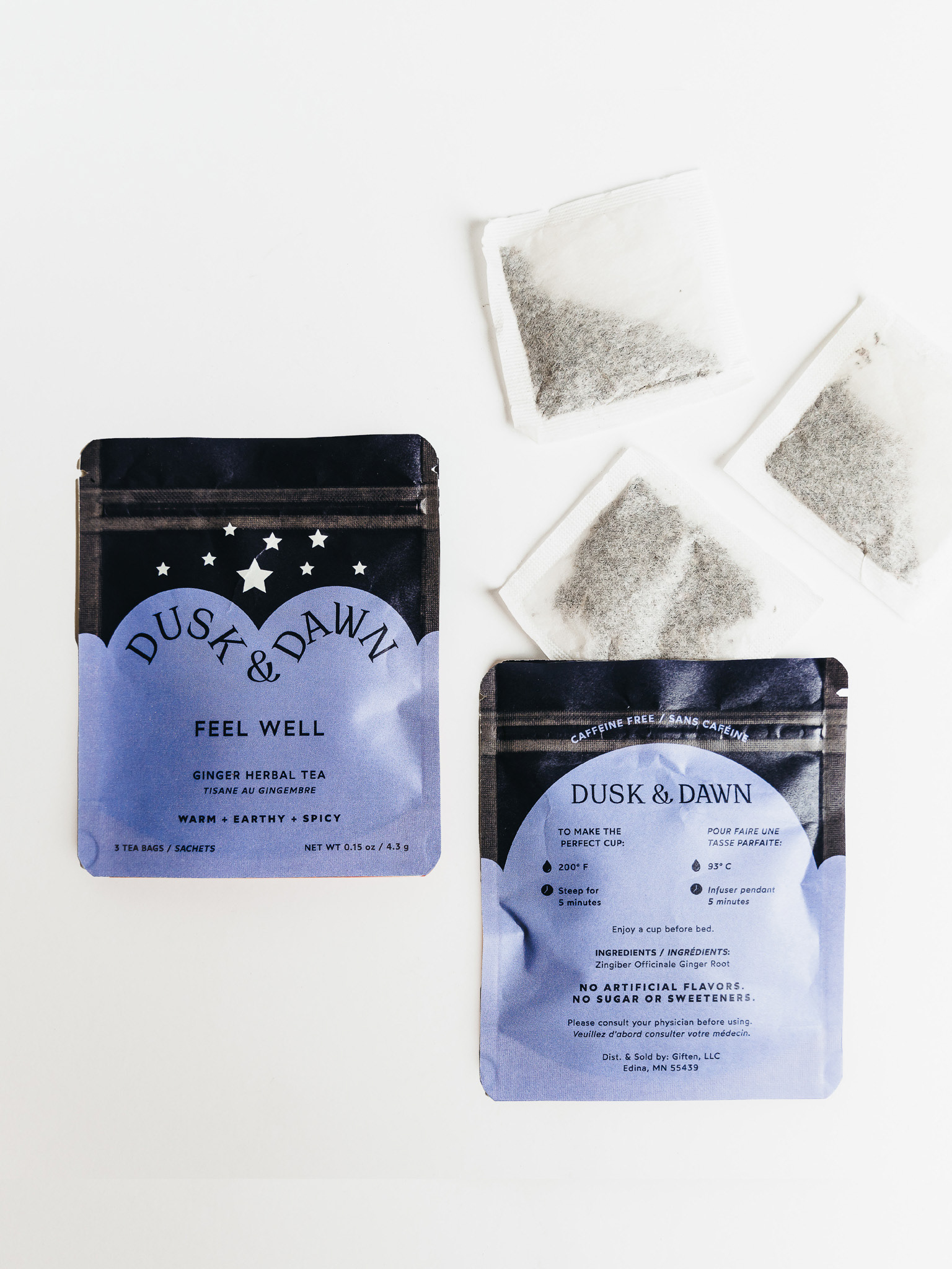
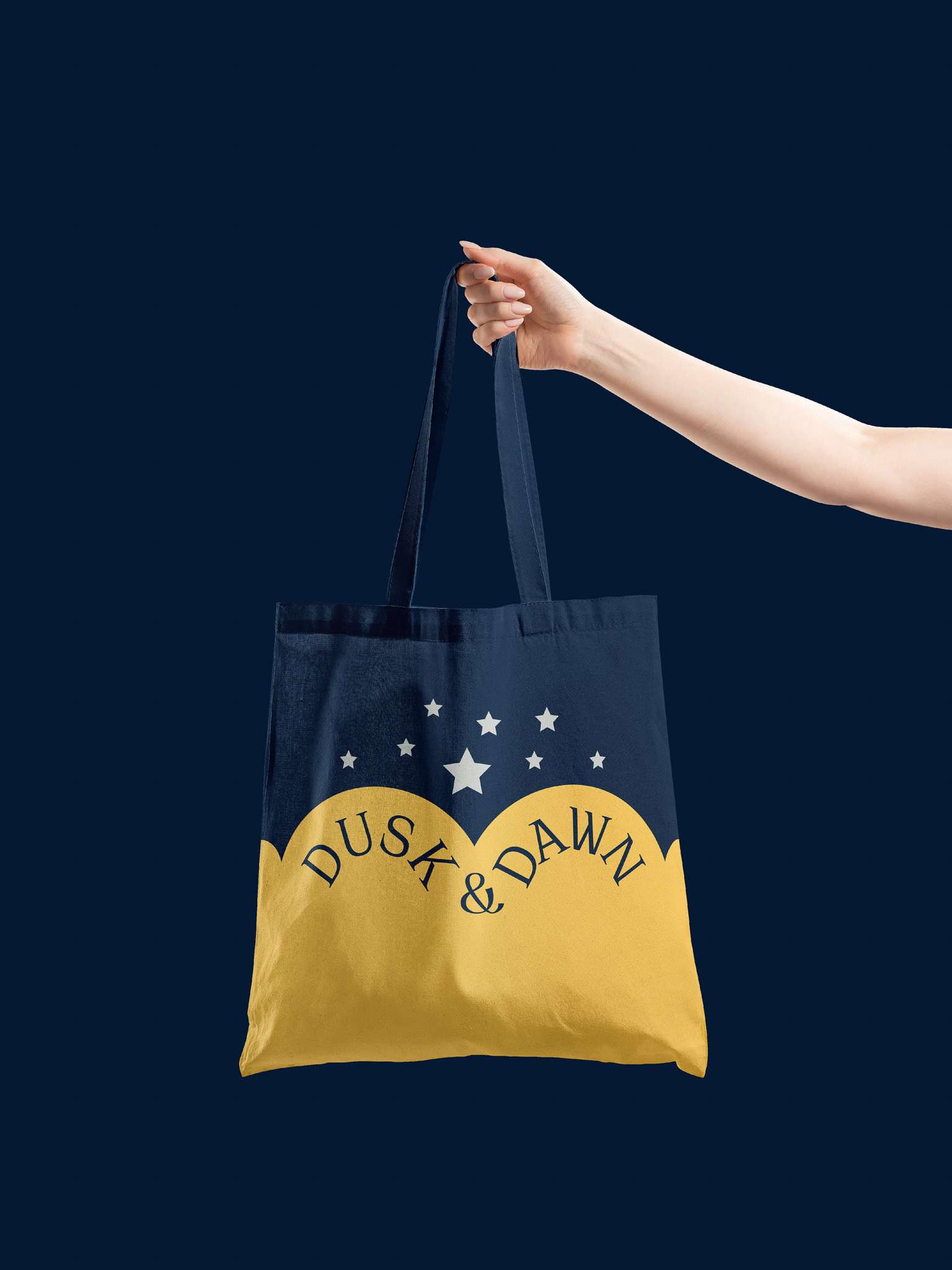
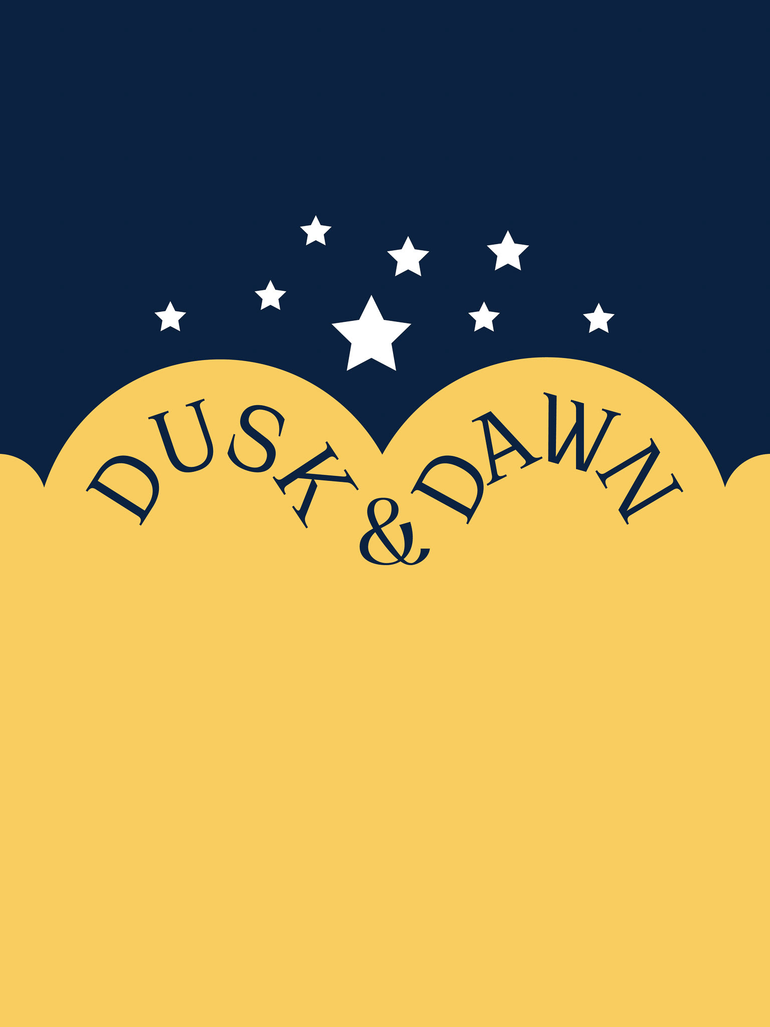
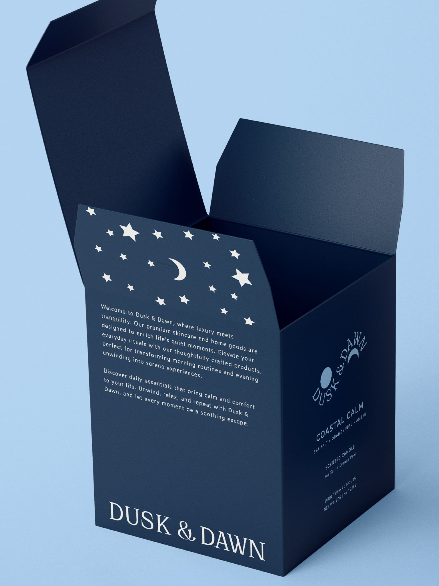
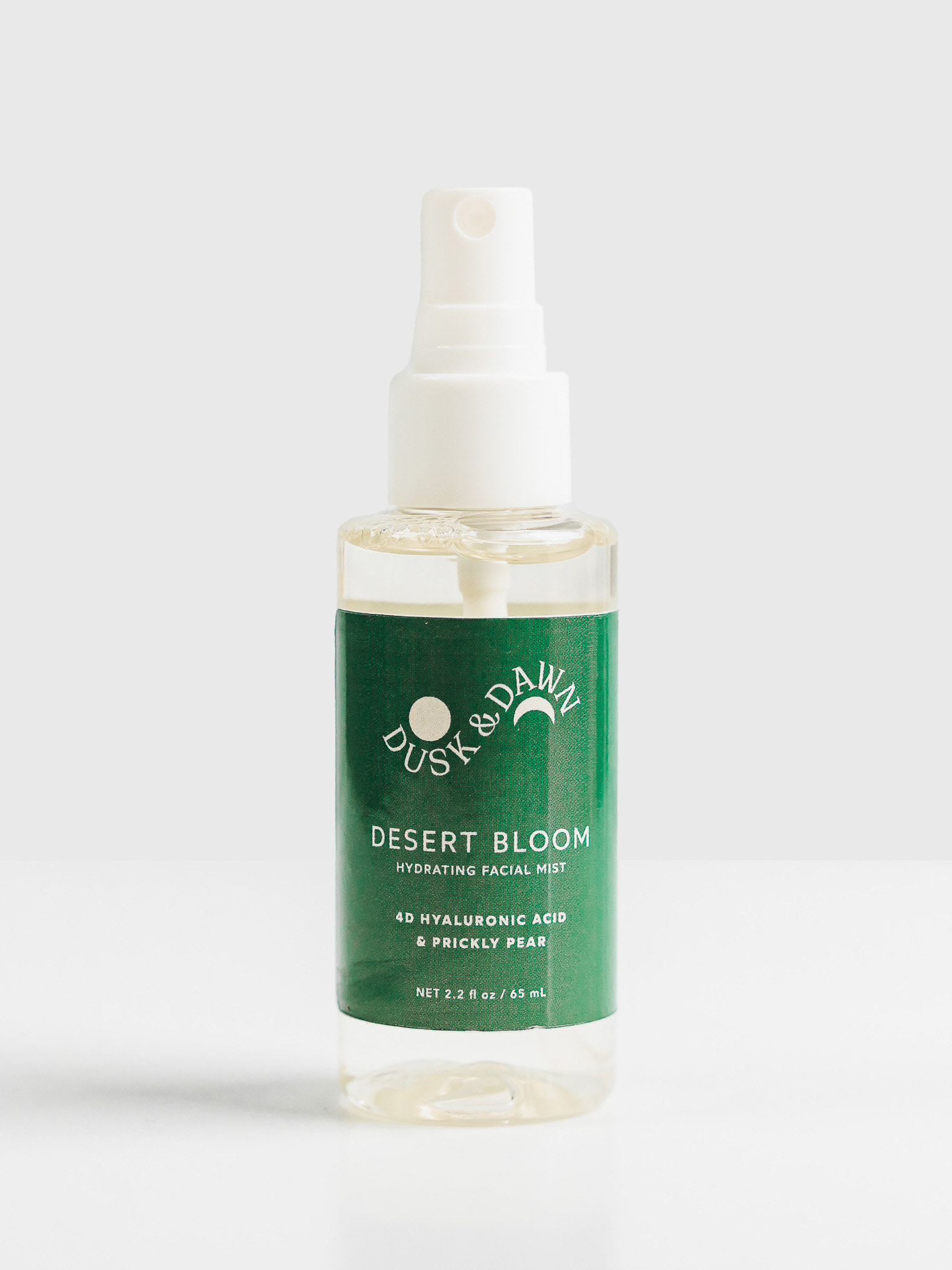
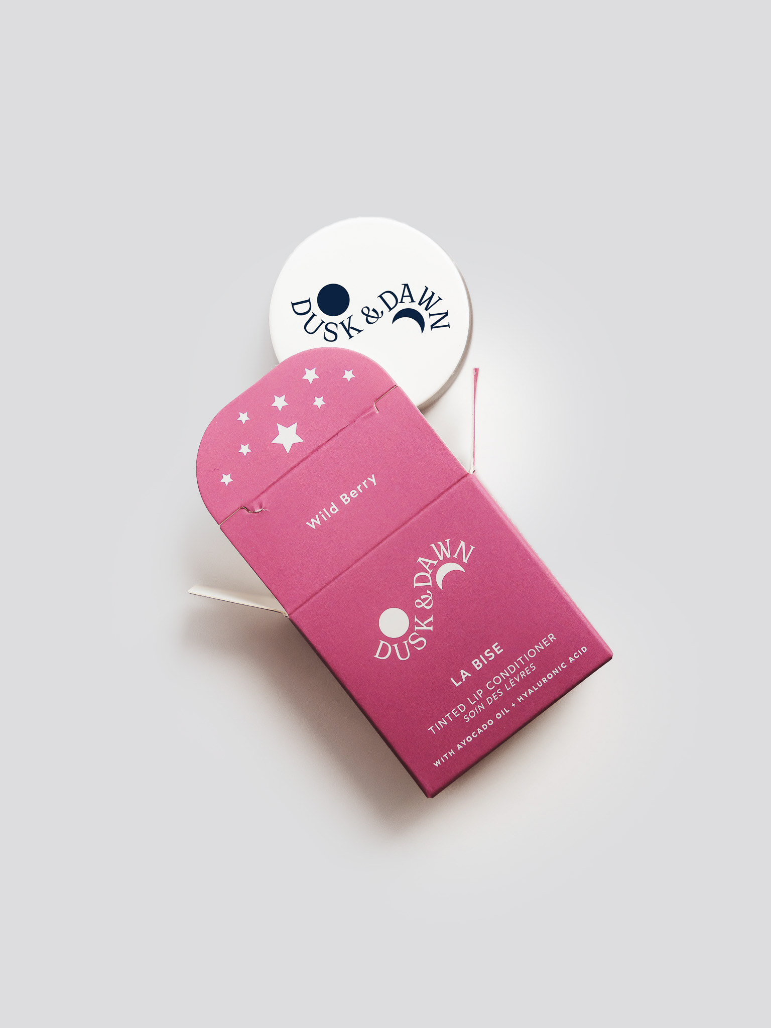
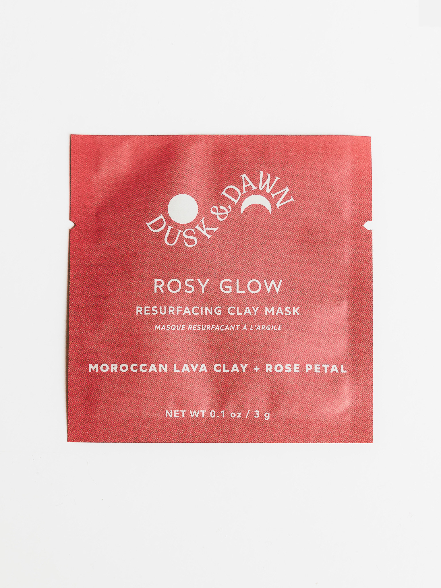
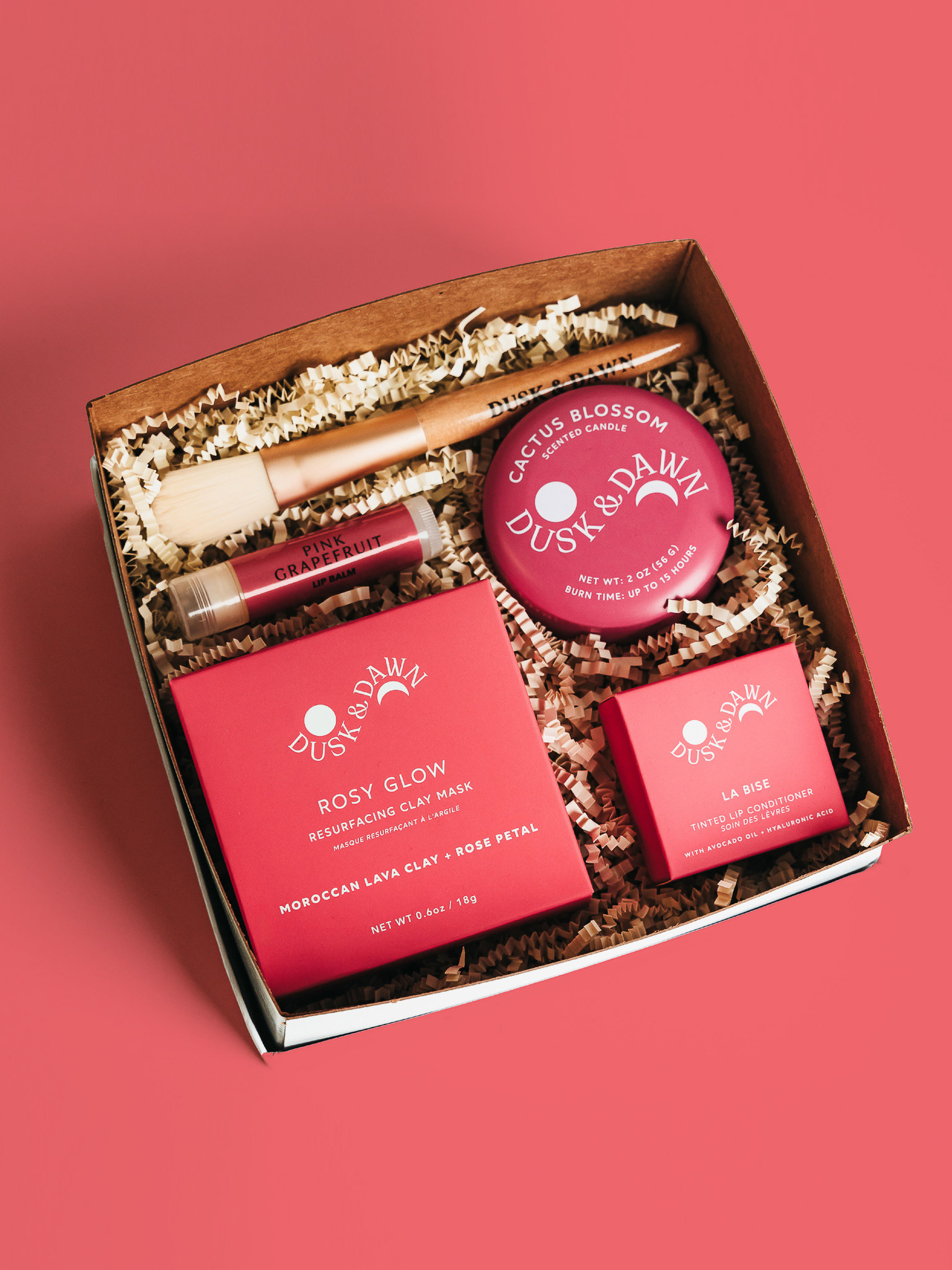
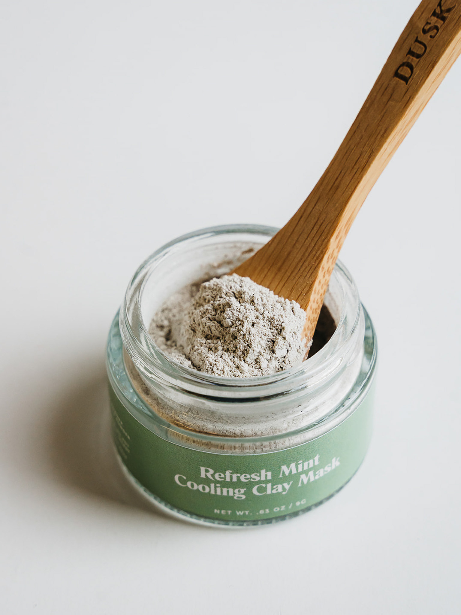
Dusk and Dawn is a self-care brand offering botanical blends designed to help individuals relax or boost their energy through the power of scents. The concept behind the Dusk and Dawn branding & packaging is to visualize the starry nights between dusk and dawn, while maintaining a color scheme that corresponds to the product ingredients across tea, candle, facial mask, and bath salt packages.
The double half-arc shapes were inspired by vintage moon calendar watch dials, where stars dominate the dark night sky in the absence of the moon. This design choice allowed for the use of color at the bottom of the packages, particularly in tea packaging, which includes pouches for loose tea and tubes for sachets.
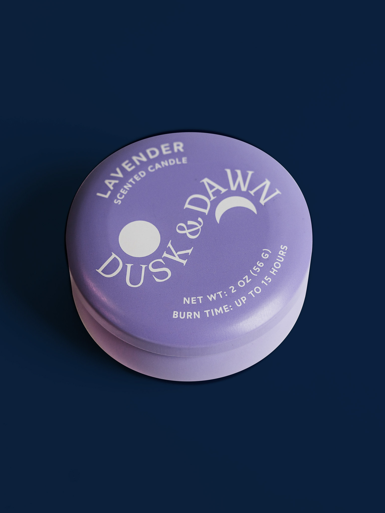
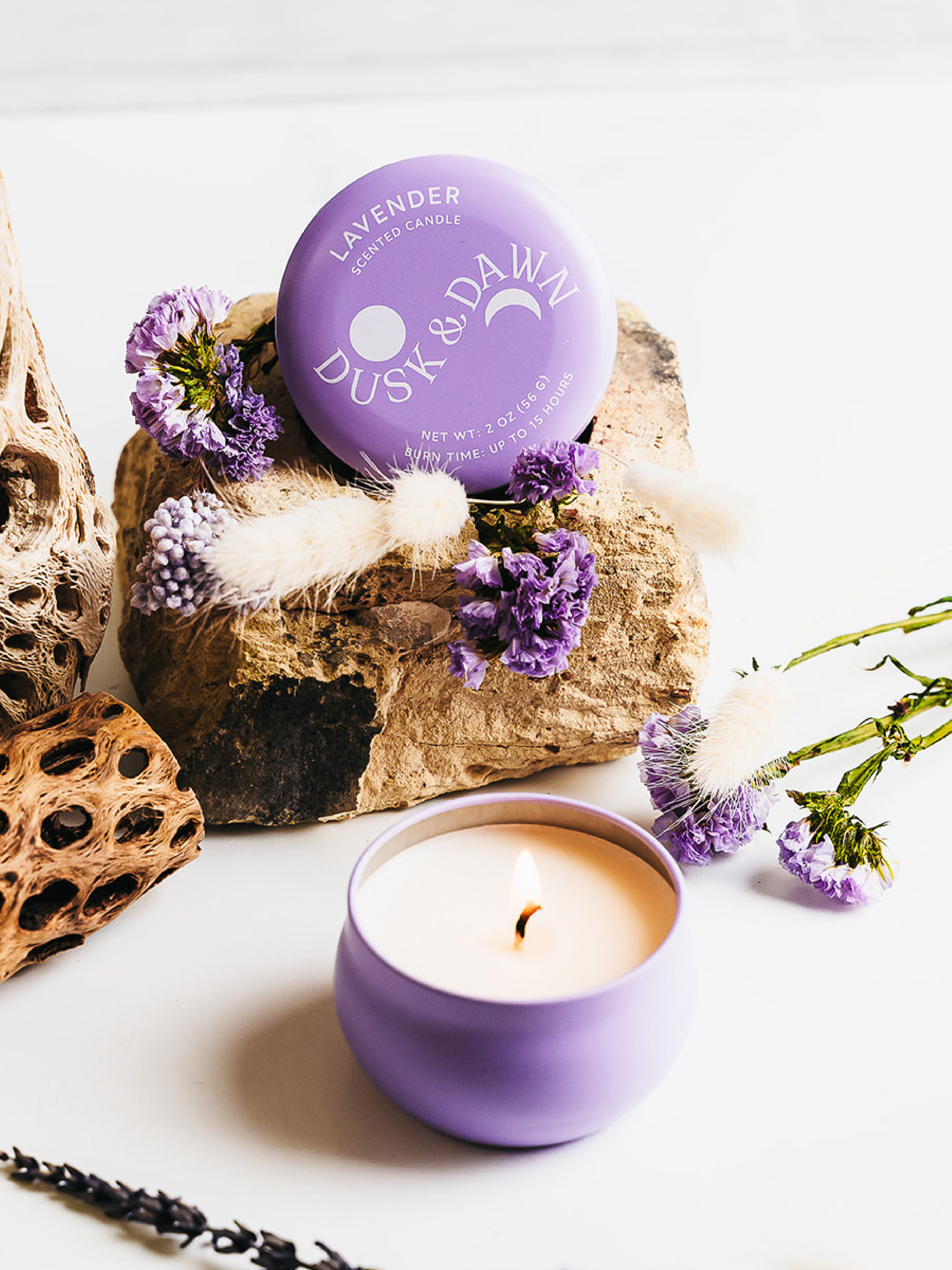
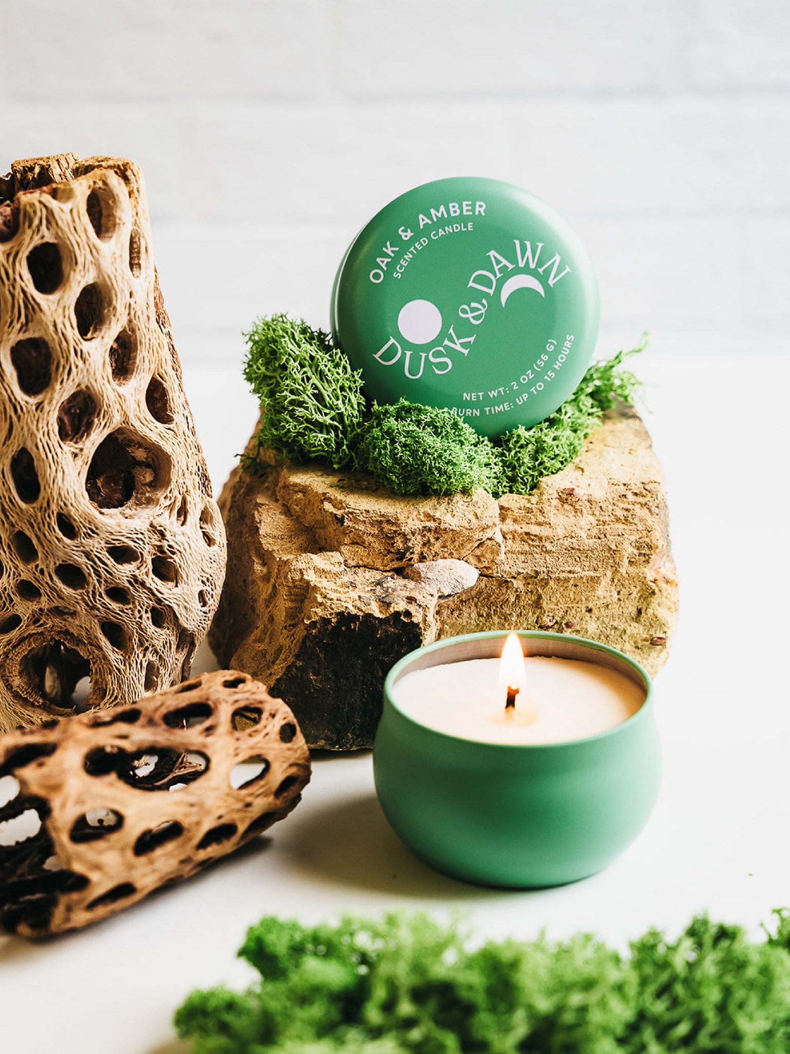
The bath salt packages employ a color scheme inverted from the tea packs, featuring navy pouches with colorful text to create a striking contrast. This differentiation is crucial for gift sets, ensuring that similar color packages appear interesting side by side without overpowering each other. This coordinated color scheme extends to the candle boxes, with large candles housed in boxes and trial candles in full-color tins.
