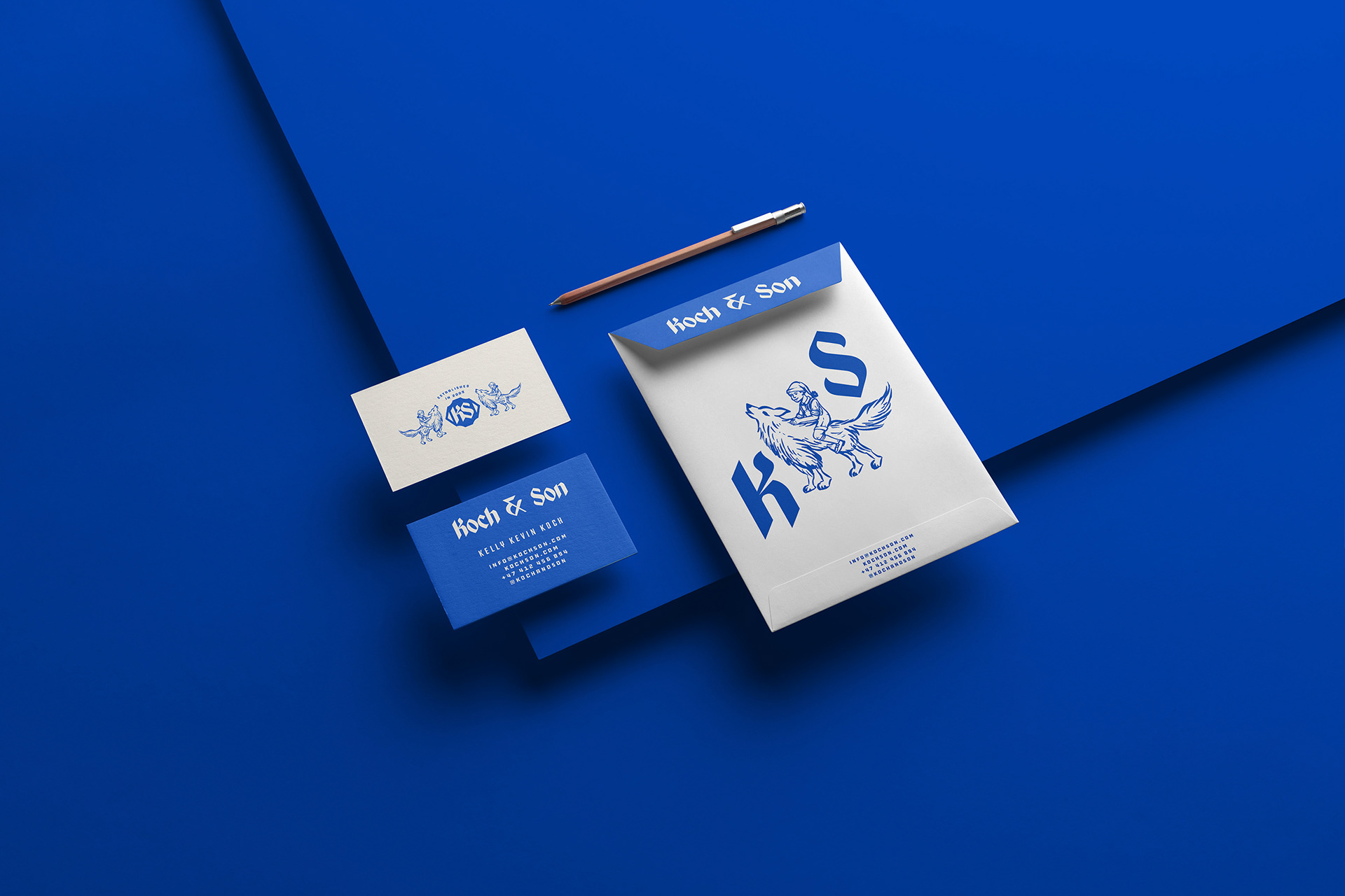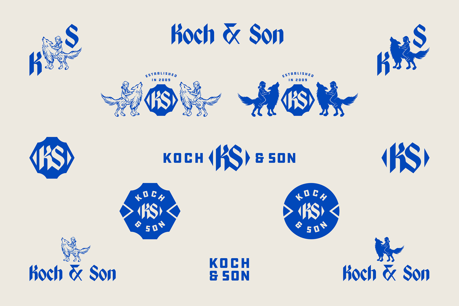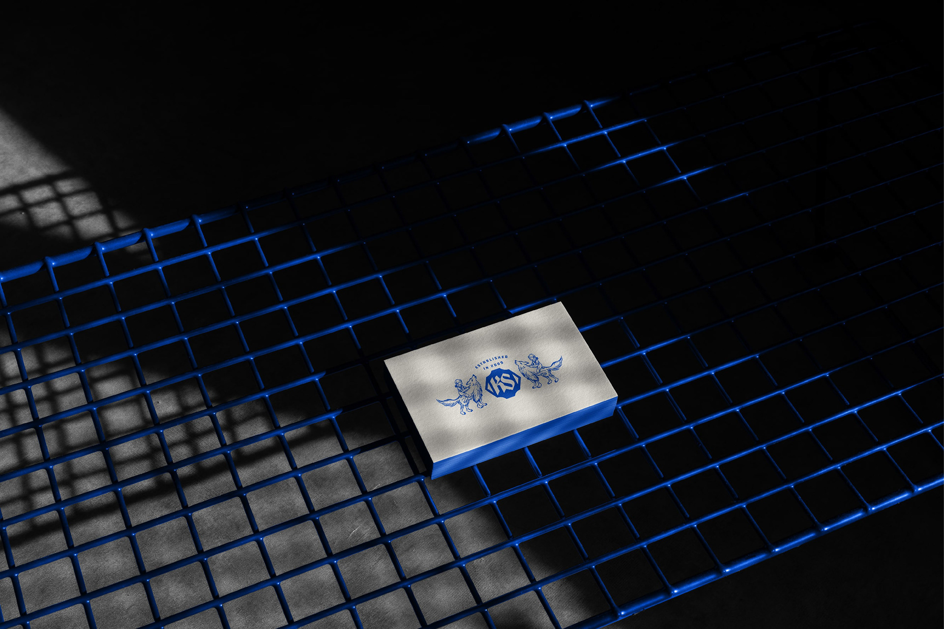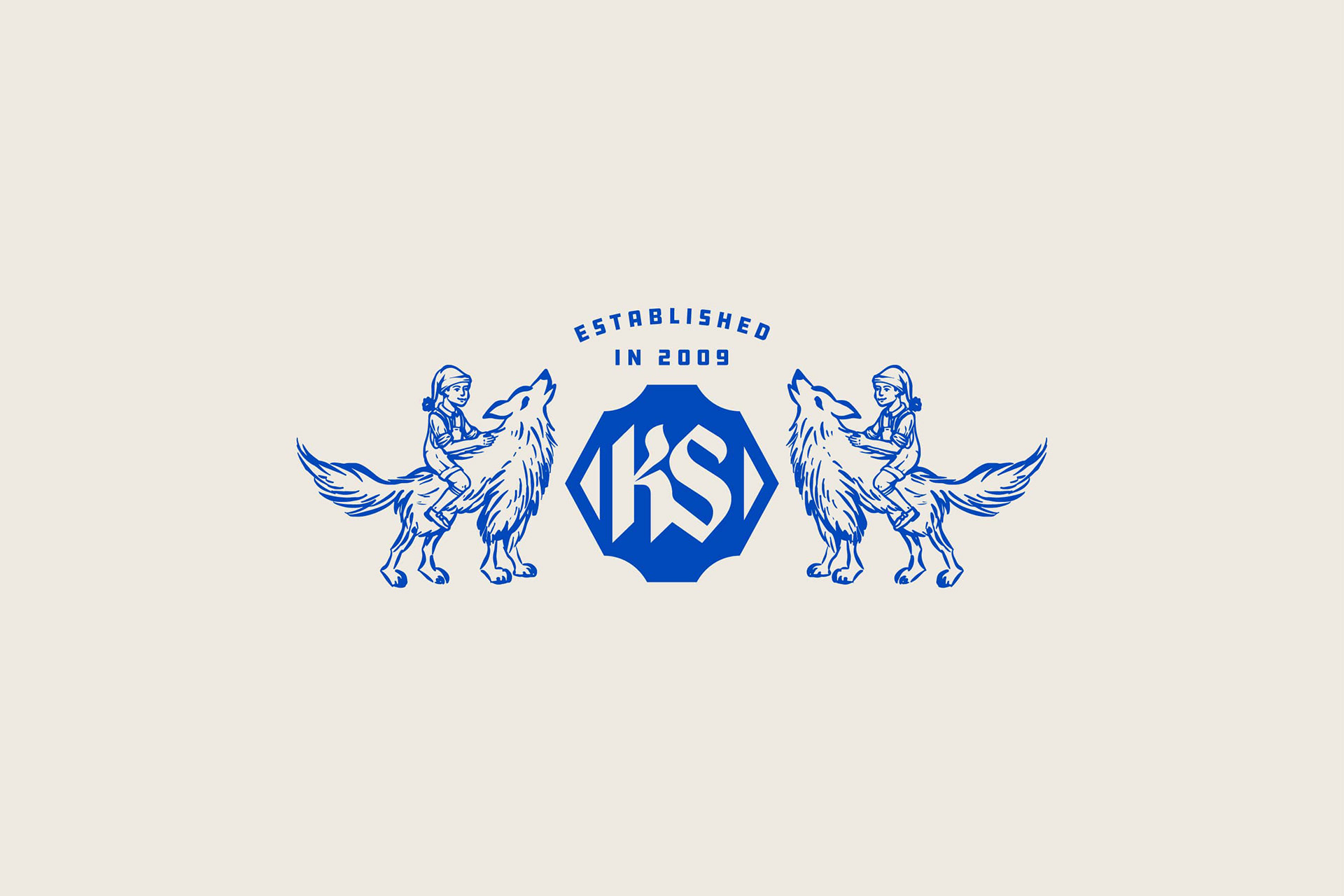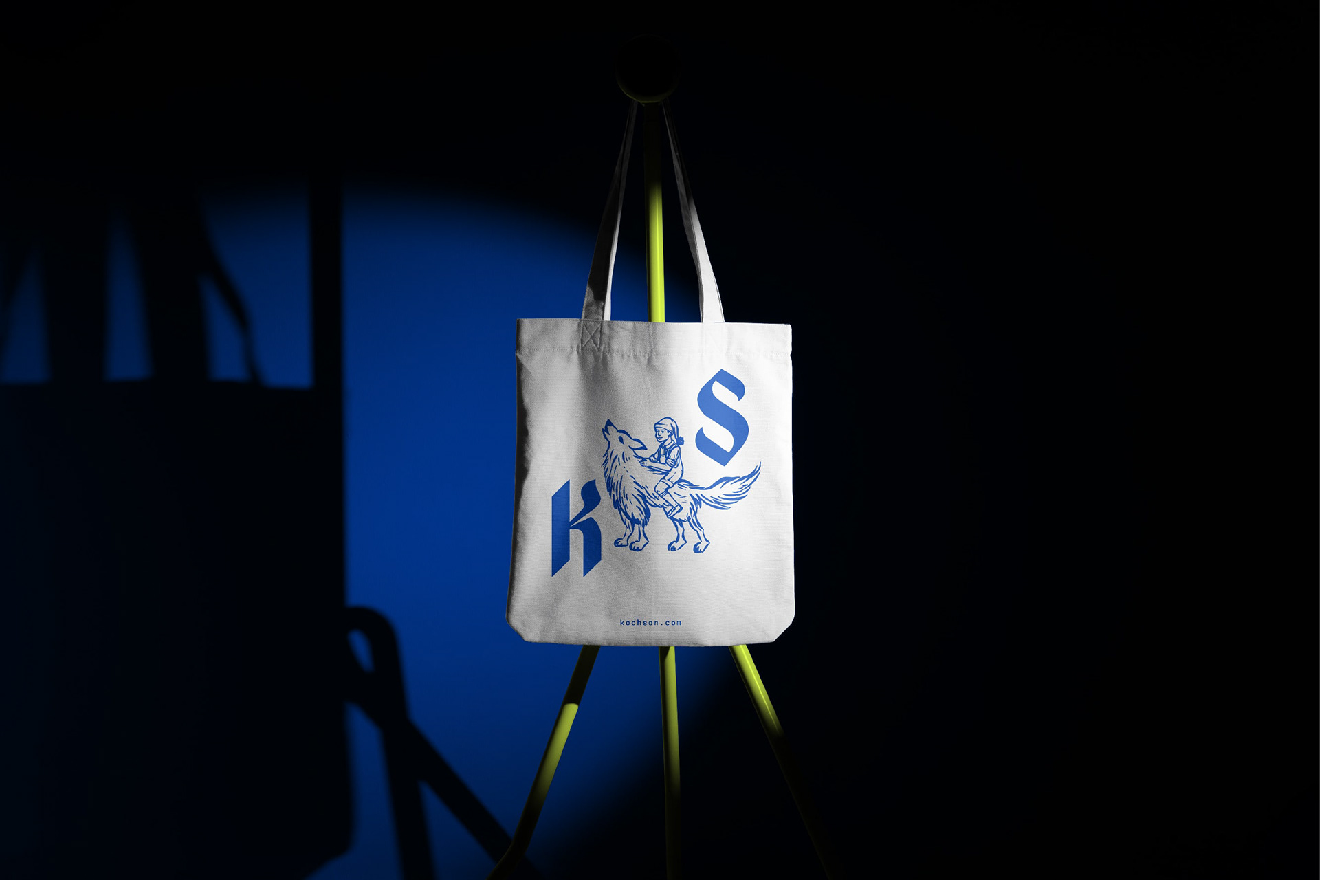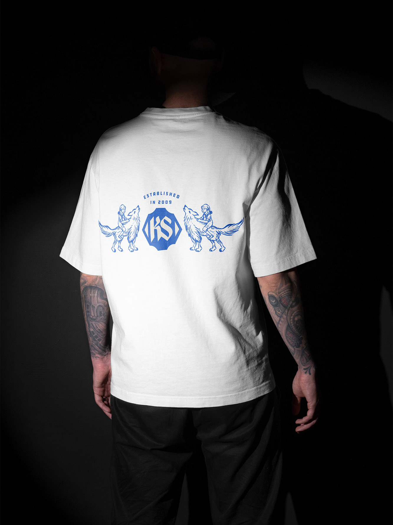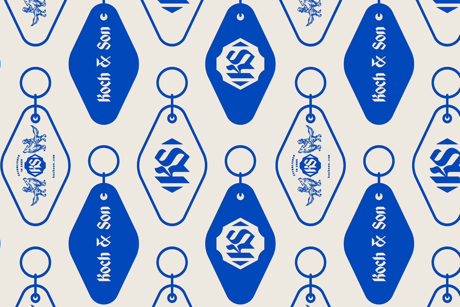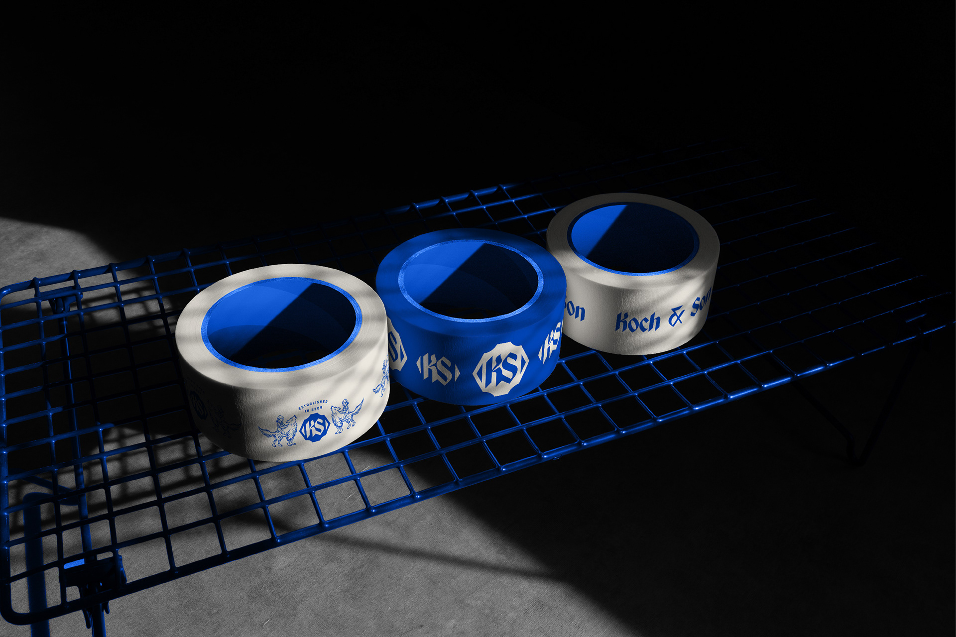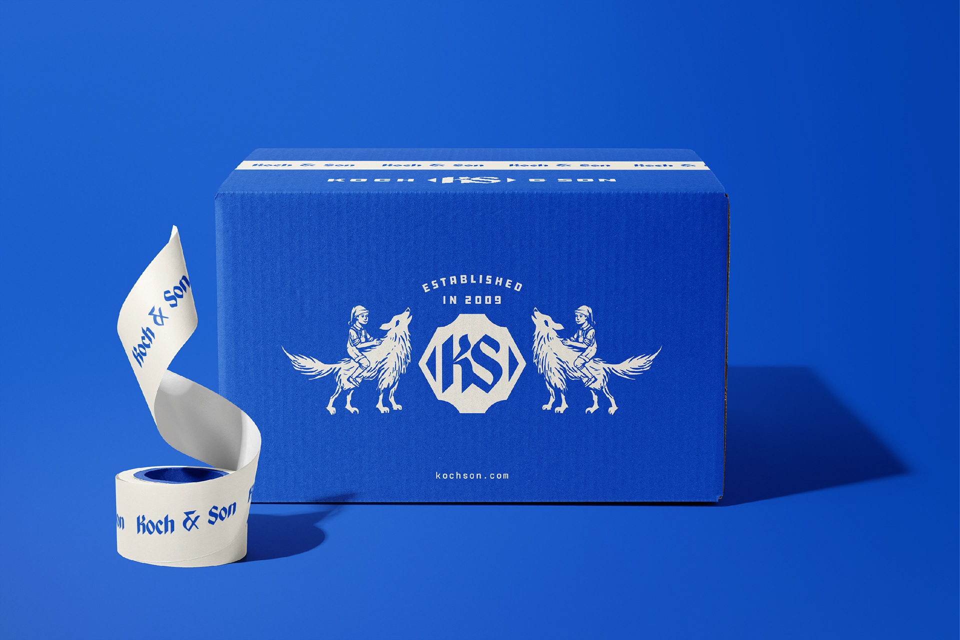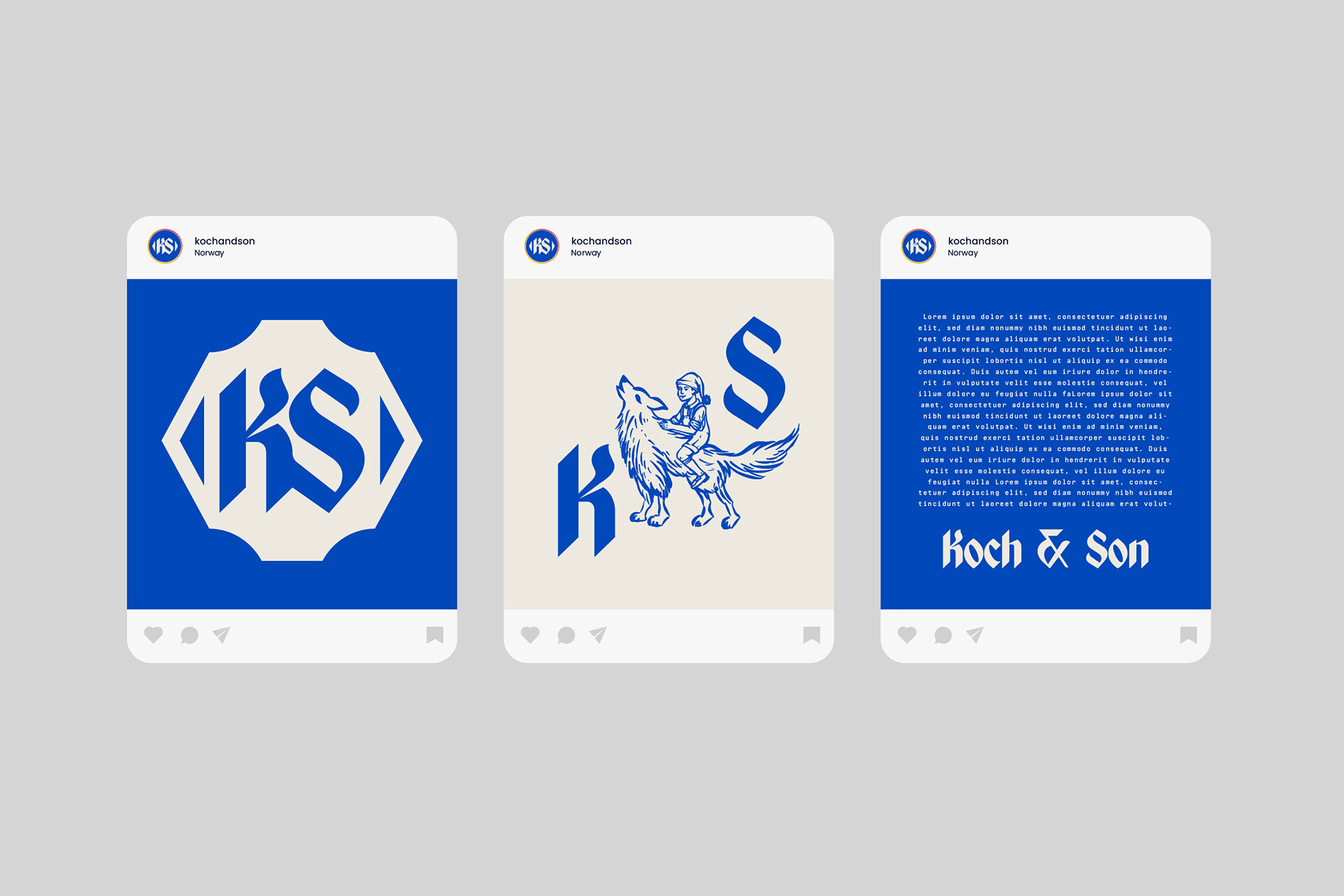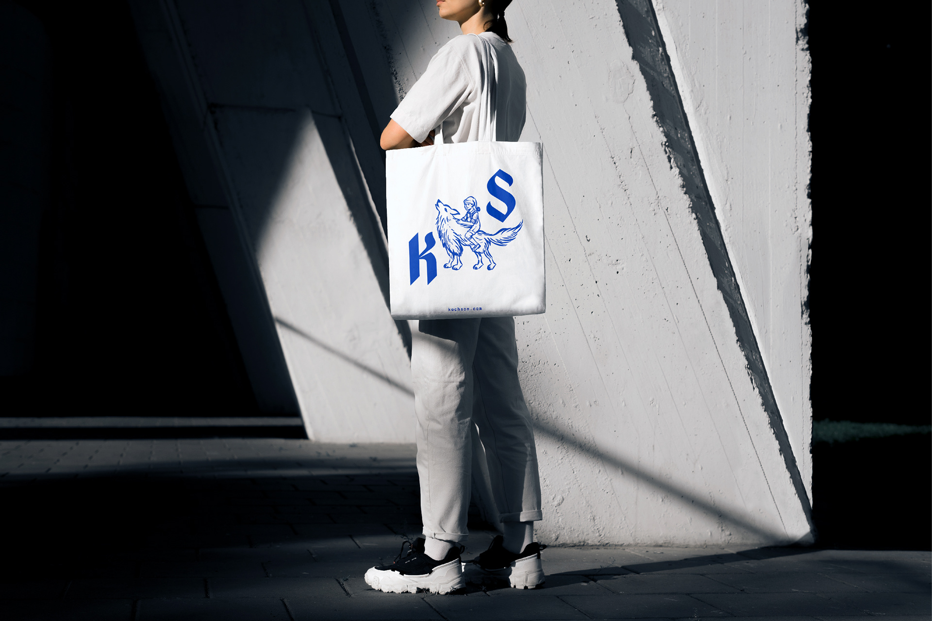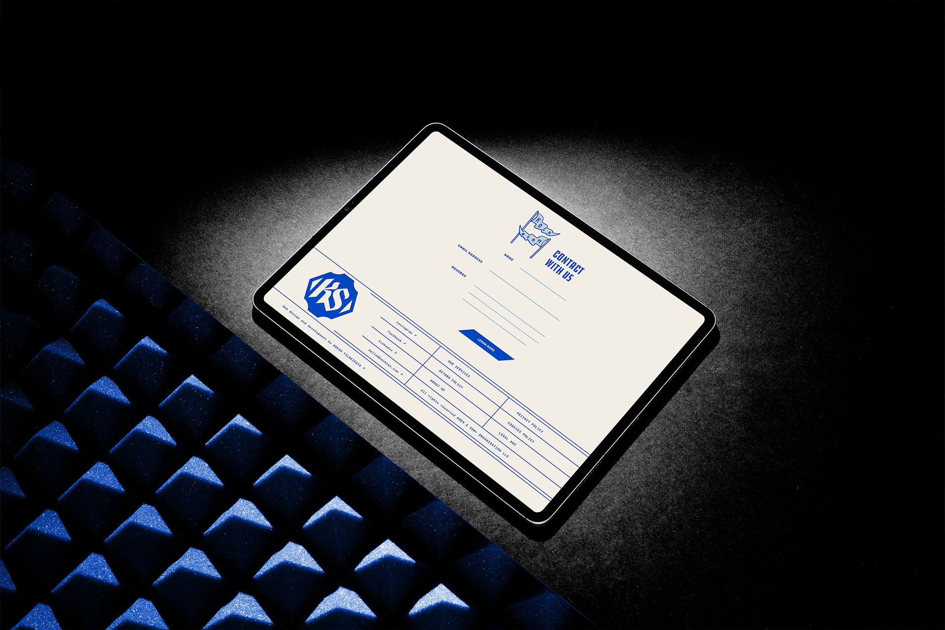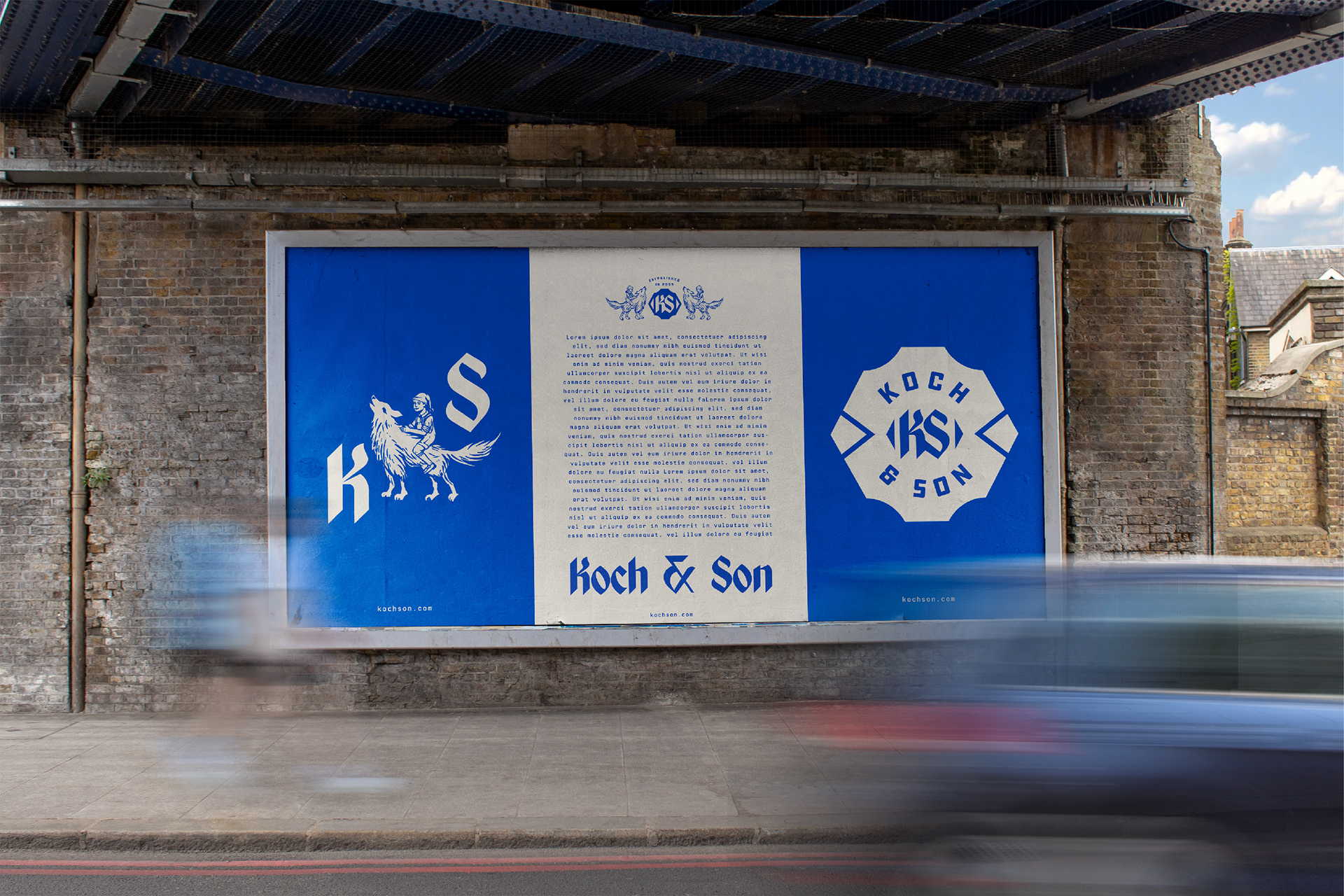
Koch & Son's brand identity draws inspiration from the founder's son, resulting in a unique name and logo. The logo features an illustration of a toddler riding a wolf with a stocking hat and dungarees, infused with a touch of magic. This imagery represents adventure, strength, and a sense of wonder on this personal branding.
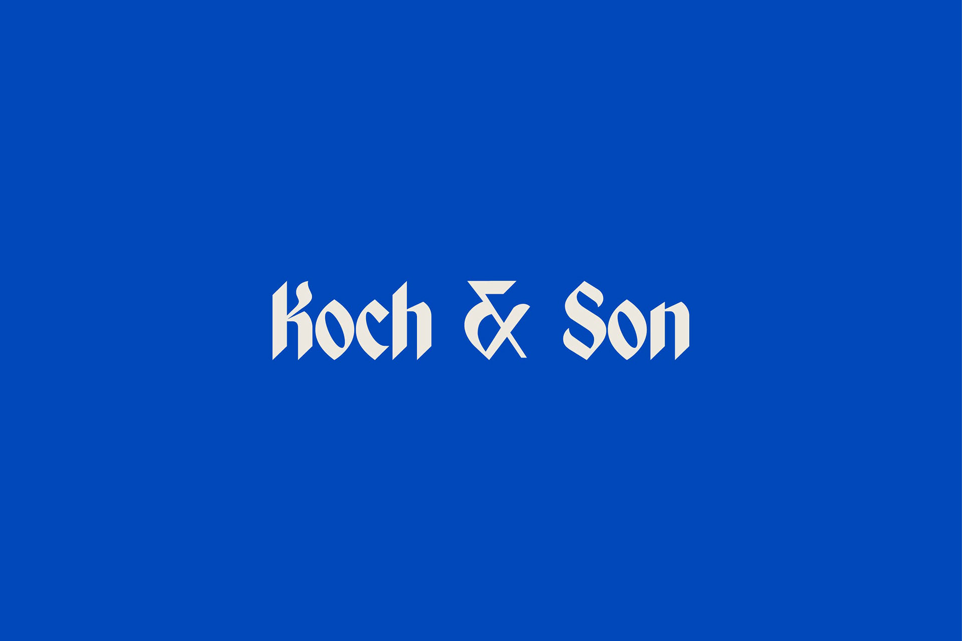
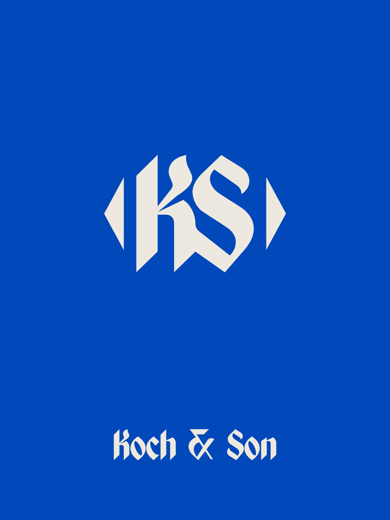
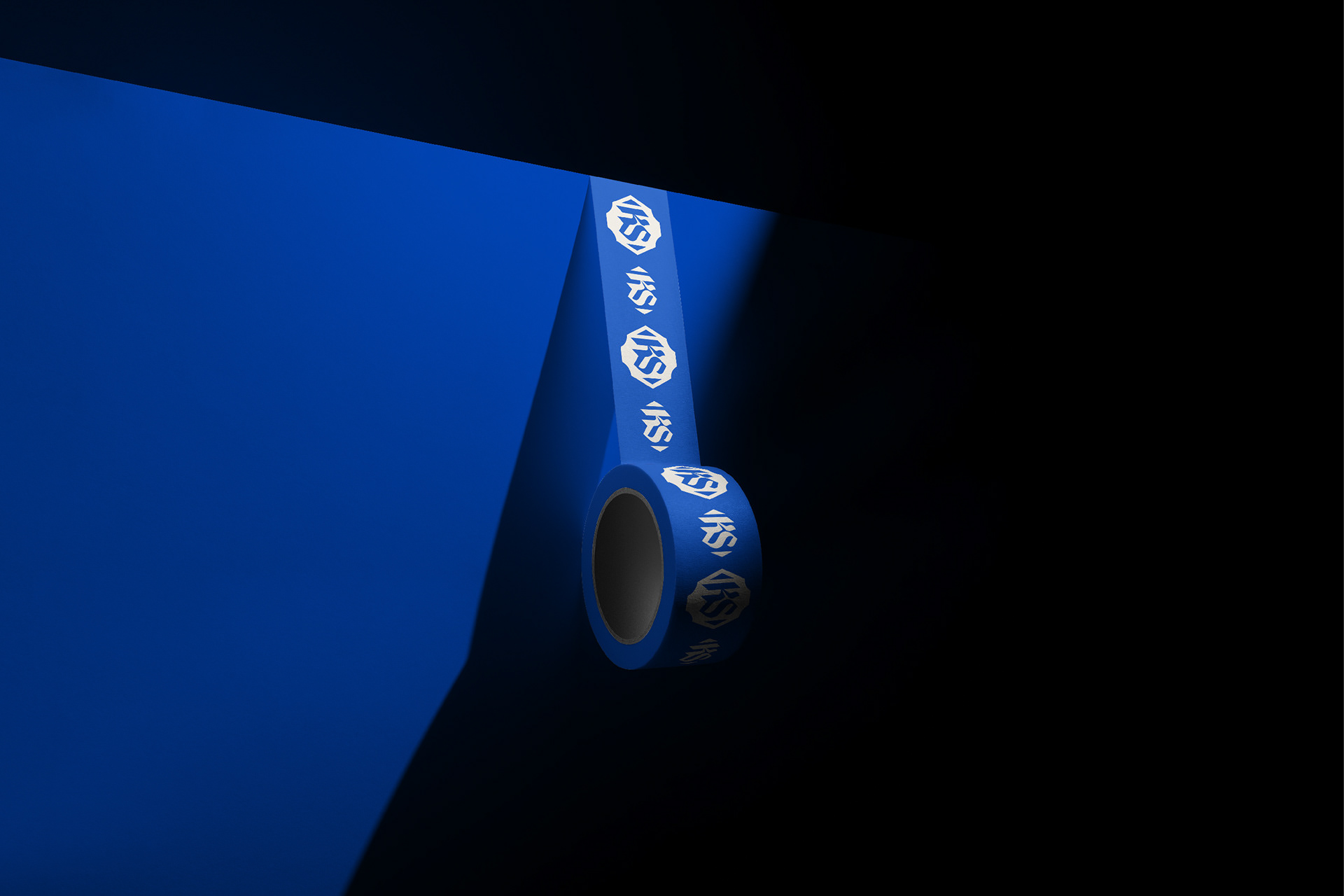
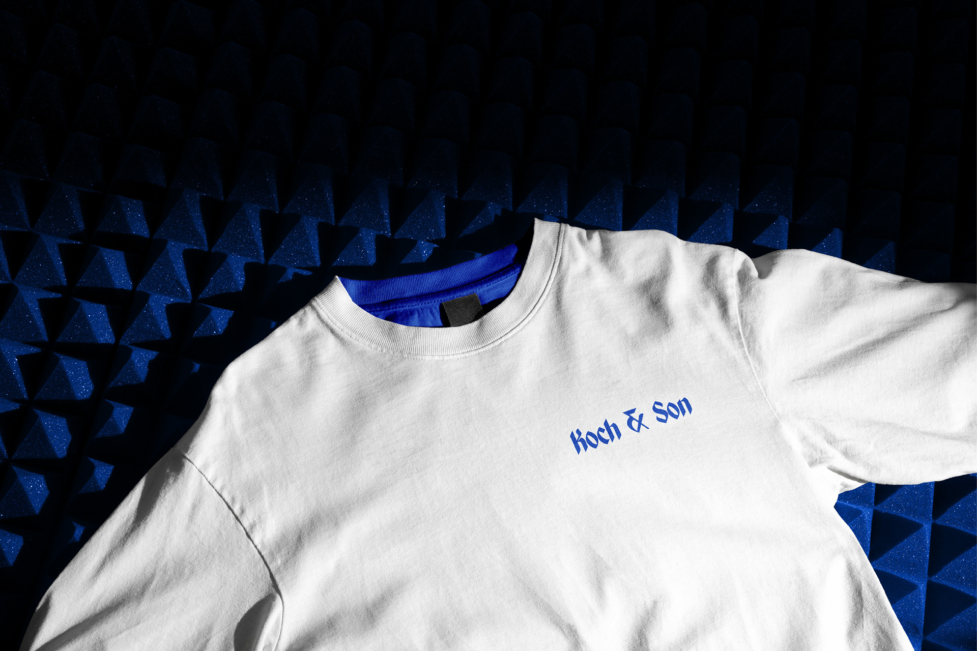
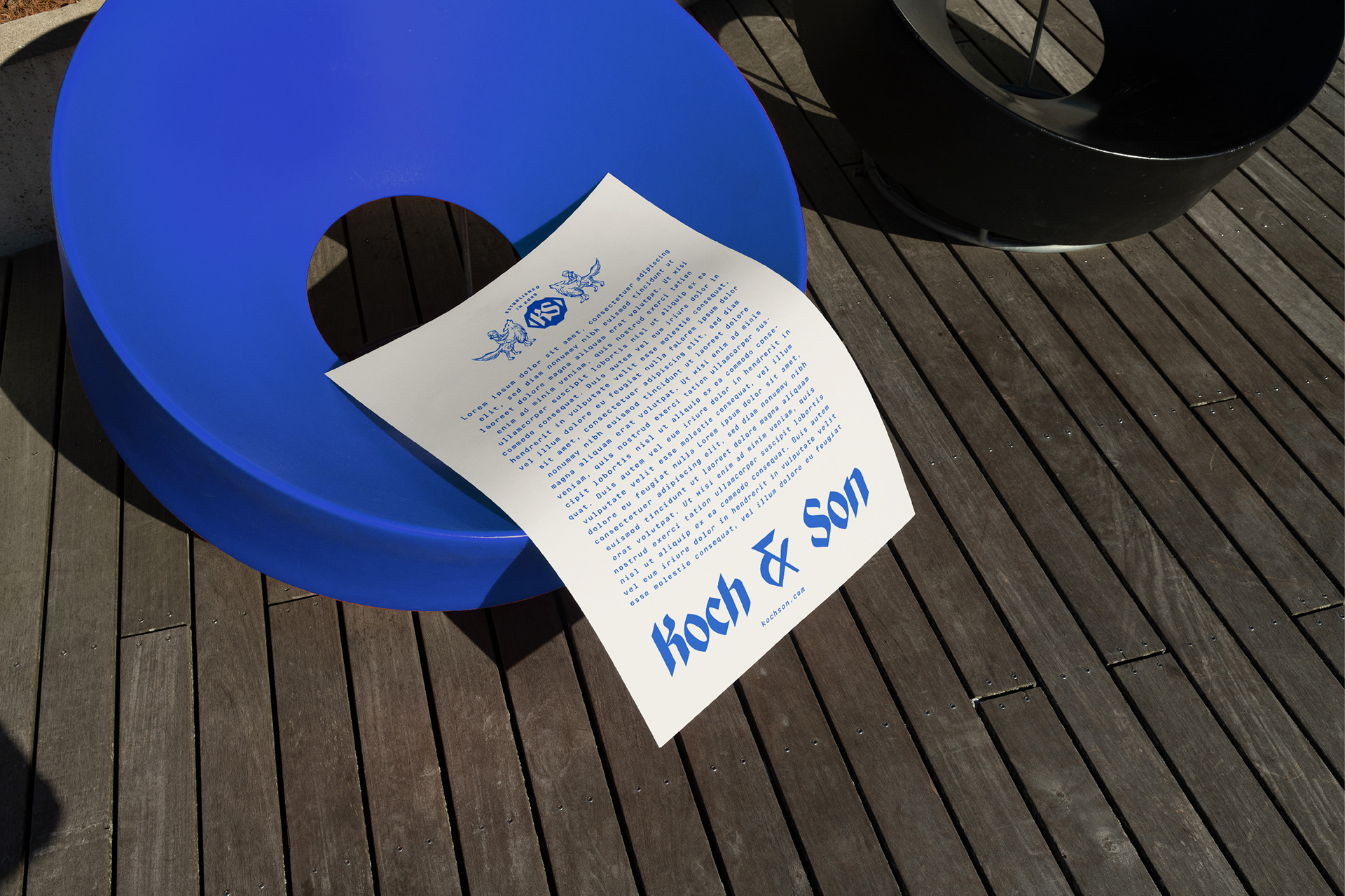
To further enhance the brand's identity, a KS monogram is incorporated within a distinctive badge shape, used with the toddler illustration, we've created a logo mark that is close to a coat of arms. To complement the logo, captivating blackletter typography is used. Blackletter, also known as Gothic script, is a classic and ornate style of typography that adds a sense of timelessness and sophistication.
In terms of color, a royal blue is chosen to make the logo truly stand out. Royal blue is associated with royalty, trust, and authority. It conveys a sense of prestige and exclusivity. The blue color contrasts beautifully against a cream background, creating a visually striking combination that grabs attention.
Awards
World Brand Design Awards 2023 - Silver Award
Featured on World Brand Design
Web Design: Hakan Yılmazkaya