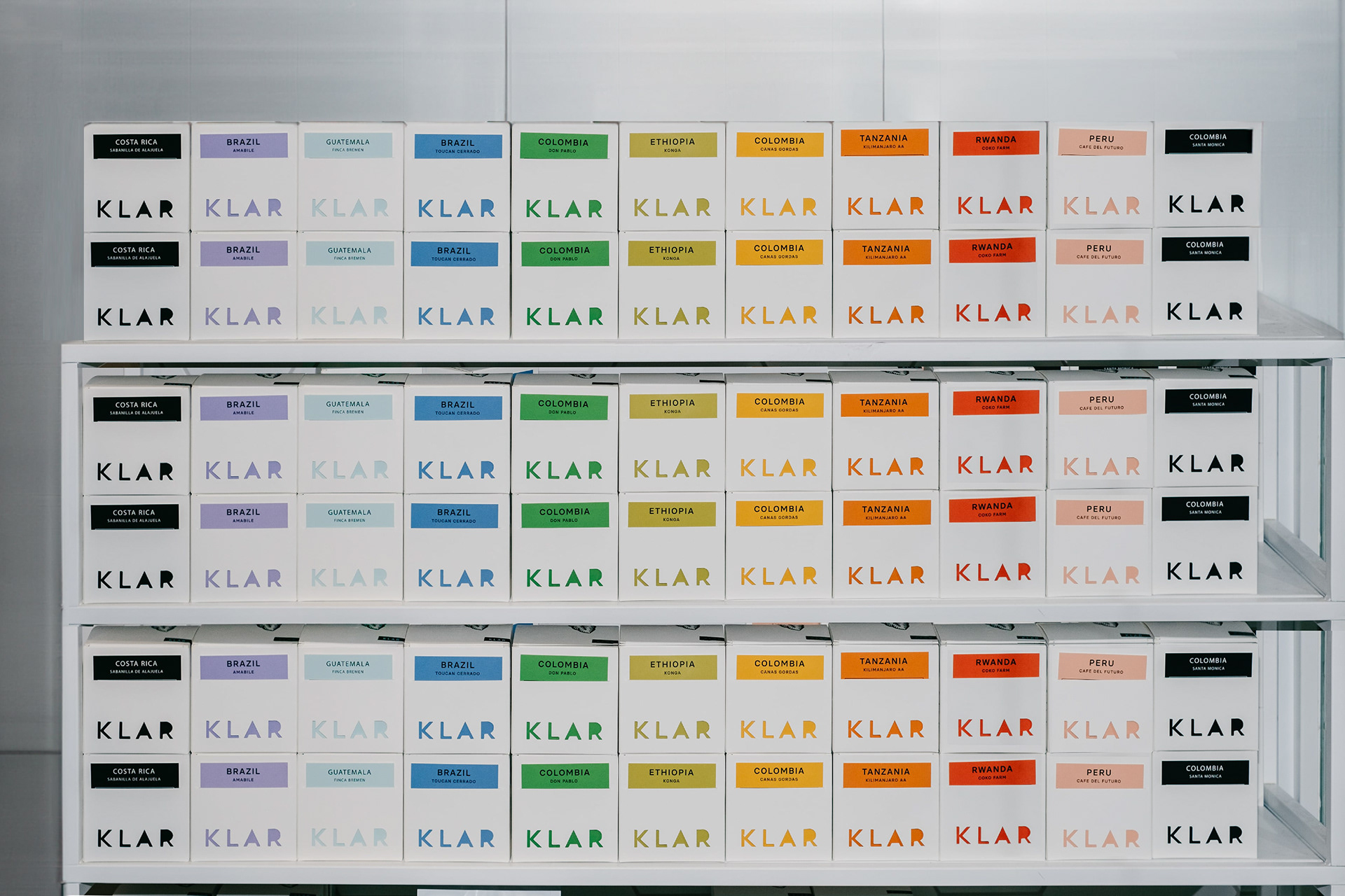
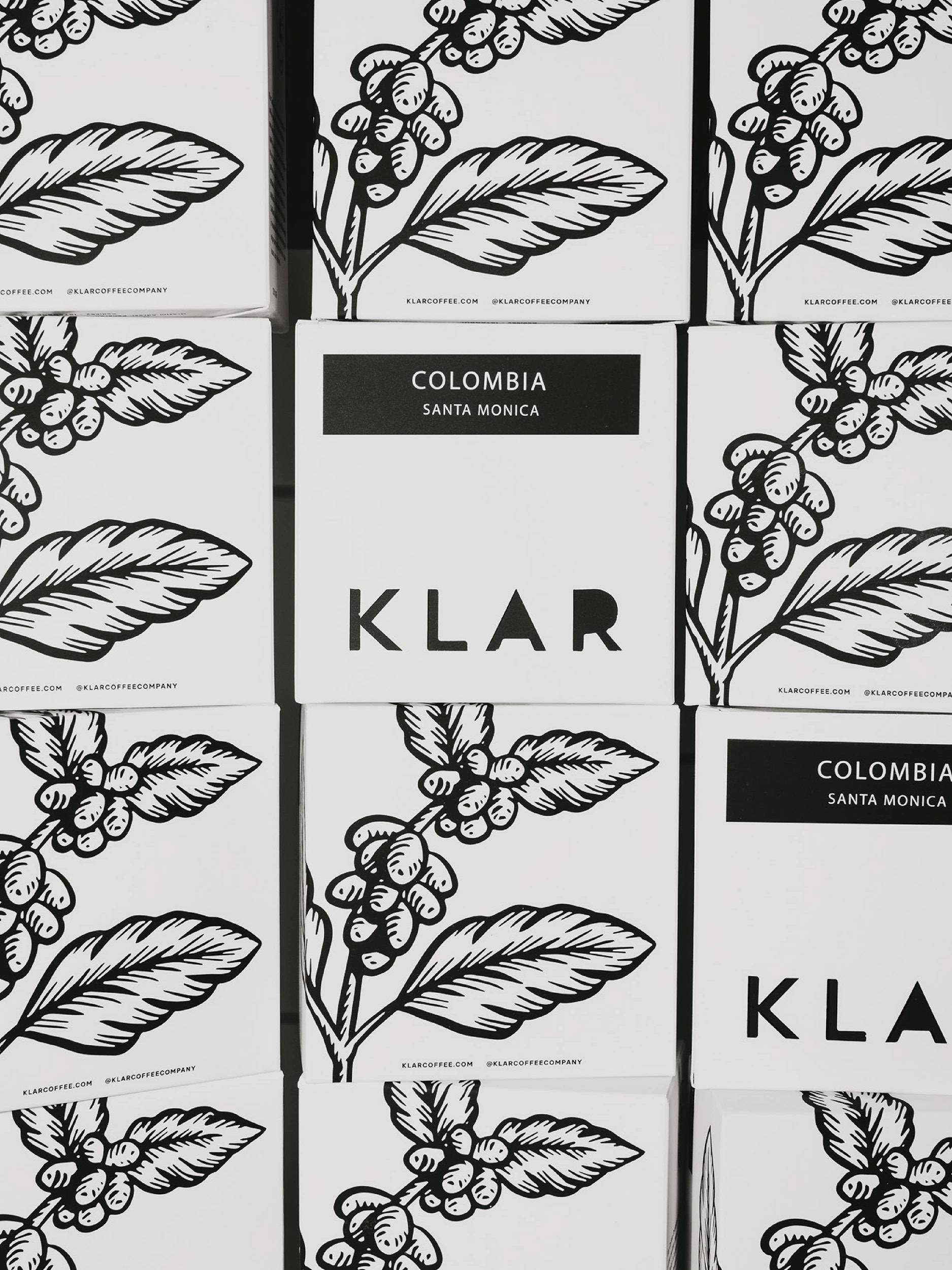
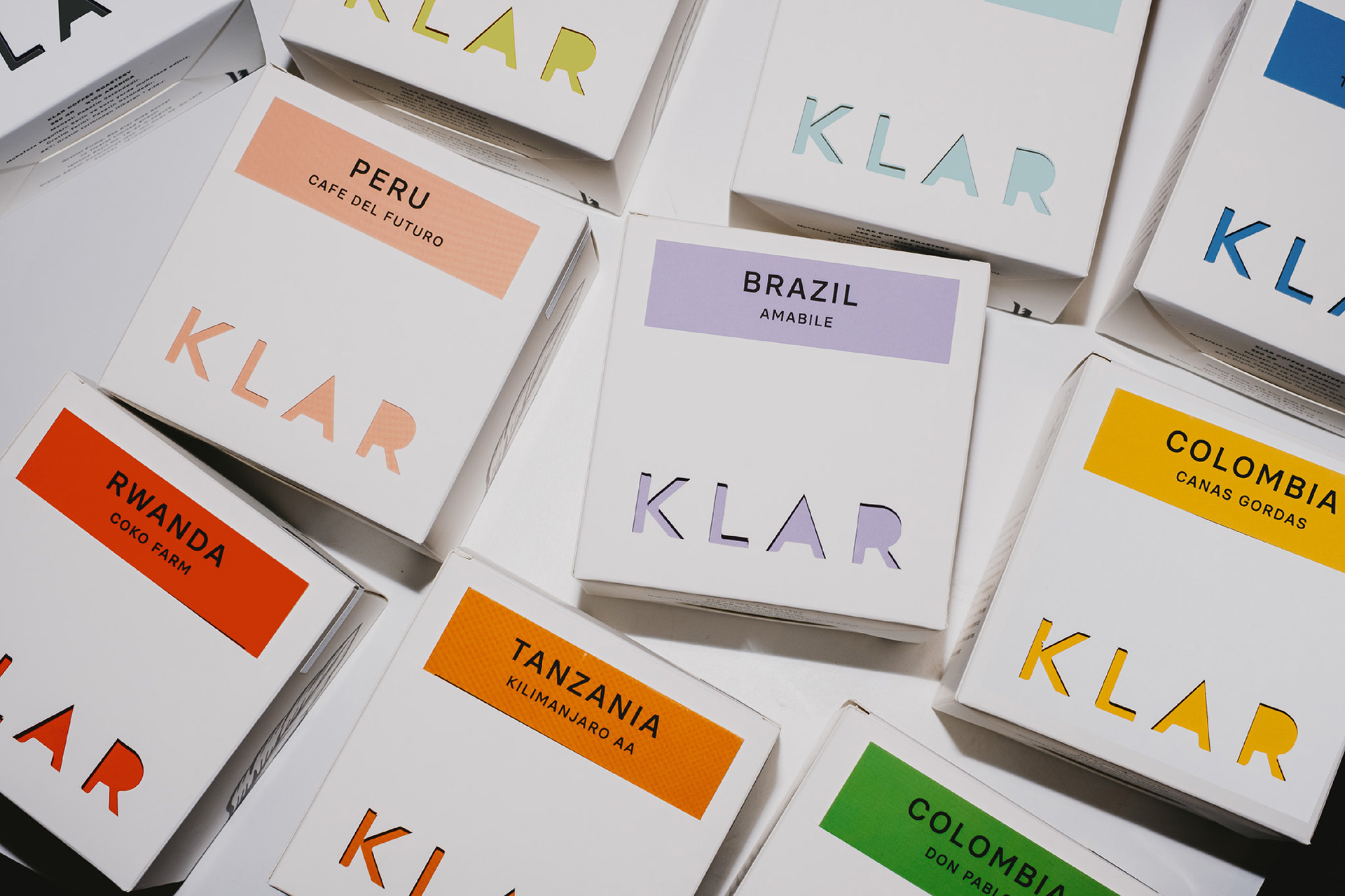
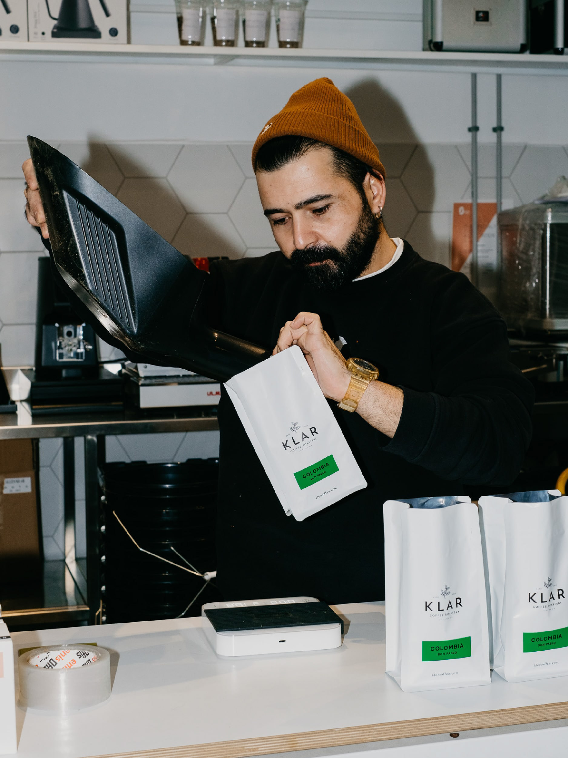
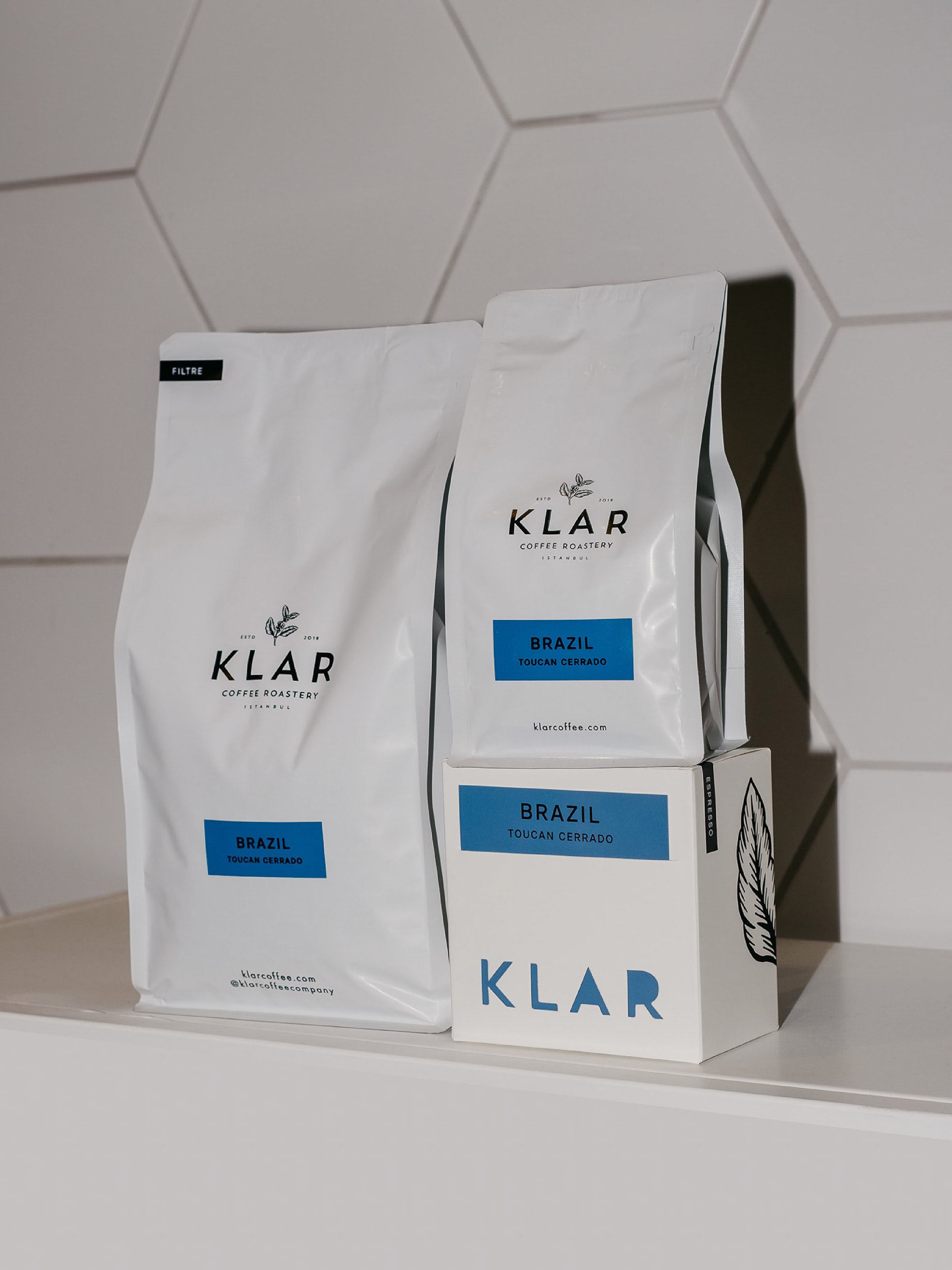
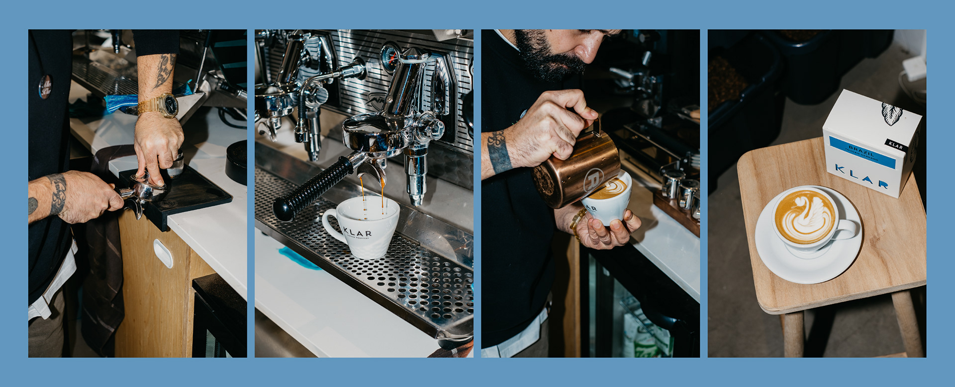
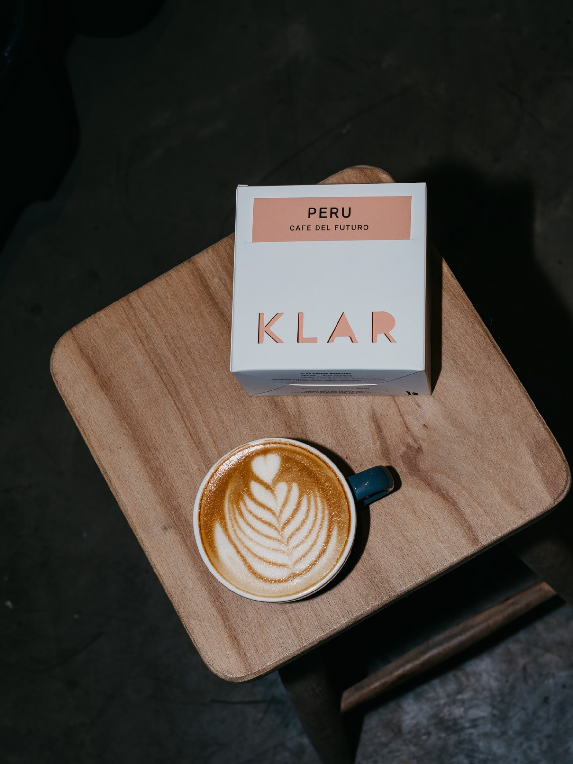
When I was approached by the owner of Klar Coffee regarding new packaging requirements, it was noted that baristas encountered challenges with aligning stickers on standard coffee bags, resulting in misalignment when displayed side by side. My task was to develop a packaging design that not only aligned with the brand's aesthetic but also commanded attention on the shelves of coffee shops.
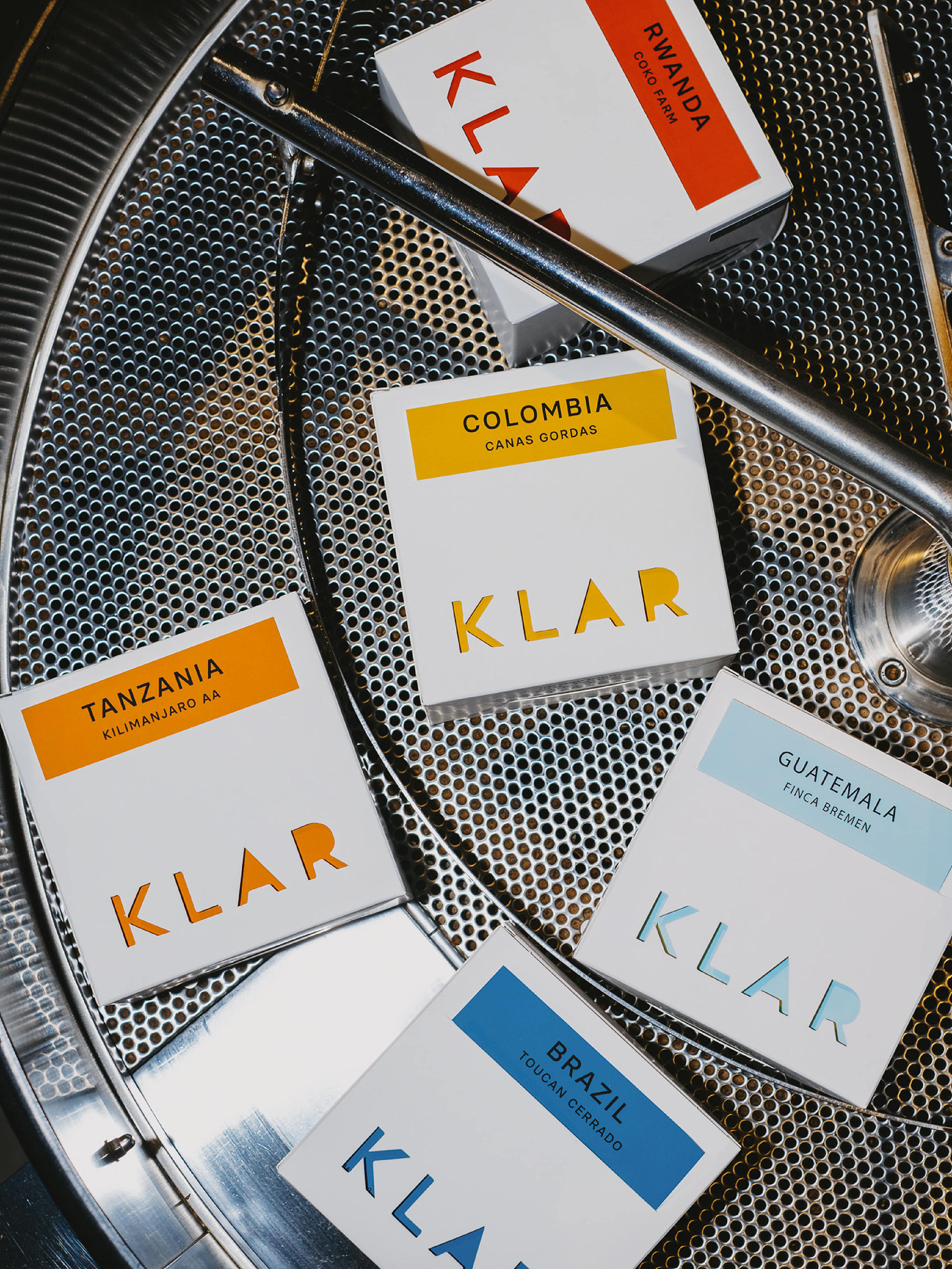
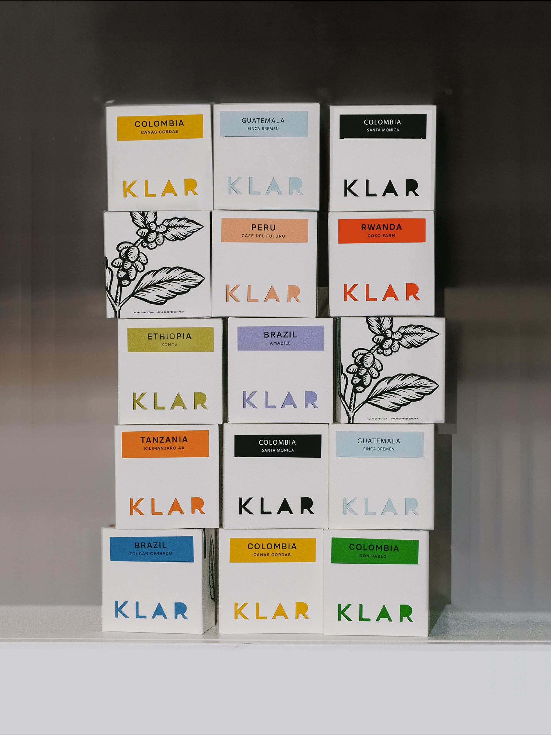
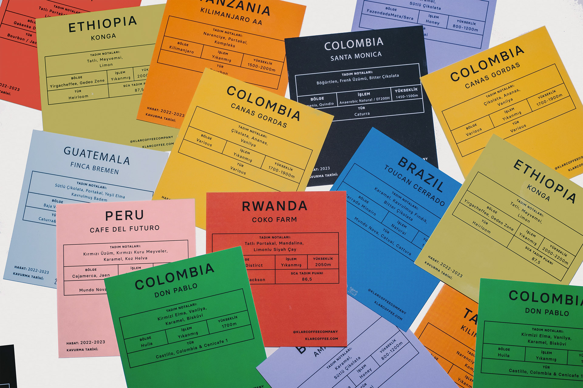
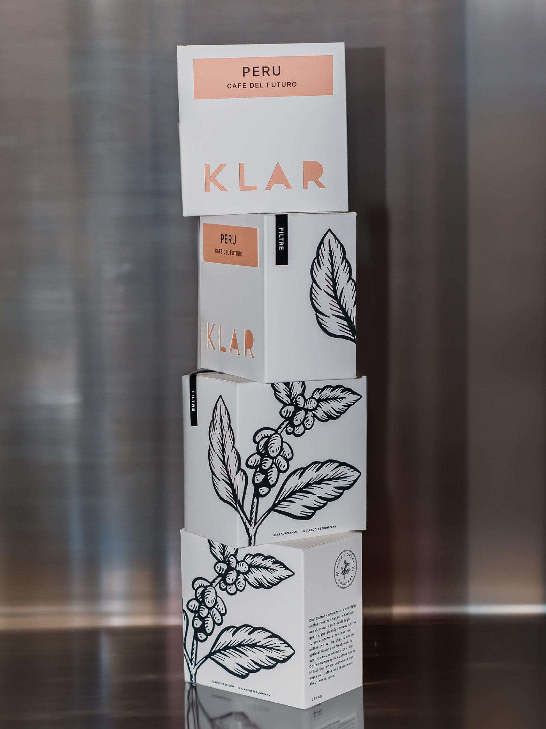
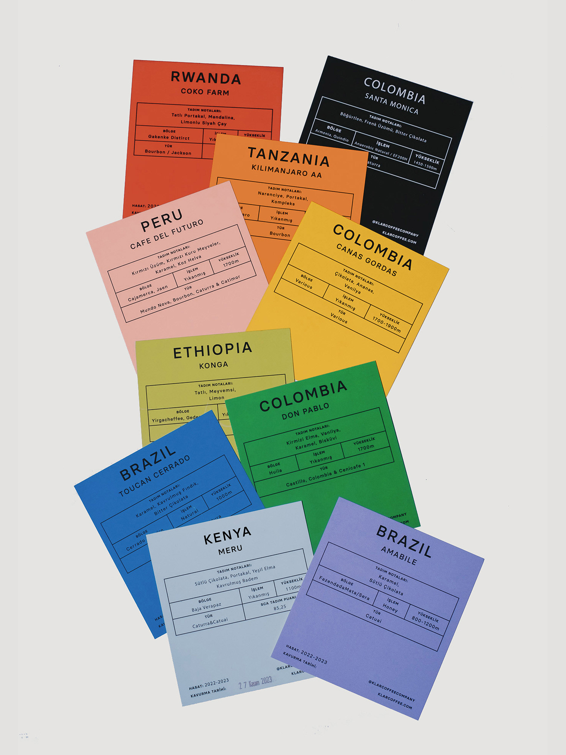
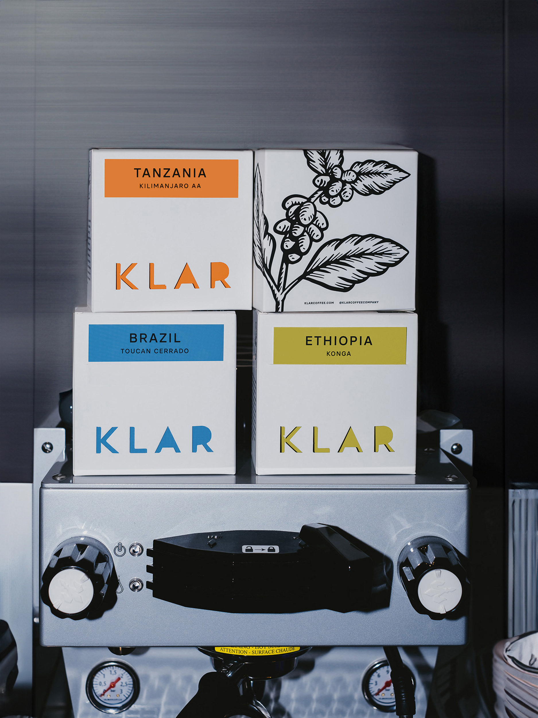
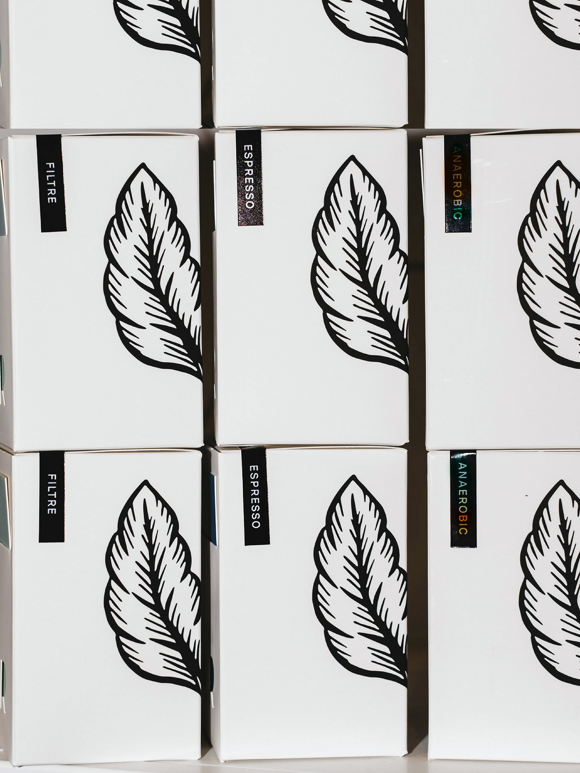
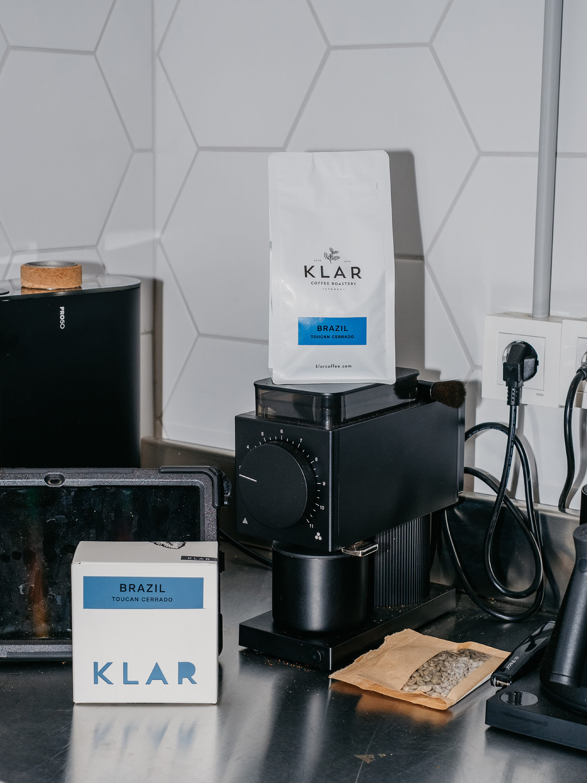
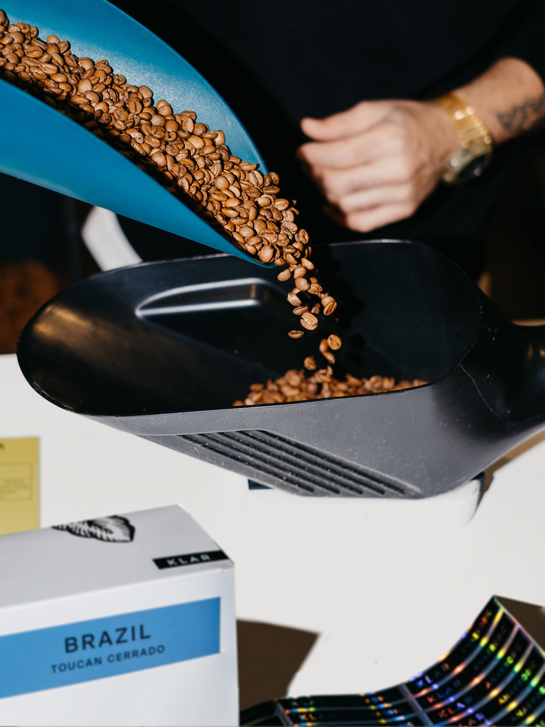
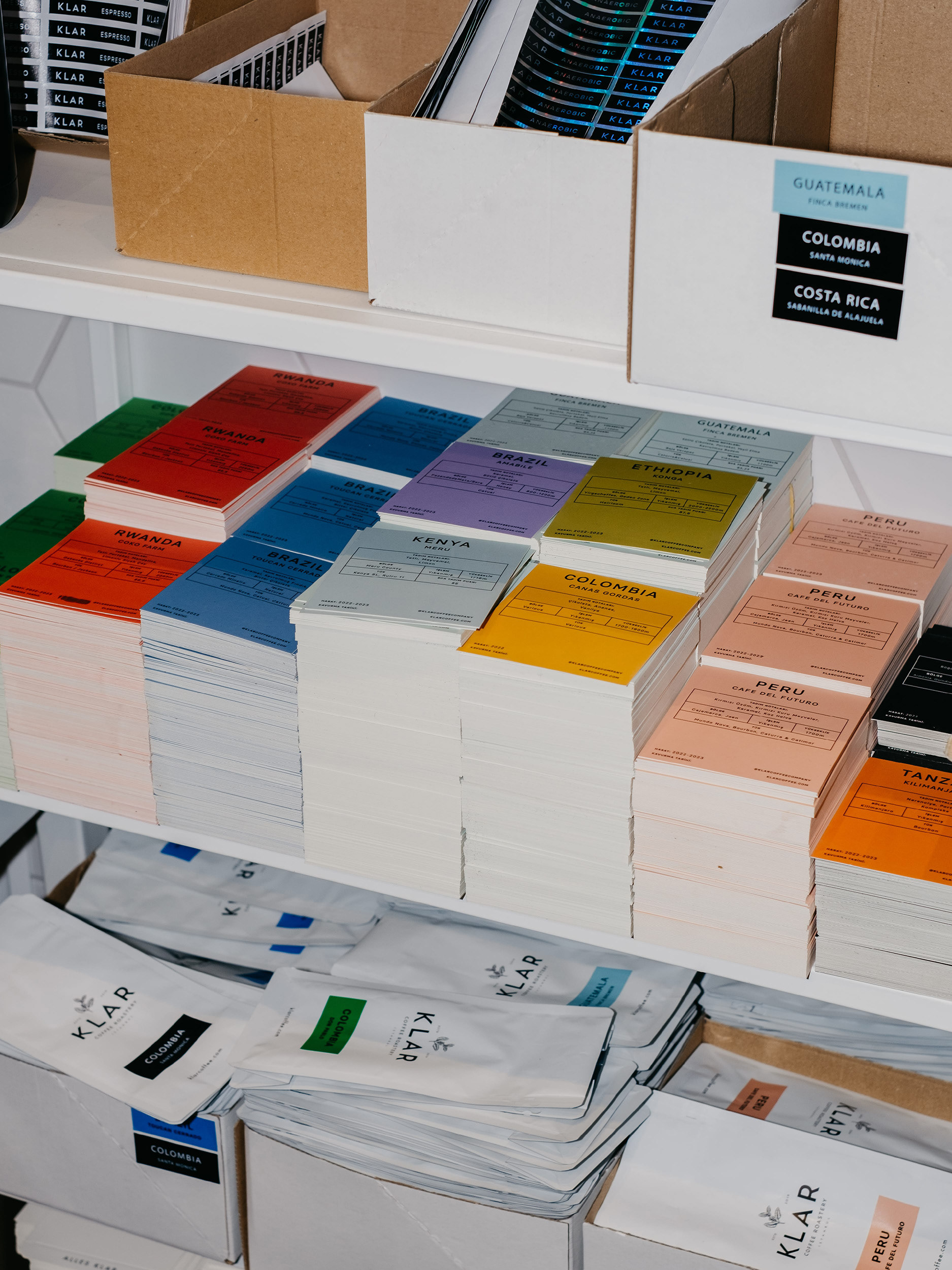
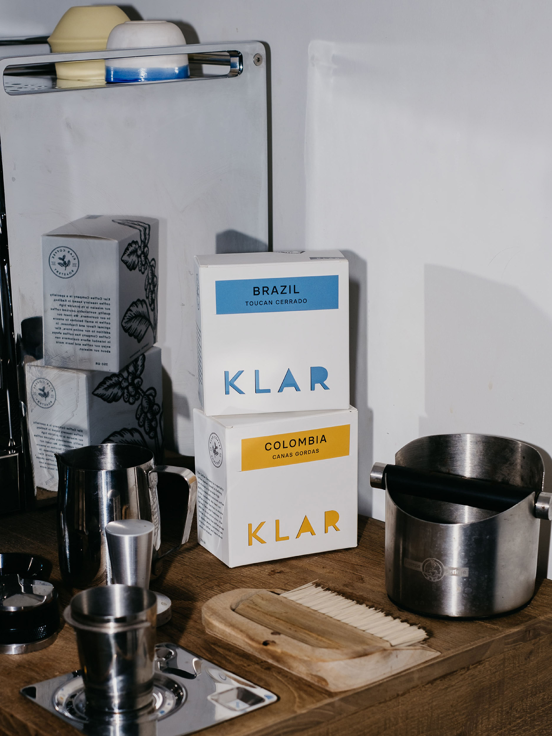
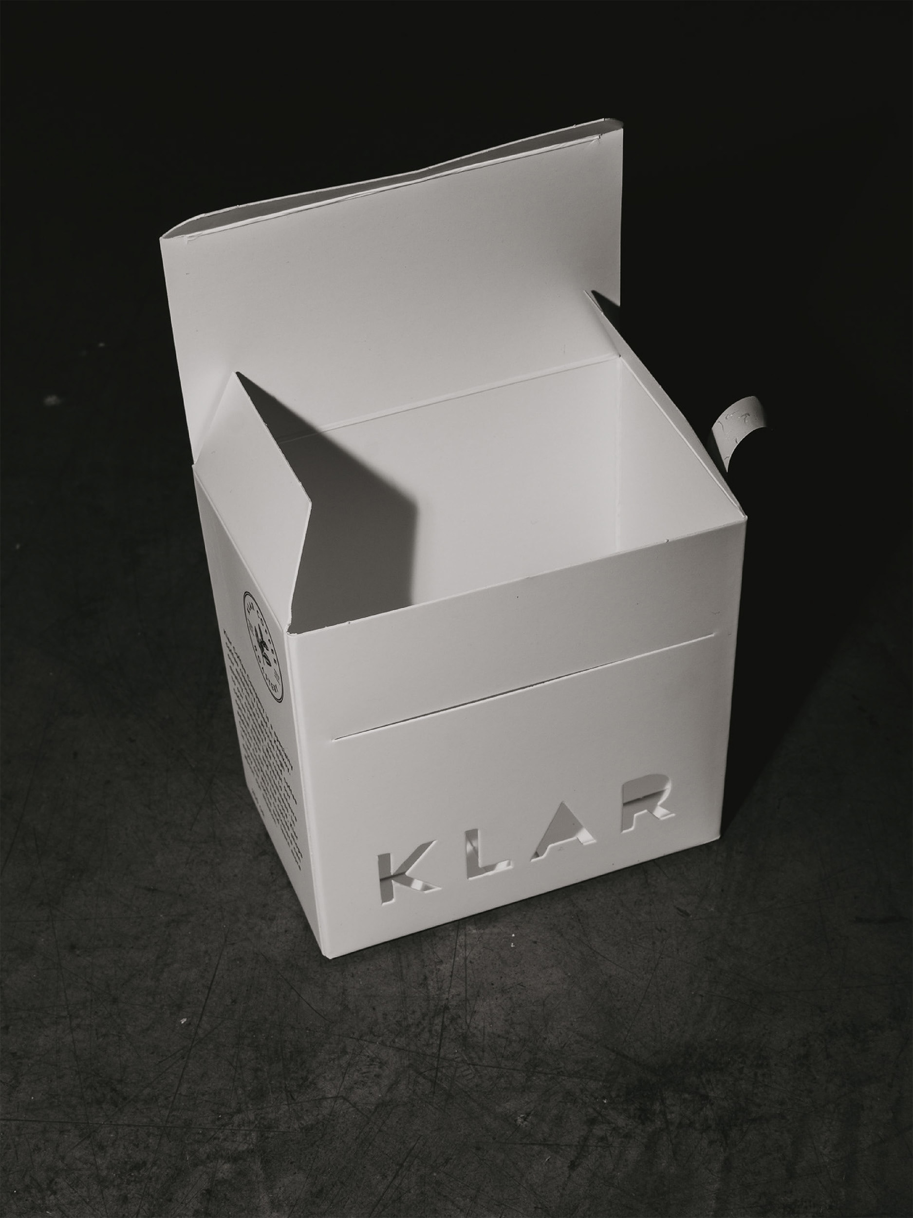
Packaging design for Klar Coffee features a minimalist wordmark with a twist – a cutout of the logo mark on a plain white box. This design choice not only adds a touch of sophistication but also allows for a fun and interactive element. Each box comes with vibrant and color-coordinated coffee information cards for every region. These cards not only provide essential details about the coffee's origin and tasting notes but also add a pop of personality to the cutout part of the box.
Choosing cards over stickers isn't just a matter of preference; it's a strategy for ensuring a consistent and error-free presentation. Placed in box pockets, each card aligns flawlessly at the same level, eliminating the risk of human error and elevating the overall design cohesiveness.
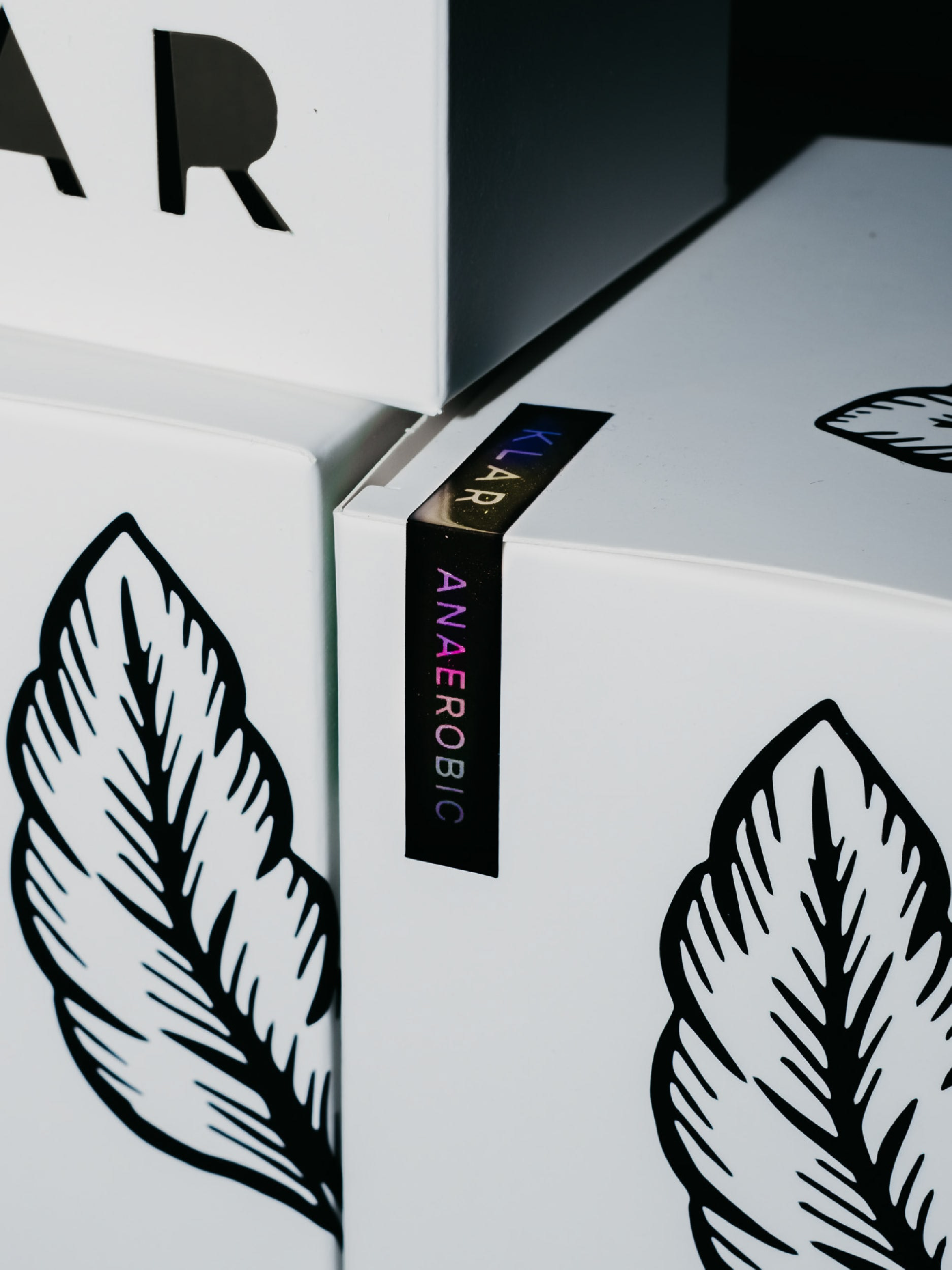
The choice of premium white matte paper with velvety touch, ensures a tactile and luxurious feel. This deliberate selection not only enhances the overall sensory experience but also conveys the exceptional quality of the coffee enclosed within.
Note: Packages were designed to sell in the coffee shop near the counter therefore securing the coffee information cards incase someone would take it was not the case.
Animation: Sedat Azazi

Shortlist | Tea & Coffee Packaging
Featured on