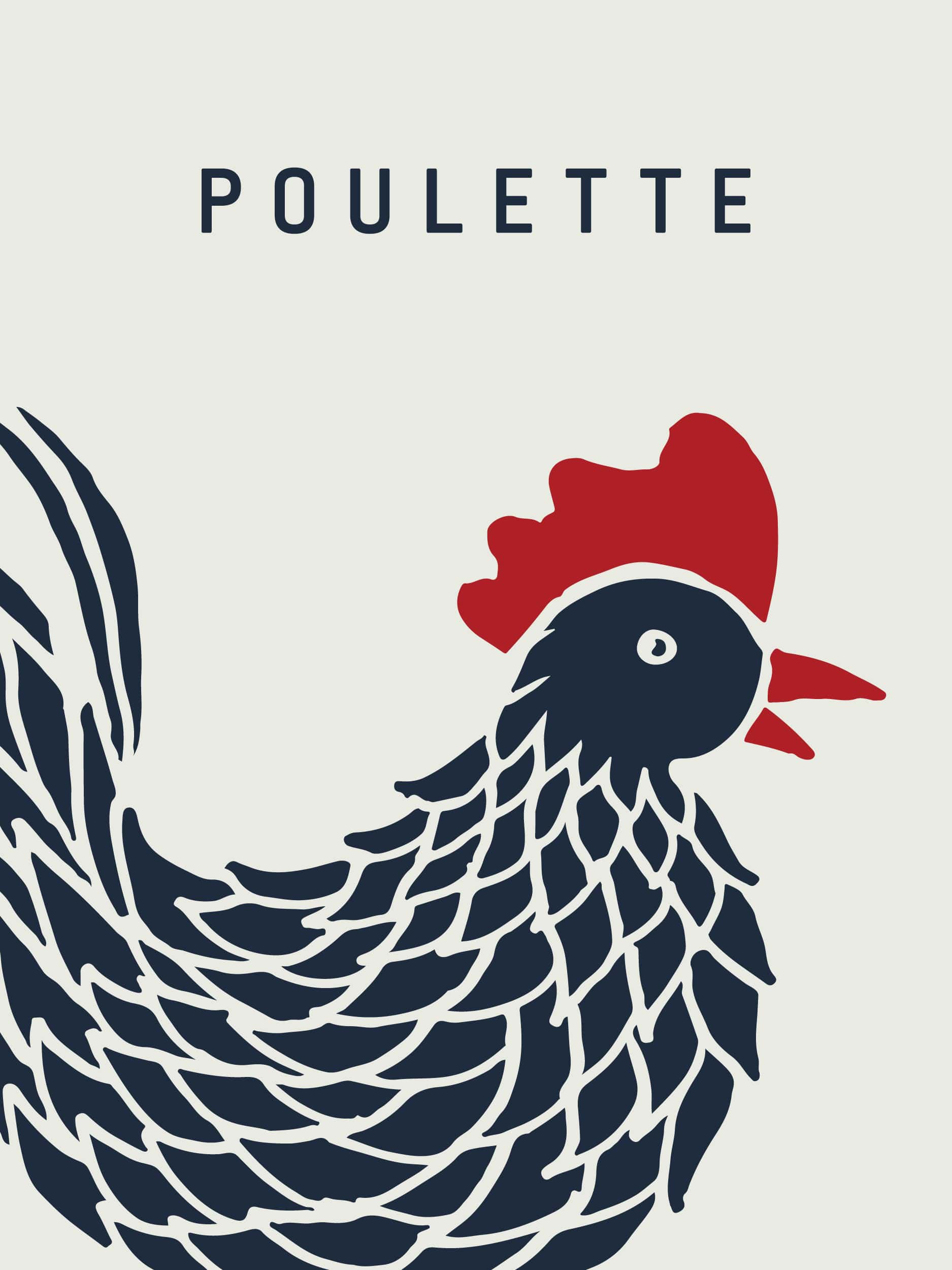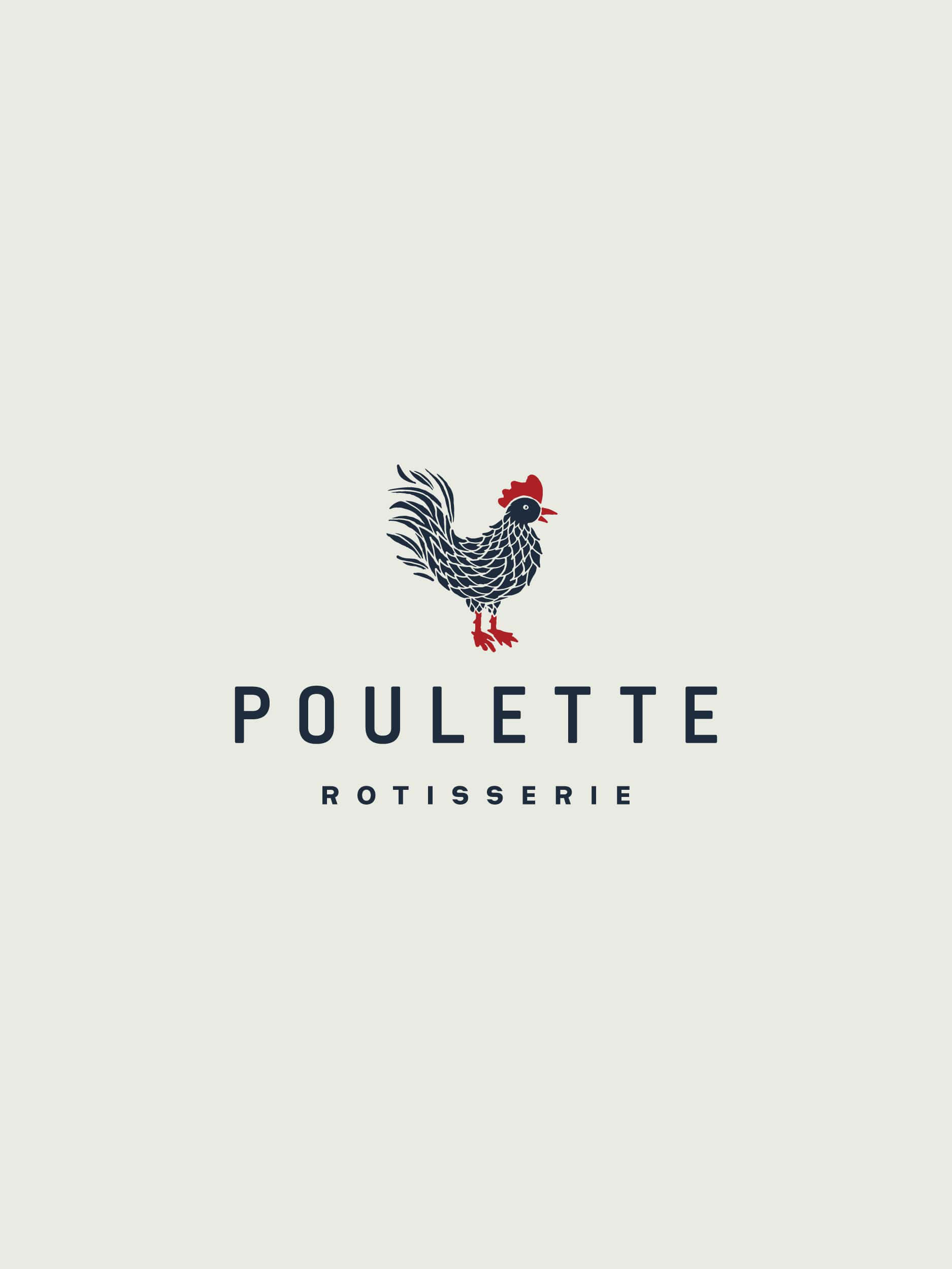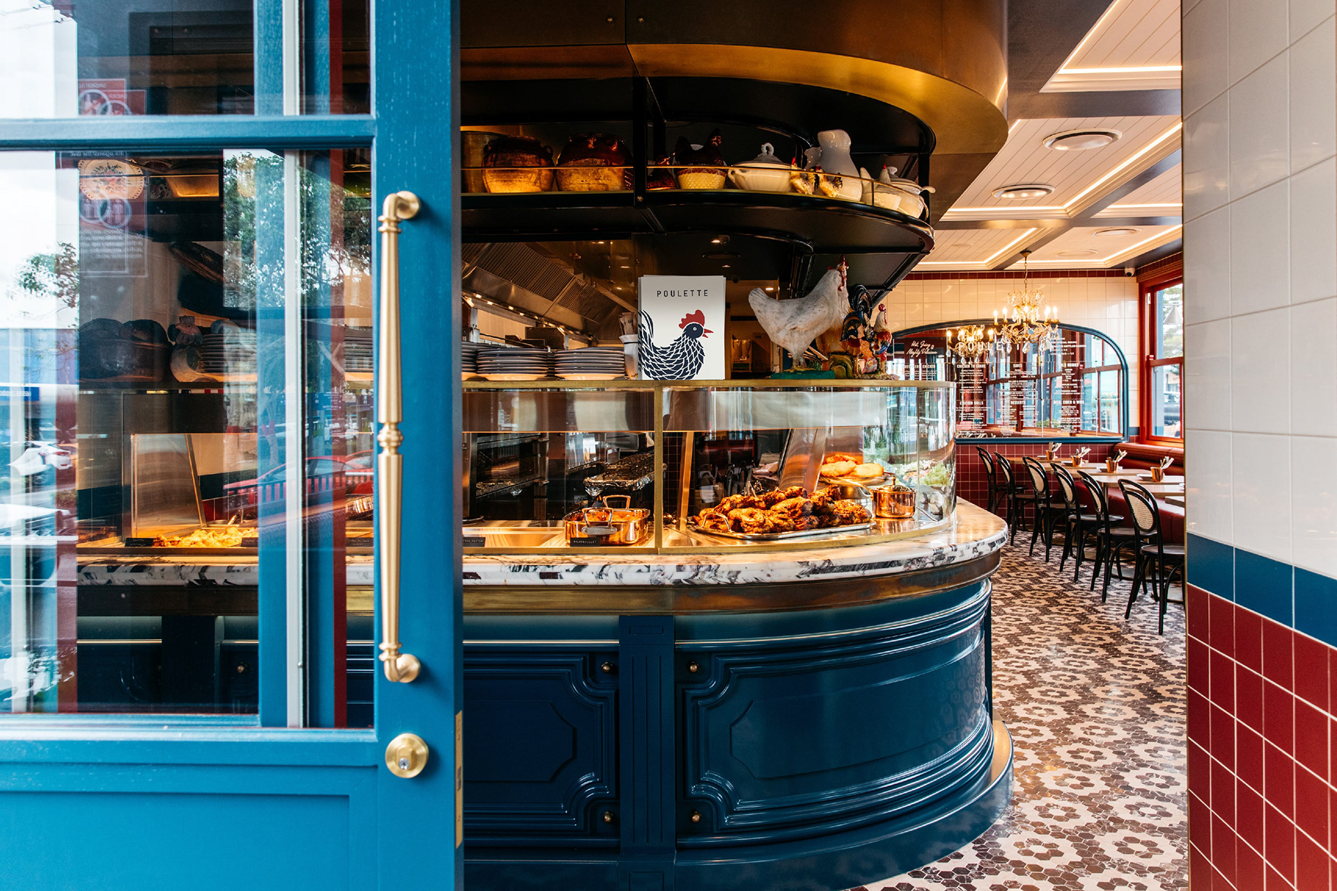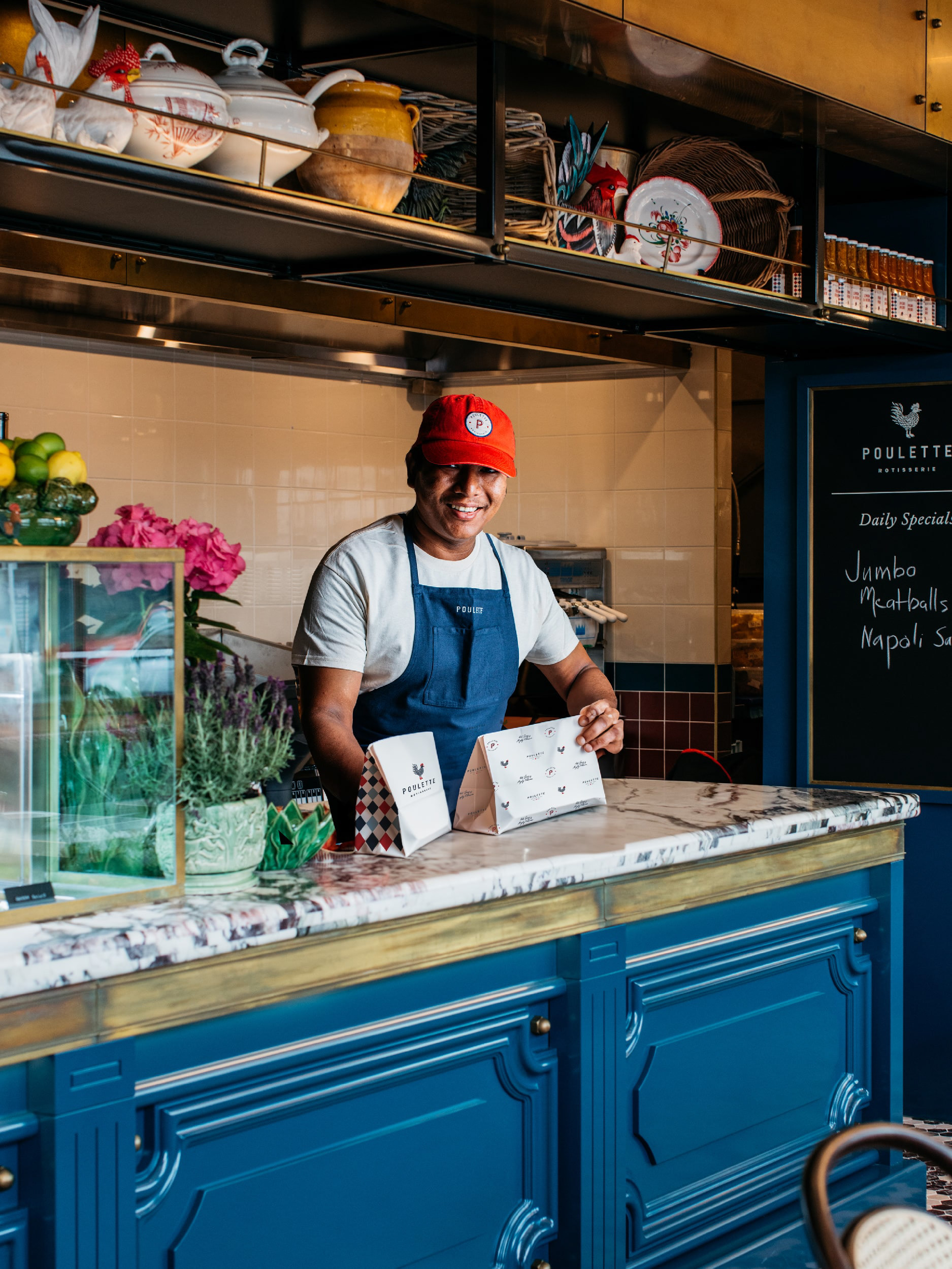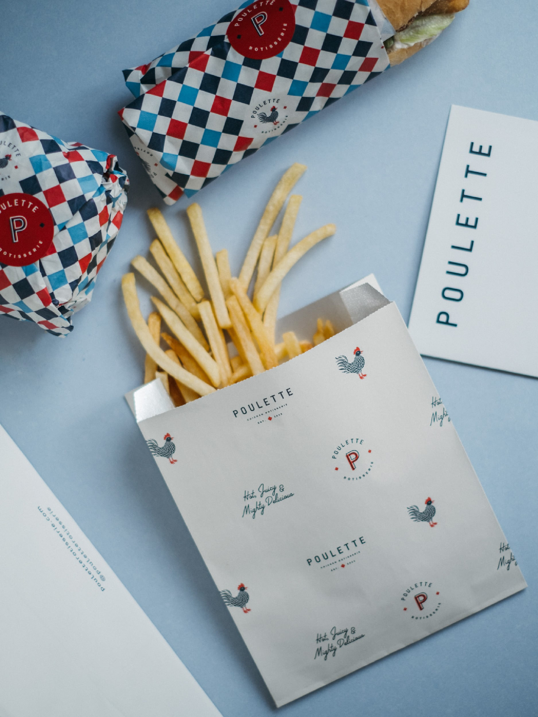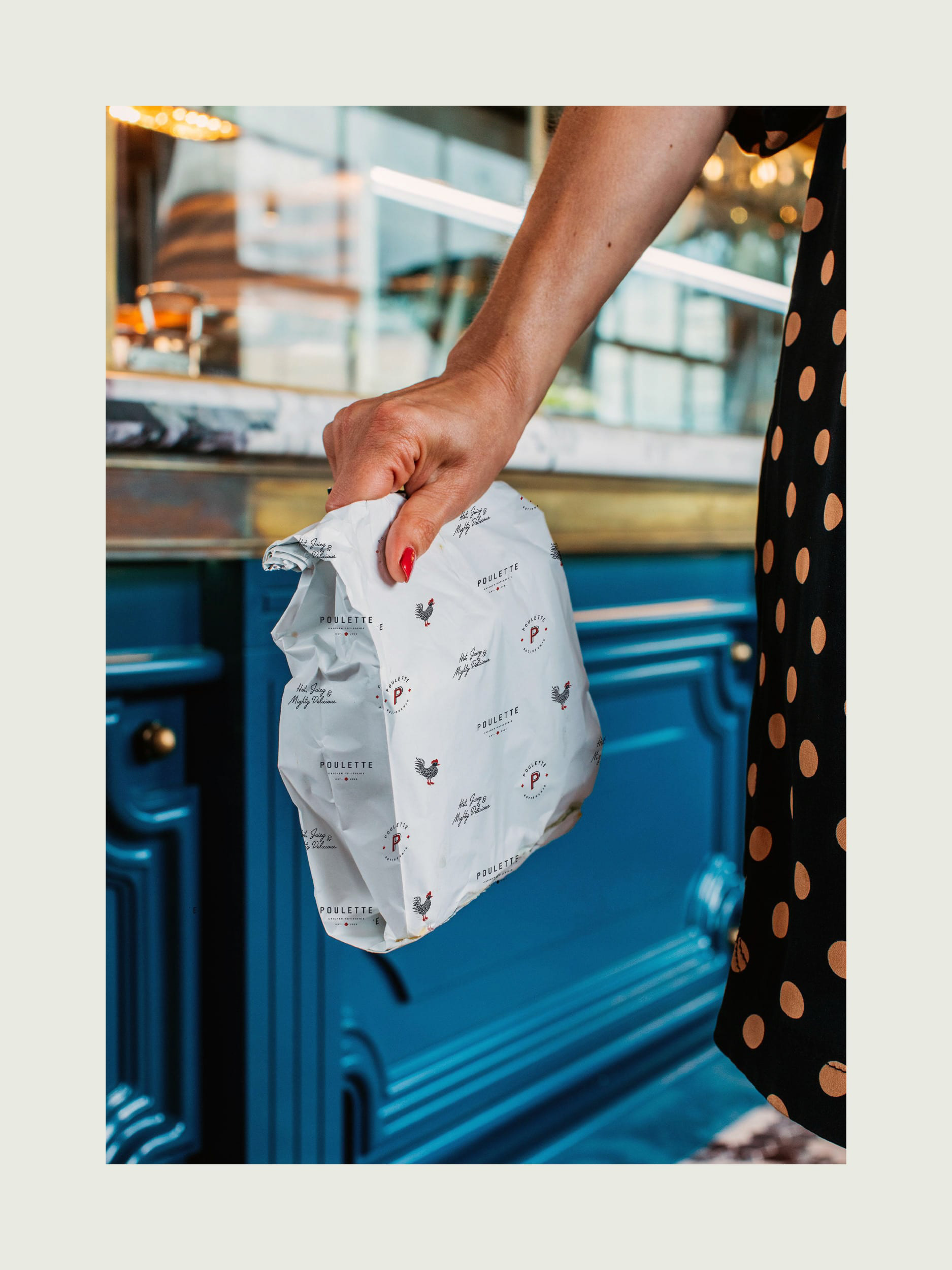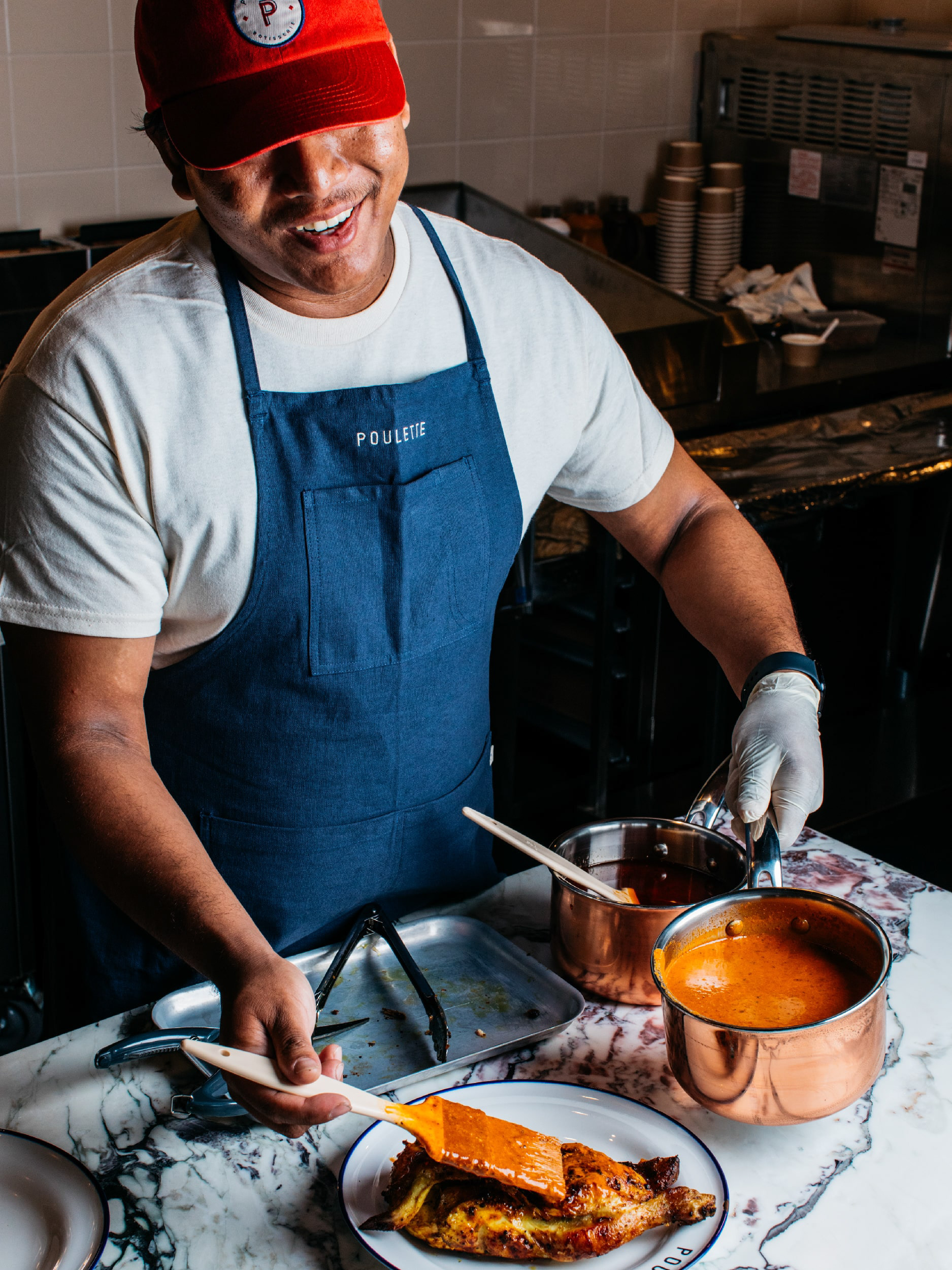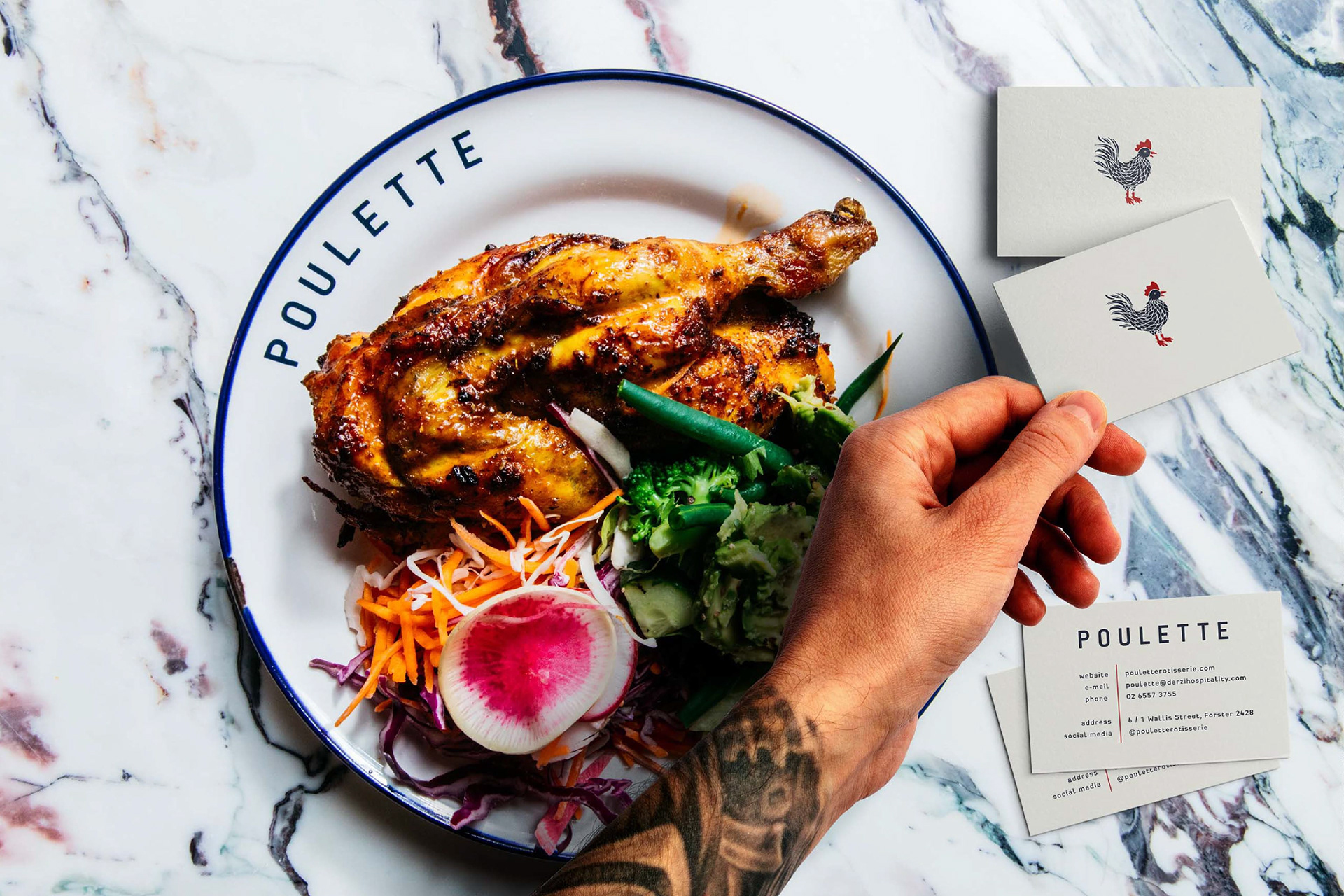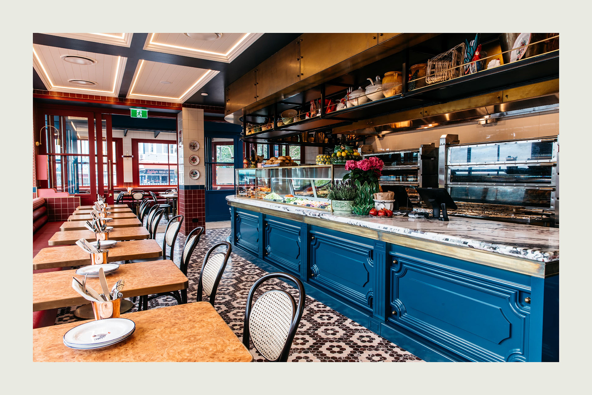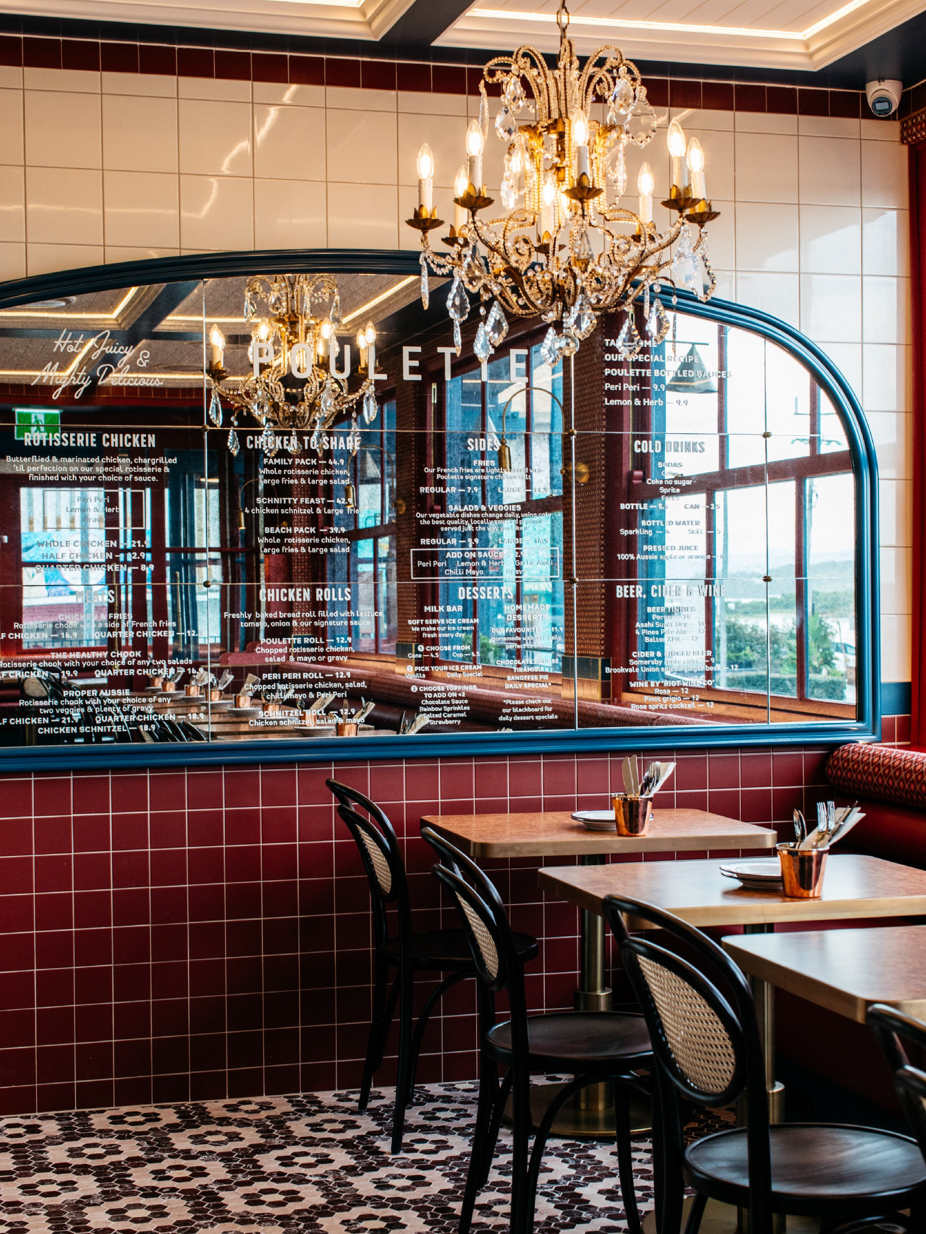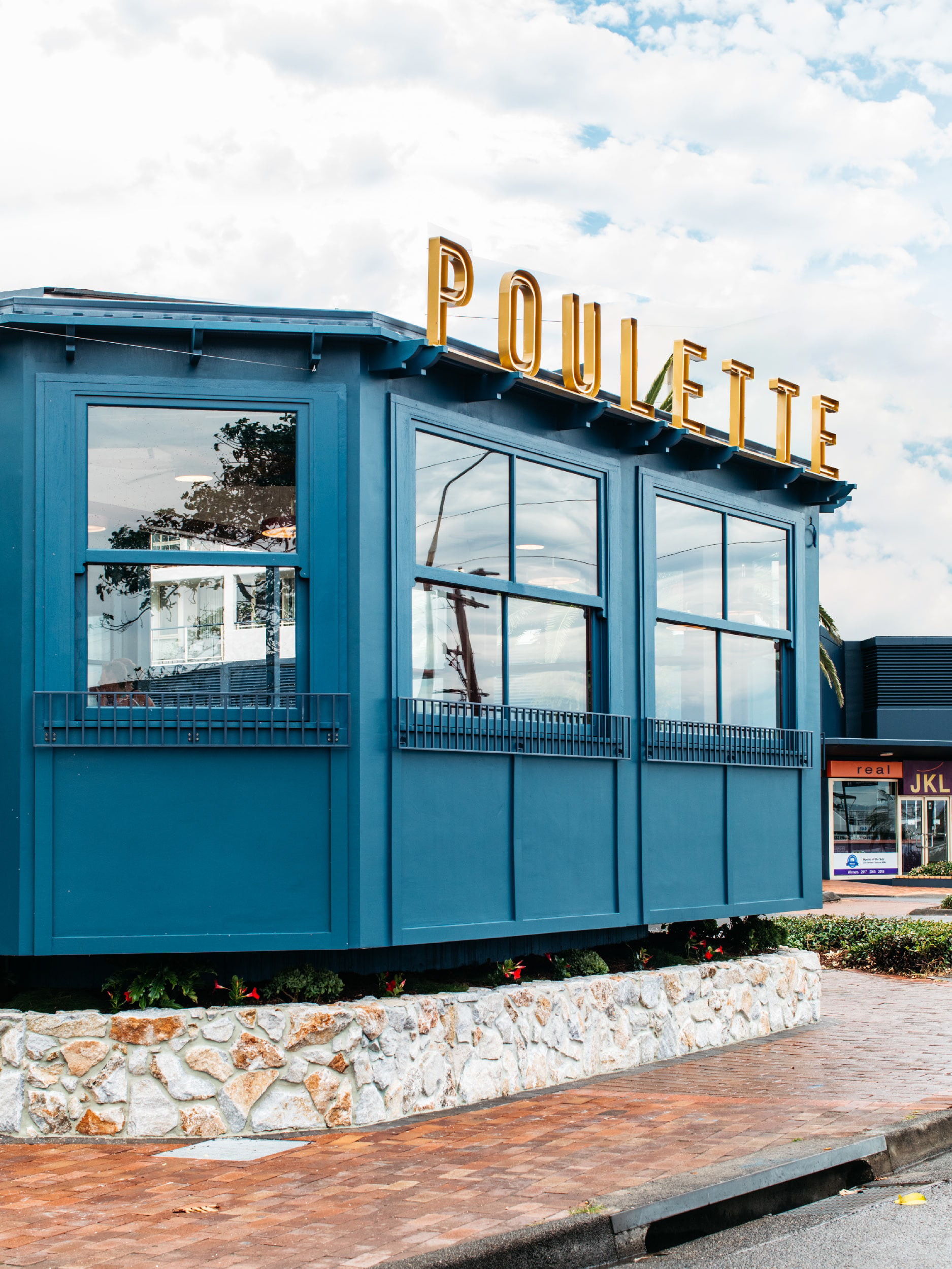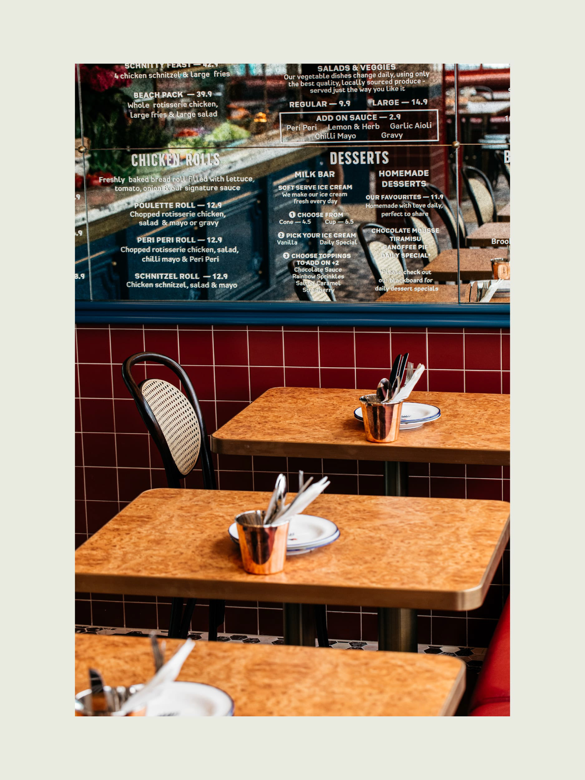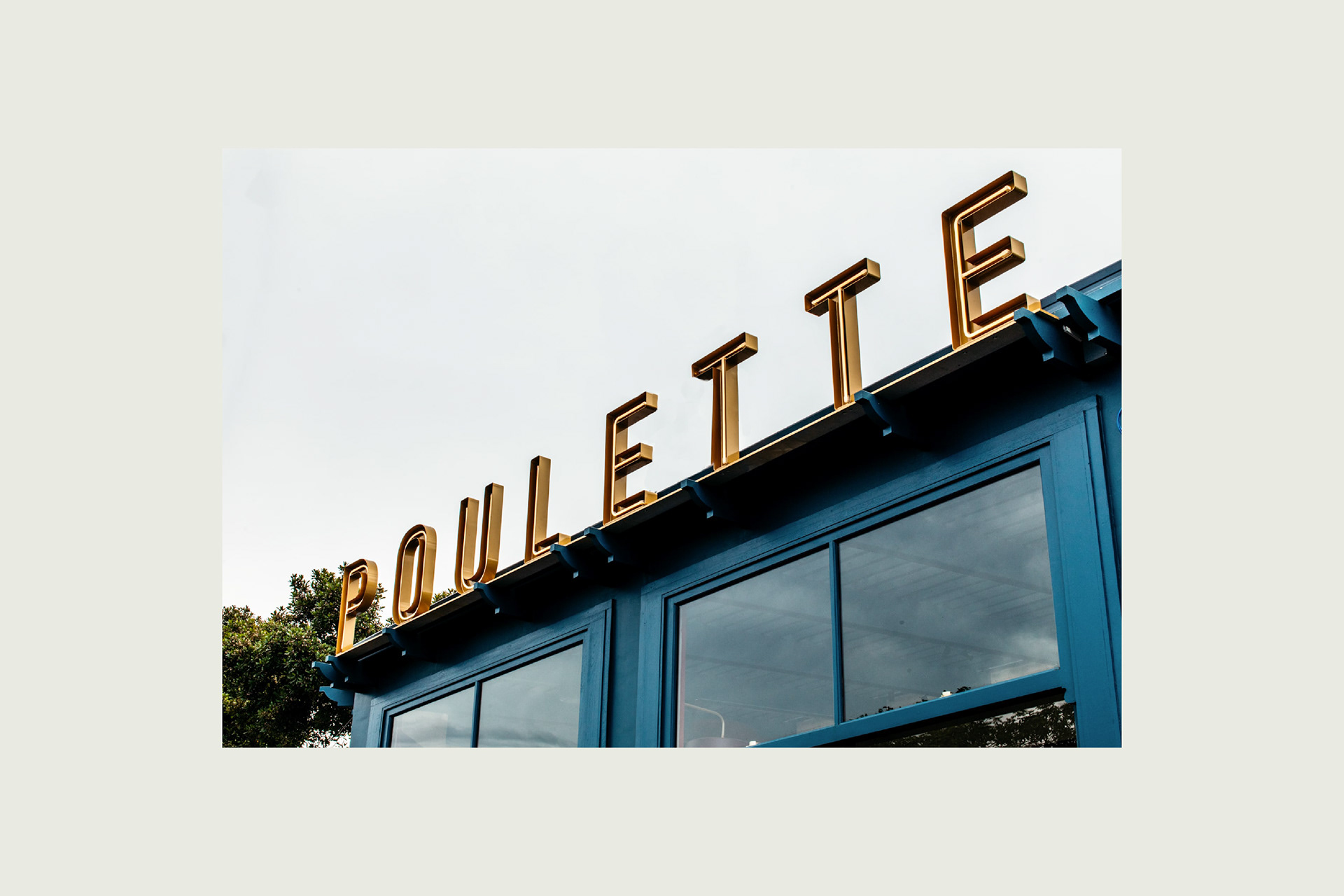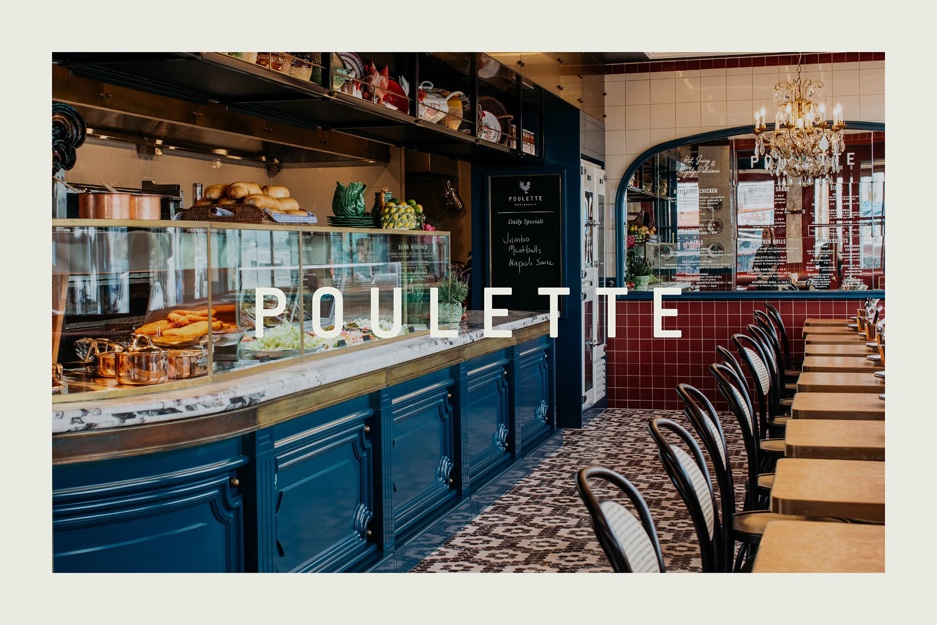
Poulette (pou· lette | (ˈ)pü¦let) means chicken in French and was the perfect choice for a casual take-away and dining restaurant from New South Wales/Australia. The restaurant's branding and color palette were inspired by the aesthetics of old French restaurant signs and facades, while incorporating a modern twist.
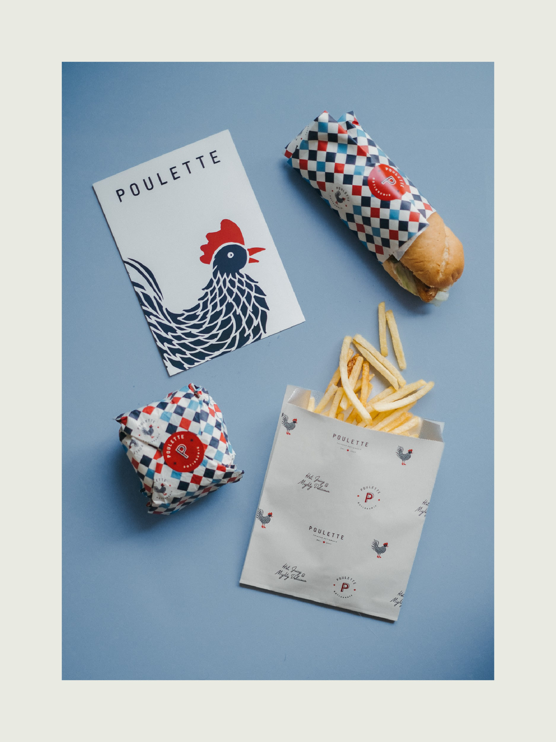
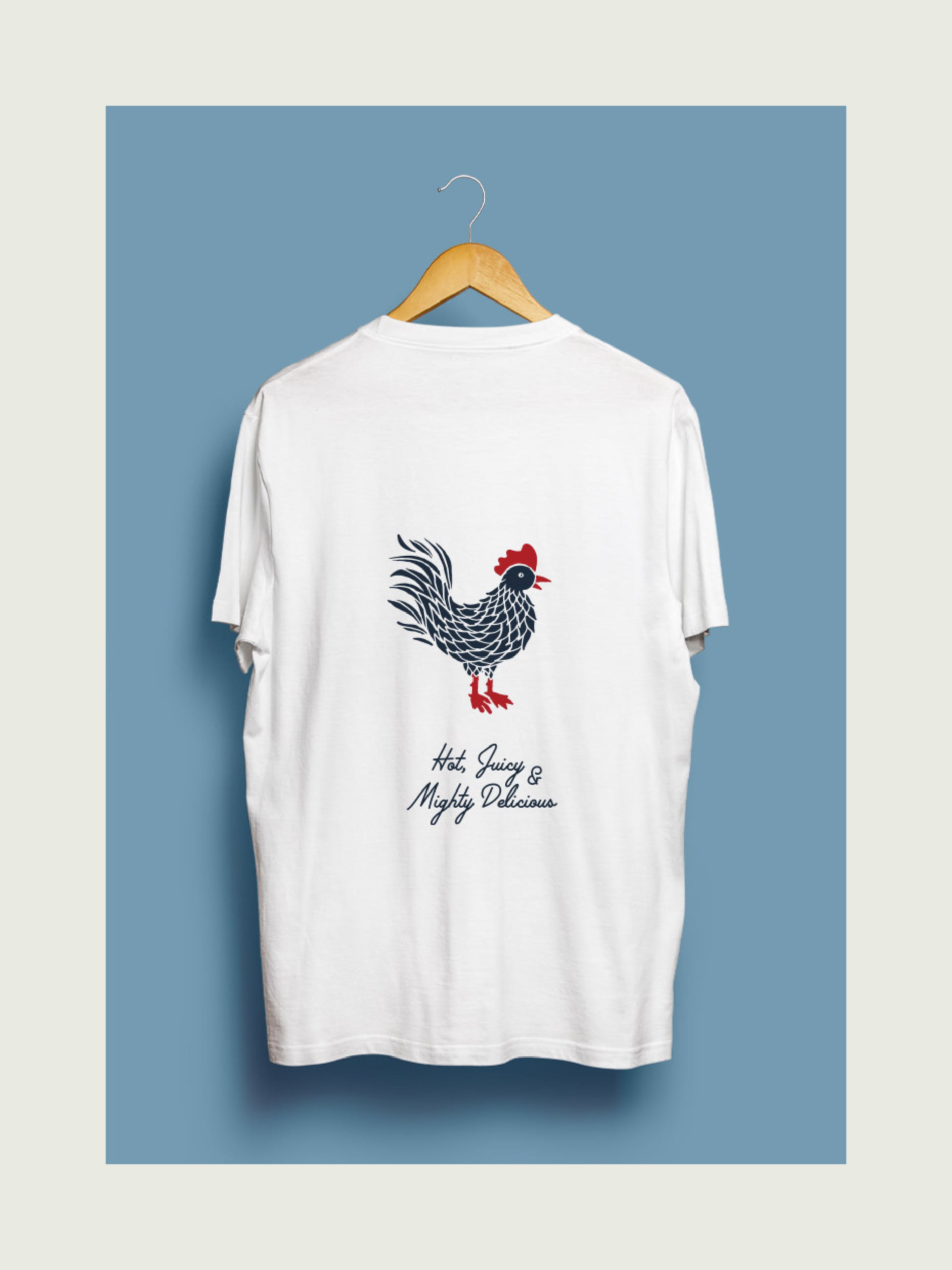
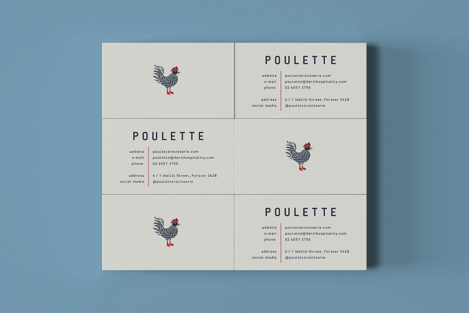
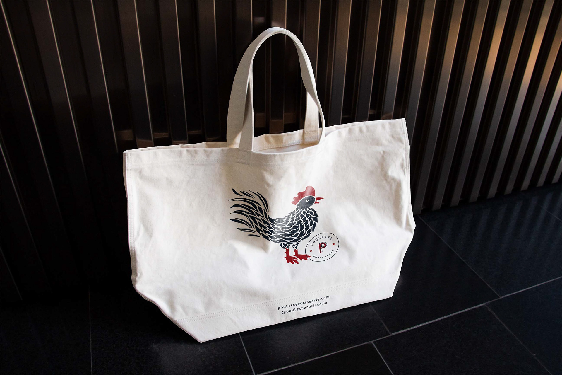
The chicken illustration created for the brand can stand alone as a representation of the restaurant's identity, without the need for any accompanying text. The playful nature of the icon is balanced by the use of simple typography, which lends a modern and timeless quality to the logo.
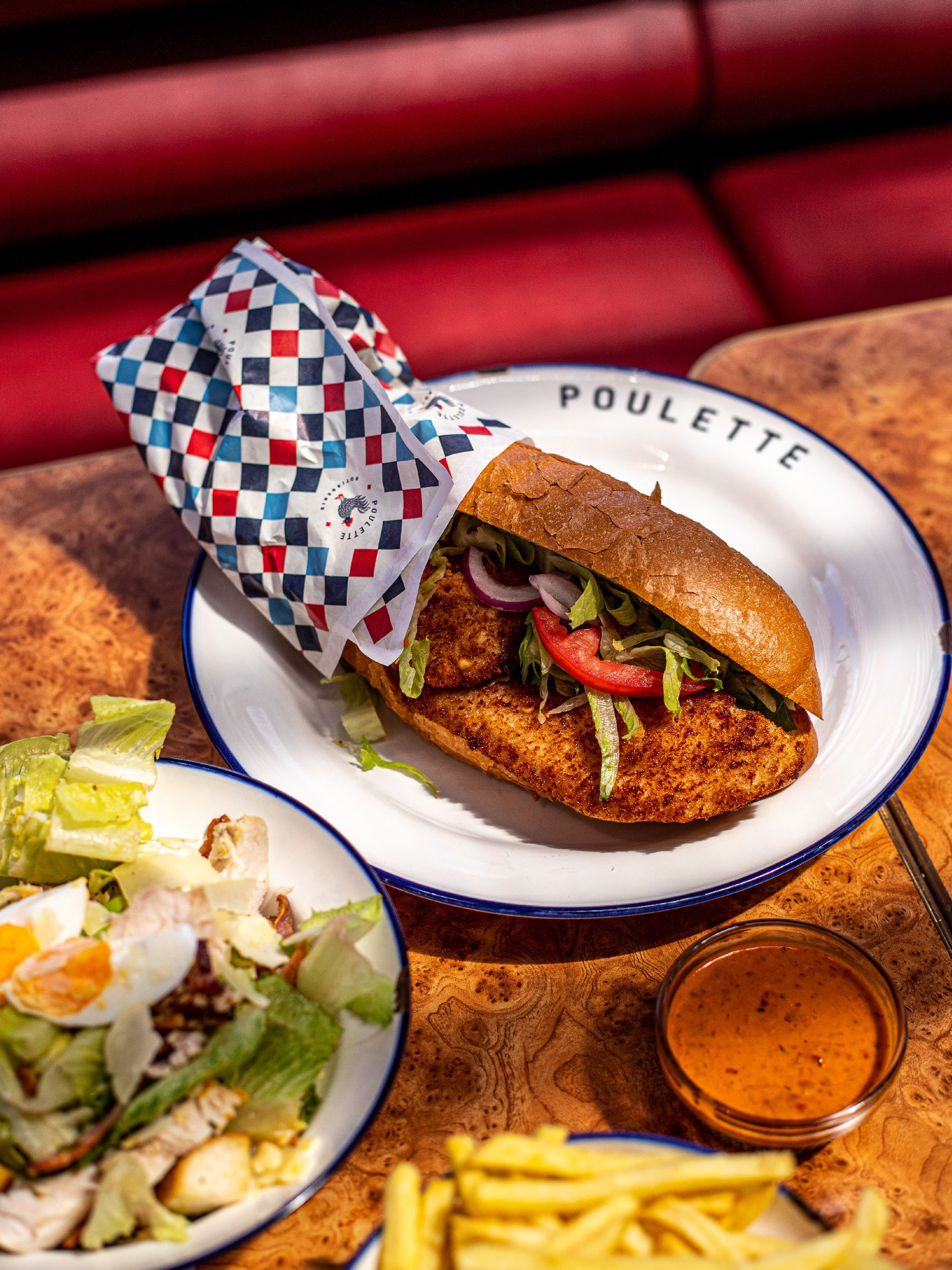
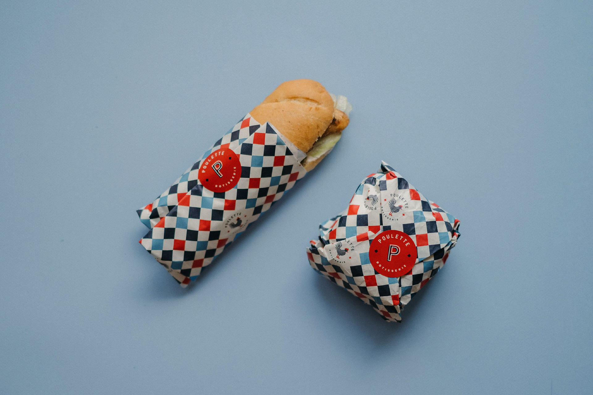
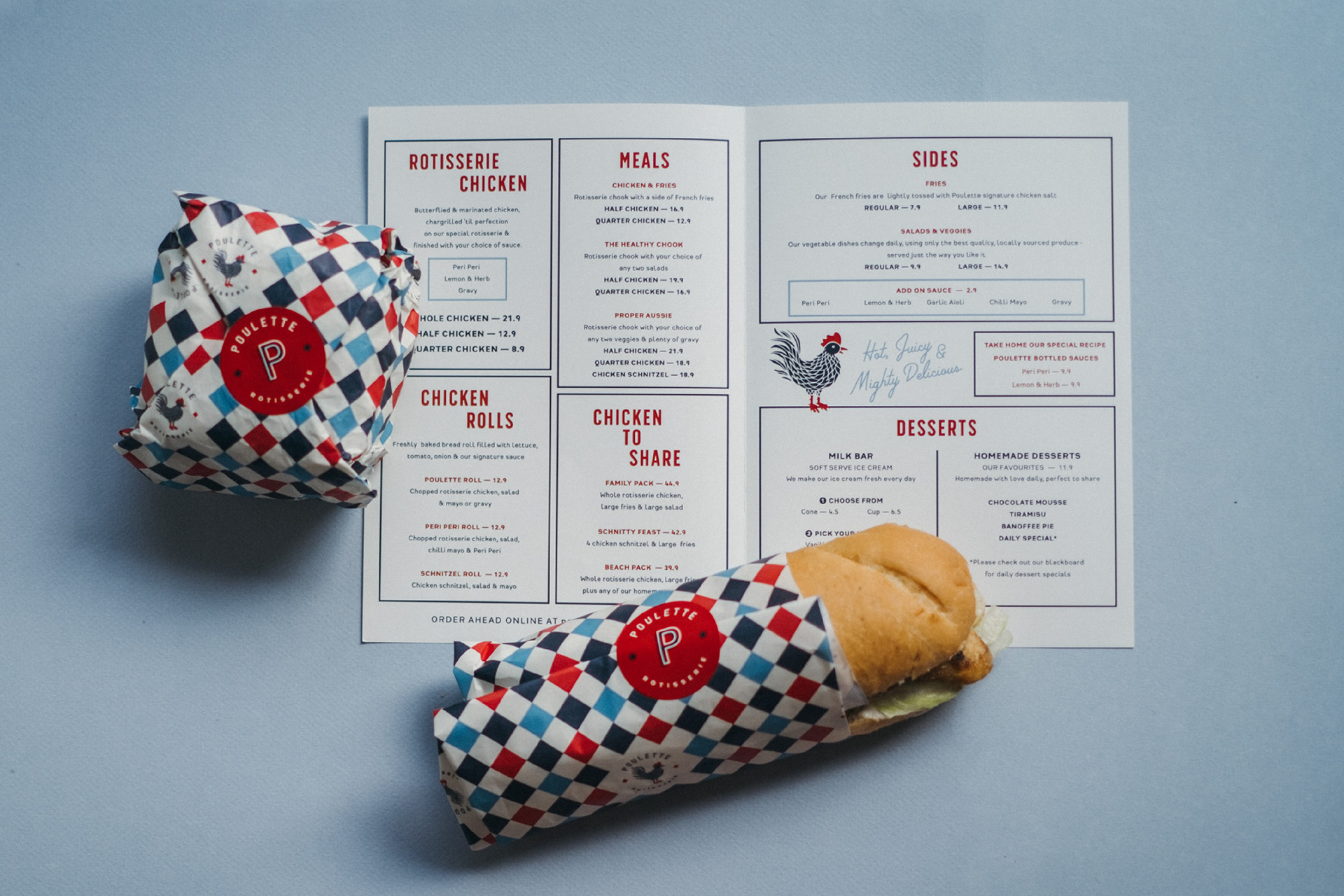
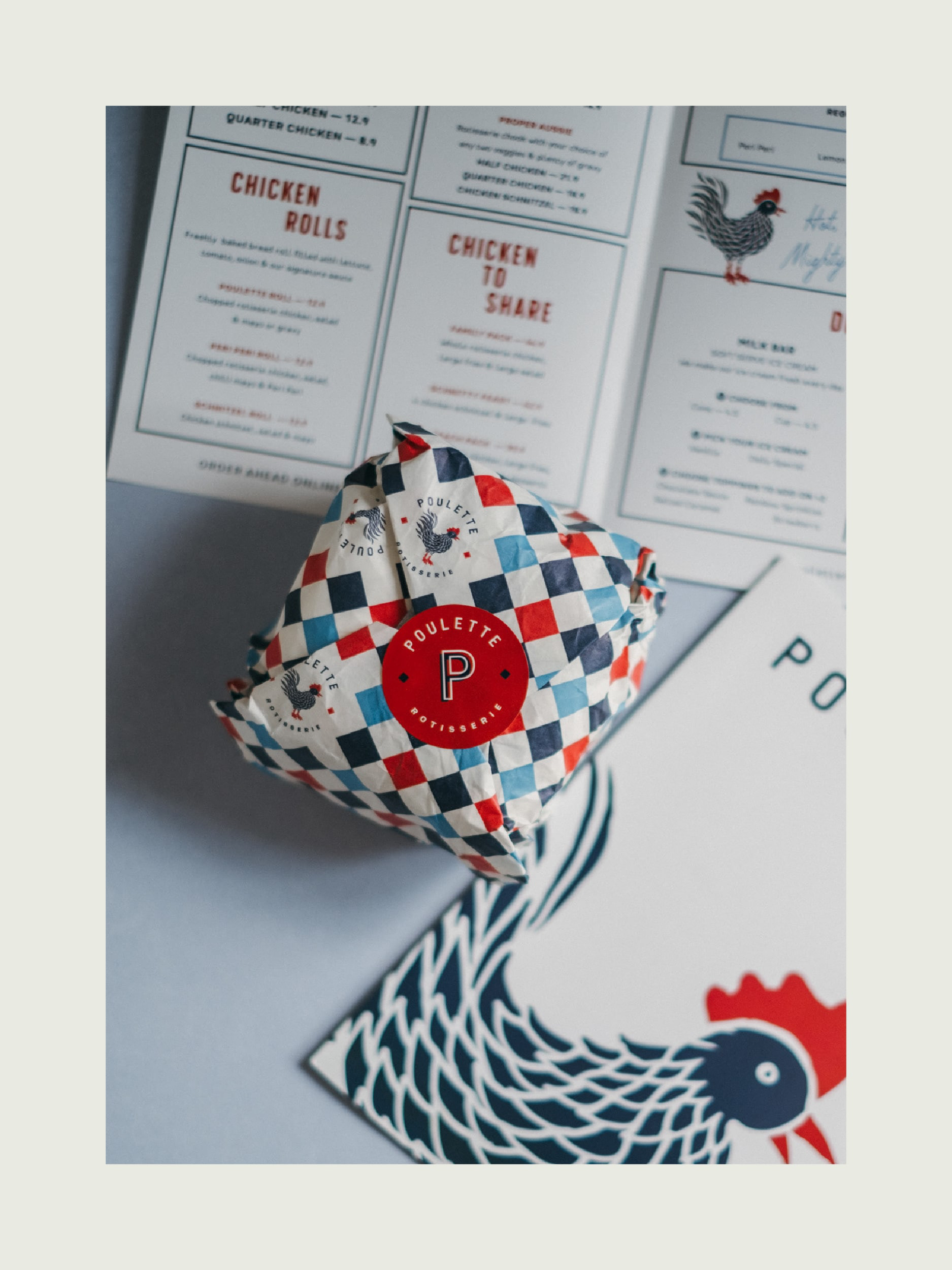
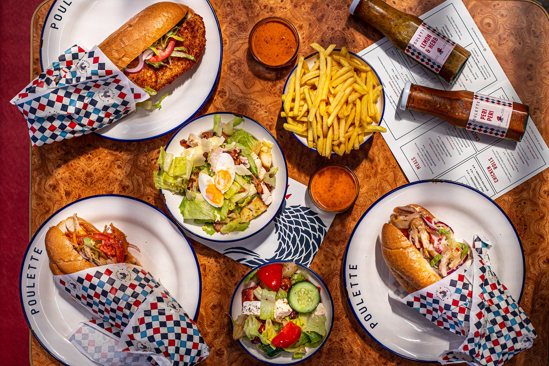
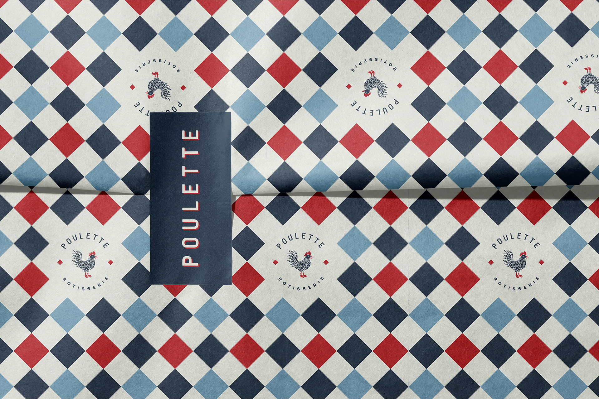
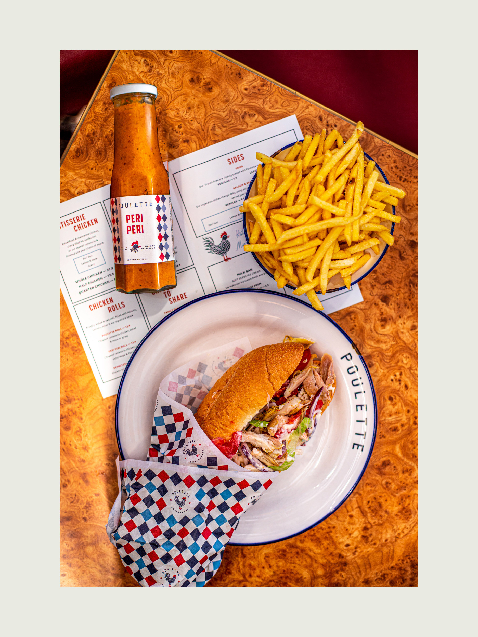
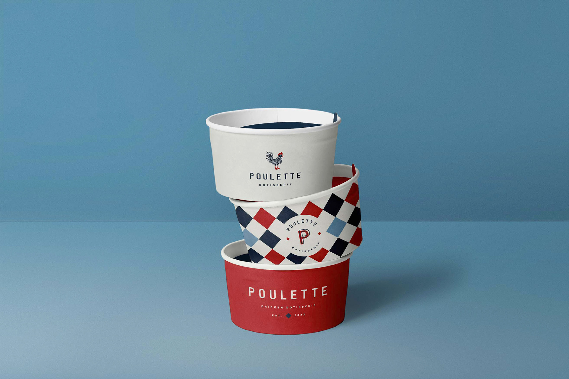
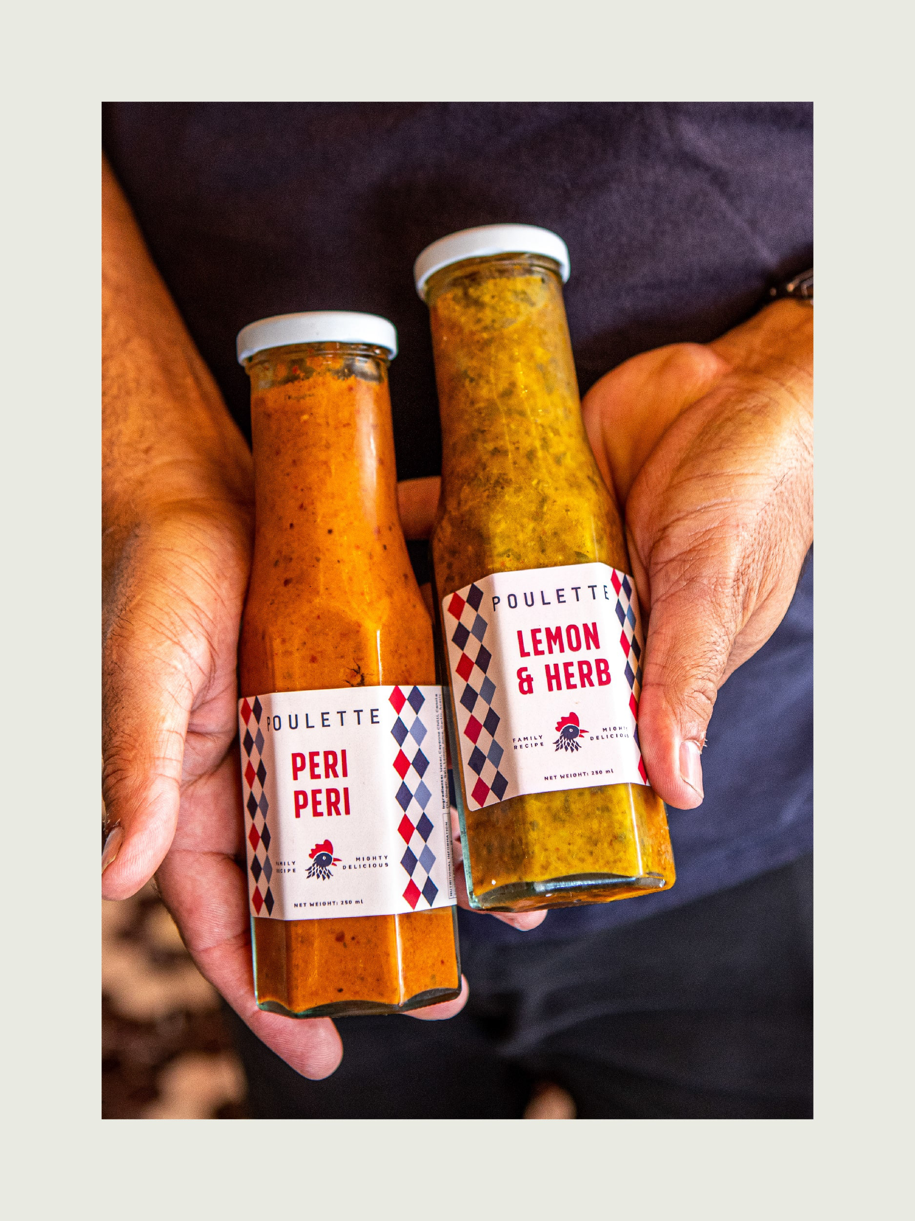
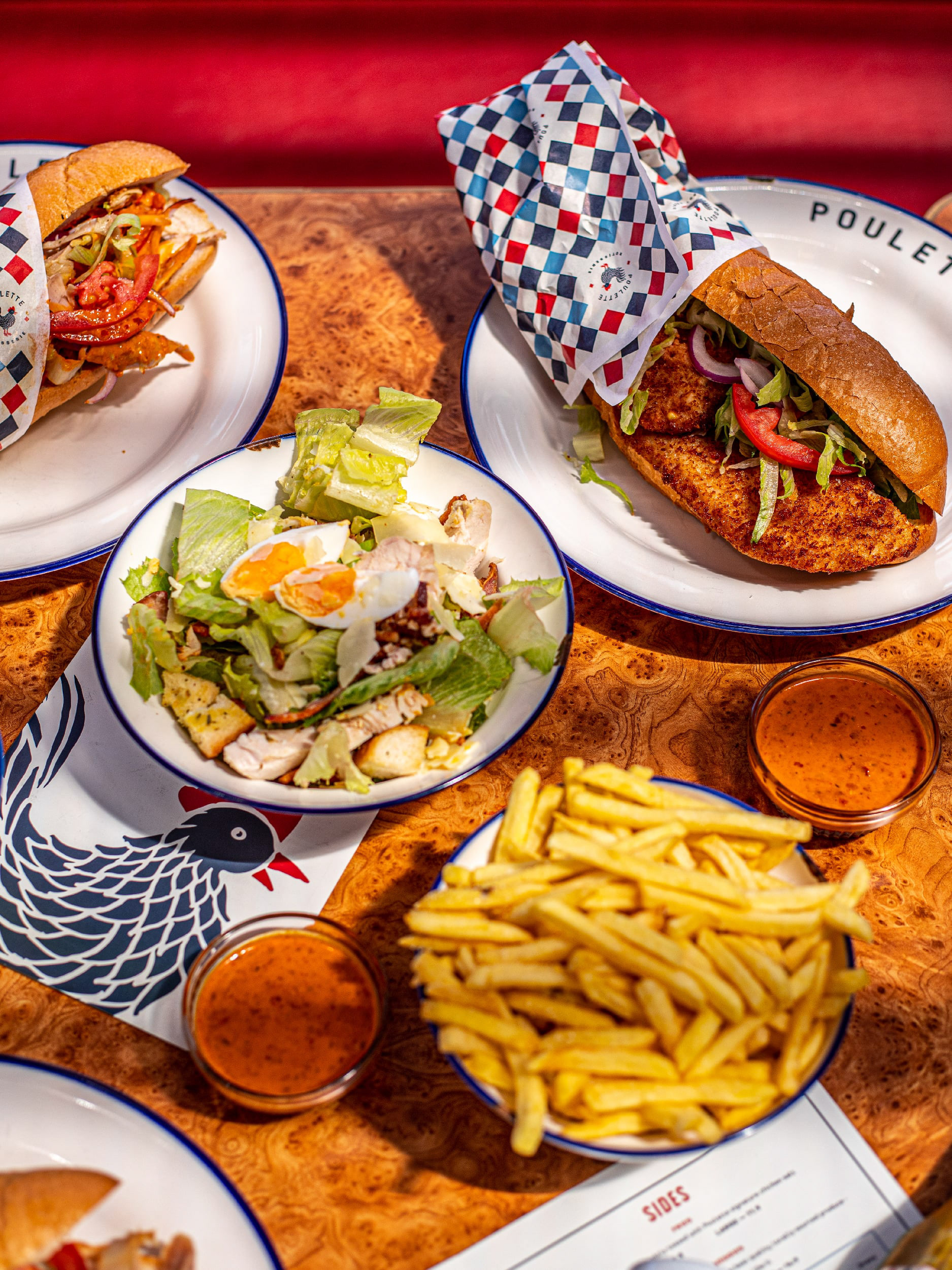
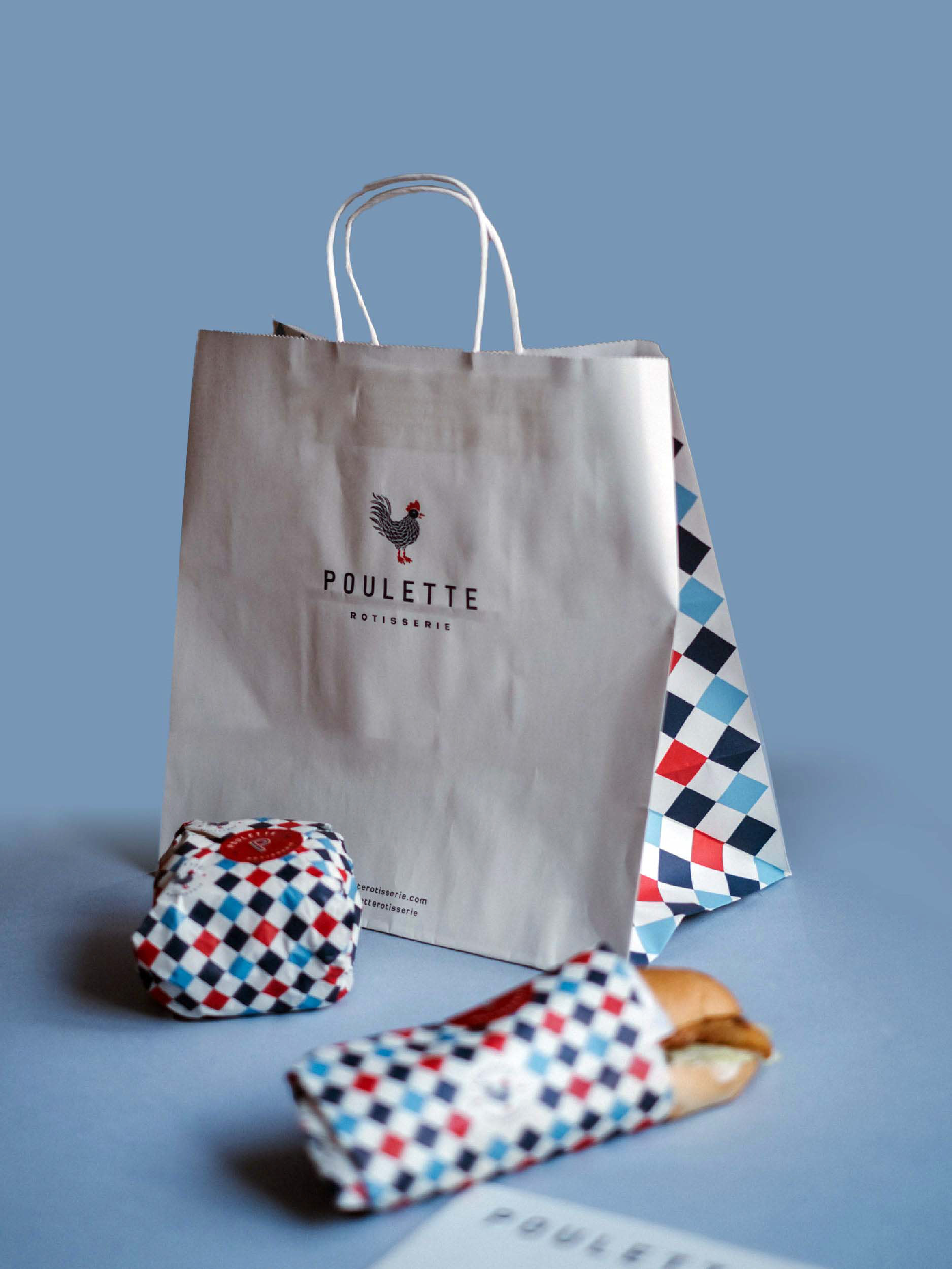
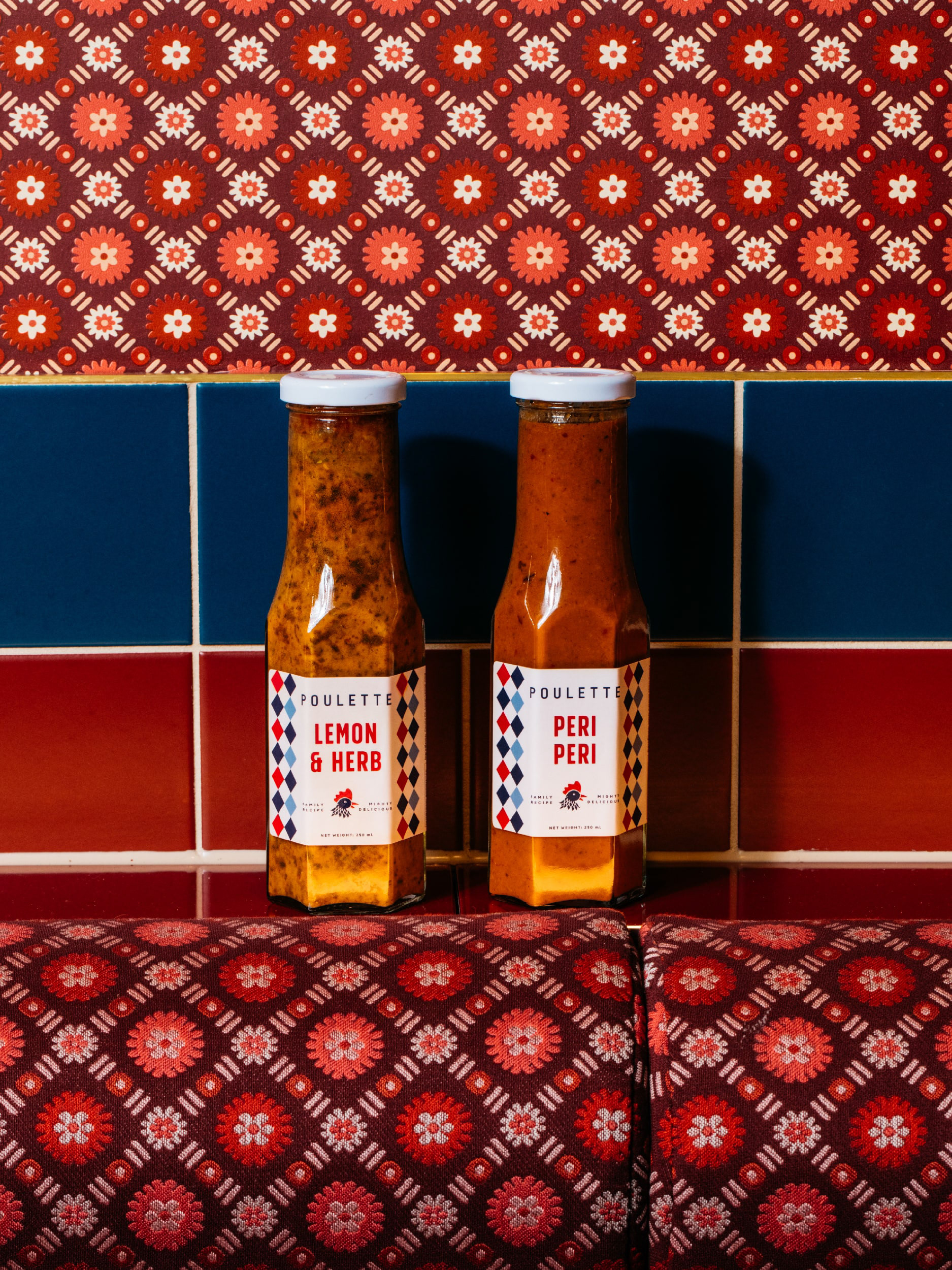
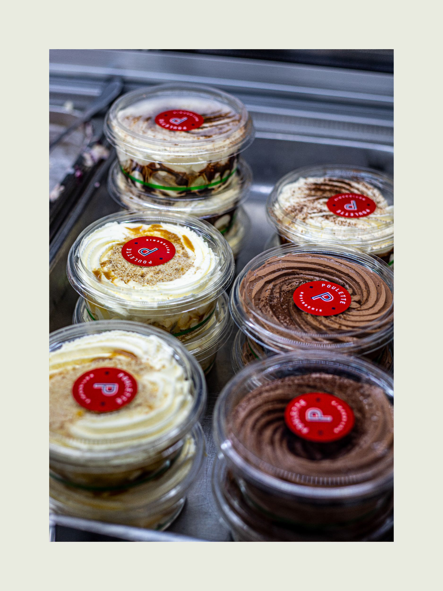
Consistency is achieved throughout the branding and packaging through the use of a rhombus pattern, which is featured on take-away boxes, papers, and sauce label details. This approach ties all of the elements together and reinforces the brand's visual identity.
AWARDS:
International Design Awards 2023 - Silver Award on Brand Identity
Featured on Mindsparkle Magazine & World Brand Design
DELIVERABLES:
Logo & Brand Identity
Packaging Design, Collateral
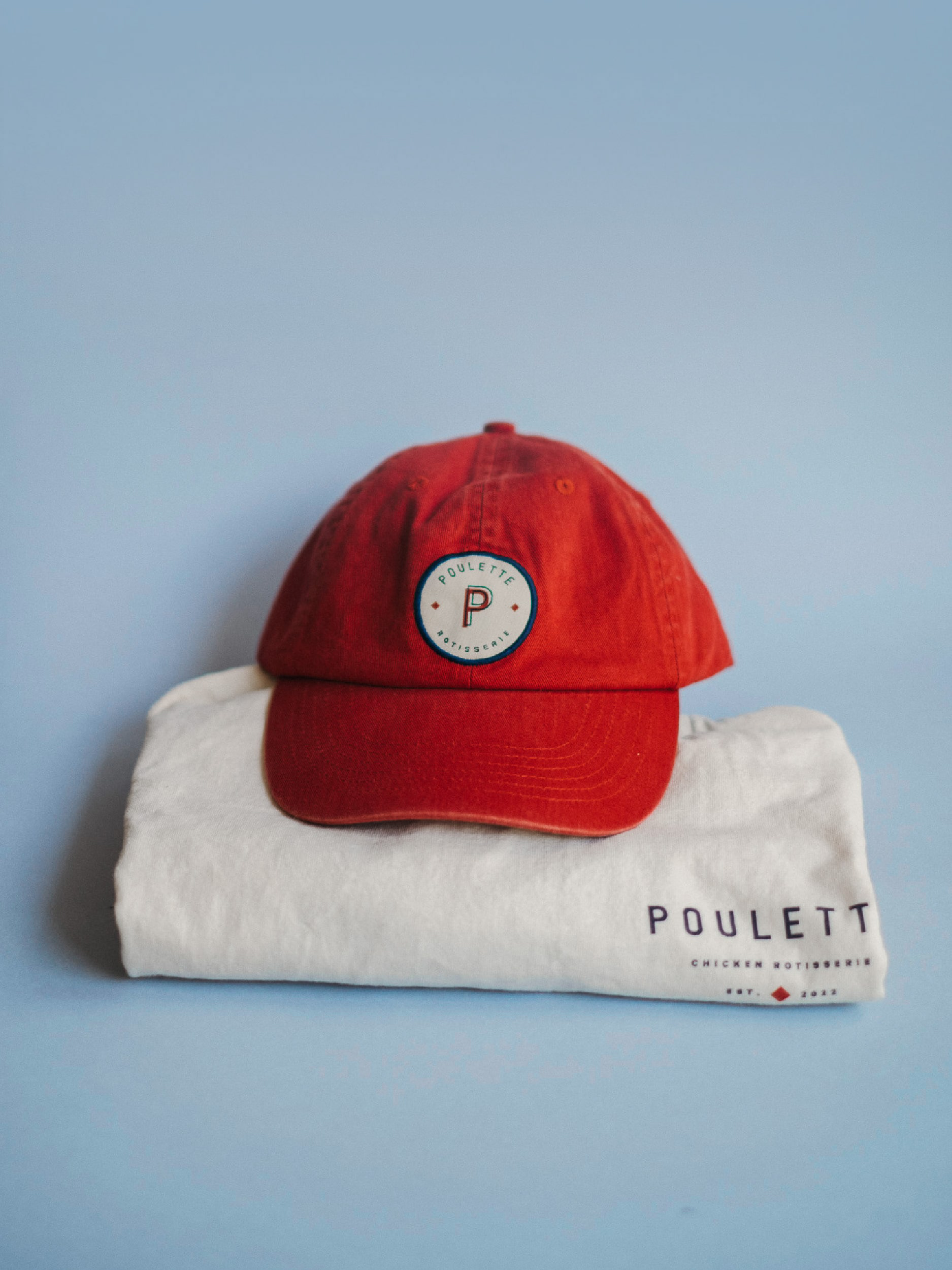
Uniforms, Tote Bags, Caps
Illustration
Menu Design for various applications
Signage
Client: Gabriel Darzi / Darzi Hospitality
Consultant: Kelly Taylor / Spitfire Fox
Interior Designer: Melissa Collison
Venue Photos: Kitti Gould
PACKAGING Photos: Ceren Burcu Turkan